

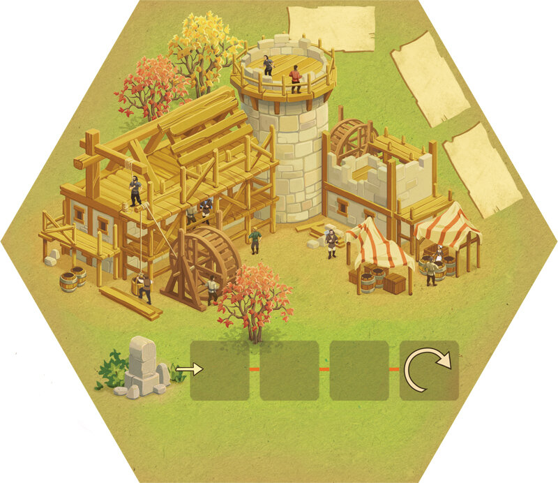
Ofrenda Board Game Art - Honoring Culture and the Dead - Interview with Alex Herrerias (Issue #79)
“This game was an excellent opportunity to teach people more about this Mexican tradition, and I had the chance to explore familiar places. I thought about families from Mexico, but I also wanted to represent the various regions.”
In this board game art interview, I’m speaking to Alex Herrerias, a freelance illustrator based in Mexico. ‘Ofrenda’ is their first board game art project, and I was drawn to its colorful art, captivating theme, and great table presence.
‘Ofrenda’ is a card placement game about creating a colorful altar to honor your loved ones. Upon discovering the game, I was really curious to learn more about Alex, and how he approached the game’s themes and depictions.
The word ofrenda will be said a lot in this interview, both describing the game, and the altar to honor the dead, so for clarity, I’ve capitalized the board game reference and put it in quotes: ‘Ofrenda’. Enjoy the interview!
p.s. Big thanks to Tabletopping for sharing their photography to support this interview.
Enjoying the site? Support it by sharing the articles you read. For more great insights, see the interview archive.
Thanks for joining us, Alex! Could you tell us a bit about yourself?
Well, I’m a freelance illustrator with almost twenty years of experience. I live in Mexico City, so I enjoy visiting the museums (this city has the third most museums in the world) and savoring delicious food from various places around the country. I’m currently working on my new graphic novel, which I hope to publish by the end of this year.


Have you always wanted to be an illustrator?
Well, I remember drawing since I was old enough to hold a pencil. But when I decided to study design, everything became more “serious.” Then, I started working on textbooks, attending book fairs, and uploading my portfolio to Behance and Facebook. I participated in numerous illustration contests and later served on the jury. I joined the Pencil Illustradores agency (in Spain).
Do I ever have a crisis of confidence? Hehe, all the time! Not just professionally, but I have always found time to recover and find calm, with music, movies, and books, talking and walking with friends, or just doing my classes at the faculty. Or even simply just breathing.
What is your process when creating art?
I enjoy the document process, which includes searching for samples, reading the text, and even creating a music list for each project. I’m a graphite lover, and I like to sketch in my actual notebook.
If the project allows me to, I want to incorporate any analog technique because most of the time I’m under a deadline. In my personal work, I used to be experimental. Right now, I’m working on some stamp techniques (etching).


How did you start working on board games?
Initially, Jordan Wheeler from Osprey Games contacted me to inquire about my interest in collaborating on a board game centered around Día de los Muertos (Day of the Dead), my favorite Mexican tradition. They sent me some samples from my portfolio to show the style they were looking for.
At the time, I was actually working on material about Día de los Muertos for a workshop for the Buenos Aires Book Fair in 2024, so I was entirely in the mood. I was thrilled about this project, my first one in the tabletop industry, by the way.
‘Ofrenda’ is a board game about celebrating loved ones for the Mexican Day of the Dead. Can you tell us more about it?
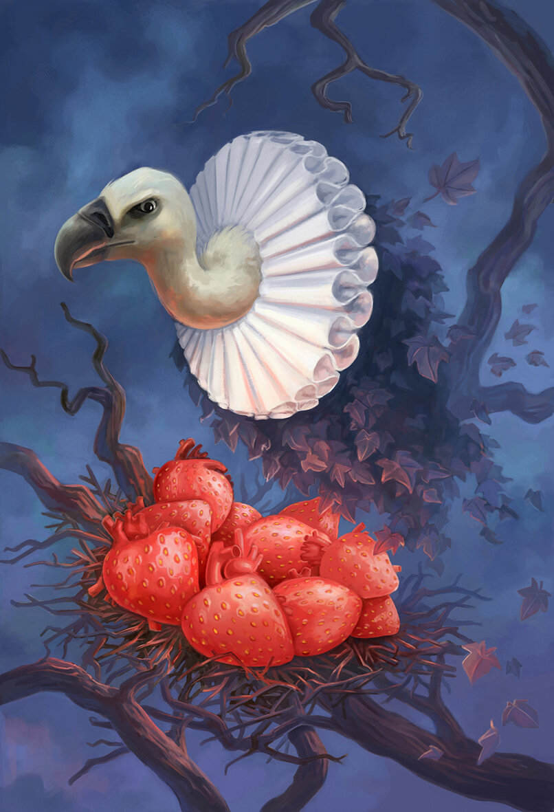
This game was an excellent opportunity to teach people more about this Mexican tradition, and I had the chance to explore familiar places. I thought about families from Mexico, but I also wanted to represent various regions: the north, the south, the center of the country, and so on. I represented artists, luchadores, sportspeople, and students.
In Mexico, we also paint our faces to look like skulls on that day, so it was a good idea to do it for the game.
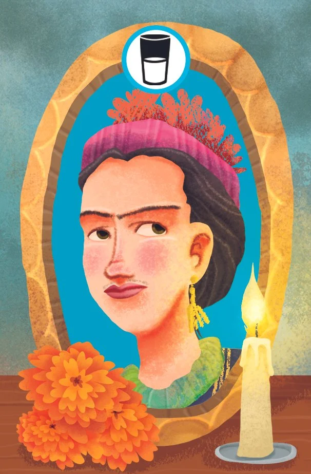
Can you explain what an ofrenda is, and how it’s made?
An ofrenda is an offering (template) for our relatives who have passed away. Each ofrenda is different for every region in Mexico. Every family that maintains the tradition could add more or fewer elements, but most have the same.
We add some portraits or just photos, their favourite food, water, or some drinks they liked for their thirst, candles to guide them to our place, traditional bread “pan de muerto”, fruits from the station, salt, papel picado for furnishing, and the most beautiful flowers, marigolds (cempasuchil). We sometimes use sugar skulls, and occasionally paper or handcrafted skulls. Each Family uses their resources, including fruits and traditional breads from their region.
How are ofrendas represented within the board game?
I gathered the necessary elements for the game and searched for samples, then attempted to incorporate my style. In my art, I like to represent traditional elements from my culture. I enjoy drawing skulls, luchadores, and diablitos a lot.
I tried to be as accurate as possible with the deep elements of traditional ofrendas, while adding my special touch to the game.
You mentioned traditional face painting. What are the usual elements that make up these designs, and how do they feature in ‘Ofrenda’?
In Día de los Muertos (Day of the Dead), we have many celebrations, such as parties, visiting ofrendas, going to the cemetery to make ofrendas, parades, and more. And it’s so common to disguise or paint our faces with elements from handcrafted art, like Puebla´s talavera (Mexican pottery) or anything that our imagination allows to honor death and tradition. This always depends on the artist or the ideas of the people who want to be painted.
I proposed incorporating this idea of face painting into the portraits in the ‘Ofrenda’ board game. The unlit side of the cards displays the same art from the lit side, but with fewer colors or in black and white. I think it works perfectly.


How did you approach showing the various regions of Mexico?
At the beginning of the project, we had to think about the 65 portraits - characters that conform to the elements of the ofrenda. My first step was to divide Mexico into five major regions - families (north, south, center, southwest, and northwest)- and look for the main elements, ethnicities, and original and ancient peoples. I tried to avoid stereotypes (such as big moustaches and charro hats) and incorporate traditional clothing from Oaxaca, Chiapas, Veracruz, and beyond.
Then, I sought to balance the representation of women and men characters, their ages, and their complexions. And of course, I added my fictional luchador “el Cangrejo celeste” - The blue crab. There was a lot of work, so I asked some of my talented students to help me find references and gather inspiration.
What are you reading, listening to, or looking at to fuel your work?
I have just finished a novel, Pedro Páramo, by Juan Rulfo, a classic from Mexico. Then, I´ll start with Pan´s Labyrinth, a novelization by Cornelia Funke and Guillermo del Toro based on the movie. I’m listening to a lot of movie soundtracks and Radiohead as my safe place, and I just saw The Phoenician Scheme, the latest movie by Wes Anderson. Some graphic novels are about heroes, while others are about monsters or both, such as Batman, haha.
Ofrenda - Photography by Tabletopping
Finally, where can we see more of your work?
You can see my portfolio on:
Behance: https://www.behance.net/AlexH
Instagram: @alexherreriasilustrador

Eternal Decks Board Game Art - Merging Ancient and Modern - Interview with Mujunsha Inc (Issue #78)
“Creating a story is a lot like excavation. The famous Japanese sculptor Unkei once said that carving a Buddha statue was like "releasing it from the stone." This reflects the idea that the figure already exists within the material—and the sculptor’s role is to uncover it.”
In this board game art interview, I’m speaking to Shinmei Yamamoto, a creative based in Japan. ETERNAL DECKS is their first board game art project and, in my eyes, a complete triumph. From the box to the game board, it is stylish, cohesive, and stunning on the table.
Eternal Decks is a cooperative card game that features a satisfying gameplay loop that constantly evolves. This is a game for fans of logic puzzles, and so readability is incredibly important across the table. Thankfully, the cards are not only colorful and clear, but packed with personality.
After playing the game for the first time, I was so impressed that I contacted the creative team behind it as soon as I got home. Shinmei Yamamoto joins me to share an in-depth look into their unique approach to creating art - enjoy!
p.s. A big thank you to No Pun Included for lending me their copy of Eternal Decks to photograph for this article.
Enjoying the site? Consider supporting it by sharing the articles you read.
For more great insights into board game art, check out the interview archive.
Thank you for joining us, Shinmei. Could you tell us a bit about yourself?
My name is Shinmei Yamamoto, and I’m the founder of MUJUNSHA Inc., a creative company based in Shibuya, Tokyo. We specialize in advertising, with graphic design at the core—from concept development to production.
In advertising, we’re expected to constantly read the shifts in lifestyle, values, and public sentiment to deliver communication that fits the times. I’ve also found myself increasingly drawn not only to the new but also to the old. In my personal time, I collect antiques, retro games, stickers, and posters—things that fascinated me as a child.
I also work as a part-time lecturer at Tokyo Zokei University, a fine arts university in Japan, where I teach once a week to support and mentor the next generation of young designers.
Rebranding for Yoshoku Kuronfune-tei, a Western-style restaurant founded in the Meiji era, located in Ueno, Tokyo.
As a mentor, what advice would you offer new designers?
This year, I am teaching a “Visual Communication” class to third-year students. The course mainly focuses on advertising production and branding. In my classes, students are given assignments, engage in group discussions, review their production processes, and receive critiques on their final outputs – all in a practical, hands-on format.
The main advice I always give is that design is built upon two wheels: “ideas” and “craft.” It is essential to identify early on which of these you are stronger at. Of course, there are designers who can stand out with their outstanding technical skills alone. However, I believe that combining both ideas and craft leads to the highest level of quality. Developing your own methods for generating ideas is, in fact, one of the most important skills.
To do this, it is vital to learn basic skills and rules, but above all, to live your life with an awareness as a designer. When you walk through the city, there are countless hints hidden around you – shapes, colors, typography, textures, people’s movements, how things are arranged. For example, the font on an old signboard, the texture of a building’s paint, the way people line up in queues, how spoons are placed on tables. Things that may seem trivial can become seeds for new ideas.
Another crucial aspect is the ability to think about “people’s feelings.” In Japan, there is a unique cultural concept called “reading the air,” which refers to understanding the atmosphere, a person’s expressions, or gestures, and acting accordingly, even if nothing is explicitly said. This is similar to advertising: simply shouting a product’s superiority rarely resonates with people. More sophisticated and subtle communication is required.
In ETERNAL DECKS, there is a special piece called the “Communication Disc,” which players use to express their intentions. This was an idea by the game designer, HIROKEN, and I believe this kind of consideration is a reflection of a uniquely Japanese sensibility.
Have you always wanted to work as a creative?
Yes. Since I was in elementary school, I loved drawing, inventing characters, and creating stories—often making comics of my own. Naturally, I went on to study graphic design at an art university. After graduating, I started my career at a design production company and later spent about 20 years working as an art director in the creative departments of international advertising agencies.
Many of the projects at such agencies are large-scale and team-based, often bound by strict brand guidelines. Over time, I began to feel a certain distance from my personal creativity. As a counterbalance, I’ve continued to pursue more personal creative expression through illustration, comics, and other solo projects.
Can you describe MUJUNSHA Inc. to us? What is your design philosophy?
MUJUNSHA was established in 2019. The name “mujun” means contradiction or paradox in Japanese, and it reflects our belief that original creative value can emerge when differing perspectives or ideas are allowed to coexist.
Our creative process always begins with contradiction. We find value in generating visual tension by bringing together seemingly conflicting elements—for example, using a casual tone to approach a formal or serious theme. We aim to attract attention through these unexpected combinations.
Our logo is based on a regular heptagon (a seven-sided polygon). Interestingly, a perfect heptagon with all sides equal in length cannot actually exist in strict geometry. That contradiction—something impossible that still forms a symbol—is exactly why we chose it as our emblem.
As for our design philosophy, we always keep in mind the idea of the “human era.” Everything is created by humans, viewed by humans, and used by humans. That’s why we believe people must be at the center of every process.
How did you get involved with ETERNAL DECKS?
The game designer of ETERNAL DECKS, HIROKEN, is actually my younger brother. He had worked with other designers on previous titles, but when he began developing this one, he reached out to me to collaborate from the early concept stage. I’ve always enjoyed retro digital games like the Famicom, but I had very little experience with analog games like board games.
When I first saw the paper prototype—filled with rows of numbers—I could tell the game mechanics were intriguing, but I intuitively felt it would be more compelling to tell the story visually through illustrations. Perhaps because I wasn’t familiar with traditional board game conventions, I was able to approach the visual design more freely and take a slightly different direction.
ETERNAL DECKS is a puzzle game at its heart. How do you approach storytelling for abstract creations?
Creating a story is a lot like excavation. The famous Japanese sculptor Unkei once said that carving a Buddha statue was like "releasing it from the stone." This reflects the idea that the figure already exists within the material—and the sculptor’s role is to uncover it.
In ETERNAL DECKS, we began by digging into elements already embedded in the game system—such as the cycle of exchanging decks, characters that hold a bundle of cards and activate under certain conditions, or the multi-stage game structure. From these, we unearthed key themes like "cycle" and "eternity," which eventually became the title: ETERNAL DECKS.
Next, we asked ourselves, “Why are the players doing what they’re doing?” That led us to the core narrative: the players are explorers investigating the mystery of humanity’s shortening lifespan. The story has them confront the truth of life itself. The theme of eternal life is a universal question that has fascinated humanity from ancient times to today. By rooting the gameplay in a theme that speaks to a deep human instinct, we gave the act of playing a sense of purpose.
Assigning meaning to each element and gradually building the narrative layer by layer is a method I’ve refined through years of work in advertising. There, you're often asked to deliver a product’s unique selling point (USP) to a specific target. Sometimes the answer is already set, and the only question is how to convey it—like solving a puzzle with one piece missing. Storytelling for this game followed a similar structure.
ETERNAL DECKS has a stunning box cover, featuring numerous fantastical characters. Can you explain how this was designed?
When we started the project, I first looked at many board game boxes to understand the common visual language of the medium. While I recognized the standard conventions, we wanted to take a slightly different path. Our goal was to create a game that could be loved for years—not something fleeting.
Board games typically spend more time on a shelf than in active play. With that in mind, we wanted the box to feel like an art object—something you'd want to display. Practical information like age range, play time, and player count was moved to the back. With input from HIROKEN, the game designer, we kept the front as minimal as possible and focused entirely on delivering a visual that encapsulates the world.
The color palette is limited, and the front showcases the Eternals—beings sealed within the game’s universe. Opening the box is meant to feel like breaking that seal. To enhance this, we designed the inside manual using the same layout as the cover—but this time, revealing the characters in full color.
This design approach reflects ideas I developed in advertising—such as creating strong first impressions and crafting a meaningful unboxing experience. The goal was for players to feel like the doorway to a new world opened the moment they lifted the lid.
As your first board game project, what did you learn through making ETERNAL DECKS?
In many ways, it felt similar to other creative projects. But one of the joys of this project was being involved from the very beginning—setting the tone, color palette, and shape language. That upstream involvement made it feel more like a personal work than a client project.
The game board uses black as its base color. At the beginning, the board feels calm and quiet. But as the game progresses and colorful cards are played, the board transforms into a vibrant, life-filled space. This visual shift, from black to a flood of color, provides players with a striking post-play experience—one they often want to photograph and remember.
One of the most fulfilling aspects of the project was taking something ancient and making it feel contemporary. ETERNAL DECKS is built on the theme of “eternal cycles.” Characters rooted in myth reappear in modern form. It was about resolving the contradiction between “ancient” and “modern” through design—something that resonates with the meaning of our studio name, MUJUNSHA, which means “paradox.”
One particular detail I obsessed over was the lettering. I custom-designed each letter in the game title so that the typography would harmonize with the artwork and fully reflect the game's visual language. The goal was for the text and imagery to function together as one unified world.
Did playtesting change the art, and in what way?
Balancing the immersive worldbuilding with smooth gameplay was one of our biggest challenges. For example, we went through many revisions of icon and number sizes within the limited space of the cards.
As a result of playtesting, some characters—the Eternals—were either replaced or removed because they didn't fit the game balance. In other cases, character color schemes were revised to better match the deck colors. We paid close attention to how the art and game system could reinforce each other, especially in terms of color design.


Interestingly, sometimes we adjusted the rules after finalizing a character’s illustration. We went back and forth between game mechanics and visual elements many times. That process helped the two sides complement one another and ultimately led to a more polished, unified product.
Since international release was part of our plan from the beginning, we made sure to emphasize non-verbal communication. We minimized text where possible and used iconography to express information visually. For instance, while Japan uses “O” and “X” for yes/no, we switched to checkmarks and Xs for global audiences.
We also addressed accessibility by adding unique symbols to each card color, ensuring colorblind players could still navigate the game smoothly.
What do you think are the most crucial elements of creating great graphic design?
At Mujunsha, we work across a wide range of media, not only in two-dimensional graphics such as logos and posters, but also in video, events, and websites. Regardless of the project, one common approach is to always start by creating a single “key visual.” This is a core graphic that condenses the concept into its purest form, conveying what we want to express in the simplest and clearest way possible.
All graphic design consists of “copy (words)” and “visuals (imagery).” By using visuals effectively, it becomes possible to reduce the amount of text while communicating feelings and meanings more quickly. Emoji, for example, are a Japanese-born culture that conveys emotions like joy or sadness instantly – a great example of visual efficiency.
ETERNAL DECKS - Operational rules for design
Another important aspect is not to produce things in an ad-hoc way, but to first create “operational rules (guidelines).” In ETERNAL DECKS, several of our designers were involved, so we established visual guidelines that defined colors, typefaces, tones, and other elements to ensure consistency. This made it possible for anyone to join midway through the project while maintaining a uniform quality, and we paid close attention to how this information was shared.
However, it is just as important not to become “bound too tightly” by these rules. This may sound a bit contradictory – which is quite fitting for a company named Mujunsha (“Contradiction Inc.”) – but while rules form the foundation, sometimes boldly breaking them leads to new discoveries and expressions. I believe that this balance between rules and freedom is at the core of great graphic design.
What are you reading, listening to, or looking at to fuel your work?
My inspiration comes from “things shaped by human hands,” regardless of era or genre. I enjoy viewing everything on equal footing—from renowned artworks in museums to old candy packaging or collectible stickers found in retro stores—without ranking them in terms of value, and simply seeking what resonates with me.
For example, the wave pattern used on the green token in ETERNAL DECKS was inspired by a detail from Red and White Plum Blossoms, a National Treasure of Japan painted by Ogata Kōrin in the Edo period. Each token in the game represents a different emotion, and the green one symbolizes “harmony.” I felt the imagery of waves flowing between red and white plum trees perfectly captured that concept.
On the other hand, the upgraded cards in the game use holographic foil inspired by Bikkuriman stickers—a massive craze among Japanese children in the 1980s. The “Eternals” in the game emerge from a sealed state into vivid color, expressing their awakening. This transformation from shadow to light represents the return of life. To reinforce that symbolism, we used seven-color holographic foil to give the visuals a vibrant, life-filled glow.
ETERNAL DECKS cards and game token design
Are there any other non-gaming projects you’d like to highlight?
I would like to introduce one of our projects called “WOOD CHANGE.” This was a commission from the Forestry Agency of Japan. The project communicates the benefits of integrating wood into daily life through various approaches, including videos featuring original wooden dolls that tell stories, and workshops where participants can experience woodworking firsthand.


Finally, where can we see more of your work?
You can find more of our work through the following:
Website: https://www.mujunsha.com
Instagram: https://www.instagram.com/mujunsha_inc
We’re planning to host an exhibition in Tokyo later this year or early next year, featuring artwork from ETERNAL DECKS. We’ll announce details on Instagram, so we’d be grateful if you followed us there.

Welcome To Board Game Art - Reversing Gender Norms - Interview with Anne Heidsieck (Issue #66)
“I wanted to make a joke about the omnipresent sexism of the 50s era by reversing the roles on the cover. At first, I imagined a woman in a suit near a sold sign in front of a nice house, giving the key to her nice husband..”
Welcome to issue 66 of my series sharing the stories behind board game art. Roll and Write games aren’t always well-known for their gorgeous art, but what struck me Anne’s work on ‘Welcome To’ was how fully realized its theme was. Hearing about Anne’s process on this project and more was fascinating. I hope you enjoy!
For more great insights into board game art, be sure to check out the interview archive.
Anne Heidsieck - When I Dream board game card art
Hi Anne, thanks for joining me! For our readers who aren't aware of your work could you tell us a bit about yourself and what you do?
Hi Ross, and thank you very much for writing about the art in board games! I'm a 27 years old illustrator, working since 2012 after my studies in Nantes. Currently, I live in France and more precisely in Lorraine. When I'm not working, not often enough, according to my dog, I like hiking in the mountains and the snow (as much as possible!), reading, playing games of course, and devouring lots of series!
I have worked on several games from Blue Cocker (Welcome To, Argh and Meeple War), on Majesty and Carcassonne Safari of HIG, on some cards for When I Dream of Repos Production and on a game of Haba, Frido's Treasure Trove.

Anne Heidsieck - Frido’s Treasure Trove board game art
So how did you first get involved in making board games?
Soon after finishing my art studies I wanted to make the artwork for games. My sister and brother made a game themselves for our family when I was a kid and maybe that inspired me! So, with my partner, we created a game. We invented the rules, I carried out the illustrations and then we met several editors to present our project. It was quite a failure and the game is somewhere in a box in the cellar now, but it allowed me to meet people who were so nice and gave me the advice that really convinced me to keep trying, but only on the side of the illustrations this time.
Anne Heidsieck - Card Artwork - Frido’s Treasure Trove
I sent emails to many editors and, one day, Alain Balay from BlueCocker answered me. He was looking for an illustrator for his new game, Meeple war! That's how I found my first work on board game designs.
I haven't had the opportunity to work on a lot of things other than games but, from what I’ve seen, the work is really different in-game illustration and book illustration, for example. I think that game design requires even more organization. It can seem too strict because we have a lot of "rules" to respect, for the ergonomy of the game, but it's rather reassuring to me because we don't begin the work with a blank page.

Anne Heidsieck - Save the Meeples cover art
When beginning to work on any new project what are the first few things that you do?
I always begin by researching a looooot of pictures, on Pinterest mostly and also in my art books. I need to figure out the idea of the mood of the game, the color atmosphere, the style, etc. Even if I don't use them later during my work, they help me to find the first ideas. I make some first sketches after that, to be sure that we agree with the editor. When the work begins for real (and after I print a plan and fix it on my wall!), I start working precisely on each illustration. First with a sketch, a definitive drawing, a color rough and finally the definitive coloring, asking the editor for confirmation between each step.

Anne Heidsieck - Meeple War drawing construction
What do you remember about your first board game project Meeple War, and how did you prepare yourself for the job?
As I had already worked on a full project for a game (even if it was personal, it was really formative), I wasn't very surprised by the necessary rigor of work when I started to illustrate Meeple War. The first thing I did was to organize a very strict plan, that I totally exceeded of course. Today when I do planning, I schedule much more time than I estimated at first, to avoid being under too much pressure. I continue to exceed my time limit, but less ;)
What were the most challenging parts of the job?
The newest thing for me was the technique: it was my first project entirely digital, and I have to say that this new way of working wasn't really appreciated by my eyes and my back! The biggest challenge and stress I had were for the cover I think. We kept it for the end, when the art was well fixed on the game elements to be sure to have consistency. I looked into a lot of covers for games and put myself under more and more pressure. Finally, when we validated a rough design with the editor, the final realization was quicker than I thought.
Anne Heidsieck - Meeple War game tile illustration
Other challenges were the setting-up of the punchboard and the cover with the marges, bleeds, cut lines etc, as this was also new for me. I understood nothing at first and hated that. I had to make a lot of searches on forums to know what I had to do. Now I do all the setting-up for Blue Cocker and maybe even like it (sometimes), knowing the characteristics needed for the publisher later, which allows me to gain some time on the art. Moreover, it's rewarding to follow the project from the beginning to its very end. It allows too, amongst others, to check the colors of the first print (which are always very different than on the screen) and to adjust until the production all that must be modified.
I made a big mistake with ‘Meeple War’ when I drew the illustrations for the tiles. I had totally forgotten the bleeds! I had to add on to each file the margins for printing later and remake the forests. I don’t think I’ll ever forget bleeds after that!

Anne Heidsieck - When I Dream card art
You worked on 'When I Dream' a card game with wonderfully creative artwork. How freeing was it to work on a game with this kind of concept and what were some of the words you created the art around?
[Editor: When I Dream is a guessing game and without focusing too much on the rules I’ll just tell you about the cards that make it up. Each card features two words, one at the top and one at the bottom. Each card illustration represents these two words and can be rotated 180 degrees to focus on either one].
The art brief was wonderful because the artists were so free. We had a list of several words and had to combine them 2 by 2 however we wanted. After that, the only directive was to make a surreal illustration that showed both of these words. We could include other objects and ideas, but they had to be less important in the picture than the 2 chosen words.
The artists involved didn't have to work in a similar style, the common theme was the surrealism for the dreams. I wish I could seize this opportunity to reuse my paintings and brushes, which I miss very much! But traditional painting takes me more time than digital and sadly I couldn’t find the time to make it work.
I had some words on my list that I immediately wanted to illustrate. Words like "snow", "vulture", "tunnel", "bear" and I imagined different situations with the others words in order to make, if possible, poetic pictures, and sometimes nightmarish ones. When the project got down to only words that didn't inspire me, I asked for another list of words. I didn't understand at all that we had to deplete most words from our first list before asking for new words but the artistic director still gave me new words, so I was very lucky to have a lot of choices to make my pairs.
Some pictures refer to books, movies, or universes that I love, and I also often listen to audiobooks when I work, so maybe that influences and inspires me in some ways. The most perfect design brief I ever had was on the goodies card of this game, because I just had to do whatever I wanted with as many elements as I wanted! There are two blanks for writing the words, suggested by the card that the player wants to use.
Anne Heisieck - Welcome To Game Sheet
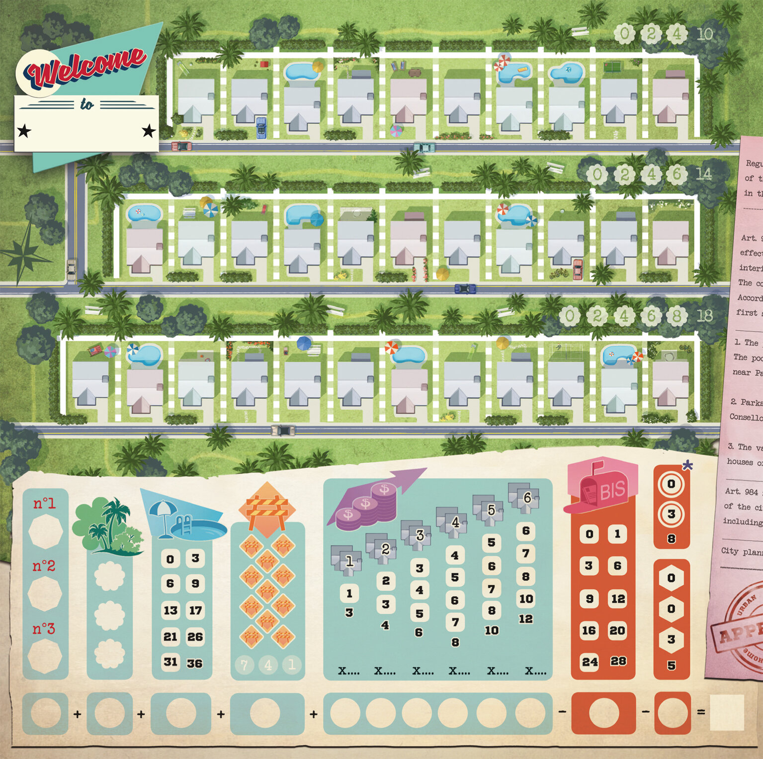
2018 saw the release of the roll and write game 'Welcome To...' which has been a huge success. The game has a strong 50s vibe to the artwork, so how did that develop and was this look part of the original brief?
Alain Balaÿ already knew that he wanted the theme "urbanization during the 50s". The graphic style that he wanted was very much in the mindset of American ads from that era. Most of the work was spent on research: ads, maps, real estate documents, aerial views, logos, style, colors... I even listened to 50's rock and roll music and watched a few movies from this period to be completely in the mood! Even with a lot of research, I still think it could have been even more "50s" in my designs. But sadly it's always so different in my head than the end result I manage to create by my illustrations.
Anne Heidsieck - Welcome To - Art style research examples
I spent a lot of time researching the "perfect traditional house" during the 50s. I also viewed a lot of paintings from Hopper for inspiration. By spending time researching 50s advertising, I wanted to make a joke about the omnipresent sexism of the era by reversing the roles on the cover. At first, I imagined a woman in a suit near a sold sign in front of a nice house, giving the key to her nice husband with the kids in his arms. I wanted it to be so we could imagine her saying to her husband "see what I bought for you and the kids darling". This cover idea wasn’t chosen in the end, but that core idea of reversing gender norms pleased the editor and author.

Anne Heidsieck - Welcome To board game fake advertising
An extra detail I love in this game are the adverts on the back of the player reference sheets. How did this come about and where did your ideas come from?
Alain wanted to give me the chance to make more real illustrations. Beyond the cover, I mainly did icons and graphics, so to strengthen the atmosphere of the 50s he decided to add different advertisements on to the back of the player reference sheets.
The illustration of ‘Meeple War’ is a parody of a well-known ad, where a man and his son are playing battleships while the mother and the daughter are behind, doing the dishes. The illustration of Toulouse is inspired by the many tourism advertisements and the editor and the author are both from this town.

Anne Heidieck - Welcome To board game fake adverts
The one of the man in the kitchen is a reference to the countless pictures of housewives with their all-new household products, and the poster ‘le cocker aux trousses’ is a parody of the poster of the movie ‘North by Northwest’, ‘La peur aux trousses’ in french with all the authors and illustrators who worked with Blue Cocker until the release of Welcome to.
You mentioned that you made some early mistakes when it came to things like bleed lines on projects. So when it comes to creating and editing game art with punch boards and print work in mind what are some basic lessons that you could share?
I would recommend always being careful from the very beginning of the creation of a file about several things:
The size of the picture, personally I often work twice the print size
The definition with 300dp minimum for print
The color profile which depends on the manufacturer, but always at least in CMYK for print.
The density of black, as printers cannot print black deeper than a certain density.
To not forget to embed the fonts on a pdf export.
And in anticipation of the print, which always darkens and tarnishes the colors somewhat, to saturate and lighten up a little bit for each of the pictures.

Anne Heidsieck - Raccoon Illustration - Frido’s Treasure Trove
When it comes to resources, I think it's always a good idea to ask other illustrators how they work, as we have a lot to learn from each other! The boardgame manufacturer ‘Panda’ https://pandagm.com/tools makes very good guides for preparing the designs, it’s all in that link!
I also often search on adobe forums when I don't know how to do something in particular.

Anne Heidsieck - Carcassonne Safari board game cover
Last year you illustrated Carcassonne: Safari, so how did you end up working on this game and was it different working on an existing series?
After working on the game Majesty by Marc André with Hans im Glück, (thanks to Gaëtan Beaujannot from Forgenext, the agent of Marc André), Hans im Glück asked me if I was interested in creating the artworks of their next "around the world" expansion of Carcassonne. I couldn't say no! Besides, I love elephants so much! First, as a test, I made one tile with the different main elements (a piece of savannah, one of a forest, a baobab and a road), in order for them (and for me!) to see if I could make something in the spirit of Carcassonne that would fit with their vision. After that, I improved each kind of element separately as well as designing all the animals, plus some additional to give us choices.

Anne Heidsieck - Carcassonne Safari Animal artwork
For example, I made an antelope and a lioness, but the monkey and the lion were chosen instead. When we agreed on everything, they send me the final layout of each tile, with the frame of each element and the animals present on it, and I arranged them one by one, trying to diversify some set elements. It was kind of tedious work!
For the scoring board, I mainly used the frame of another expansion and used some of the same elements from the tiles I’d made as you see in the other Carcassonne games. As it is a collection with a very specific editorial line, the illustrators have to follow a general pattern, so it's not a very free "artistic" project, however, it is really well organized and we know exactly where we are going, which can be nice too!

Anne Heidsieck - Carcassonne Safari scoring track
You've also gone on to illustrate a variety of neighborhood expansion sheet packs for Welcome To. So are there any differences when illustrating an established game series (eg Carcassonne) and how do you look to make the art distinct within the design constraints?
It was my first work on an expansion, and indeed, it could have been a peaceful project by just modifying a little bit the first neighborhood, but we were under a bit of time pressure on these. Our American publisher (Deep Water Games) wanted to present the mini-expansions on their Kickstarter in Autumn, so we had to work fast. I was working on another project at the time, so they helped me by beginning some of the graphic work to have something to show to the backers at the Kickstarter launch, and I reworked it afterward for the final files.

Anne Heidsieck - Welcome To card art
It was nice and easy to create the art for something that I knew already worked for the players. I just had to change the aesthetic, the mood of the season or the event, and not on the games ergonomy. It was pretty relaxing! After searching for the main color for the ambiance, I made new trees and bushes and I felt that it immediately changed everything. Making new decorative files on the right, even if it isn’t important for the game, was fun too, and helps create a richer atmosphere I think.

Welcome to - Expansion Artwork
What are some non-game related creations (books, music, movies, etc) that you’re currently enjoying?
I often read or listen to audiobooks, mostly fantasy, and a bit of horror and science fiction. I'm a huge fan of Harry Potter and read and re-read them very often! I made the illustrations for my school examination about the french book ‘La horde du Contrevent’ by Alain Damasio, a beautiful emotional adventure! I also read the ‘Game of Thrones’, and wait for the next volumes while the internet spoils me every day. One of my recent crushes was for the books " The Gentleman Bastards" by Scott Lynch.
I watch more series than movies, of all kinds. Some of my favorites are ‘Orange is the New Black’, ‘Black Mirror’, ‘Stranger things’, ‘Parks and Recreation’, ‘Kaamelott’, ‘The Marvelous Mrs Maisel’ and of course ‘Buffy the Vampire Slayer’ :) Thinking about movies, I love in particular all the animations by Laika, especially ParaNorman!

Anne Heidsieck - When I Dream board game card artwork
Just as with my taste in books and series, the music I listen to is really diverse. When I work, I tried to adapt as much as possible the kind of music I’m listening to with the mood of the illustration I'm doing but I do listen to audiobooks and podcasts sometimes. Otherwise, I mainly love Nordic Folk music (groups like ‘Garmarna’, ‘Triakel’, ‘Omnia’) and some french artists like Camille, Claire Diterzi, Air, Polo & Pan. And when I'm working on layouts, I can only listen to very soft piano!
Finally, if we’d like to see more of you and your work, where can we find you?
Here is my website: www.anneheidsieck.com
On Facebook : Anne Heidsieck - Illustrations
All images provided by Anne Heidsieck.
If you’re new to the site, why not stick around a while? There are interviews with some of the best artists in the industry and if you’d like to read more you can them by heading over to the Interview Archive!

Techlandia Board Game - Silicon Valley meets Lovecraft - Interview with Dan Ackerman (Issue #64)
“The key for me was not to just have a guy in a suit with a Cthulhu head, but to have the guy in a suit with a Cthulhu head be just another cog in the corporate wheel…”
Welcome to issue 64 in my series sharing the stories behind board game art. With all of the tech scandals of the last few years, the idea that a secret evil is lurking behind the scenes, pulling the strings, seems less like fiction every day. Techlandia is a board game that takes the premise of Silicon Valley corporations and spreads supernatural horror on top like a thick Lovecraftian marmite. Enjoy this glimpse into its dark reality.
For more great insights into board game art, be sure to check out the interview archive.

Today I'm joined on the site by Dan Ackerman. Thanks for stopping by! For our readers who aren't aware of your work could you tell us a bit about yourself and what you do?
I'm probably best known as a tech journalist, and I've been with CNET, the technology news and reviews publication, for about 14 years, covering everything from social media and hacking to laptops and games. I'm also a pretty regular TV news talking head, mostly on CBS This Morning, and even found time to write a book. Naturally, it was game-related. The Tetris Effect is the nonfiction real-life story of the classic game Tetris, which was created in the Soviet Union during the Cold War and eventually escaped to the West. Fun fact -- not only am I a New Yorker, I'm a native one at that -- born and raised here.
Dan Ackerman - photo by Sarah Tew
You've got a brand new tabletop game on Kickstarter called Techlandia. Now before we get into the game itself, after years as a journalist covering tech and videogames, why make your own board game?
Over the past several years, I've seen a lot of innovation and interesting storytelling coming out of the tabletop community. It reminds me a lot of the late '90s and early 2000s in the indie video game scene. So, when I had an idea for a story I wanted to tell in an experiential, interactive way, my first thought was: "This should be a video game." About five minutes later, I thought, "Wait, this should be a board game!" Precisely because it was about technology and technophobia and high-tech gear, I loved the idea of presenting it in a very analog way, with cards and map tiles. It made for a very interesting juxtaposition, high tech and low tech at the same time.
Alright, elevator pitch time, what is Techlandia and what's interesting about it?
Techlandia combines some of my favorite things about board games with some of my wish-list must haves. It tells a dramatic narrative story with some Douglas Adams satire vibe, it has cool characters on a hex-based map, some exploration, some combat, and the two big things that were key for me -- it fully supports solo play (or up to 4 players), and it'll fit on a normal, human-sized table. As an apartment-dwelling New Yorker, I'll tell you that's a big plus.
It's a modern-day dungeon crawl, where as heroic (but unknown) tech bloggers, you have to sneak into the massive headquarters of Techlandia, the world's biggest tech company. Their CEO is announcing a brand new smartphone on stage in a few hours, and you suspect he's going to use the power of millions of connected new phones to open a portal to another dimension and summon various Eldritch horrors. I pitch it as "Silicon Valley meets Lovecraft."
Techlandia - Light Side
Just to put on your journalistic hat for a second, tabletop gaming has seen amazing growth over the last decade or so. Why do you think board games and RPGs have seen such a rise in popularity and do you think this will continue?
Part of the rise, or re-rise of tabletop gaming has to do with people being burned out on digital. From non-stop news to the negative effects of social media, to harmful "blue light" from laptops and phones, it's become trendy to take time away from screens, and recapture some real-world interactions. The ongoing popularity of vinyl records confirms this, and physical book sales are outpacing digital books again. For games, do many video games are big-budget cookie-cutter affairs that lack any real imagination or originality. They're like blockbuster movies -- all focus group and no inspiration. Tabletop is in a unique position right now where it's big enough to be sustainable and have a decent economic footprint, but still small enough for auteurs and indies to compete .
First time designers often find projects change more than anticipated during their development. Thinking back to your first concepts for the game, how has it changed since then?
If anything, my concept became larger and more in-depth as I went along. The entire thing started as an idle thought after a particularly grueling tech industry press conference. "This should be a video game!" And I brainstormed briefly on the idea of an 8-bit-style narrative adventure. Then, like lightening it hit me: "This should be a board game!" I had been playing a lot of Mansions of Madness and similar games, and a dungeon crawl to escape a terrible tech company was such an amazing idea, I got to work sketching it out on hex paper immediately. It really started to come together when I flipped the narrative -- instead of escaping the tech company, you were trying to break in.
Techlandia - Night Concept Art
Techlandia - Dark Side
I've got to say, it's a great narrative concept. So how did you look to marry that theme to the art?
Techlandia is a satire, in the mode of Douglas Adams or Brazil. But satire works best for me when everyone involved plays it totally straight. The art for the game box, the hex tiles, the various cards and the characters all play it close to the vest. Dark, foreboding, creepy. But when you combine that with the text and the scenario, the humor comes out. The key for me was not to just have a guy in a suit with a Cthulhu head, but to have the guy in a suit with a Cthulhu head be just another cog in the corporate wheel. The ridiculousness and the horror work hand-in-hand, and frankly, except for the actual evil magic stuff, it's not that divorced from the real tech industry.
Techlandia - Concept Art
Where did you find your artist(s) for Techlandia and were there any challenges in communicating your vision for how the game should look?
I've worked on print magazines and websites for many, many years, often very closely with designers, so I brought a pretty solid mainstream media understanding of design to this project. That comes along with respectable skills in Photoshop, Illustrator, InDesign and the like (I mean, back in my print days, it was all Quark...). For Techlandia, I used three main artists, although I had preliminary discussions with many more, though the Board Game Geek forums, Fiverr and ArtStation. One artists did background and environmental art, another did all the characters, and a third did a single concept piece I had in my head and really wanted to include.
Techlandia - Pinboard of early game board sketches, which eventually transitioned into a hex tile map.
How long did you spend playtesting the game and at what stage of the project's development did you begin?
For me, development, playtesting and even art and design are all part of an organic whole, and you can't separate them. So, I was designing, testing, and sketching concept art from day one. For a narrative game like this, so much of the story is told visually, so if that doesn't work, the entire idea falls flat. One of the very first elements I designed was the player dashboard, which looks like a life-size iPhone. It's something I put together in one afternoon in Illustrator, and it's remained almost exactly the same ever since. Other elements change constantly, including all-new character design reasonably late in the game, when I wanted to shift gears a bit.
Techlandia - Early Prototype
Playtesting is often where board games graphic design elements are pulled into focus and refined. Did you find this was the case with Techlandia and what did playtesting make you more mindful of?
I'm not much of an artist, in that I provided original very rough sketches for a lot of the art, but they were really just pencil roughs. However, my long media career has given me many opportunities to work on page layout, UI and information design, so I'm a bit of a nut for that stuff. After the illustrations were ready, I laid out everything from the box to the rule book to the cards to the online ads. My design philosophy is all about clarity, purpose and narrative. Is the meaning of each design element clear? Does it serve a purpose? Does it advance the story?
Techlandia - Full game layout
Through playtesting, that led me to eliminate gameplay and design elements that did not advance those goals. By doing so, the writing became tighter and more focused, fiddly busywork elements were eliminated, and the visual design hewed towards minimalism wherever possible.
What are some non-game related creations (books, music, movies, etc) that you’re currently enjoying?
I'm a big reader, as many writers are. Some recent reads I'd highly recommend include Lovecraft Country by Matt Ruff and Fall by Neal Stephenson. I'm really into authors like Walter Mosley, Richard Price, and Elmore Leonard. But I also love hitting up used book stores for classic mid-century sci-fi and always look for stuff by Frederik Pohl, J.G. Ballard, etc.

The Tetris Effect - Dan Ackerman
Do you have any recent projects, or upcoming that you’d like (or are able) to tell us about?
Before Techlandia, my big project was The Tetris Effect, a non-fiction book from Hachette/Public Affairs. It's a real-life high-tech thriller about how the video game Tetris was created by a Soviet computer scientists in the 1980s, then essentially stolen by western software companies, leading to a huge international battle for the rights to the game. You can find it on Amazon or anywhere books are sold, and it even got reviewed by the New York Times.
Finally, if we’d like to see more of you and your work, where can we find you?
I am very easy to find. ;) You'll see my work on CNET just about any day of the week, where I've been reviewing gadgets and giving tech advice for the past 14 years. I'm on Twitter as @Dan Ackerman Instagram as @danack and I keep track of all my various projects at danackerman.com. Oh, and I do a semi-regular podcast where I interview authors, called CNET Book Club , and that's here:
And before I forget, the Kickstarter page for Techlandia is right here!
All images supplied by Dan Ackerman
If you’re new to the site, why not stick around a while? There are interviews with some of the best artists in the industry and if you’d like to read more you can them by heading over to the Interview Archive!

Kids on Bikes Art - Fighting Perfection and Finding Your Style - Interview with Heather Vaughan (Issue #63)
I went through a long time where in my head “Finished art” meant that the art was hyper realistic and perfect. It was a hard time training my brain to be okay with finished art that was polished, but not sterile.. That’s where my color choices and strange themes come from, me leaning hard into the skid of trying to buck the idea that realism is the only way for art to be truly “finished”.
Welcome to Issue 63 in my series sharing the stories behind board game art. Earlier in the year, Restoration Games reached out to me because they had created a series of prints for Fireball Island. As soon as I saw Heather’s name, I was on board, as I’ve long admired her work on projects like Kids on Bikes. Enjoy the interview and her art!
For more great insights into board game art, be sure to check out the interview archive.
Today I'm being joined by Heather Vaughan. Thanks for joining me! For our readers who aren't aware of your work could you tell us a bit about yourself and what you do?
Hi Ross, excited to be here! I am an Illustrator and game artist based out of Philadelphia PA. Most players would recognize my work with Kids on Bikes, the 80s themed RPG about small town kids going on strange adventures. In addition to Kids on Bikes I’ve also worked on other tabletop games such as Beneath Nexus from Silverclutch Games, and a few others that are still in development and under wraps. In addition to being a game artist, I also serve as an Associate Art Director for Silverclutch games.
When I’m not drawing I’m usually tinkering with my menagerie of exotic reptiles, a hobby I’ve had since I was a kid. If art didn’t work out I was going to be a Herpetologist, going out and catching frogs and snakes is tied with art as being one of my favorite pastimes. Aside from that I’m generally out enjoying my city. Philly is a great food, drink and walking city and I take full advantage of having all of that right at my doorstep.
Personal Work - Girl
When did you realize you wanted to be an artist?
I’m pretty sure that aside from the point in my life where I was hell bent on making a living out of catching frogs, I always wanted to be an artist, as cliché as that sounds. My dad was an artist, he did mostly wildlife paintings that you would see hanging in nice hunting cabins, lots of deer and fish, and woodland scenes. I remember he had this big, old refrigerator in our basement that he had repurposed into a supply cabinet for all of his art supplies and I would raid it with impunity. I probably single handedly destroyed his entire set of very expensive Rapidiograph pens and nice alcohol markers.
I was always drawing as a kid and my dad taught me a lot while also never really pulling any punches with me. I remember once I drew something and when I presented it to him he pointed out how my light sources were all over the place and wrong. After that critique I had to go back and fix it before I got the thumbs up and it went on the fridge.
I think my earliest art making memories were of drawing animals while watching Wild Discovery or Mutual of Omaha’s Wild Kingdom. Drawing animals and endlessly doodling was my jam. If I had a drawing utensil in my hand and something to make a mark on, I was almost certainly drawing a big cat or dragons or something. My grade school teachers hated it, every assignment I ever got was collected back to the teacher covered in doodles.
Illustration for killed project, The Devil's Syndicate.
Your work often has an otherworldly feel to it, either through the colour choices or the themes. Where do you find your inspiration?
There was a time in my life where I wanted to make super, hyper realistic art. I was likely inspired to work like that because of how my dad worked. I went through a long time where in my head “Finished art” meant that the art was hyper realistic and perfect. I got a lot of comments about how while my finished work was nice, it lacked the personality and looseness my doodles had.
It was a hard time training my brain to be okay with finished art that was polished, but not sterile. I think that’s where my color choices and strange themes come from, just me leaning hard into the skid of trying to buck the idea that realism is the only way for art to be truly “finished”.
My choice of palate is just what feels right to me at the time. I like slapping color around and experimenting to see what off the wall combinations I can achieve. There is no deeper meaning, just aesthetics and me messing around until I dig it.
Beyond Nexus - Poster design
So how did you first get involved in the tabletop industry?
I didn’t ever think that I’d end up in tabletop. It was never even something on my radar. I got into illustration thinking I’d do children’s books or editorial stuff. It wasn’t until I met my fiancé, Tom that I became aware that this whole industry even existed. I’m not a gamer at all, I spent my childhood losing at Sonic to my brother and the only board games I played were Scattergories or Pictionary. I was never into DnD or RPGs or any tabletop games like Tom was growing up. Through him I got my introduction to the entire genre, and while there are a few games I did find I enjoyed playing (I have a soft spot for Epic Spell Wars) I’m still not at all a gamer.
Beyond Nexus - Card Art Development - Baatar
I got my first official start in the tabletop world when Tom and a friend of his decided to try making a game of their own, that game eventually turned into Beneath Nexus. After they won a grant to begin development they ran into a hurdle over how they were going to be able to afford all the art needed for the game, so I offered to help them out by doing some art on deep discount so they could afford to also pay the other art interns they hired for the project. I had a lot of downtime and I saw it as a good way to keep busy making portfolio pieces.
Beyond Nexus - Vairin Character Art
I quickly found that game art was really no different than the other illustration jobs I had previously. I was glad to see my lack of any sort of background in the hobby wasn’t a strike against me, I still had to research and pull reference just like I would for any other project. I’d say the biggest lesson I learned was how tough it is to work to a style guide, it was the first project I’d ever worked on with multiple artists. All of us having pretty different working styles meant we had to all work to a type to make sure the game looked cohesive.
Looking back, the work I did for Nexus is *wildly* different from any work I’ve done before or since. Nexus eventually went on to fund successfully on Kickstarter and from then on I suddenly found myself getting work in the indy tabletop industry. It was a total surprise I never saw coming. From Nexus came my offer to work on Kids on Bikes and there has been no looking back since!
Kids on Bikes - Cover Art
I remember when Kids of Bikes hit Kickstarter and although I don’t play RPGs (but would love to) I actually nearly bought the book just because of your art. What do you remember about the project?
Thanks! Doug and Jon originally contacted me after getting a recommendation from Chris Visco (1/2 of Silverclutch games) and a mutual friend from the Philly Game Makers Guild, Nicole Kline (1/2 of Cardboard Fortress) and the game itself was pitched as a game where players could recreate their favorite 80s themed movie or TV show where weird stuff happens (Super 8, the Goonies, Stranger Things). Which was later more solidified to being a game where the Kids were the heroes, sussing out strange happenings and exploring the stranger side of sleepy suburban life, armed with their trusty 10 speeds.
Kids on Bikes - Chapter Image
Doug and Jon were very easy to work with, they provided a lot of “mood direction” which made sure the art was hitting the notes it needed to, while also leaving things open ended enough for me to take some artistic license. Some of the prompts would be like “Typical 80s suburb, moderate income area with sinister shadows like there are things that could be creeping through the shadows after dark that you can’t see, but wouldn’t be hard to imagine being there”.
Kids on Bikes - Free RPG
Or “Close up of a young woman glowing with strange energy, fighting off two or three wolf like monsters. Mid fight with the power the girl is using visibly causing her strain or harming her in some way”. Lots of the mood of the book was lifted from classic 80s movie tropes like Poltergeist, Stand By Me, The Goonies, The Breakfast Club, E.T., etc. Some of the stylistic reference I was looking at during the process were from comics like Paper Girls, Joe the Barbarian, and some old X-Files comics.
Additionally, since Doug, Jon, and I all had roughly grown up in the broader time period the game was set in, I was able to sneak in some autobiographical elements and even our own likenesses in spots throughout the book which was a lot of fun.
Fireball Island - Heather Vaughan Print
We’re talking in part because Restoration Games have made their own poster series for Fireball Island and you’re involved. What can you tell me about this series and the poster you’ve created for it?
Jason Taylor from Restoration Games first reached out to me back in August of last year. They had been looking for several artists to work on some limited edition promo posters for their game Fireball Island: The Curse of Vul-Kar. The idea was for these posters to be offered to Kickstarter backers and to be sold as merch once the game became available for general sale.
The pitch for the poster was very open ended. The folks from Restoration Games were lovely and provided me with loads of production stills and some of the existing art from which I could formulate my personal approach to the poster.
Poster design - from initial sketch to finish
One of their expansion packs, Crouching Tiger, Hidden Bees really tickled my fancy and after just coming off of Kids on Bikes I was really feeling drawing something that wasn’t a human or a bike! I got to go back to my childhood roots and draw some big cats and bugs which was like an art vacation for me. The only thing Restoration asked me to keep in mind with the piece was that Vul-Kar, the angry volcano god, was prominent.
Fireball Island Poster Revisions
Since the goal of these promo posters was to be more of an artist's interpretation of the theme, in their own voice. Looking at George Doutsiopoulos’s existing work on Fireball island was a great way for me to see where I could diverge. My work tends to be moody/gritty so I decided to lean into that contrast with George’s existing art. Where his art for Crouching Tiger, Hidden Bees is bright and full of action and some lightheartedness, I decided to go for a darker, more brooding piece. I was heavily channeling some of the more sinister feelings you get in the movie/book Jumanji where Alan Parish recounts having to wait decades in the jungle, which can be dark and full of peril.
Personal Work for Gallery Show - Danger Noodle
Most artists I speak to seem to be split between home, or a shared studio space. How about you, where do you create and what are your go to tools?
I generally work from home these days. I’m lucky enough that I have a spare room in my house that I share with Tom that serves as half art studio and half office. Back when I was working on Kids on Bikes I did have a studio I rented with a few other illustrators which had it’s pros and cons. The biggest con being that it was a big hike from my house at the time and I was not always the best at mustering the gumption to trek out to West Philly from South Philly to go put a few hours of work in.
Now, with a home office I really don’t have that distance excuse to fall back on. I’m also very fortunate to have Tom right next to me to bounce ideas off, and for his assistance in taking photo reference and getting extra eyes on work for fresh feedback when I’ve been staring at a piece for 16 hours and feeling nearly blind! Creating a work environment in your own home can be really challenging, since I work in a separate room in my house, the door to that room plays a large part in creating a dividing line between work time and non work time. It’s not always a perfect solution and I still get distracted, but as long as I’m putting out good work and hitting my deadlines I’ll call it a successful tactic!
Personal Work - Amidala
My work environment right now is just a desk, an old Mac laptop and my old reliable Cintiq 13HD. I try to keep my area clean but often fail as I am a trash person by nature so my work environment generally ends up looking like a bomb went off by the time I reach the midpoint of the project I am working on at that time.
These days I am working purely digitally. I don’t sketch with pen and paper near as much as I should and it is a goal of mine to make a good effort to get back into that habit as soon as my life calms down a bit. I also want to make a good effort to get back into weekly life drawing sessions…It’s like going to the gym for artists, and I need to get back on that wagon!
Personal Work - Witch Tree
I personally have difficulty switching off and putting work to one side as I do my freelance projects from home. Do you have any tricks or advice for people in a similar situation?
I am in the same boat, I think all of us that work from home are in some way. I find that I am very easily distracted and also that I’ll use any excuse to find a thing that I need to do and procrastinate if I’m not in the mood or headspace to work…Clearly that’s not a great place to be when you are trying to hit deadlines and put out good work. Scheduling helps me to be ok with enjoying my down time without guilt, while also giving me a structure to work within when it IS time to get work done.
Being in an inspired mood to create art is great, but if I waited for those moments, I’d never get anything done…So, when it can’t be all “Bob Ross and rainbows” it’s schedules and discipline that comes to save the day.
Personal Work - Pussycats
Based on your experience as a professional artist, what would you say to anyone looking to get started if they were here now?
I guess the biggest thing is discipline and an ability to work even if you feel uninspired. Some people think working in creative is just awesome and a joy all the time. But it’s just like any other job really…There are great days, there are OK days, and there are days when you find yourself dreading your pencils wondering why you ever decided to do this with your life. So I’d tell anyone looking to get into this line of work to accept that it's not this “perfect, dream job” right out of the gate.
You also need to know that no one will chase you to do that work. You have to be your own boss, you have to set your hours and you have to stick to them… On one hand, that much freedom is awesome, but on the other, you have to also hold yourself accountable. You can’t just rely on your artistic skills to carry you through, there are plenty of wonderful artists out there who never “make it”. Drawing well is only a small part of being a successful artist, to “make it” you need to be able to commit to doing the leg work which is a lot less fun most of the time.
Kids on Bikes - Free RPG 2
In my photography work, witnessing the talent of other people has given me so much inspiration. Which artists have inspired you and whose work you admire?
Probably too many to list! Eyvind Earle is a huge favorite of mine, he was a background painter at Disney in the 50s… His backgrounds and concept work on Sleeping Beauty are just breathtaking. I’m very drawn to how ‘design-y’ and iconic his work is, it’s very striking.
Walter Peregoy is another Disney background artist (101 Dalmatians) that I am enamored by. Everything is loose washes and very organic until he adds a few lines of ink to bring everything together like a magic trick!
Interior Illustration for Kids on Bikes rule book
What are some creations (books, music, movies, etc) that you’re currently enjoying?
I’m a podcast person, right now I’m usually listening to Death In the Afternoon, which is a podcast from the same team behind youtube’s “ask a mortician”.
Three other’s are Hardcore History, Lore and Unexplained…I religiously listen to all four of these while I work and commute and I can’t recommend them enough to any one who’s into off beat science, spooky stuff, history, and urban legends.
Kids on Bikes - Town
Finally, if we’d like to see more of you and your work, where can we find you?
I’m currently trying to cut the Facebook cord, so I don’t have one of those for my art, but I am pretty active on Twitter and Instagram. My art posting can be sporadic as I tend to really only post stuff that is personal work or just me messing around. Client work generally stays under wraps until the project is finished so you will see big art dumps from time to time… Mostly my feeds are full of my pet reptiles and dogs. So if you enjoy snakes, lizards, and dogs with a side of art, I’m the lady to follow!!
You can also find more of Heather’s work on her website.
EDITOR: Thanks again to Restoration Games for putting me in touch with Heather and check out the full print series on Board Game Geek!
Finally, I will briefly make it clear that although this interview will link to a print series on sale, this isn’t a sponsored post of any kind. With all the interviews on my site I do them because I believe there’s a story worth sharing and I’m proud that More Games Please runs purely based on the support of my little band of Patreons. If you like the site, consider becoming a sponsor or giving my interviews a share, it all genuinely helps.
All images supplied by Heather Vaughan.
If you’re new to the site, why not stick around a while? There are interviews with some of the best artists in the industry and if you’d like to read more you can them by heading over to the Interview Archive!

Reavers of Midgard Board Game Art - Collaboration and Creative Direction - Interview with Tyler Myatt (Issue #62)
I remember at one point in time I was working on a Kickstarter, making graphics for 2 other games, AND doing the art for another game. It was pretty stressful but you have to get use to cutting down vines one at a time, eventually you start to see a clearing ahead..
Welcome to Issue 62 in my series sharing the stories behind board game art.
Creative directors are often an integral part of creating board games. Board games often feature many creative inputs, from artists to graphic designers to different visions within a team. Creative Directors are often the glue that binds and makes a project feel whole. I’m grateful to Tyler for sharing their story. Enjoy!
For more great insights into board game art, be sure to check out the interview archive.
Hi Tyler, thanks for joining me! For our readers who aren't aware of your work could you tell us a bit about yourself and what you do?
No Problem, Ross! Thanks for having me! I work as the Creative Director at Grey Fox Games here in Saint Louis Missouri. I also live about 5 minutes away from our office in a house with my lovely wife Morgan and my two cats Theron and Artemis. That is over in Maryland Heights.
My work includes Illustration, planning, and graphic design of board games from start to finish. A little less on the illustration side though, it is so time-consuming so we commission out a lot of it.


So how did you first get involved in making board games?
Well, I always loved the look and feel of board games. As an artist I was so drawn to games like Small World, and Sheriff of Nottingham, etc. just based off of the way they looked. The look of a game can totally sell me on it. Anyways, I saw a job opening for Grey Fox Games and immediately went to their Office and asked to be interviewed. I showed up in my best suit and had my portfolio ready! 2 weeks later I had the job.


My first assignment was to work on a game called Bushido and another game called Harvest Dice. Harvest Dice is a cute little roll and write game and is entirely done by me. All of the art and graphics, rulebook, etc. You should try it out! Bushido took a lot longer and we had some issues with the original character art. After taking it into consideration we decided to go with new character art, which set back the release time but it will be 100% worth the wait. The rest of the art and graphics in the game are done by me.

When you start a project, how early do you decide what will be done in-house and what will be produced externally? What are your first steps?
First off, we make sure the game is at a point to where there won't be very many huge changes to the game mechanics. That way we don't run into a situation where we have spent time and money on an aspect of the game which we then have to scrap because something changed.
So, when that point is achieved, we move forward and discuss what kind of audience we want to reach (kids, adults, gamer crowds, family, mass market, etc.) from there we will sometimes write down style aspects and feelings we want to convey or maybe even some backstory and elements of this "world" we want to bring to life.
Afterwards I will go on to some of my favorite sites like ArtStation, or Pinterest (I mainly use Pinterest) and look stuff up. I like to create boards on Pinterest. It is an amazing reference tool for artists and I think everyone should check it out. Once I get a bunch of findings together I will make a "mood board" which is really just a big document with a collage of references put together. I take that and show the Ceo, Shane, what I have and what I am thinking for the project.


He gives me the okay and then we discuss budgeting and how much of this project i will do and how much we will have farmed out. Usually, a lot of the big illustrations we will have one or more artists do. It's just so time-consuming, so we have to min/max a lot here. Let's take City Of Gears for example. We had two different artists do the building art and another artist do the front cover of the game. I did everything else. One important thing that I like to have done in this process is getting the cover art done first. That helps me figure out how the rest of the game can look from there so that you really get a look into the game from a glance at the cover.


We are constantly finding artists we like and try to keep their information for later use. The biggest thing we look for, however, is how good the work you can do in a short amount of time is. Making games is always on a time crunch so you gotta be quick. When we reach out to an artist we like to be very upfront. we take a few of their pieces that stand out to us and link it in the email, telling them what aspects we like about their work and how we would like to use it in our game. we then tell them what the game is about and wonder if they would be interested in working on the project with us. After that we tell them what the budget is and go from there.
I know lots of creatives use Pinterest as a sounding board for ideas. How important is it for your research and has it replaced more traditional methods for you?
So Pinterest is a site that allows you to make something called a "Board" these boards can have any number of things pinned to them. So for instance, one of the big projects I worked on recently was our Reavers of Midgard Kickstarter. I went on Pinterest because I knew the style I wanted to go with. At the top of the page I wanted this Carved wood header with all these cool runes and knot work and dragon heads.
Obviously I can't just pull that stuff out of my head and make it accurate. Most people can't haha. So I created a board called Viking stuff and then started searching for things like "Carved viking stuff" "viking symbols" "norse mythology" "viking ships" etc. then from there I started making all the art for the page. This method helps me stay consistent with the final outcome and helps me capture the feel of what I am trying to do.
If you don't use Pinterest you are doing yourself a disservice. It is so incredibly useful and you can find a lot of inspiration on there.
How do you think wearing many hats in your job, such as graphic design, illustration and creative director work has changed your perspective on each role?
Well, at first hand, I thought working for a game company would be me sitting in a cubicle, drawing characters and monsters and items and whatnot all day long. That is very much not the case. I do all of that (minus the cubicle part), but also I answer emails, attend meetings, do graphics , make icons, sketch out crappy looking boxes for components, crawl through Pinterest constantly, play prototypes, make kickstarters, update graphics, make advertisements, and anything else that needs visuals. All of that happens at the same time haha. You really have to be good at time management. At the beginning of all this I was not the best at it but you really just kind of HAVE to learn it. Like, sink or swim.
I remember at one point in time I was working on a Kickstarter, making graphics for 2 other games, AND doing the art for another game. It was pretty stressful but you have to get use to cutting down vines one at a time, eventually you start to see a clearing ahead. I get way less stressed now than I used to and it is starting to become second nature.


What do you do to ensure you can stay on top of things, how do you prioritize and structure your daily or weekly workflow?
Well to be completely honest, this work is very chaotic. Work on this, now work on that, oh! also work on this while you are doing that, and then do these two things. It is a lot to keep up with. Therefore, I use a LOT of sticky notes, and also this cool pad of paper with cats on it :).
In order to keep things prioritized, however, there is a lot of making lists after talking with my boss and coworkers. We also use a system called Trello. It's a project management system based around making checklists and applying due dates on specifics parts of projects. I also get a lot of requests in email format so i use a small priority system in there as well.
You mention the timescales being quite short for turning around artwork on a board game project. Could you give us an idea of how long we're talking and how much art gets produced within that time?
This is a really good question and it is also very difficult to answer. This sort of thing varies from artist to artist. Let's take Reavers of Midgard for example. Reavers has a ton of BEAUTIFUL art by Yaroslav Radeckyi and let me tell you this guy is FAST. We were so fortunate to have him work on that game because he just pumps this stuff out. I'm talking full illustrations in like, 2 days. That is very fast compared to a lot of illustrators.
When we start this process we usually try to find different people with the same style we are looking for. We ask them some questions and really like to dwell on the "how fast can you do something like this?" referring to one of their pieces we like. Most of the time they say it was faster than it actually probably took but that's fine as long as it is close. You have to remember they are trying to sell themselves. So, depending on what their answer is we use that to gauge the time frame of what we expect the art turnaround to be. We always give some cushion room as well for our sake.
So lets say if we tasked Yaroslav with 50 illustrations and he can do let's say 3-5 a week. we would probably give him 12-13 weeks for the project. if we need the project done faster, we would get multiple people on it. and cut that time down to a third. Here's the thing, Illustration takes time, and when you understand that, there is less pressure.

What advice would you give to anyone wanting to work in the industry?
I believe that the best thing you should do is find out exactly what you want to do, go to your favorite games on your shelf, read who all made the game and reach out to those people in a humble way.
Just simply say something like "hey, I love your games and I would love to get into the industry myself, what kind of first steps did you take to get to where you are now?". Most people are nice and will email you back. Though, it might take awhile because we are always busy!
Characters art by Ryan James
People love being complimented on their work and I believe that is the best way to start a conversation. Also, if you are an artist, I suggest not sending them your art asking "what do you think about my art?" I can answer that question for you right now, What do YOU think about your art? If your art comes into the conversation organically then by all means feel free to share :)
If you think you have the skills necessary to do this, then put on your best suit and put together a great portfolio and start sending it out!
What are some non-game related creations (books, music, movies, etc) that you’re currently enjoying?
RETRO WAVEEEEEEEEE!!! I love this genre of music right now and it puts me in such a good mindset for creating.
My spotify playlist for this is really cool if you want to check it out! it's called Session:Neon. Musical artist suggestions - Mitch Murder, The Midnight, Timecop1983, FM-84, Kalax, Gunship. I also like this super happy EMD stuff lately likeeeee AIKA, HoneyComeBear, Cosmicosmo, succducc, JVNA, dark cat, Snail's House.
I'm a kid at heart so this really positive sounding stuff really speaks to me and I listened to a lot of this stuff while creating all of the art and graphics for Creatures and Cupcakes.


Do you have any recent projects, or upcoming that you’d like (or are able) to tell us about?
Yeah! We have just recently released Creatures and Cupcakes, Feelinks, and Bushido. Run Fight or Die! And Tsukuyumi: Full Moon Down will be released shortly. Also, we are doing Kickstarters for 2 big games you NEED to look out for all coming VERY soon:
After the Empire - A Tower Defense, Worker Placement game set in the Middle Ages.
Science or Die! - A Real Time Dexterity game where players design and build cures to save the world from disease.
This is going to be a killer year for Grey Fox Games so keep your eyes peeled!
Finally, if we’d like to see more of you and your work, where can we find you?
I try to keep up with my Instagram for art (check out my pet portraits!). I also stream on twitch sometimes.
All images supplied by Tyler Myatt.
If you’re new to the site, why not stick around a while? There are interviews with some of the best artists in the industry and if you’d like to read more you can them by heading over to the Interview Archive!

Between Two Castles of Mad King Ludwig Board Game Art - Collaboration vs Solo Projects - Interview with Bartłomiej Kordowski (Issue #61)
All these things make sense if there is an art director. Someone who watches over everything and has a vision of how a particular game should look, selecting the right people and paying attention to graphical coherency…
Welcome to Issue 61 in my series sharing the stories behind board game art.
It’s always a treat when I speak to an artist whose work lives within the board games in my collection. Between Two Castles of Mad King Ludwig is a great game, and I was really excited to hear about Bartłomiej’s work. Enjoy!
For more great insights into board game art, be sure to check out the interview archive.
Hi Bartłomiej, thanks for joining me! For our readers who aren't aware of your work could you tell us a bit about yourself and what you do?
Hello! I'm very glad to share my passions with you. Together with my family, wife Natalia and two little girls, we live in Toruń in Poland. The youngest daughter Eliza is now two years old and the older Lidia is four and a half years old. For over four years my passion is to be a cool dad. My second passion is painting which I've been doing from a young age and I'm currently working as a board games illustrator.
So how did you first get involved in making board games?
During my studies I painted a few illustrations for a collective card game "Veto". It was my first contact with a board game publisher. I had a lot of freedom in this creation so I could practice and develop my skills. At the time I bought my first tablet and I made my switch to digital art. Then after my studies ended, I started working for advertising and illustration agency. I have been working on many different projects from pizzeria leaflets, business cards to book covers and computer game arts.
After a few years I decided to look for my own jobs and I began working as a freelance illustrator. This, which I didn't mention earlier, helped me in my other passion which is board games. I love gaming and this is one of the nicest ways to spend time in good company. This is why I decided to send my portfolio to publishers and I got lucky. I managed to combine work with pleasure. At that time "Rebel" publishing house was looking for a new guy in the industry and it fell to me. I received a work order for my first big project - the Dream Home board game and from the beginning I was in constant contact with Rafał Szczepkowski a Game Development Coordinator at that time. He showed me in from the kitchen (back door) of this game industry and gave me a lot of good advice and tips.


Working on Dream Home took a long time. From the start to the end of the project it had been a year. I've never had to do over a hundred illustrations before, design layouts, box, tokens, the first player marker and so on. It was hard but with the aid of my wife (she is also an illustrator) we finished Dream Home. Many of the details which can be found in rooms were painted by Natalia. Working on this project was a big lesson for me and through this experience I realized how much time every phase of work consumes and also what rules support the visual side of board games.


Did the experience on Dream Home change how you approached your next projects?
In few aspects yes. First of all, I have become more aware of how to spread my time across the work and how fast I need to work too. Knowing how much time to spend on the box cover, how long on components I can therefore more precisely establish when my work will end end. My biggest challenge is the cover art and I'm always stressed because I know how important this is for developers. That's why I try to complete the cover concept first. Everything else is pure pleasure.


You've worked on a number of games released this year which have featured a collection of artists work. What do you think the major differences are when working as a solo artist compared to being part of a team of artists on a board game?
That is true, this year I have been working on a couple of team projects. There were projects where I had to simply adjust my work to the graphics prepared earlier and I had to work on their basis. This is harder but fortunately, that doesn't happen very often. In other projects where I was part of the team, each artist watched over a different aspect of the board game. So it was with the Spy Club board game. I illustrated cards, characters, the box cover and other artists were responsible for layouts, typography, compositions, game visualization, commercial, printing etc.
Of course, all these things make sense if there is an art director. Someone who watches over everything and has a vision of how a particular game should look, selecting the right people and paying attention to graphical coherency. This is very important and in the case of Spy Club, those people were Jason Kingsley and Randy Hoyt. I think that such an approach to the subject is the best way in big and time-consuming projects.
Working as a solo illustrator you have more control over the visual side of a board game. It's a bit more challenging because you need to take care of almost all graphic elements, but personally, I like this way better. I often choose what the board game will look like and this brings me greater satisfaction. In my case, these are typically small games such as Blossoms, Staropolski Wokabularz (Old Polishlexicon), O kocie w kłopocie (Cat in trouble).


One of those collaborative projects was Between Two Castles of Mad King Ludwig, the recent Stonemaier Games, and Bezier Games release. Can you tell us more about your role in this project?
It was a special situation and my role was limited to illustrating the box cover. When Jamey Stegmaier first time contacted me he offered me to join the team working on the art for the room tiles. Unfortunately at that time I was working on Spy Club and our timing didn't fit. However, we made a deal that I would end up working on the front cover and title. I had an insight into all illustrations showing the rooms of castles so I could look at them to get into the atmosphere. Based on the description from Jamey, combined with the room art I started working on the cover and the final illustration is inspired by the game tile themes. I was very happy about this project, it was one of the most interesting jobs I’ve recently had, all the more, I love to paint landscapes.
Having worked on a number of board game box covers are there any key elements you try to include and do you think the box needs to reflect the game inside?
I think that most of all the box cover art should put you into the game vibe. If we also add an interesting style and great colors... it's perfect! That kind of illustration stays in the mind and causes us to want to know more about the game. At least it does for me. Recently I was hypnotized by the box cover and graphic art for Feudum made by Justine Schultz, so much that I decided to buy a game on KS version for the first time. In the case of the illustrations I make, the publishers usually already have some idea of what should be placed on the cover. For example, if I get a brief that it should be a sweet, friendly kitty game but the arrangement of the whole scene belongs to me then I always try to sneak a piece of story in background and details to pull the viewer into the game world.


With Spy Club, you mention the game having strong art direction to hold it together. Could you talk us through the direction you were given and how this helped you to create more cohesive illustrations?
My work on Spy Club began with creating a deck of Clue cards that were shared into six categories: Crime, Motive, Suspect, Location, Object and Distractions. Certainly the subject of the illustrations was important and I was supposed to illustrate each subject but I had a wide margin of discretion with how I did this. The game mechanics and usability were the most important factors and required that the categories should be clearly different from each other.
That point was well tested by the publisher and the same solution was given by the game prototype. Graphics from each category have their own color code (for example the predominant color for locations is green). For the illustrations used on campaign cards there were no restrictions so in that case when layout was put all together it was connected with the main characters and their hobby. The game prototype also outlined the direction of iconography and textures. I think that such preparation of game elements and a good brief make it possible to better understand the game objectives and facilitate the work in graphic arrangements. In my view it is the key to a coherent and attractive product.
What advice would you give to anyone wanting to work as an artist?
Looking at my current work I see that I still have a long way to achieve the level I wish to. It's a little disheartening, but the good thing is that looking at my older works I can see how they are evolving and that there is a progress. So my advice is don't lose your confidence and keep drawing. Creating is the best work ever.
What are some non-game related creations (books, music, movies, etc) that you’re currently enjoying?
I'm a movie fan and I love movie soundtracks, so while working I often turn on a list of different soundtracks, also those from computer games. Most commonly on my list is Bladerunner, music from Gothic series or Machinarium. But recently youtube is successfully giving me a whole gallery of lo-fi hip hop/study/chill/homework music radio that put me in a good mood for the day. From time to time I also listen to the board game video reviews such as Dice Tower, Rhadho, and local things like PoGraMy, GambitTV to find out a little more about new games. After work, in my mind there are only my children.


Do you have any current projects underway, or coming up that you’d like (or are able) to tell us about?
There is one project which me and my wife just finished late last year called Wodny szlak (Waterway) by FoxGames publishing and it should be in store this year in Poland but I believe that in time this will be also released in other countries. It's a family game known as "My first tile drafting game" in which you build a river path, gather resources like wood or wheat and ship them to lumber mills and water mills. We love tile games and it was an obvious fun to illustrate those small landscapes with snaking river. On another recent project we have also had tiles to illustrate but this time it’s about building sandcastles. As part of our research we grabbed a bucket and shovels and moved to the beach.
Finally, if we’d like to see more of you and your work, where can we find you?
You can find my work here at ArtStation website.
Thanks for taking the time to chat to me Bartłomiej Kordowski.
All images supplied by and copyright of Bartłomiej Kordowski.
If you’re new to the site, why not stick around a while? There are interviews with some of the best artists in the industry and if you’d like to read more you can them by heading over to the Interview Archive!

Atommix: Art in Board Games #59
Art shouldn't be in a museum where you need to go especially and pay money if you want to explore aesthetics, it should surround us…
Welcome to Issue 59 in my series sharing the stories behind board game art. It should come as no surprise that I’m a big fan of street art. I’ve walked around countless cities, marveling not only at the talent of the art but also the location and scale of some pieces. I was intrigued when Rafi and Tutti got in touch about their card game based on street art. I hope you enjoy this conversation!
For more great insights into board game art, be sure to check out the interview archive.
Today I'm being joined by Rafi and Tutti creators of the card game 'atommix'. Thanks for joining me! Before we find out about the game itself could you tell our readers a bit about yourselves and what you do?"
We are a duo of street artists from Tel Aviv otherwise known as Extra Crunchy. We’re creating murals and traveling together around the world for 3 years, nomadic lifestyle. Recently we’ve settled down in Costa Rica. We painted at street art festivals and music festivals. While traveling, we got to meet some of the guest artists (on the game) and thought it would be rad to form a project with them. Rafi also has a background of 3d modeling and animation and we both love creating art and finding new sources of inspiration.


Let's talk about your art collaboration, Extra Crunchy. When did it start and what have been some of your personal highlights along the way?
We’ve been doing Extra Crunchy since we started traveling three years ago. We both come from different artistic backgrounds. Rafi’s artistic style is more 3d because of his background and I’m more illustrative and flows. It seemed like going on an adventure together and combining our styles was the most obvious thing to do. We started in Panama and continued to about 10 other countries on this planet. Basically following opportunity, wherever we could paint and had good friends and vibes. We got influenced by each other’s style throughout this journey, and shared different kinds of inspiration to create Extra Crunchy. It’s always fun to check art together and zoom in on techniques.
You’ve now collaborated to create a card game 'atommix'. What inspired you to create a game and what do you think makes it interesting?
It started with an illustration we decided to call ‘Helium’ and slowly continued to grow. We thought it would be fun to learn science by illustrating the elements. Later on we realized a game would be the perfect way to engage with the cards, so we started creating the gameplay. Most of us have long ago discarded the periodic table from memory. But in order for it to genuinely stick we have combined the Elemental properties with visual language, which is immediately interpreted by the brain. Our brains are far more engaged by storytelling than just plain text, so by placing powerful and beautiful images next to words our brains create an immediate connection between the two - just like in advertising - the same manipulation can be used for a better purpose.


You're working with artists from a variety of backgrounds on this game. How did you decide who to include and when it came to directing the artists what kind of brief did you give them?
While traveling we had the opportunity to meet many great artists from different fields, street art, visionary art, character design and whatever in between. We feel art is a high form of communication and big ideas should be shared through them. It felt more accessible to refer to them first. We were looking for artists who also resonated with the project and could express that. Some of the artists had a clear vision for the element they wanted, and some wanted us to pick for them. We sent them the characteristics of the element and let them tell a story from their point of view.


What kind of characteristics would you give for the elements?
We did a lot of research about the properties of elements and what makes them magical, and decided to focus on the most interesting chemistry information we found. For instance, if it’s magnetic or diamagnet, metal or nonmetal, high or low reactivity, electric conductivity, energy levels and families. We wondered what we would like to learn about the elements and what would be fun to translate into a symbol. The symbols ('or special effects') are serving different purposes throughout the game. They are inspired by actual Alchemic symbols.


So how did you get started as street artists?
We're both inspired by street art. We love the idea of large scale art on the street. Art shouldn't be in a museum where you need to go especially and pay money if you want to explore aesthetics, it should surround us. We started with our first piece three years ago in Tel Aviv central bus station and we've both been hooked ever since. It took us some time to learn to work together, how to give and receive critique and create for the being that is Extra Crunchy that allows us to deliver our message better.
What do you think are some of the differences between street art and that of other mediums?
Street art in our opinion has raised the bar in the last few years. Pieces being made these days are such high quality, we believe it's made by some of the greatest artists ever lived AND they are not dead yet :) People are doing 12 story building murals with super high skill and often it's a one man band. You can see how different styles are merging together on buildings in international cities; hyper realistic with calligraphy, graphic design with portraits and so on. It's a strong effort of one to communicate a message.
Looking back on our first piece, it was actually two separate pieces one next to the other also designed separately. We would definitely do it differently today, nowadays we just move the sketchbook/sketch pad back and forth fixing, correcting, and creating the story as we go. Large scale mural open and shut different options in terms of size. It's best to have a rough sketch, see the wall and shape it accordingly. We never really know how a final piece is going to look like exactly.


When it comes to the game itself, how has it changed as you've been developing it?
Creating the gameplay wasn’t easy for us, we’re more visual artists than gamers. But we love learning new trades so it saw it as a challenge. When researching other card games we saw mostly what we DON’T want it to be like. It started as a Uno/Taki type game, a well known casual game that would be easy to catch up with. Naturally we kept finding ways to make it stand for itself. After we perfected the rules we found out that writing it down as a rule book was yet another challenge. We’re getting as much feedback as possible from reviewers and gamer friends, and using their high standards to make extra special.

What lessons have you learned about game design in this project so far? Have there been any surprises?
Everything is a learning process and because it's our first time running a Kickstarter we have to learn who our audience is and what they’re looking for. We wish to use this platform to allow an open communication with the backers, so we can use our collective intelligence to perfect the game.
As creators we are really enjoying the process of developing the gameplay. We had the idea of creating multiple levels and unlocking them during the campaign. Looking back it might have been better to reveal all of the levels at launch, because we figured that many potential backers that wanted to see the whole game might not return later on.

How has your perception of tabletop gaming changed?
Since we're more gamer creators, or let's say 'experience creators', we want to communicate with the gamer audience and elevate the game experience. We have some gamer friends who have reached out to design a higher level of game. It's important for us that it will be engaging in many aspects. This way the chemistry and the art will be memorable and THIS is what we want.

Do you have any advice for anyone looking to become an artist?
Be consistent. Make yourself spend around half an hour a day and draw shapes for fun, no expectations. Collect three favorite artists and study them, take note of the details you like and try to apply that in your work. Make your tools accessible for you to keep them in sight. But most of all - practice.
What are some non game related creations (books, music, movies, etc) that you’re currently enjoying?
Tekkonkinkreet, Paprika and Ghibli films are favorites. recently watched Kung Fury for the third time and also loved Hereditary and Jordans Peele's work, Get Out and Us. (Ross, if you haven't seen these yet, we recommend you to). In the video (on the Kickstarter page), the music is by Symbolico. These days we mostly like electronic music we can paint or work with, like Symbolico, Ott, Man of No Ego, Clozee, Hypnagog. Also we both look forward to the next Tool album.
Finally, if we’d like to see more of you and your work, where can we find you?
You can find atommix on Kickstarter here until July 10th. You can also find us on social media: Facebook / Instagram. Our website is: goextracrunchy.com
Instagram accounts for the artists featured in atommix:
Deih: https://instagram.com/deih.xlf
Thoth: https://instagram.com/t.hoth36
I AM EELCO: https://instagram.com/iameelco
N30: https://instagram.com/n30n3
Dragon76: https://instagram.com/dragon76art
Lubomir Arsov: https://instagram.com/lubomirarsov
Sermob: https://instagram.com/sermob1
Emily Ding: https://instagram.com/_emilyding
Hobbes Escrew: https://instagram.com/hobbesescrew
Otis Chambelain: https://instagram.com/otis_chamberlain
If you’re new to the site, why not stick around a while? There are interviews with some of the best artists in the industry and if you’d like to read more you can them by heading over to the Interview Archive!

Kwanchai Moriya: Art in Board Games #58
I was turning 30 without a clear path, and absolutely buried in loans paid for private art school, and going through quite a bit in my personal life. I unsuccessfully applied for job after job on my college’s job board for anything art-related…
Welcome to Issue 58 in my series sharing the stories behind board game art. While this website is a personal curation of board game creatives, I don’t tend to throw around terms like “favorites” very often. However, Kwanchai is, in my humble opinion, one of the absolute best in the industry right now. His name was at the top of my list when I launched my site, and I’m so glad we finally got to chat. Enjoy learning more about his work!
For more great insights into board game art, be sure to check out the interview archive.

Thanks for joining us, Kwanchai Moriya. For readers unaware of your work, could you tell us a bit about yourself and what you do?
Hi, thanks for having me! I'm an illustrator and painter, working mainly in board games and children’s books. I was born in New York to a Japanese father and Thai mother, both emigrated from their home countries.
I mostly I grew up in the ‘burbs of LA and Chicago, in the 80’s and 90’s. Did some schoolin’ and ended up with a degree in history before sayings ‘oops’ and going for my BFA in illustration in Pasadena, California.
I popped out the other side: nine years, lots of debt, and many part-time jobs later. I’ve been freelance illustrating for the past 9 years, though I’d say the last 4 years have been markedly different in terms of the growth and opportunity I’ve had.
I currently live in Los Angeles with my wife and like to spice life up with board gaming, backpacking, travel, woodworking, etc.
So how did you first get involved in making board games?
My first real gig illustrating board games was doing 11 half-inch counter illustrations for a little-known wargame called Heroes of the Gap. The publisher contacted me through Boardgamegeek, since I was quite active doing my own fan redesigns of games and posting the art there.
In fact, my next two freelance gigs came through BGG’s Geekmail system: Catacombs 3rd edition and a game called Twin Tin Bots. The Catacombs gig I was offered specifically because I had done a fan redesign of the game with my own whimsical art and had posted it to BGG.
In 2010, I also started going to all the big conventions (Essen, Origins, Gen Con) with my portfolio and the widest grin I could muster. Back then, I’d bother every publisher booth on the floor and hopefully fly home with at least a project or two in tow. The first handful of games I illustrated were equal parts, nerve-wracking and thrilling.
I feel like I’ve grown a lot as an artist since then, and it’s hard to look at early projects without feeling squirmy. With my scant experience, publishers were apt to pay very little and over direct a project to death. Definitely a lot of stress in those early years was because I was learning the business side of freelancing on the go, while butchering my work/life balance, and flexing relatively weak artistic muscles.
For example, Catacombs 3rd edition was the first time I’d ever done something in that cartoony whimsical style, as I was primarily doing figurative oil paintings at the time. But, one thing that hasn’t changed is how exciting board games are for me, both playing them and being invited into the process of making them. I love being an illustrator in this industry and having a hand in so many varied and interesting projects.
Having worked in the board game industry now for a number of years, how has your relationship with clients changed as your reputation has grown?
It's awesome! In general, I get a very warm reception from folks working in this industry. Sometimes, just wearing my name badge at a convention will get me a sit down with someone important I wasn't even planning on meeting. That's nuts!
Compare that to a couple of years ago, when I had to plead with people for a few minutes to look at my pitifully scant portfolio. The warmth I get is definitely attributable to the kind-hearted folks in this business, but I'm sure it also has something to do with the growing list of games I've been a part of.
With my clients now, there's more trust that I can get a project wrapped on time and it can look good. Earlier projects did tend to be over-directed, with a lot of hand-holding. But I don’t blame publishers, as choosing an artist is one of the many risks they take on in the process of making a game.
A brand new illustrator thinks they are hot stuff, with a unique style and vision. Or at least, I did! And it takes a few projects to smash that down, and learn how to collaborate well and flow with others. Nowadays, I do get more say on what a project should look like, but of course it varies wildly from project to project. Some clients know exactly what they want, and some take me to the park and just want me to run and run. I like the ones that take me to the park.
The negative side of an increased reputation is an increased expectation from people. Or perhaps I have an increased expectation that other people have an increased expectation? For sure I’m harder on myself now, and more scared to make mistakes. I feel like I have to constantly hit home runs, even though I just learned how to play. Moreover, I feel like I've made a lot of different plays on almost all of my projects, visually, conceptually. Dinosaur Island looks totally different from Flipships, which looks totally different from Catacombs or Capital Lux. So I'm stressed, Ross, I'm stressed all the time.
When you're presented with illustrative work that is outside of your comfort zone, where do you start?
I love a challenge, though often I end up over-challenging myself. I try to pick one big project a year that I'm going to totally just throw myself off a cliff with. Either something that challenges my command of a medium or trying a new style or type of art. For example, one year that project was the thick paints and stylization in Flipships, another year it was the crazy colors and line art in Dinosaur Island. Those styles I'd never really tried before. I'm also a sucker for weird themes and new concepts.
I have a running 10-item list of themes, or styles or kernels of ideas that I want to try at some point: a bucket list of 'style-cliffs,' if I may.
Tantamount with any project, in or out of my comfort zone, is doing good research. Looking at what's been done before for that particular theme, or making sure there are facts in the factual part of a project. I feel out of my depth all the time, and oftentimes I am. Really being a freelance artist means being in your own head all the time, and a polite nudge or two from the art director or graphic designer is sometimes just the ticket to a solid piece of art.

Alright Kwanchai, you got me, what's currently at the top of that your art creation bucket list and will we see this soon?
Okay, I'll give you a few off my list.
1. Classic Gnomes. I really want to do a project that features little mischievous gnomes in red hats. You know blue shirts and tiny beards, the whole thing. I would just get a kick out of illustrating tons of little gnomes just going about their day, tormenting the house cat, stealing food from the fridge. I don't know why, I love it.
2. Really Creepy Ghosts. Have you seen Nate Hayden's games (Cave Evil, Psycho Raiders)? It's unsettling and weird and I love it. I've been jonesing to do a theme that is about ghosts or some kind of creepy supernatural thing, but not done in a cutesy style at all. Just straight terrifying and dark, with lots of heavy paint and scratchy ink lines. I have a lot of bright colors and friendly themes in my usual work and it'd be fun to throw that out the window.
3. Illustrative Type. So this would be illustrating components using only hand-drawn type and fonts. Like if a card is supposed to have a Man-eating Squirrel on it, I would hand-draw the words 'MAN-EATING SQUIRREL' on the card and illustrate the letters in a way that is thematic and immersive? Hah, I have no idea what this would end up looking like, but I've been thinking about it a lot.
4. Women's Baseball League. "A League of Their Own' the board game, or something akin to that. Love the history there.
On another note, a goal of mine is to design and illustrate my own game. I have two or three game designs that have I've been puttering around with for years. I think it would be really fun to do all the design work, play testing, pitching to publishers, graphic design, and artwork.
Of course, everyone and their mom has a game design, and I'm sure anything I design would be mediocre at best. But I think going through the whole process would be a very valuable experience for me, since I've only really experienced one particular side of this industry.
You've illustrated some of the most distinctive and original board game box art in the industry, so tell me, what's your process when you come to work on a game cover and how is it different from creating other art?
Box cover art is usually the priciest line item in a project, and for good reason. It's the thing that wraps around the outside of all this important stuff. That stuff being: the designer's hopes and dreams for their baby, the publisher's investment in components, wrangling printers and scheduling, etc. So yea the cover is a big deal because it needs to speak to all the important things inside in one solid punch.
I usually begin planning a cover by looking at all the covers from any games, comics, or movies that share the genre. Then I try to cut sideways from the norm and try to come up with a concept that feels fresh. Sometimes that means using colors or a composition that atypical to the genre, or maybe using subjects that bend the stereotypes that genre. Most importantly, in my thinking, a cover needs to exude energy and investment.
For example, on Bosk, a recent project with the theme of forests and trees, the publisher really wanted the forest itself to be the subject of the box cover. So I thought okay let's make the trees huge, and have a few tiny hikers in the composition just to exaggerate the scale of the trees.
Or in Gorus Maximus, a game about gladiators, I wanted to make the covers just bonkers-level of dumb gore: brains popping out of helmets, crocodile sliced up like someone was playing Fruit Ninja.
A composition needs to feel full of liveliness and thought. And although I don't always succeed, I think it's a far worse crime to deliver something that looks boring or typical.


As someone who started out as a figurative painter in art school, one of my crutches has always been to just throw a well-painted person on an illustration to give it that 'wow.' Lately I've been trying to get away from that crutch, wanting to see I can still do an awesome cover without a person, front and center.
So for example, my recent cover for 'In the Hall of the Mountain King', it's three trolls marching into caverns on it. And I've only ever really drawn really cartoony trolls, like in Catacombs, so trying to do realistic ones was a really scary and I think it really paid off.
Or in my redesign of 'The Game' for Pandasaurus, it was all just paper cut-out of shapes and abstract objects, no humans at all. I finished up the cover for Gil Hova's 'High Rise,' which is a cityscape with towering skyscrapers looming in the background. No hoomans, but still much wow I hope!
I've found success when I try to paint towards a feeling. For the cover of Bosk, I tried to assemble reference material and choose colors and a composition that reflected that feeling I get when I pass the trailhead sign on my way into a national park.
For the cover of Dinosaur Island and its expansion Totally Liquid, I tried to tap into all my love of dinosaurs and growing up in the 90's: neon-dinosaur toys, Trapper Keepers covers, Capri-Sun, Disneyland, and Saturday morning cartoons.
For the cover of Dual Powers, I tried to tap into the sadness of that last scene in Doctor Zhivago, a man drowning against the onward march of history and conflict.
Sensibly, publishers and game designers often want a cover to arithmetically reflect the contents of the game. They want to show every faction type in the game, the landscape, etc. This can crowd out the potential of a well-composed, beautiful piece of art.
No publisher is that blunt, but given all the risks that a publisher takes on to make a product, the last thing they need is a cover that doesn't make sense or causes Kickstarter backers to form a mob, etc. But building a box cover illustration by just adding up what’s in the box and the rulebook is a total bummer for me.
We poke fun at Euro box covers that have a merchant in the foreground gesturing back at a medieval city, but man there's still a lot of that going around. Just not for me. At least as an internal starting block, I believe it's crucial for an artist to paint towards an emotion, a feeling, a nostalgic moment. What comes out the other end might still end up just looking like a typical genre box cover, but I think those lofty, flamboyant inner goals are what keep me chugging along happily.
There's a lot of technical things you can get good at, the longer you work in the biz: like friendly but pointed email writing, nailing deadlines while keeping buffers for personal life, etc. But I feel like the box cover is a tabletop artist's flagship product. It's the ship of the line, the cream of the crop. So you better enjoy it and you better make it sing.
The greatest critic is said to be ourselves, but are there any projects you worked on where you think you really nailed it?
Let me just point out that I'm not necessarily always pushing myself as an artist, though I would very much like everyone to think I am. I always try to try hard. But any given painting is a mix of blood, sweat, and tears; as well as whatever I ate that afternoon, how full my inbox is that morning, or if I've been outside more than usual that week.
Moreover, the final product that sits on shelves is a larger mix of: how tight the project deadlines were, what the graphic designer did with my raw art, and how supportive and/or collaborative the publisher was during the whole process. So I can't really take credit for an amazing looking product, there's often a lot of hands that are in there and they all matter.
Frankly, I always look back on the last three projects I did and am usually the happiest with those. Anything further back, and I tend to cringe at some of the inexperience I can see evident in the artwork. So currently the last three projects are Bosk, High Rise, and In the Hall of the Mountain King. I’m really proud of those, in fact. I think they represent a good jump in my confidence and abilities that wasn't there before.
In some past projects, I would approach a piece of art and truly not know if there was light at the end of the tunnel. I don't know if that makes sense, but there were illustrations early in my career, with which I felt like I was drowning near the end and just couldn't get a face or a scene right no matter how hard I tried. I feel more confident in my recent work.
If I had to pick all-time favorite projects, I'd say any of my large-scale figurative paintings are probably the most objectively impressive things to look back on: Overlight RPG cover art, Galaxy Trucker poster, Capital Lux/Rebel Nox, Dual Powers etc.
With my history as a figurative oil painter, I tend to lean heavily on those skill sets and the experience has some shine to it. I should mention that I happen to really like my earliest project, Catacombs. I still find the composition and colors of the box cover and components really appealing and fun.
Board game art can often play it safe, sticking to known themes or visual styles. How important do you think diverse styles are in board game art, and how would you like to see the industry change?
That's a big question! I think there’s a lot out there that looks same-y and homogenized, especially your 'European merchant trading something' game, or your 'lots of miniatures in oversized black box' sci-fi game.
I am not the artist needed on a game like that, nor do I feel compelled to take on those projects when they show up in my inbox. But that's not to say that those publishers and designers don't know what they're doing.
They are mainlining their target audiences with exactly what they want, and it's great that the board game world now has different mini-worlds that can argue and bicker and have opinions about who’s best. When I got into board games years ago, there were maybe a few dozen games you “had to buy” and that was it. So the glut is awesome.
As far as diversity, I think that's an even bigger question that I'm not sure I'm qualified to answer. From an art point of view, I think an easy way to add diversity to a project is to simply represent as many ethnicities, genders, or cultures in the world-building or characters.
The more compelling way I've seen diversity approached are in games that delve wholly into specific niches of culture or history. For example, there was a game that came out a few years ago called Navajo Wars from GMT Games, and it was about the historical journey of the Dine (Navajo) peoples, from a specific era in history. I thought that was awesome, shining a light on a lesser-known part of history, rather than just another 101st Airborne game from a war game publisher.
I think having a diverse cast of characters in a game is very cool but I think having a whole game be about something specific and unique, elevating something up and shining a light on lesser known corners of our world, is even more compelling. I'm not smart enough to come up with how that would work as a board game, but I'll definitely wax poetic on the subject!
How much do you think Kickstarter has changed the landscape when it comes to board game art?
Having worked with both Kickstarter projects and regular distribution publishing, I don't know that it makes much of a difference when it comes to doing the art. I think Kickstarter has given more opportunities for smaller publishers to get products to market, which in turn means that there's more opportunities for illustrators to get projects. So that's always good.
A downside to Kickstarter, or any publishing presence on social media or BGG for that matter, is people's propensity to skewer art in a public forum. I mean, even some of the best covers I've seen get a few inane comments like: "eh, hate it" or "liked the old art better." Kickstarter is particularly bad in this regard, where some backers feel empowered to judge the art harshly.
As an artist, it's crushing to see comments like that, after spending time and thought on a piece of art. Of course a piece of art should be judged on its discrete face value, especially one that is gracing a product meant to be sold. But, man, sometimes it's hard.
The people behind a lot of awesome games are often just a tiny ragtag team of: publisher, designer, artist, and graphic designer. It's easy to demand a lot from publishers and condemn failures.
But I've found that overwhelmingly creators in this industry are thoughtful and emboldened to create fun things, often leaving other careers to do something they feel passionate about.
I don't know what my point is there, or what I'm being defensive about. I guess, just please be nice to me all the time, is the moral to learn here.
What advice would you give to anyone wanting to work as an artist?
I went to a traditional art college. Let me be depressing for a moment. When I graduated from Art Center College of Design here in Pasadena, my program (like many other traditional illustration degree programs) was essentially grooming me to be an editorial illustrator.
As in covers for books and magazines and the little illustrations in the Op-Ed section of a newspaper. Professors encouraged us to fly to New York and schedule meetings with print media agencies in order to drum up work, which I did twice. I didn’t find success by any metric.
One book publisher did give me a pamphlet for their summer intern program. I was also taught to send out mailers using expensive databases of art director info. I sent out hundreds of mailers twice a year, punching out my cards with a corner rounder on the floor of my one-room studio, piles of letters all over my bed. Nothing shook loose for me, and it was very disheartening.
I don’t think those methods are wrong, and I do think I had a very weak portfolio. But, those traditional methods now look very antiquated in the current world of illustration. It’s a wider world that includes everything from Pixar to Patreon.
At that point, I was turning 30 without a clear path, and absolutely buried in loans paid for private art school, and going through quite a bit in my personal life. I unsuccessfully applied for job after job on my college’s job board for anything art-related.
The last one I tried for was an Archivist position at Yul Brynner's estate, scanning and digitizing photos. "I'm fascinated by the opportunity to work with photos from the Golden Age of Hollywood!" and "Can begin immediately!" I wrote. It was crushing after all the effort and hope I had drummed up in myself and my family and friends.
There were other graduates from my college that got work or hired by studios. They were better artists and made smarter choices during the program. But I gave up trying to be an illustrator and ended up working as a tutor at a Chinese after-school program nearby. They're a dime a dozen here. To go to work, I'd slap a laminated sign on the side of my car (Michael's Fine Art Classes!) and pick up kids from elementary school, and then help them with their homework.
There was a ray of light during that time, I had managed to get into a handful of gallery shows in LA and Seattle. So I was still doing some art. They're awesome to be a part of, but I don’t think I was good enough, and it was unsustainable as a single source of income. In fact, I was still working at Michael’s Fine Art Classes two years later when the opportunity to illustrate Catacombs, my first big game, fell in my lap.
My point here is that I feel like I barely made it, and every step of this process has been jumping from one lily pad to the next. I don’t know what I’m doing. I think that’s important to say before I give any sage advice. So here goes, my five-step method to becoming a tabletop illustrator:
Step 1: Get loaded with debt at art college, and then work at a Chinese after-school program for two years.
Step 2: Go to lots of board game conventions and walk around bothering people with your portfolio.
Step 3: Hide your poor grasp of anatomy and perspective by adding tons of color and dialing up the composition to eleven. Empty space on the canvas? Here’s some geometric shapes for no reason! Magenta!
Step 4: Feel guilty about how hard your parents worked their blue-collar jobs and then transform that guilt into valuable energy. Harness energy in a myriad of ways like: trying to stop watching that Youtube video, or not napping at noon.
Step 5: Be old. Your poor choices and bad luck means you don’t have as much runway left as your youthful, smiling competitors.
But less sarcastically:
1. Explore a multitude of paths, and work whatever side jobs you need to. But when it’s go-time, make the jump and bring all your time and resources to bear.
2. Go to where the warm bodies are in this industry. Shake hands, meet people.
3. Bring energy and boldness to your art. Nuance and subtlety easily translate as boring in an industry where shelf appeal and table presence is important. Solid command of composition and values will win the day every time.
4. Treat your freelance job with integrity and respect, suit up and punch in every day.
5. Don’t waste time. A year can pass by and all you’ve done is illustrated two good pieces and checked how many likes they’ve gotten. Move and shake now, when it’s important to carve out a space for yourself.
What are some non-game related creations (books, music, movies, etc) that you’re currently enjoying?
I’ve been reading a lot of RPG books, stuff for Delta Green and OSR RPG stuff specifically. I run two RPG groups and of course a health amount of board gaming, so I’m often reading rulebooks, RPG stuff, and the like. Also, just finished Kazuo Ishiguro’s Buried Giant. Finished “The Caliphate” podcast series, very enlightening.
I’ve been re-watching Parks & Rec for the zillionth time when I take breaks, since they’re quick fun bites. None of this necessarily fuels my work. As a freelancer, there’s just a ton of time spent totally alone in a room. So there’s always something I’m doing besides work, little projects, something on in the background.
Do you have any current projects underway, or coming up that you’d like (or are able) to tell us about?
I usually have between 3 to 6 projects running concurrently. And there’s always a handful of wrapped project that haven’t been announced by the publisher yet. Fun stuff!
But I can definitely mention High Rise, In the Hall of the Mountain King, Complexcity, Kodama 3D, and Pret-a-Porter that will be coming out in the next year or so. I’m particularly jazzed for Pret-a-Porter, because it was a big leap for me in terms of theme and working with a new publisher, Portal Games.
Finally, if we’d like to see more of your work, where can we find you?
I’m on all the social media at @kwanchaimoriya, and my website has a full portfolio at www.kwanchaimoriya.com. I also frequent a lot of board game conventions and meetups, doing signings or panels or just walking around. I really like it when people say hi!
All images copyright of Kwanchai Moriya.

Wingspan Board Game Art - How the Hit Board Game was Made - Interview with Elizabeth Hargrave, Jamey Stegmaier, and Natalia Rojas (Issue #52)
Birds are the perfect subject to learn how to draw and to practice. There are so many species, different looking, so many colors, textures, etc and that’s why I enjoy it. Every bird illustration offers new challenges and more learning opportunities…
Welcome to Issue 52 in my series sharing the stories behind board game art.
The Wingspan board game is a global hit, selling millions of copies and being talked about everywhere from The New York Times to your local game store. In this interview, I speak to publisher Jamey Stegmaier, artist Natalia Rojas, and game designer Elizabeth Hargrave about creating the game. Enjoy!
Check out the interview archive for more great insights into board game art.
Thanks for joining me! For our readers who aren't aware of your work could you tell us a bit about yourself and what you do?
Jamey: I’m Jamey Stegmaier, and for the last 6 years, I’ve run a board game publishing company called Stonemaier Games. I run this company full time from my home office in St. Louis, Missouri, which is a fairly large midwestern city. In addition to designing games, playing games, and doing a lot of business-related stuff, I love to cook and try new food (and old favorites) at local restaurants, watch movies, read fiction, and play/watch soccer. I have 2 cats that demand quite a bit of time and attention as well.
Natalia: Thank you for having me. I am a 33-year old artist from Medellin, Colombia, currently living St. Louis, MO. I’ve been married for 13 years and we have two daughters (ages 7 and 4) and a cute puppy named Pinto. I’m a dedicated mother and work around their schedules as I don’t want to miss out in their childhood.
I have a curious mind and like to learn about everything, so I read a lot and jump from one hobby to another. I do jewelry, watercolor painting, yoga, gym, and of course color pencil drawing. My family and my art are the most important things in my life. I do commission art work and Wingspan is my first big gig as a freelancer illustrator.
Elizabeth: I'm Elizabeth Hargrave, and I live in the Maryland suburbs of Washington DC. I moved here to work for the federal government, but now I'm a freelance consultant, which gives me some flexibility to do game design work and also to travel. In addition to birding I'm an all around nature geek: I'm on the board of the local mushroom club and I help my spouse with his landscape design work.
Photograph of Wingspan board game - Instagram @MoreGamesPlease
Natalia, as a self-taught illustrator, when did you start drawing?
N: Drawing has always been something so natural to me that I never saw it as something special. I’ve always done it, but the first time someone mentioned how good I was at it was my kindergarten teacher. Drawing was something I did just to pass the time or to take my mind away from places. I’m an avid reader and I used to get in trouble during my scholar years for drawing and/or reading instead of doing classwork. I wasn’t very academic and used to get in trouble because my mind was always busy with drawing stuff or reading books (I love Stephen King, Ken Follett, and other authors who write historic novels).
Natalia’s art studio
I never really set my mind to learn how to draw, I would just try to copy an image I liked such as book covers or Dragon ball notebooks, people from magazines, or anything I could find. After graduating from high school I didn’t consider art as a career, I guess because my passion for books was bigger than my passion for art. So, I wanted to study philology but was discouraged by my parents because, like with art, it’s hard to make a living out of books. I tried three different careers including business administration and journalism and dropped them all. I’ve also had normal jobs, too; I’ve done customer support, finance, procurement, etc. However, some years ago I finally came to the realization that I’m a natural artist and that’s what brings me joy. It took me many years and several jobs to take art seriously but when I did, I found my calling. It’s a funny to think how art was always there and I kept ignoring it.
Natalia’s art studio
After my epiphany I decided to try to get better at drawing and I just knew I needed to take my time and work slow to get the level of detail I like. I started to follow some great artists like Jay Depalma and Ileana Hunter on social media. Sometimes they’d share tools and materials that I would get and use on my next little project. After moving to United States in 2012 I started going to an amazing art studio for painting nights and got more involved in the artistic community.
Even though I say I’m self-taught I’m thankful to have received great advice from other artists like Ana Martinez with whom I partnered to create the illustrations for Wingspan, and my husband who is always a tough critic, in a good way. He helps me see where I need to improve. I like to do research, and I use every available tool like books and videos but what has really worked for me is the practice and the patience to take my time in every piece.
I don’t really know how to explain it other than there’s a great connection between what I see and my ability to transfer it on paper.
Bird illustration by Natalia Rojas
Wingspan’s theme feels unique. What inspired you to make a game about bird enthusiasts? What came first, theme or mechanics?
E: It was definitely theme first, and in direct reaction to the fact that I'm not particularly excited about any of the themes that show up most frequently on board games.
J: When she (Elizabeth) pitched it to me, I was entranced by the idea of collecting different combinations of beautiful birds that each had different mechanical impacts on my strategy. So the theme itself was never a question—it was birds from start to finish. As much as I loved the theme and thought it would capture peoples’ attention after they played it, I wasn’t sure how quickly it would catch on. So I went with a fairly conservative number of games for our first print run (10,000 is conservative for us), which has turned out to be far too low.
Photo of Wingspan board game
Can you describe Wingspan to us and what makes it interesting?
J: Wingspan is a bird-collection, card-driven, engine-building game for 1-5 players. It features 170 unique bird cards, each with its own art and unique abilities. You’ll use these bird cards to enhance the core abilities of your habitats while also continually comboing the abilities of cards you’ve played in each of those habitats.
What makes Wingspan interesting to me is the wide variety of birds, which leads to every game feeling different. I like that there are a number of paths to victory, but even if I don’t win, I have a strong sense of satisfaction from my birds and what they’ve done over the course of the game.


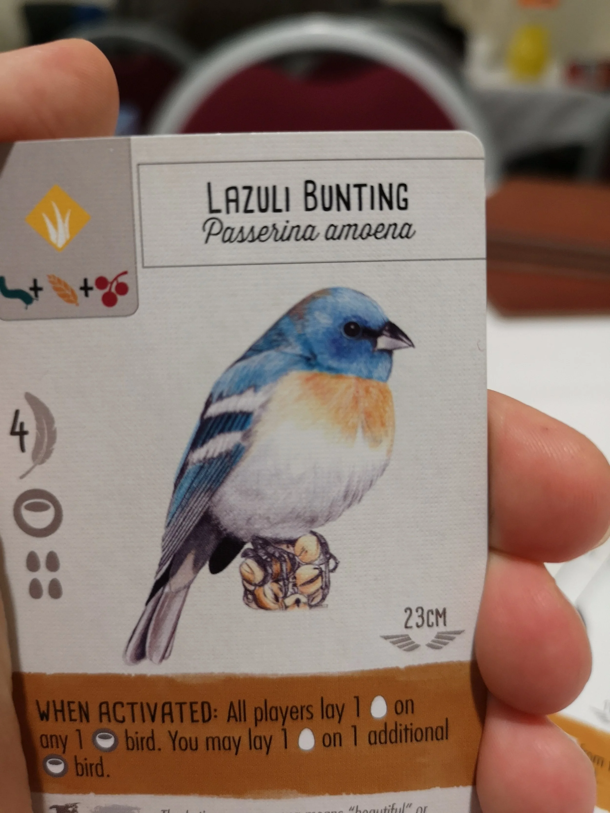

How did you try to evoke the theme of birds more in the production?
J: This is where the artwork and components came into play. I wanted an Audubon look to the game, as I thought that would best trigger that “collectors” aspect that originally drew me to the theme. Fortunately, Natalia’s style and attention to detail was a perfect match for this style.
N: From the very beginning I knew they were looking for realism art and Jamey mentioned Audubon so I started to research him, and I offered Jamey a colored pencil drawing of a bird so they could decide if I was a good fit for the project (I was competing with other artists I think).
J: As for the components, I like to publish products that have a special, tactile, and attractive table presence. I want component hooks, basically. Elizabeth thought of the birdfeeder dice tower, and I pursued the egg miniatures, the fancy insert, chunky wooden dice, and large, journal-like player mats.
Image of Wingspan board game - image cred Kim Euker (supplied by Jamey Stegmaier)
Natalia, what inspires you when illustrating birds, and what do you look for in each drawing?
N: Accuracy is key when doing scientific illustration. I do my research of the bird and the differences according to genre, season, location, age, etc. Ana and I always look for the image that best represents the bird’s characteristics. However, we also wanted to include images that would present a challenge so we can continue to learn and grow artistically.
Elizabeth was a great coach and helped us learn about birds for this project. To be able to accurately illustrate birds we got in touch with wonderful wildlife photographers and we got permissions to draw from their pictures. Nevertheless, when we couldn’t find the perfect image we had to use several pictures and a lot of imagination to guarantee an unique illustration that would represent the bird as if it was alive.
Birds are the perfect subject to learn how to draw and to practice. There are so many species, different looking, so many colors, textures, etc and that’s why I enjoy it. Every bird illustration offers new challenges and more learning opportunities.


Illustrations by Natalia Rojas and Ana Maria Martinez Jaramillo, featured in the board game – Wingspan are available to purchase via Natalia’s shop
Playtesting is the real litmus test for how close a game is to being ready. How long did Wingspan spend in this phase, and how did it change during its development?
E: I worked on the game for a couple of years before pitching it to Jamey, and then I went back and forth with him on development for another year or so before sending it out for blind playtests. It got heavier over that time, but kept the streamlined feel of those simple base actions at its core.
I tweaked the layout of my prototype cards a lot over that whole process, to make them as clear and user friendly as possible, based on what people had trouble with in playtests. That definitely helped from a UI perspective -- and Christine (the graphic designer) left a lot of things in the same positions they were in on my prototype after all those iterations. But then she made everything prettier and gave it a more cohesive feel.
Image of Wingspan board game - courtesy of Instagram @ellalovesboardgames
J: I’ll speak specifically to the blind playtesting part of the process, as local playtesting (mostly by Elizabeth, some by me) is very different than having a bunch of people around the world playing the game all at once. The blind playtest process for Wingspan actually only took about 3 months (1 month per wave), as the game was in good shape by that point. It was really all about fine-tuning it, testing different paths to victory, and making sure the rules and the text on the birds and bonus cards was as clear as possible.
Natalia was working on the bird illustrations throughout the design and playtest process—we knew which birds were going to be in the game, so playtesting had no impact on the art (and vice versa). Even the player mat, which Beth Sobel illustrated, was firmly established before blind playtesting began, though we tweaked some of the graphic design elements of it as the result of blind playtesting.
N: I learned that creating a board game is a creative and complex process that requires great attention to detail and coordination in many different areas. When I started working on the illustrations I knew this project was a big jump in my career and I gave my best to make sure the art in Wingspan was a good representation of my work.
In all honesty, I knew very little about board games from my childhood but it was a big surprise to learn how big the gamer community is. I just learned how to play wingspan a few days ago and it makes me very happy that not only I did part of the art but that is the first board game I ever played. It makes it extra special.
Working with Stonemaier has taught me great lessons about managing my time in a more efficient manner and to keep clear communication with my clients to set timelines and expectations.
Wingspan illustrations - Natalia Rojas
Do you have any other projects underway, or coming up that you’d like (or are able) to tell us about?
J: Natalia is currently working on the art for a Wingspan expansion (for which we have not announced details), and spring/summer Stonemaier Games releases include an expansion for Euphoria and a modular board for Scythe.
N: I’m currently working on the first expansion for Wingspan and already have a waiting list for a few portraits. People, dogs and more birds are on my list. I’m super excited because I’m having great exposure thanks to Wingspan and I’m making a living out of art which is not easy.
E: I'm working on a Wingspan expansion. I have an 18-card game called Tussie-Mussie that will come out around May from Button Shy, which is based on the Victorian fad of flower language. I have high hopes that it will also be beautiful, just in a much smaller package!
What are you currently reading, listening to or looking at to fuel your work?
J: I find thematic inspiration in the variety of forms of fiction I consume; right now I’m reading the Broken Earth trilogy. I find mechanical inspiration in the games I’m playing (recent plays include Dice Throne, Aeon’s End Legacy, and AuZtralia). And I find business inspiration in certain podcasts and YouTube videos, like a recent Daniel Pink talk I listened to and the Masters of Scale podcast.
E: I try to keep taking in a lot of information about the world, and I use that to keep a running list of things that might make good board games. I love the podcasts Radiolab, Curiosity Daily, and Outside/In. When I worked on Capitol Hill, a speechwriter once told me the Washington Post obituary page was a source of great stories, and it's true -- there are many fascinating things that have happened in the world, and a lot of them end up there.
N: I’m studying a book about birds but can’t say the title without spoiling the expansion. I’m following a lot of artists and photographers in Instagram because I’m constantly looking for images to use as references for the drawings, but the main source of inspiration these days is my bird feeders and daily walks around the neighborhood. Wingspan not only gave me an opportunity to grow as an artist, but it gave me the love for birds and nature. Before starting working on this project I didn’t know anything about birds and never cared but now I’m full into bird watching and the whole family loves it to the point that my daughters dressed up as a Quail and a Blue Jay for Halloween. Is great to sit by the window with a coffee to watch all the different birds that visit the backyard.


Illustrations by Natalia Rojas and Ana Maria Martinez Jaramillo, featured in the board game – Wingspan are available to purchase via Natalia’s shop
Finally, if we’d like to see more of your work, where can we find you?
J: The hub for all things Stonemaier is www.stonemaiergames.com.
N: My websites is www.nataliarojasart.com or you can find me on Facebook and Instagram.
E: I’m active on BlueSky as @elizhargrave.
Thanks to Ella Loves Boardgames for sharing some images of Wingspan with me. You can find her on Instagram over here! (All other images are courtesy of Natalia, Jamey, and if no note given, myself)
If this is your first time visiting the site then why not stick around a while! I’d really recommend checking out the communities Top 10 Best Art of 2018 to see some absolutely gorgeous games and then head to my interview archive for a wealth of wonderful stories.