
Micro Macro Board Game Art - The Perfectly Staged Crime - Interview with Johannes Sich
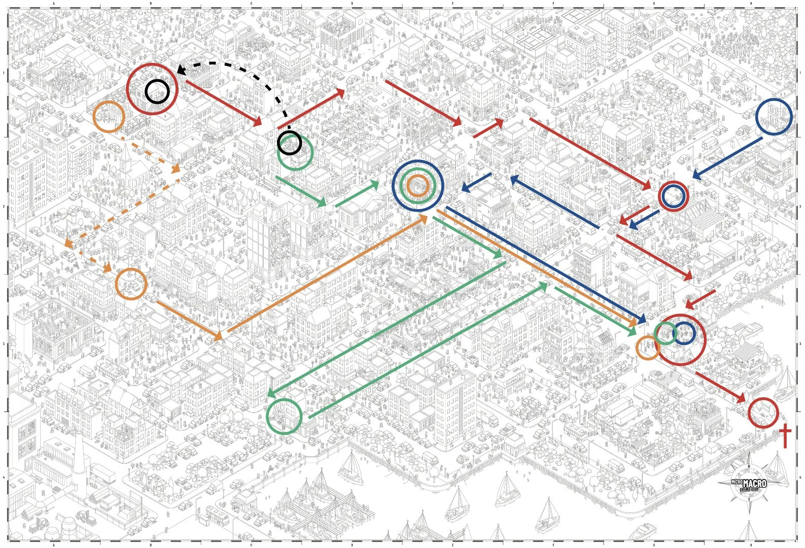
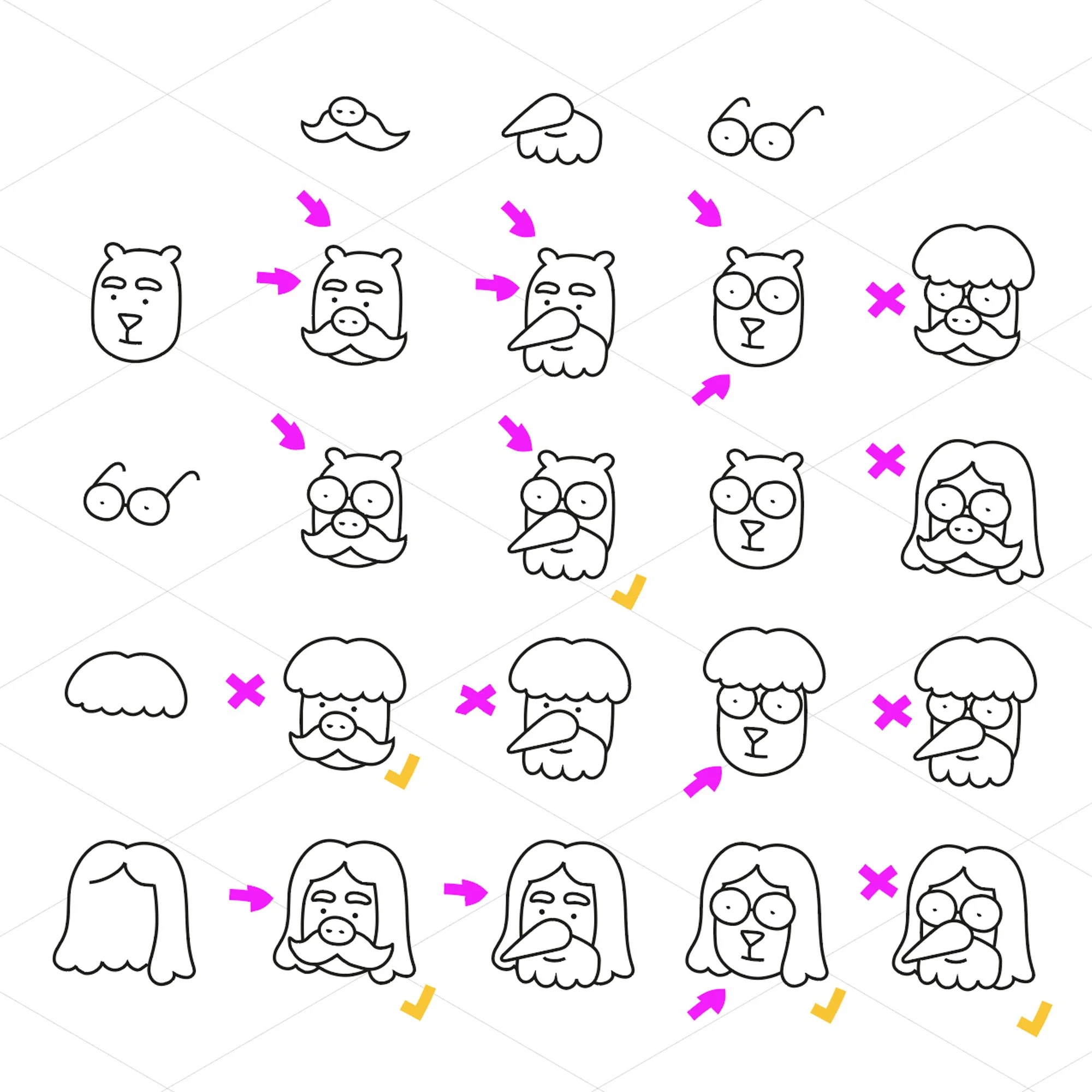
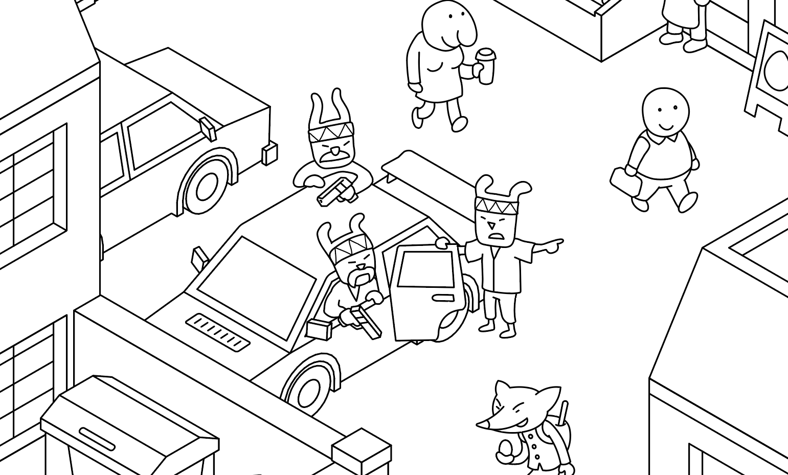
What's special about the concept? It's one big picture, but you can find the same character at multiple spots, doing different things at different moments in time.
In this board game art interview, I’m speaking to Johannes Sich, creator, designer, and artist of Micro Macro, a series of ‘hidden picture’ detective board games.
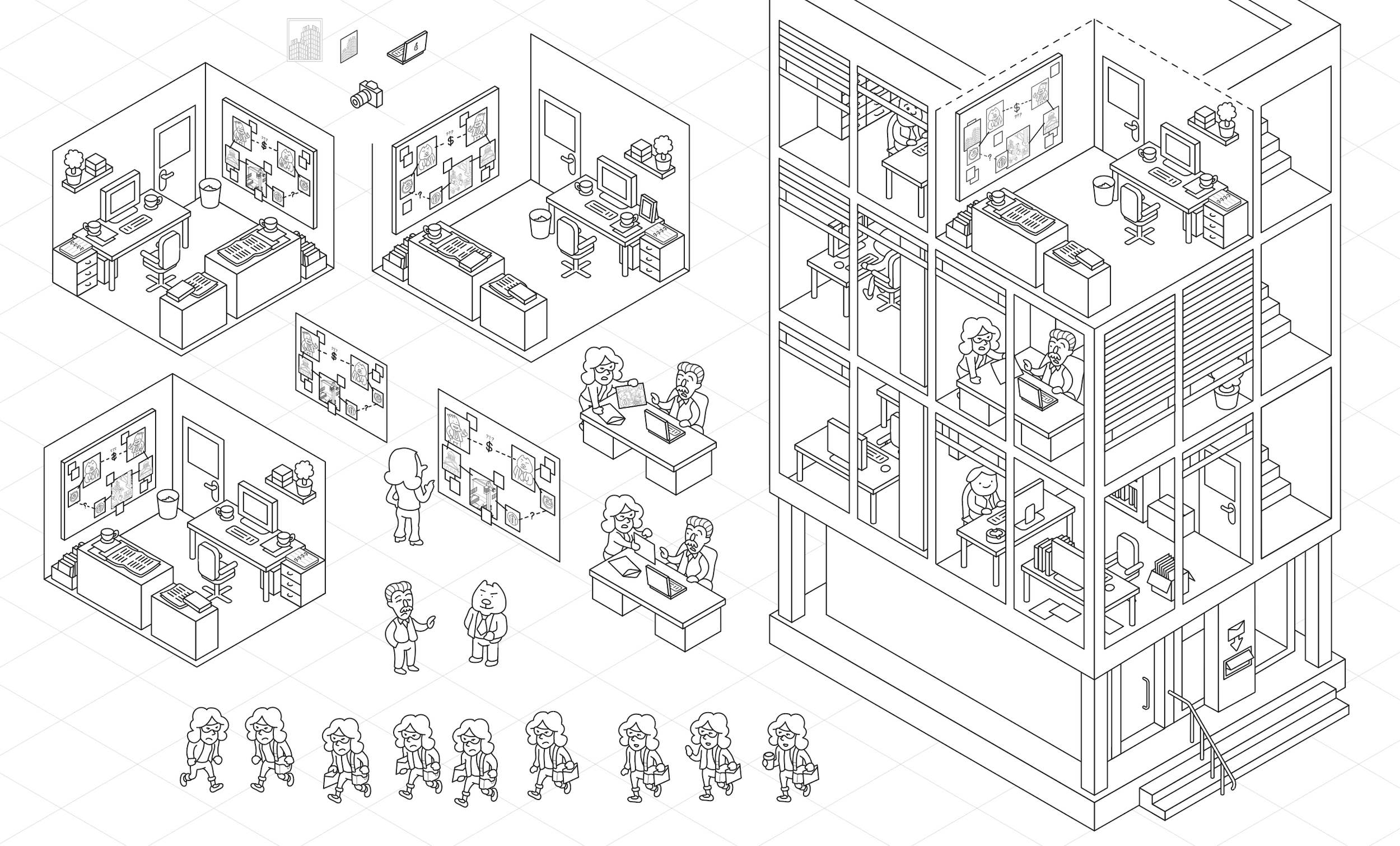
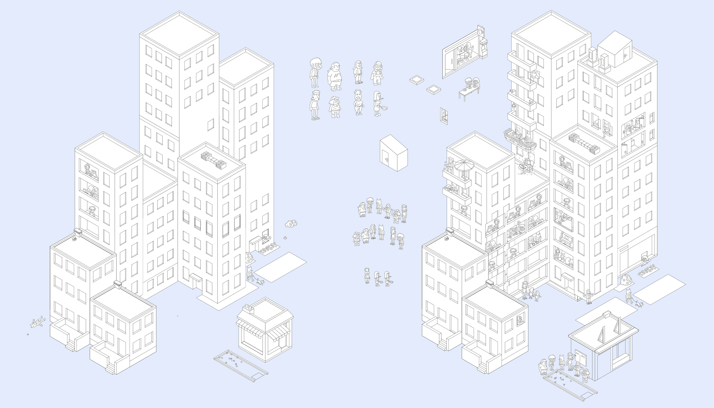
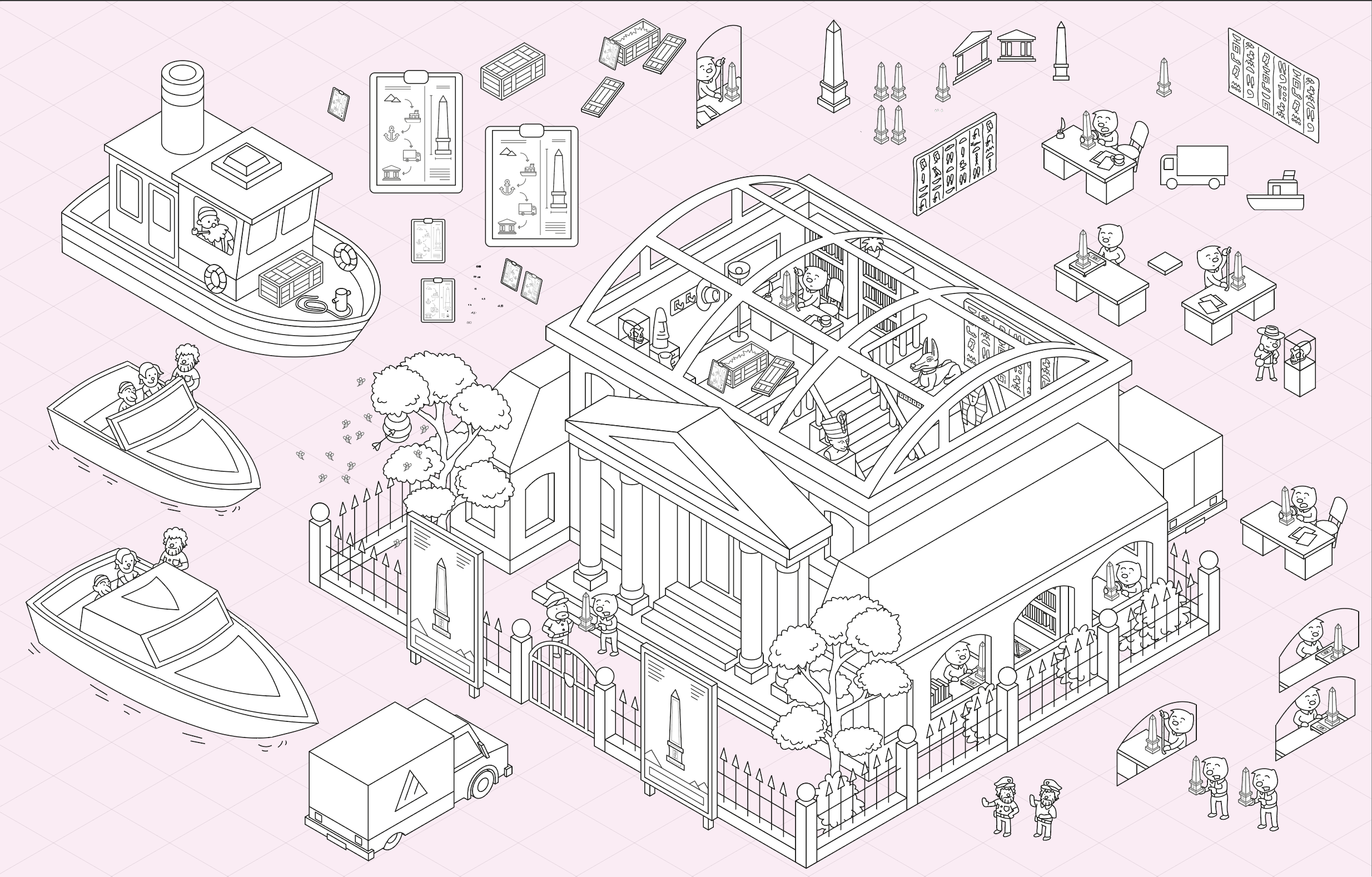
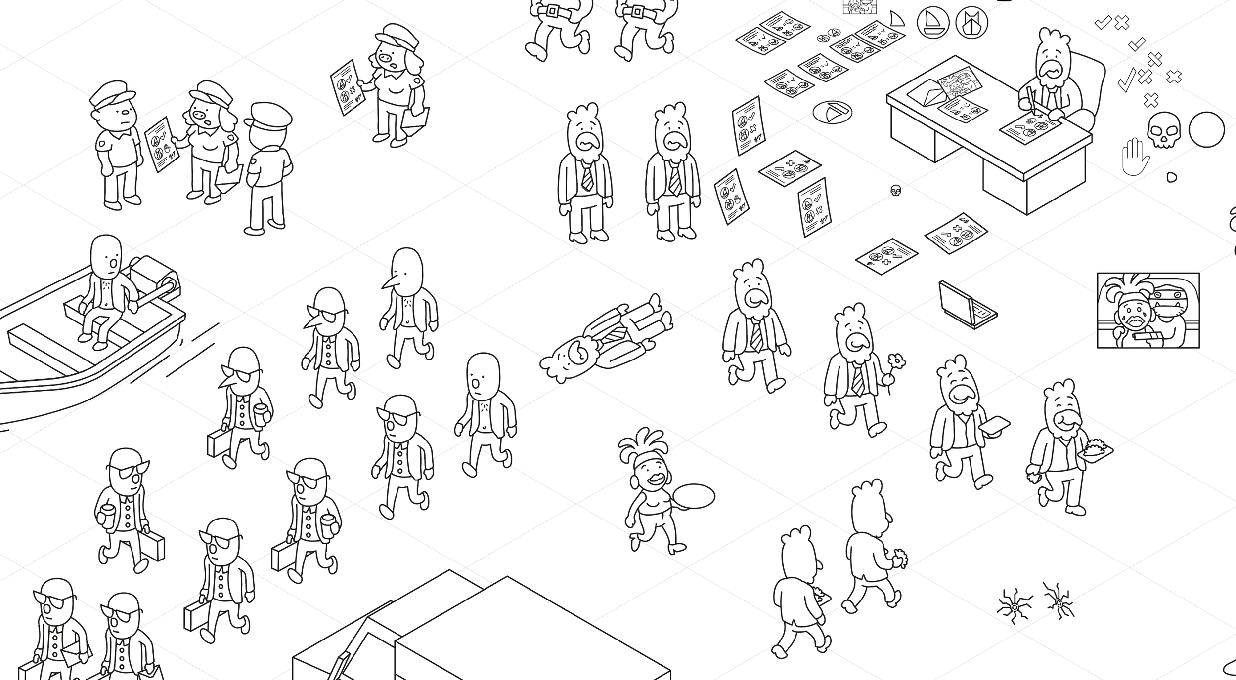
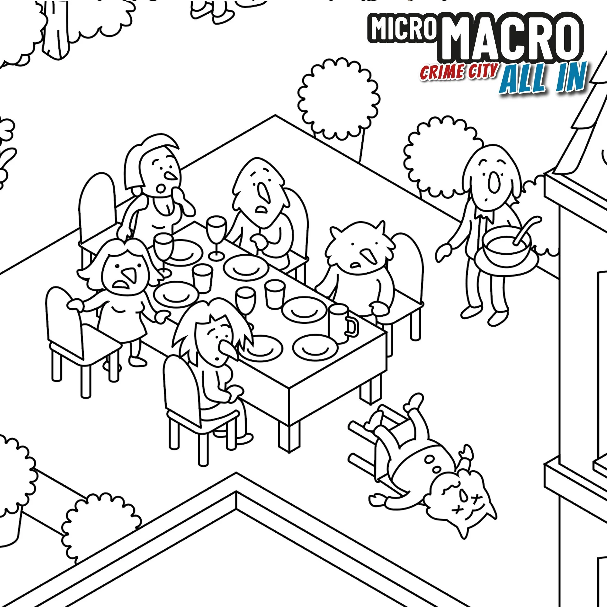
The series started in 2020 with Micro Macro: Crime City and now features 4 editions and a new digital app. In Micro Macro, you and your friends are given the task of solving increasingly complex cases together. To solve the cases, you’ll be given clue cards that ask you to examine a map of a city and its inhabitants. The city map serves as a map in time as well as space, so you'll typically find people in multiple locations throughout the streets and buildings, and you need to piece together what happened to solve the case at hand.
Considering these spaces are literally packed with criminal activity, these worlds don’t feel dark, but exude childlike whimsy and a constant sense of discovery. Johannes was kind enough to join me to reveal how it was all made.
Enjoying the site? Consider supporting it by sharing the articles you read.
For more great insights into board game art, check out the interview archive.
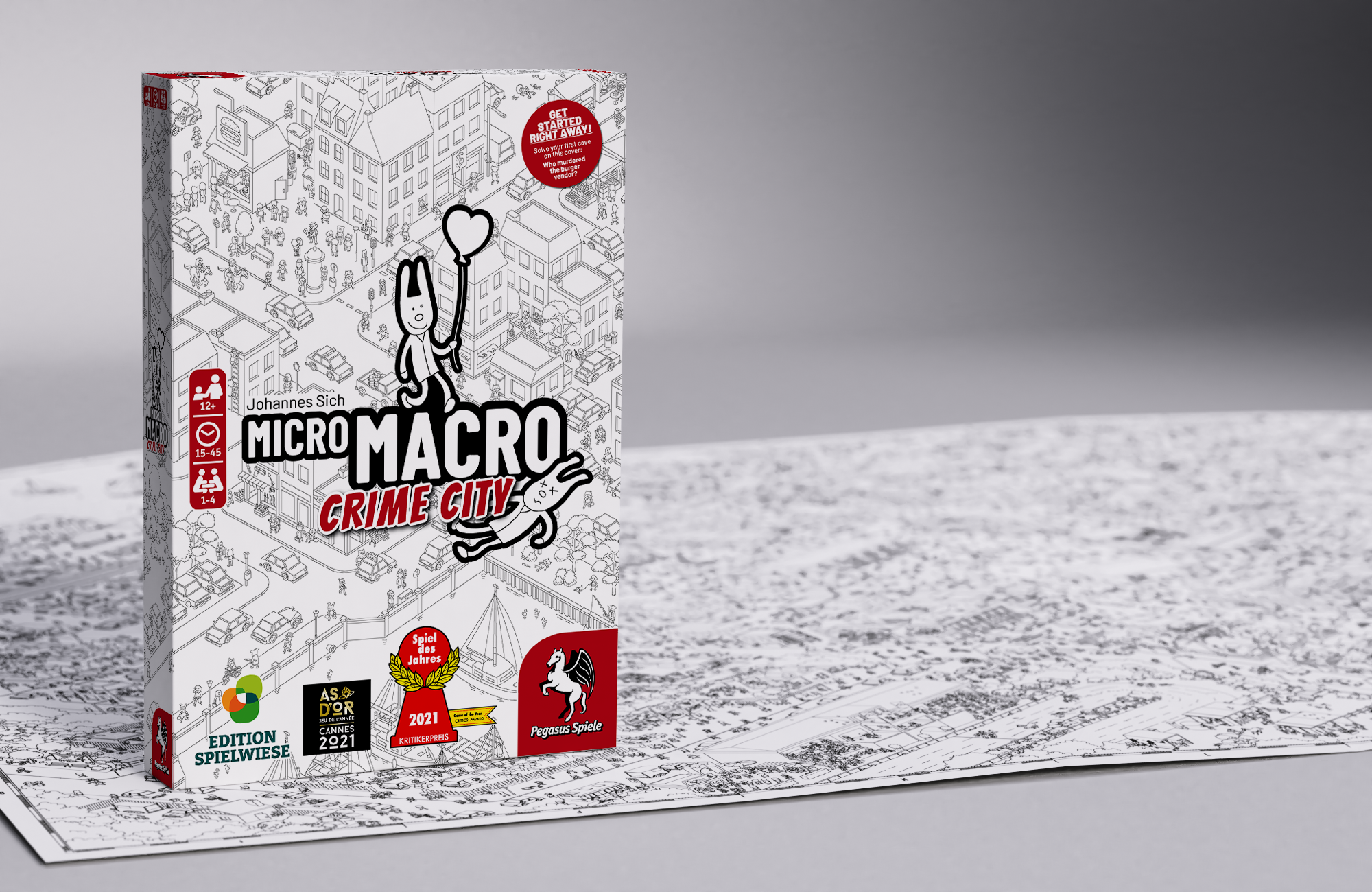
Micro Macro: Crime City board game
Thanks for joining us, Johannes! Could you tell us a bit about yourself?
Hi, thank you for having me in your interview section, which I really like. I am a game designer and illustrator, and together with my colleagues Daniel Goll and Tobias Jochinke, we created the MicroMacro game series.
I am from the rural area of the Rheinland/Ruhrgebiet in Germany, and I live in Düsseldorf with my wife and daughter. The studio where we work is not far, so I can walk or go by bike and have a coffee on my way (very important). This studio is originally a design studio, but nowadays the three of us work mainly on MicroMacro, supported by a team of coworkers and freelancers.
I met my colleagues when we studied Communication Design. We became close friends and frequently worked together on various projects. While they built a studio focused on Communication Design, I worked as a freelancer in illustration across many different areas. I was always troubled with my own ideas and interests in drawing, storytelling, worldbuilding, game design, and puzzle design.
When MicroMacro came out and became a success, everything fell into place, and now I have the pleasure of creating a world of story-driven, illustrated crime puzzle games all day long.
How did you first break into the tabletop industry?
During our time at university, we were already interested in creating games. When choosing a project for my diploma, I came up with La Cosa Nostra, a card game with a mafia theme and a strong focus on player interaction and negotiation. Initially, it was merely an excuse to create a bunch of badass gangster characters, and for my diploma, only the visual design mattered.
I became fascinated by creating the game mechanics, too. It took me years to design the final game, since I had no experience in this area, and I had to learn a ton of things. Even then, I got a lot of support from Tobi and Daniel, and together we started a crowdfunding campaign to self-publish it. It's a quite successful little indie game, at least in Germany. It was quite a ride of a project with many challenges. We got plenty of insights, contacts, and inspiration from diving into the board game scene as a self-publisher.
One of the biggest lessons was that we didn't want to spend our time on publishing work; we wanted to focus on the creative part. So when we developed the idea for MicroMacro, we looked for a professional publisher early on.
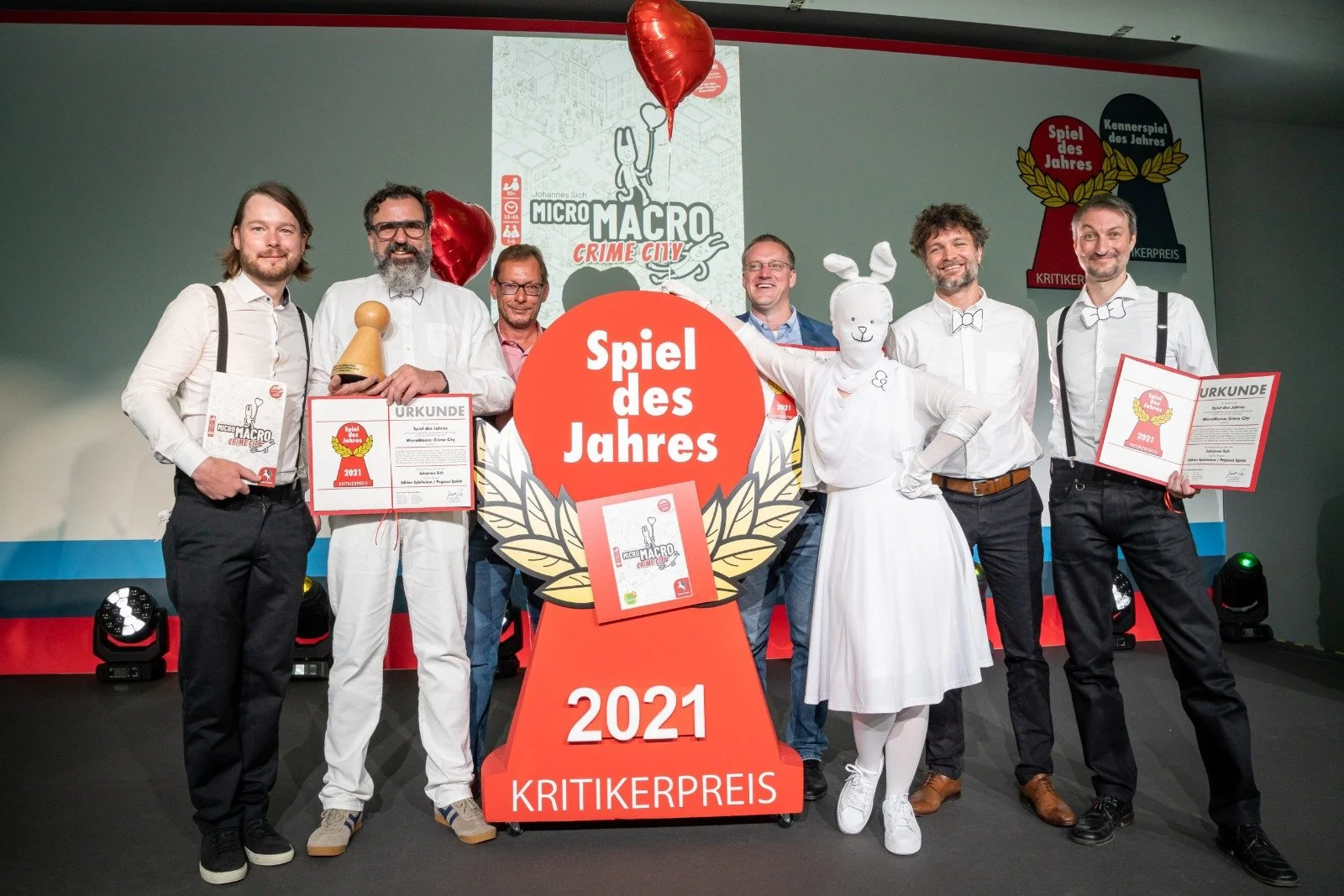
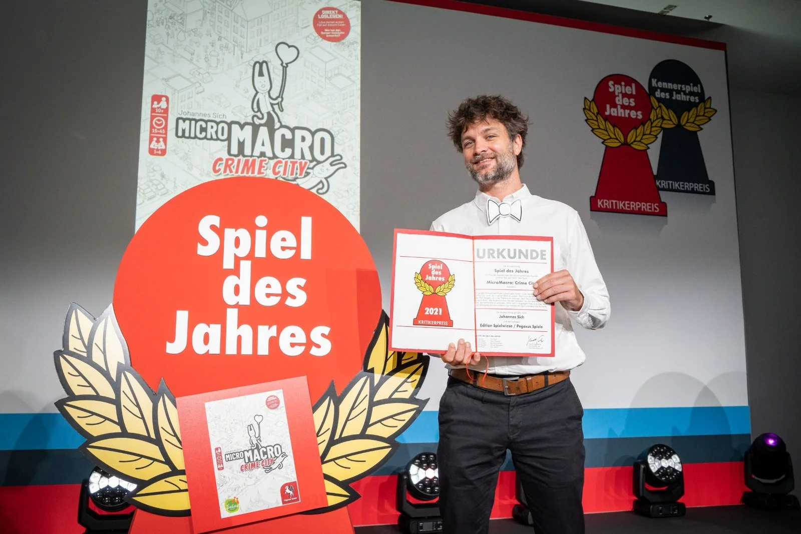
Fast forward to 2021, MicroMacro: Crime City won Game of the Year at the biggest board game awards, the Spiel des Jahres. So, what is MicroMacro?
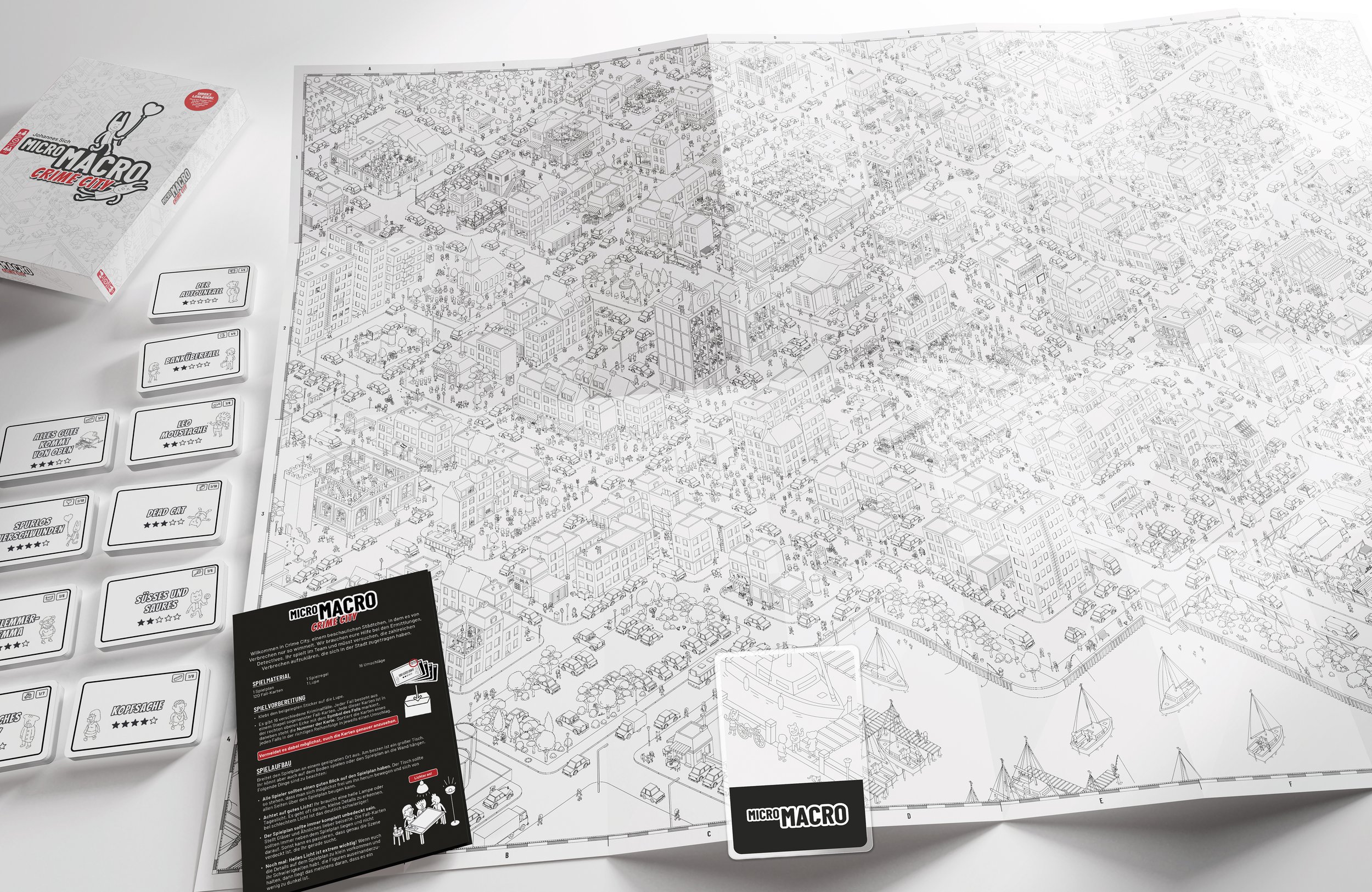
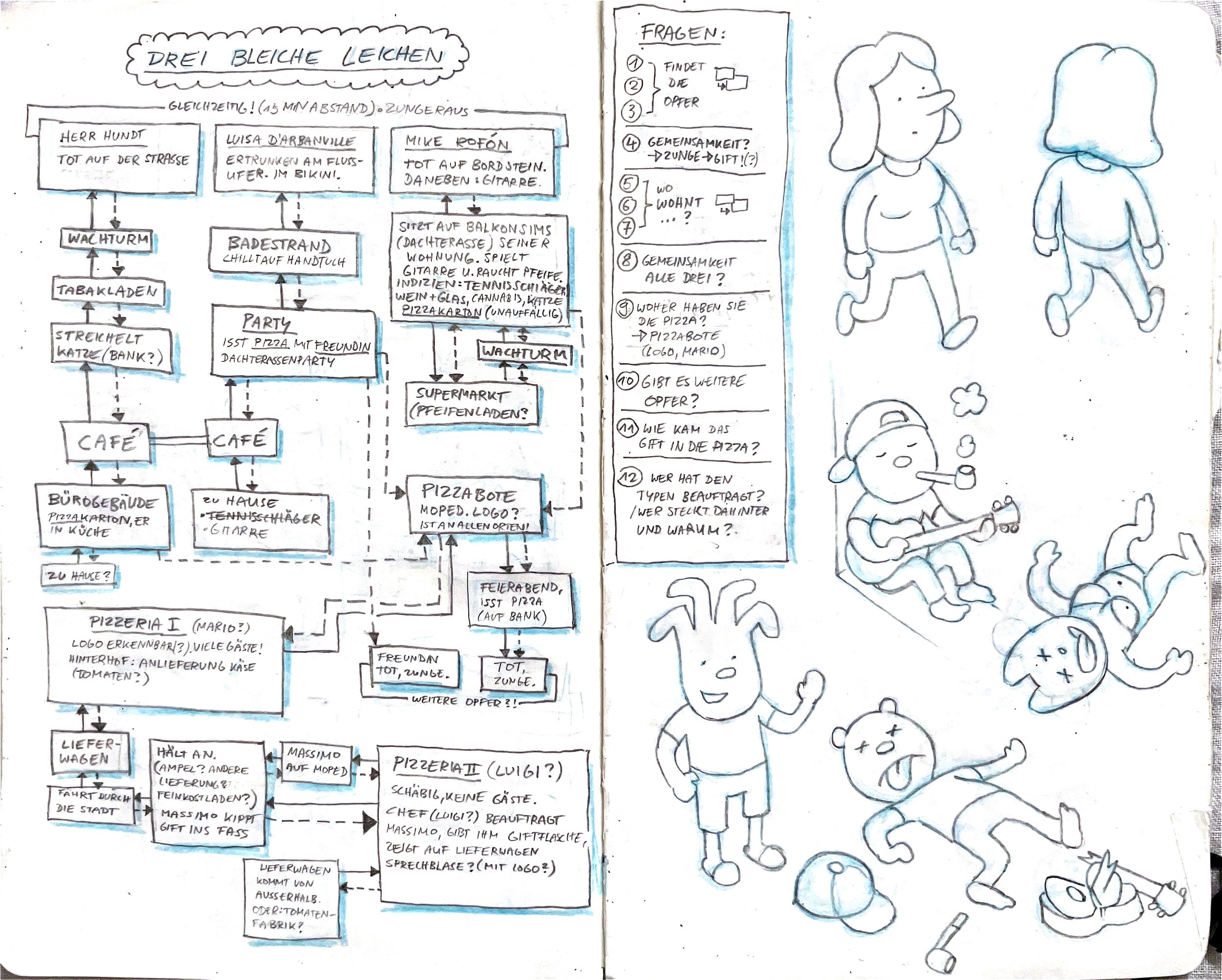
In MicroMacro, players work as a team of detectives to solve crime cases. The core of the game is a huge map, a gigantic illustration of a city, loaded with characters and tiny details. What's special about the concept? It's one big picture, but you can find the same character at multiple spots, doing different things at different moments in time. So you can follow them through the map and discover their stories.
There are plenty of crimes happening in this city, and as players, you must determine what happened. Who is the murderer? How did they do it? What was their motive? And so on. Question cards lead through the cases, and mostly it's not only about searching and finding, but also about solving little puzzles, combining your information, and thinking like a detective.
The first series, "MicroMacro: Crime City", consists of four games. While the game mechanics are suitable for children, the stories and crimes partly address adult themes. Players frequently asked us to create a version for children, and we did: Last year, “MicroMacro: Kids” was published.
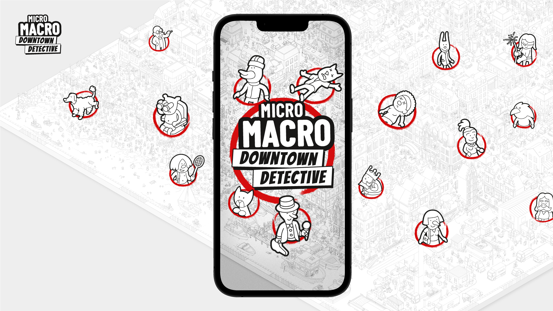
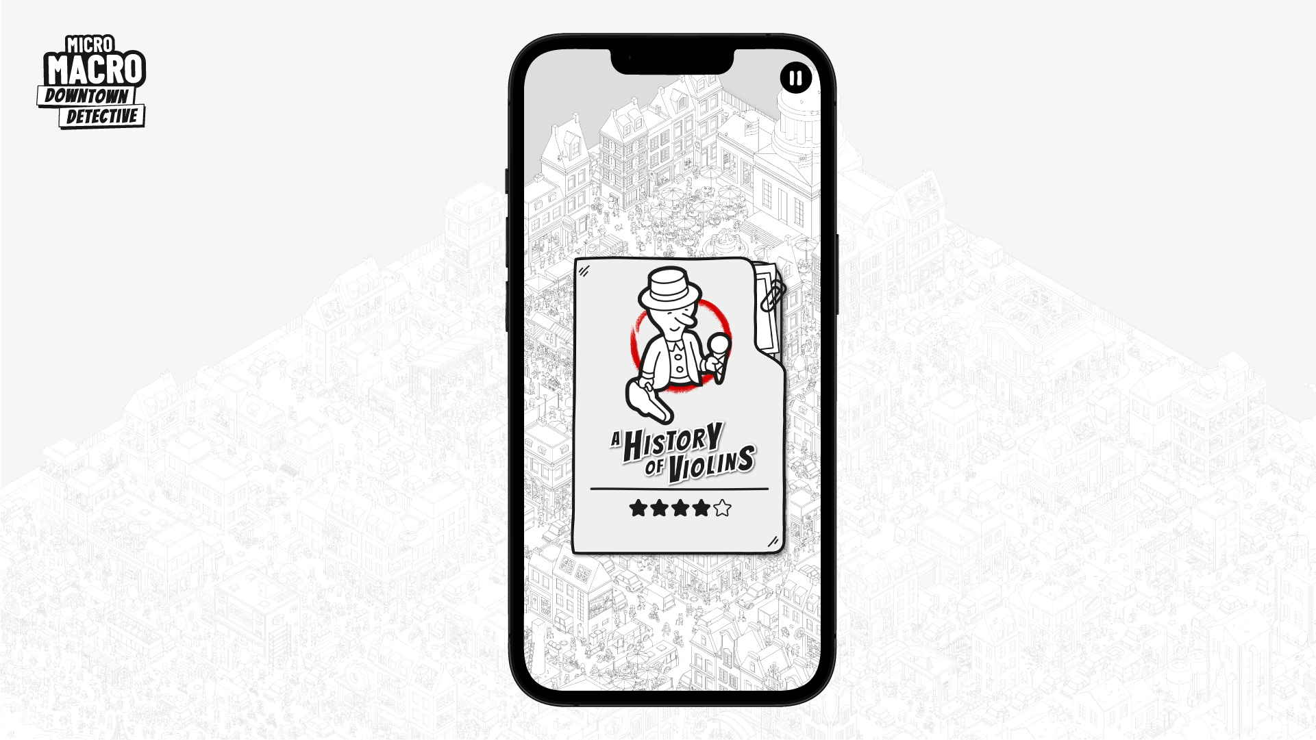
Also, last year, we published our first digital adaptation. It's called “MicroMacro: Downtown Detective", and it’s already available for iOS and Android! This is very exciting for us!
Where did the idea for MicroMacro come from?
As gamers with a visual design background, we have always been interested in innovative game concepts that rely heavily on art design.
The very first idea we developed was in 2015. We wanted to make a puzzle game where you have to use your smartphone camera zoom like a magnifier to find tiny details in a huge illustration. Details so tiny that you can't even see them with your bare eyes. We were fascinated by the new possibilities in print and camera technology. Soon, we got the idea that the "huge illustration with plenty of details" had to be a city, and the "puzzles based on tiny details" required a detective theme.
We developed the first prototype with a first case, "Dead Cat," and playtested it. And people loved it. They wanted more of this. At that point, we discovered that one of the biggest advantages of the concept was the accessibility. You don't need to read the rules or do a lot of preparation. (Well, you do need a big table and good lighting!) And this advantage was even stronger without needing to use a smartphone, so we got rid of this. (But this idea is still in our heads, maybe one day we'll make this version.)
Hidden picture books like Where’s Wally? were a big part of my childhood. Was MicroMacro inspired by series like these?
In Germany, we have a huge tradition with picture books called "Wimmelbilder", which work like "Where’s Waldo". There are tons of those; everybody knows them, and we all grew up with them. But, surprisingly, we never thought about those when we had the first idea.
It was the other way around: We wanted to create a game where you had to find little details in a huge picture and piece them together. Only after we created the first prototypes did we realize: "Damn, this looks like a Wimmelbild!" We even tried to avoid this association in the beginning.
For a long time, we avoided calling it a "Wimmelbild" game. Later, we realized this was the best way to describe the game, so we overcame our reluctance.
Micro Macro - Creating the City
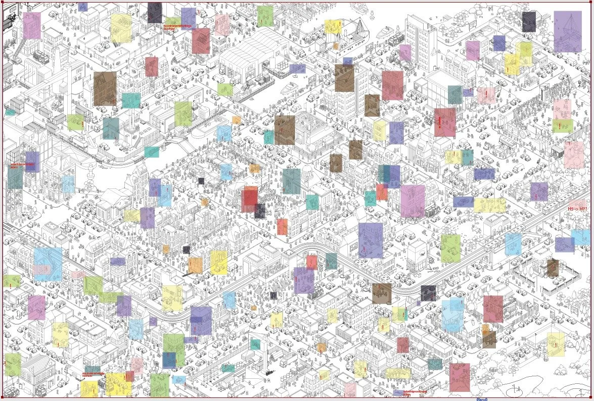
The whole game of MicroMacro is set in a single illustration of one city, where everything is connected. What were the challenges in creating a prototype for this concept?
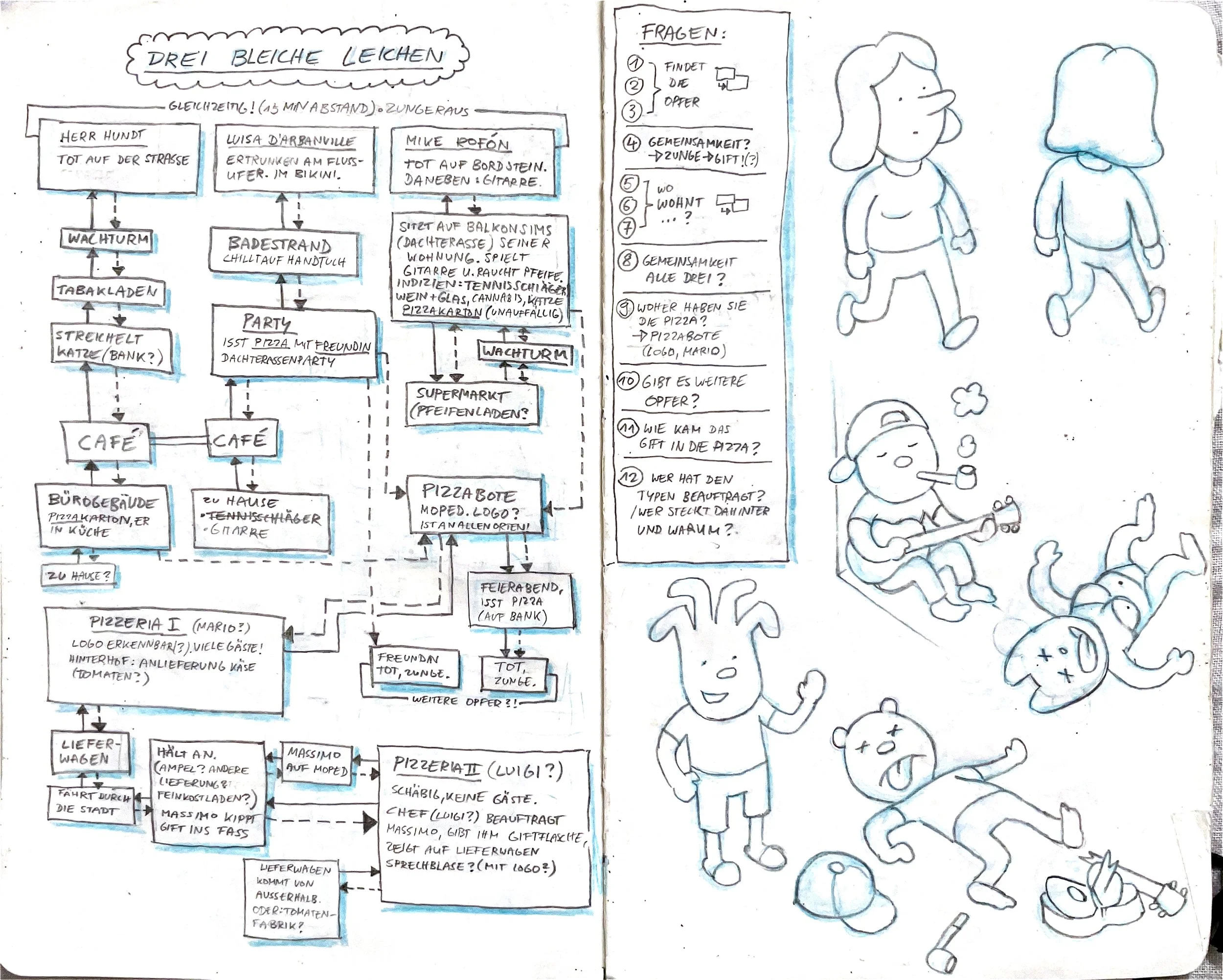
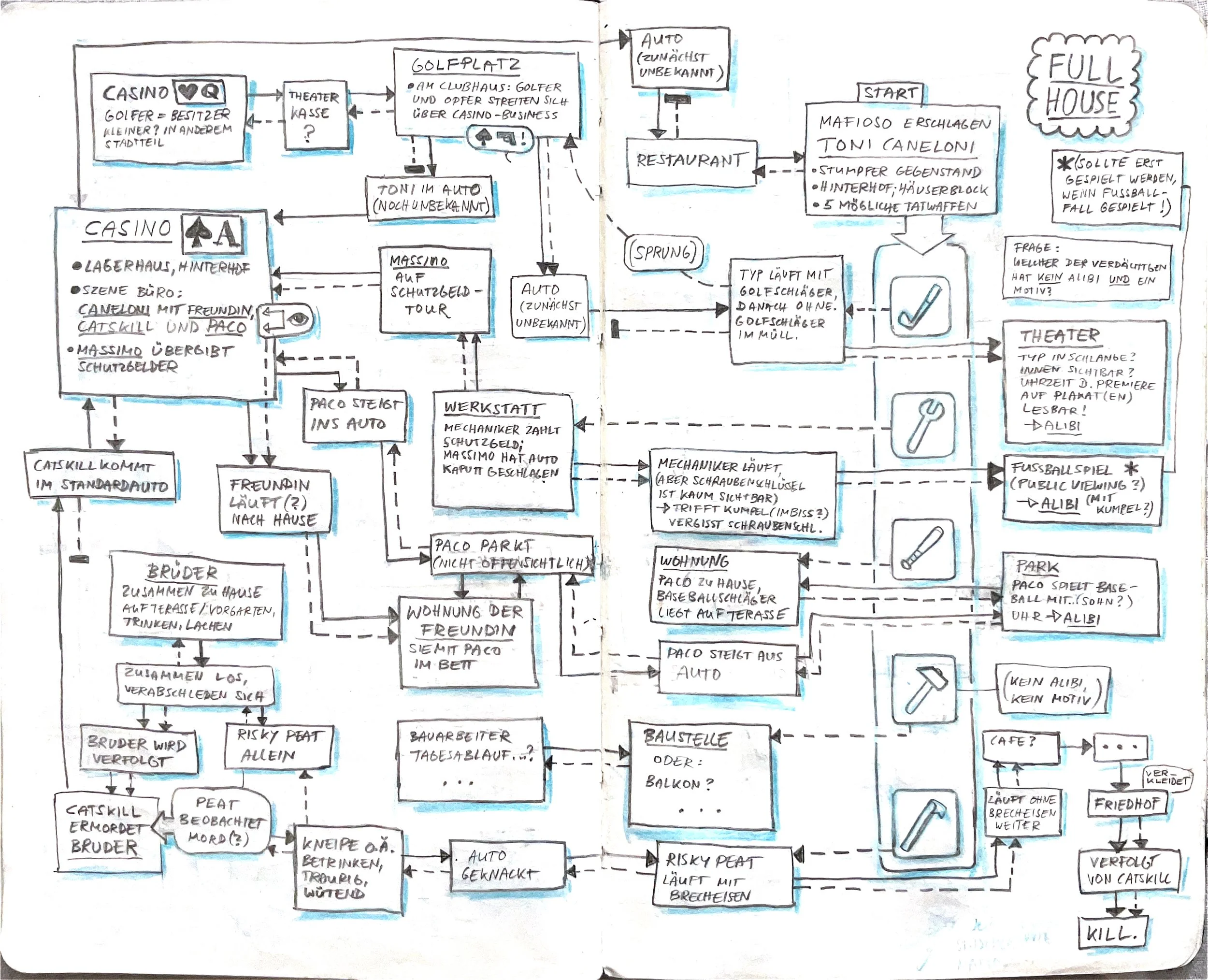
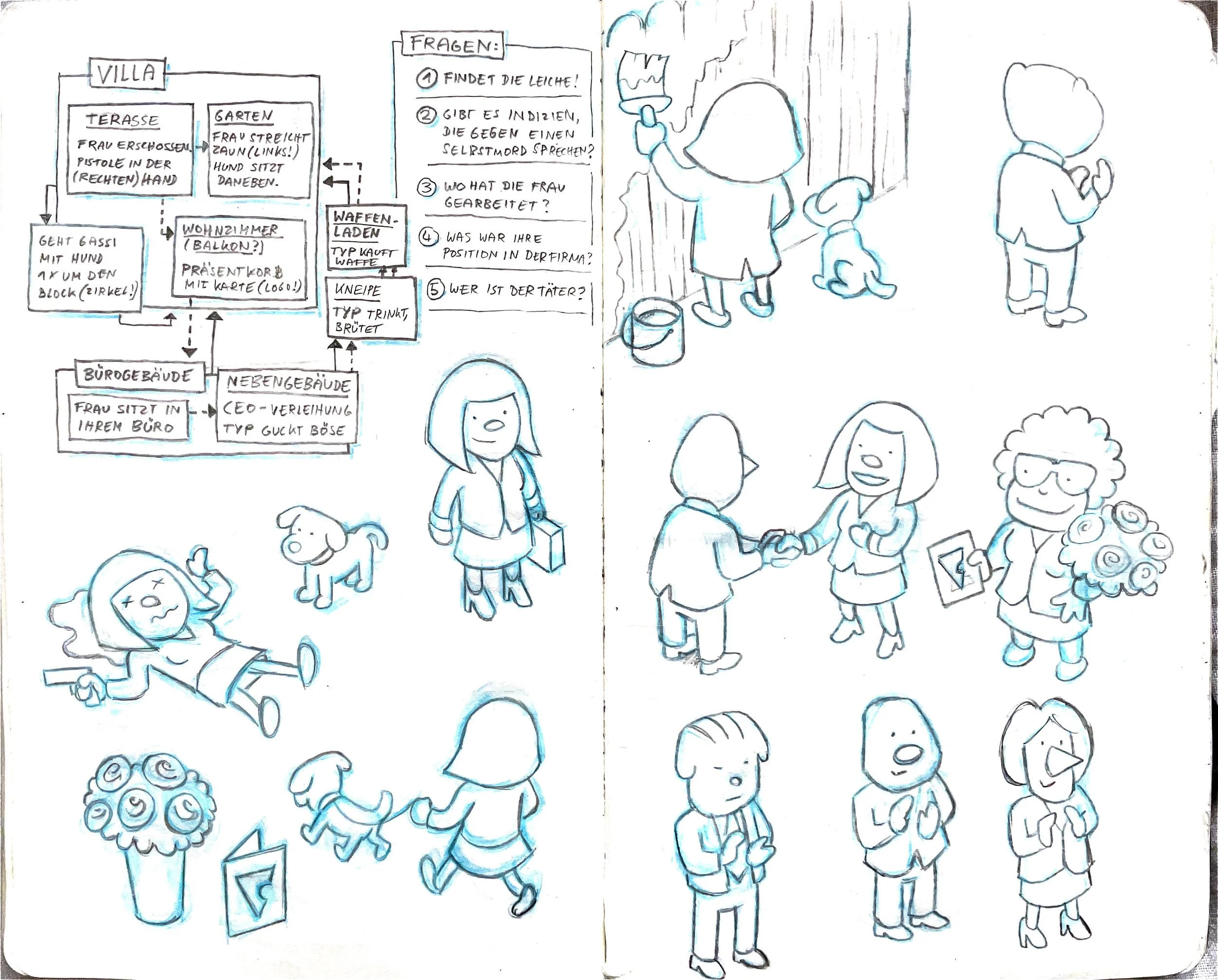
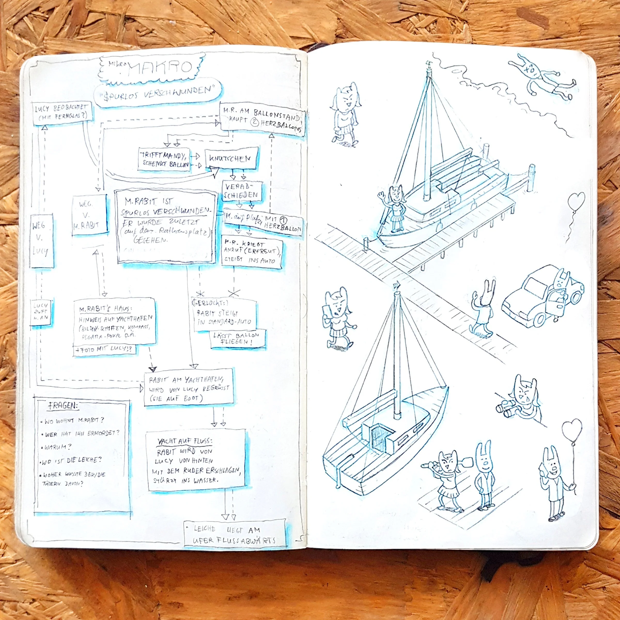
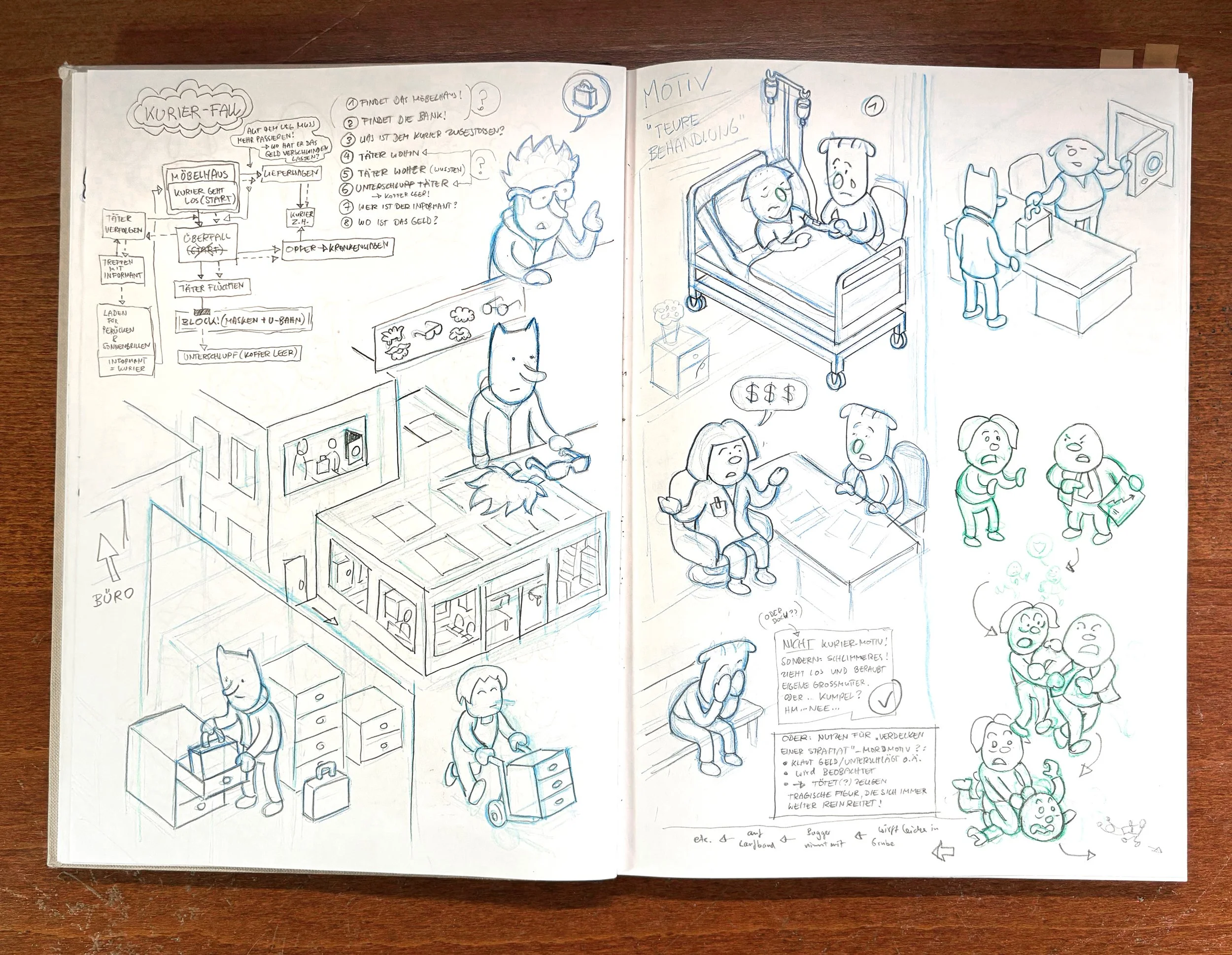
Yes, creating a prototype was the biggest challenge of our concept. Usually, you would playtest your first ideas with very rough prototypes to get basic insights early on. But in this case, an overwhelming abundance of detail is the core of the concept, so even a rudimentary prototype required a lot of work. Well, it was still veeeery rough. If you look at the first prototype today, it is quite ugly, with empty streets, houses, and cars that all look the same, and the characters are poorly drawn. But it worked! So we added more and more stories to it, and the city grew organically.
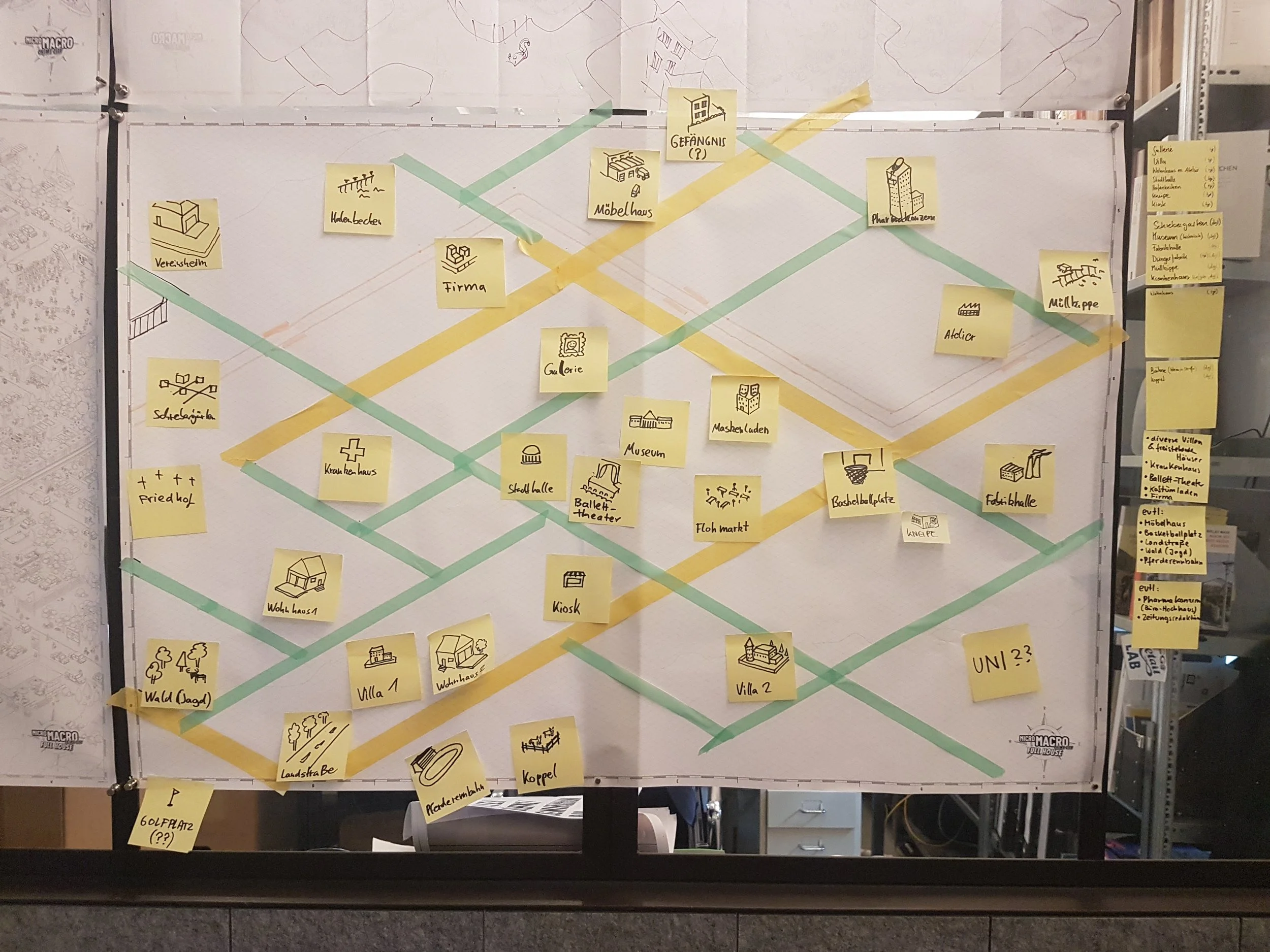
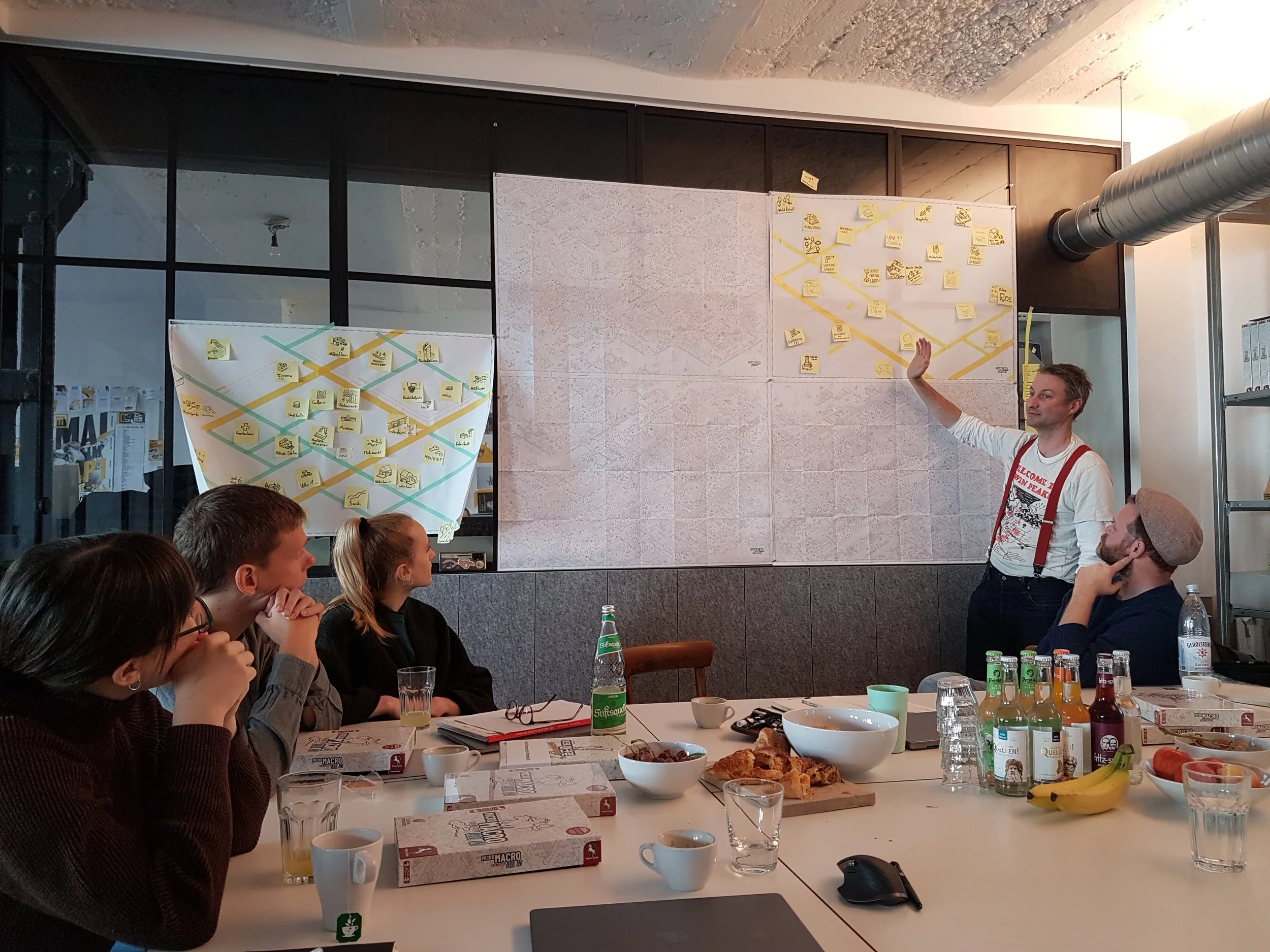
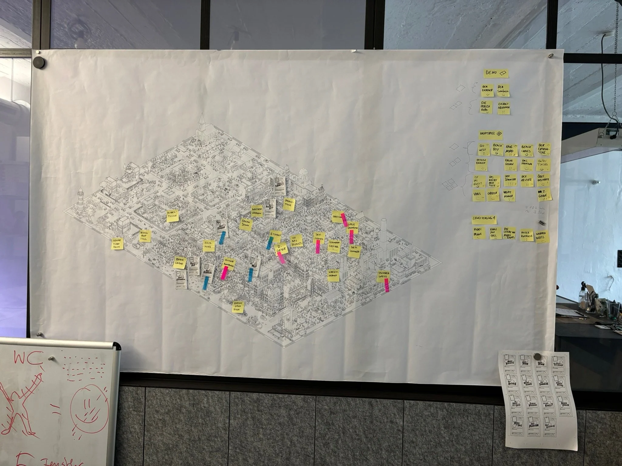
MicroMacro combines game mechanics, storytelling, and urban planning. How did you turn this first prototype into an entire city?
The stories came first, definitely. With every new story, we needed to add more special buildings, change the street grid, and rebuild entire blocks. After implementing a new case, we do extensive playtesting, which often reveals numerous issues in the puzzle designs. So we revise, playtest, revise, and so on. Thus, the city is constantly changing.
It was rather late in the process when we started revising everything to make it more appealing, which was quite a challenge. It took us a long time to establish a workflow for building a city and filling it with detail. We experimented a lot to make it work. It combines hand-drawn illustrations (characters, plants, details) and 3D-generated objects (houses, vehicles) to achieve a clearly structured yet organic and somewhat chaotic look.
Establishing a solid workflow was also important for us because we had already planned for MicroMacro to become a series. Only with an optimized workflow and organized asset libraries can we reproduce another version without spending another 5 years on it. We also had to experiment with material - what kind of paper, printing methods, how the paper would fold, what size of the map, stuff like this.
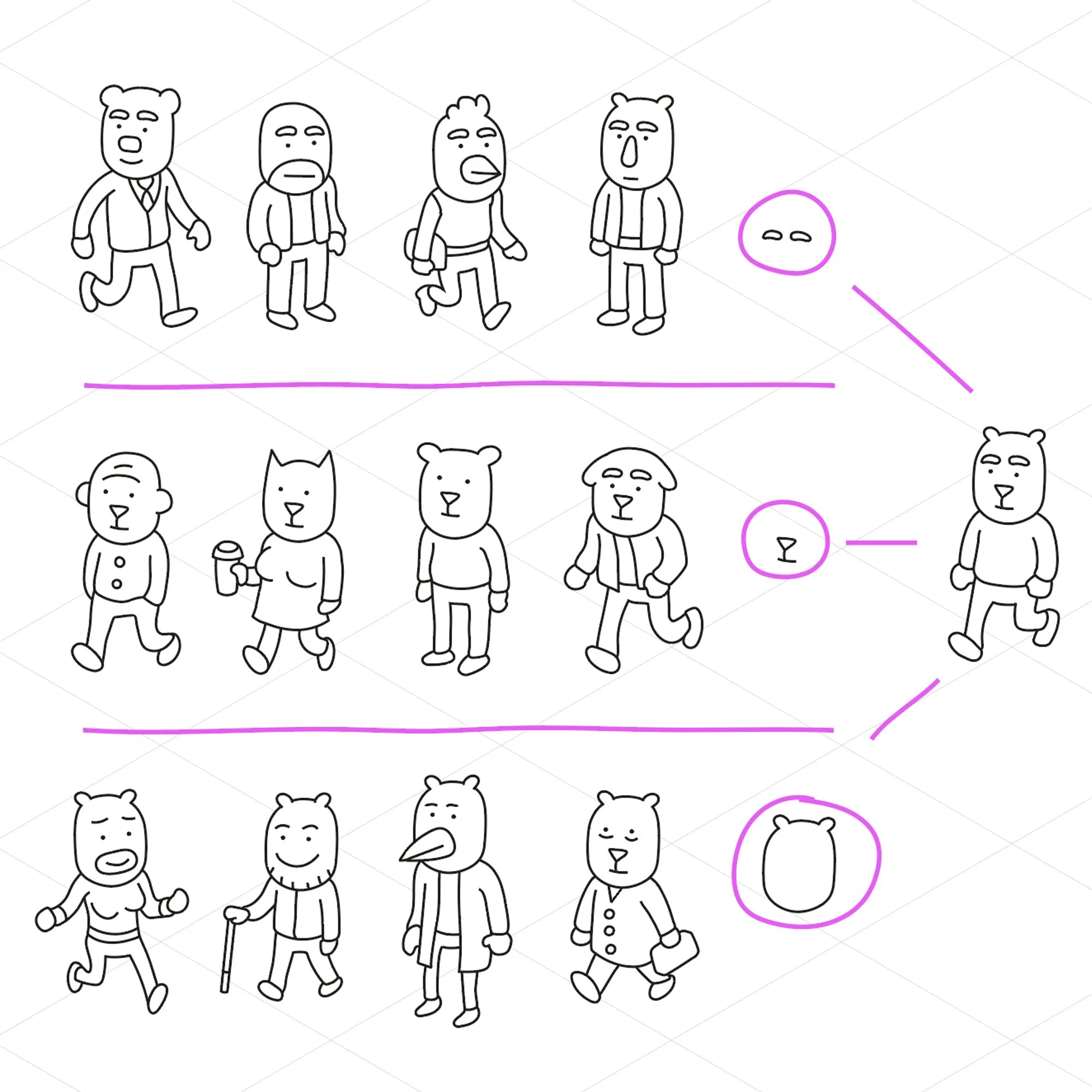
When you’re tasked with populating a city, how do you keep the characters feeling unique?
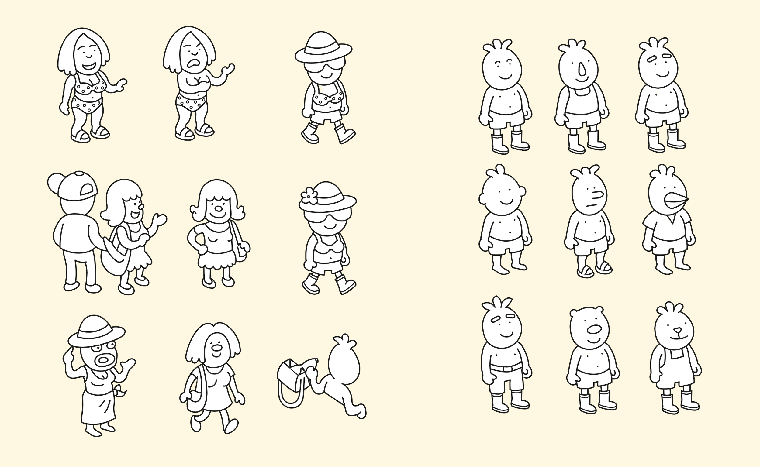
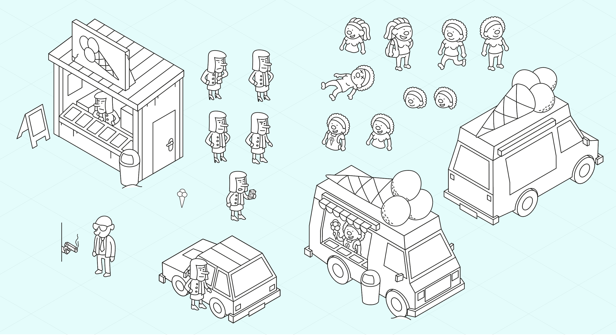
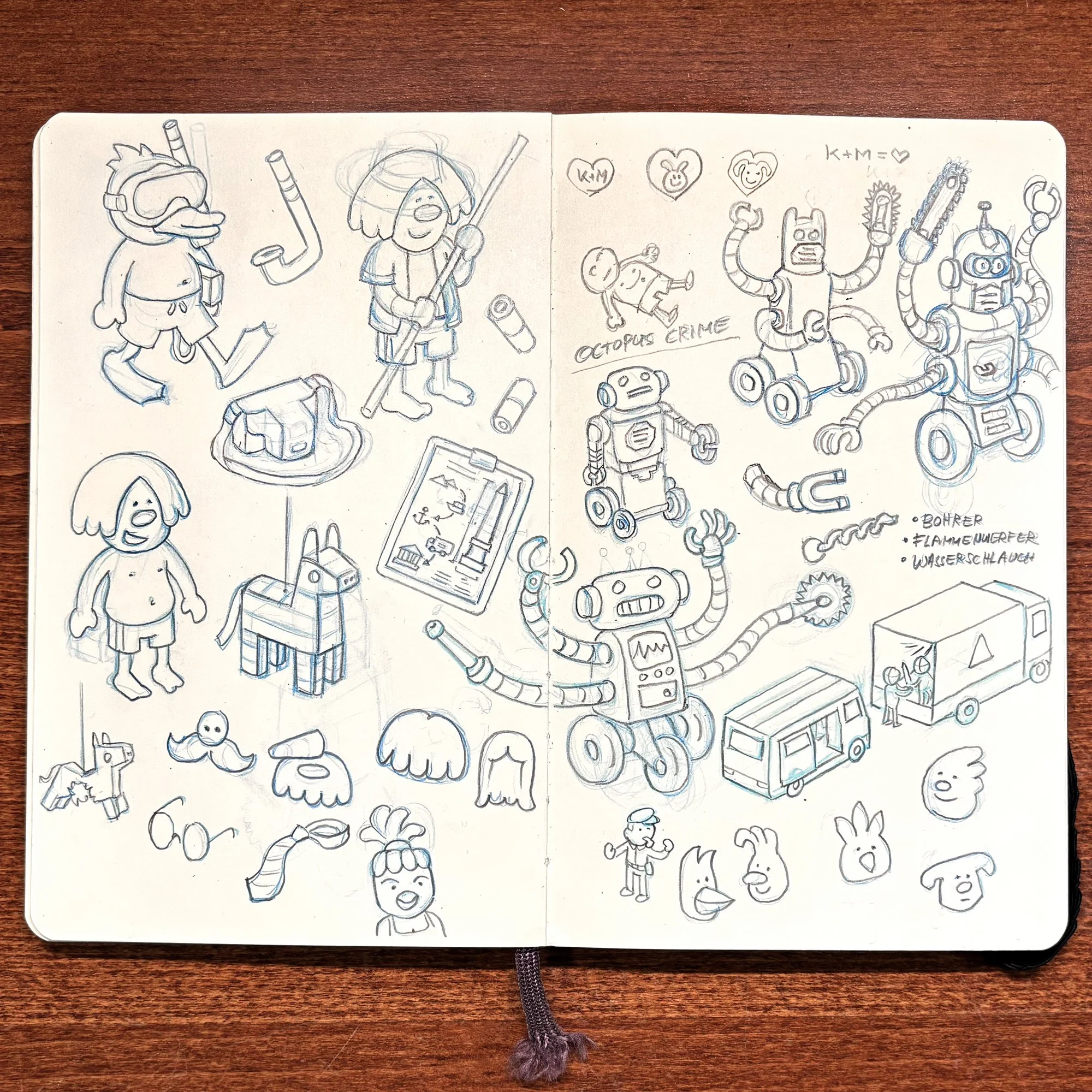
The character design is quite important. They all have to be distinguishable with the fewest possible details. Not only because of their technical size, but also because of the player’s attention. To make tracking down an 8mm tall character over the map fun, it is important to have a ‘hook’, one key feature that makes them unique. It’s also about the team communication during the game: It’s important that the players are able to identify a character by a vocal term like the egghead, the dog lady, the frog, for instance.
When it comes to designing a new main character, it depends on the story, but also on the mechanics. First question is: Will I have a section where the player has to track the character from bottom to top of the map - meaning that you will see him from behind? Then, a distinctive head silhouette is essential to make him recognizable from behind. When I am working on a new case, I like to plan the paths on the map early, so I can answer questions like this before I work on the characters. Also, the scenes and puzzles do influence this process.
Sometimes it’s important that a character is not too noticeable, sometimes I need a special detail for a special puzzle, and so on. For example, I was recently working on a case for a mobile game, where you see different details of the thief at different spots, and by combining that information, the player has to find the perpetrator. In this case, the design is entirely based on the mechanics.
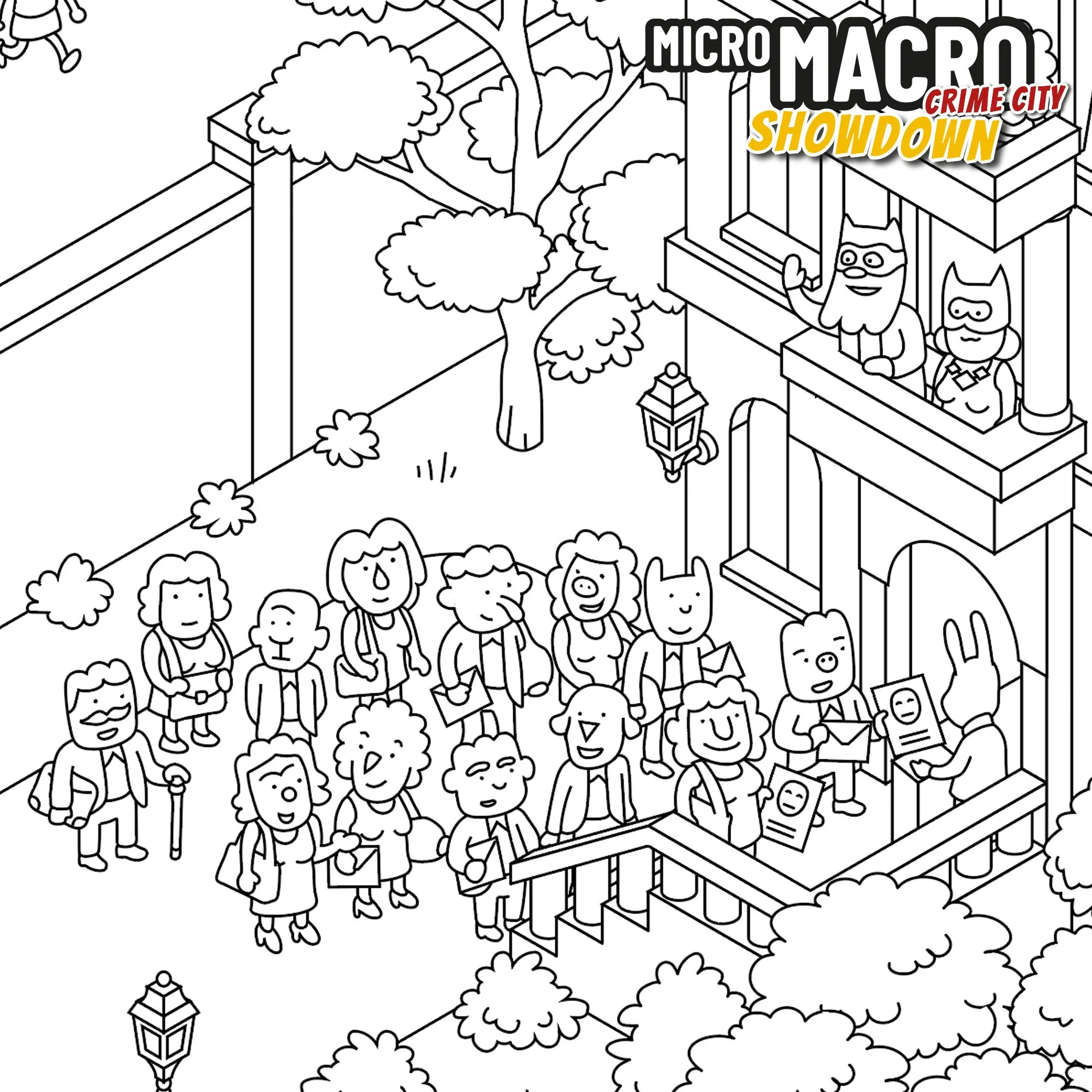
Then there are other, more story-driven cases where the design is largely shaped by the character's role. In Showdown, there is a story about a group of market sellers, and they all have headshapes and names that relate to vegetables, like Tom Ato, Erica Rott, Poe Tato (don’t know how well this works in English; in German, it’s quite funny).
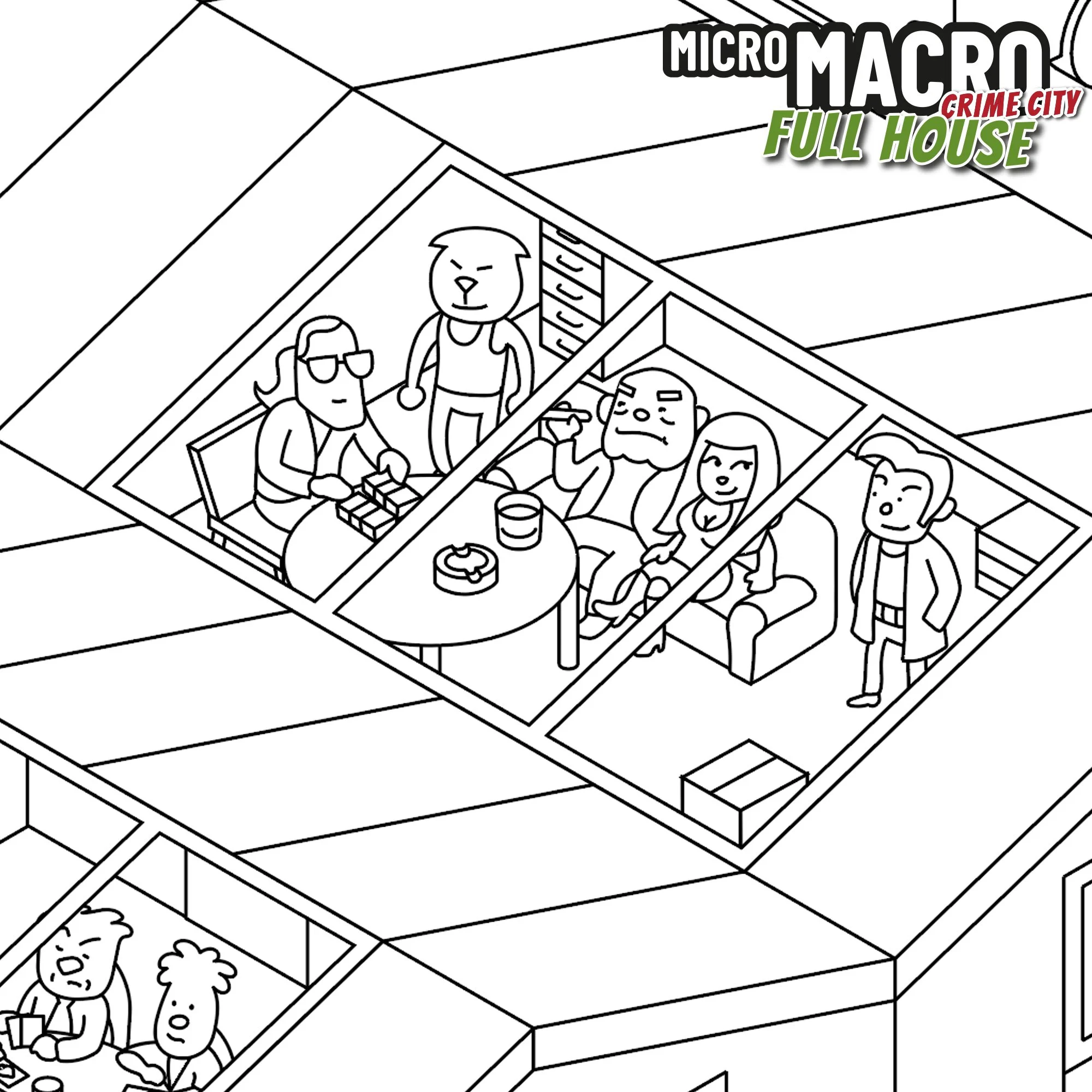
Sometimes we also use reference of real people in our lives. The thieves who rob the museum in "Full House“ are my nieces and nephews; the bank robbers are Tobi, Daniel, and me.
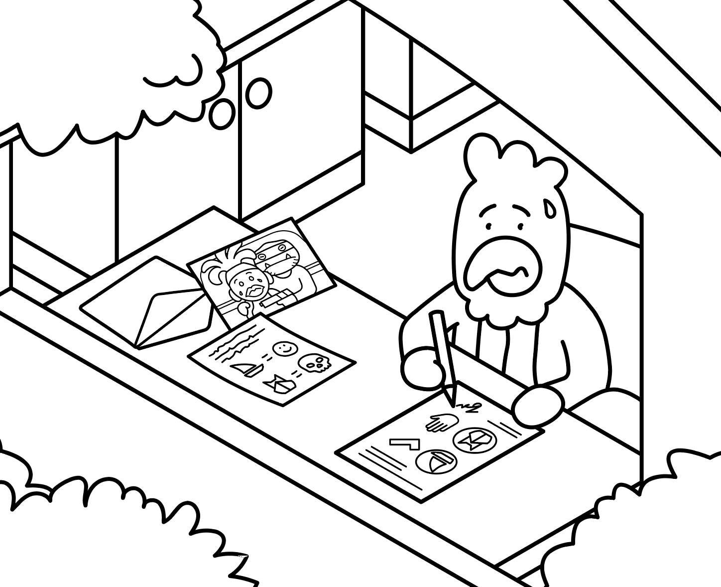
Do you have any favorites among your hand drawings?
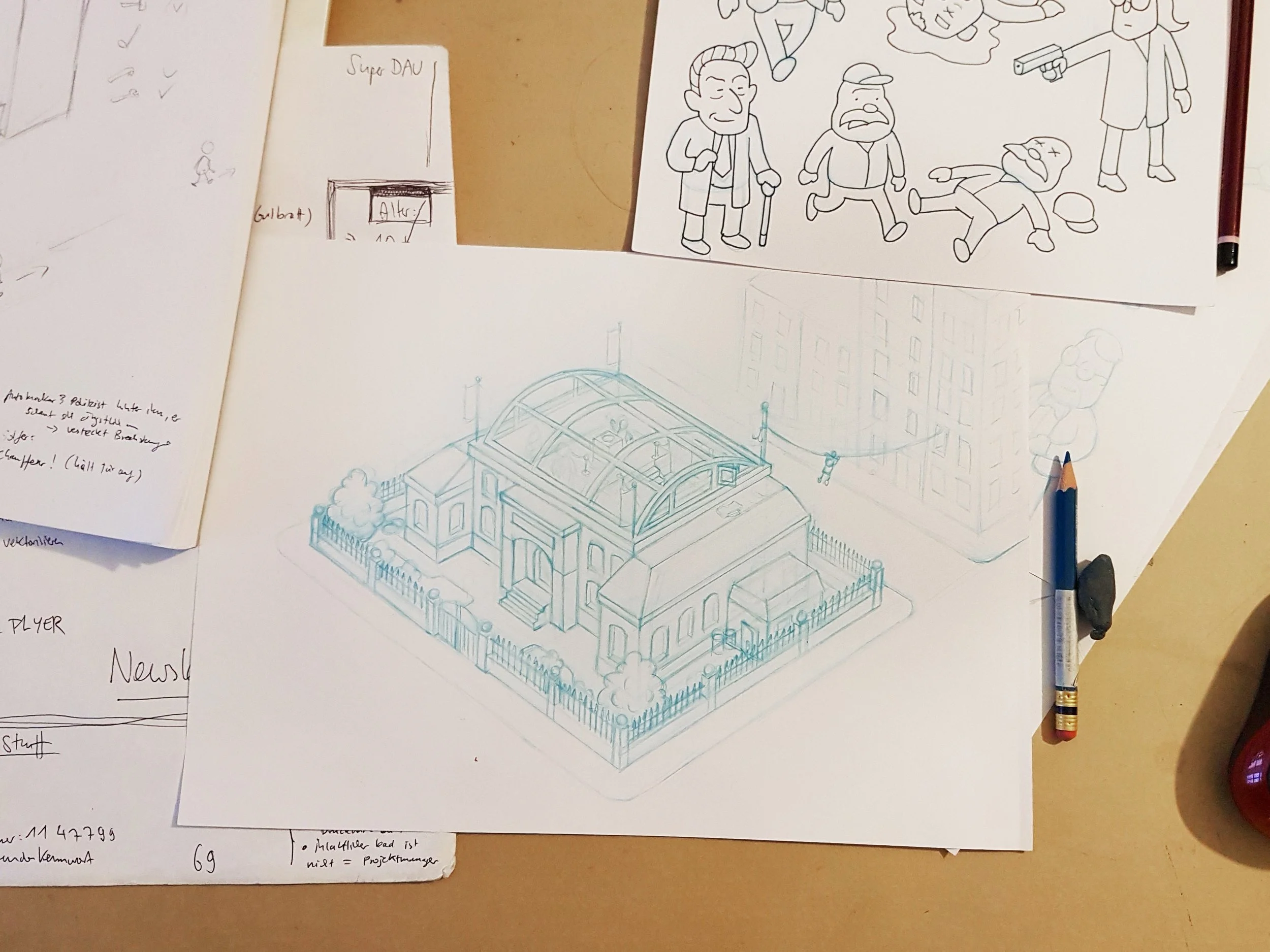
While working on new cases for the second part of MicroMacro Full House, I made elaborate planning sketches in my sketchbook. Nowadays, I rarely do it because I am too lazy, and with experience, I can plan stories with just a few notes. I haven't shown them yet, so this is a nice opportunity. At that time, I was in France at the Atlantic on a camping site, alone for a few days. I wanted to surf, but I was injured or lazy or waiting for better waves, I don't know, and I was sitting in a café all day working on those. It was a pretty nice time.
And, to show something not MiMa-related: At that same time and same café, I was also starting to develop my first sketches for "Project Asterope", and one of them I found in the same sketchbook. I still like it, even though my skills were quite low at the time; it turned out pretty decent.
MicroMacro: Downtown Detective is OUT NOW for iOS and Android. What should fans of the series expect from the digital adaptation?
The mobile game is more than an adaptation of the board game; it features an entirely new city map with brand-new cases, specifically designed for the screen.
Quite early in the process, we realized that the experience of playing MicroMacro on a screen is very different from that of a physical map. We spent a long time identifying the differences, issues, and new possibilities of the medium. It was important to us to create a game that retains the spirit of the Crime City series but leverages digital capabilities. Therefore, we produced MicroMacro: Downtown Detective entirely by ourselves. Felix Weiler, a programmer and a friend of ours, joined the team, and together we founded the studio "Soft Boiled Games".
We had to find new ways to structure the map, adapt the case design, and develop the interface and UX in order to achieve the easy access and fluid gameplay of MicroMacro.
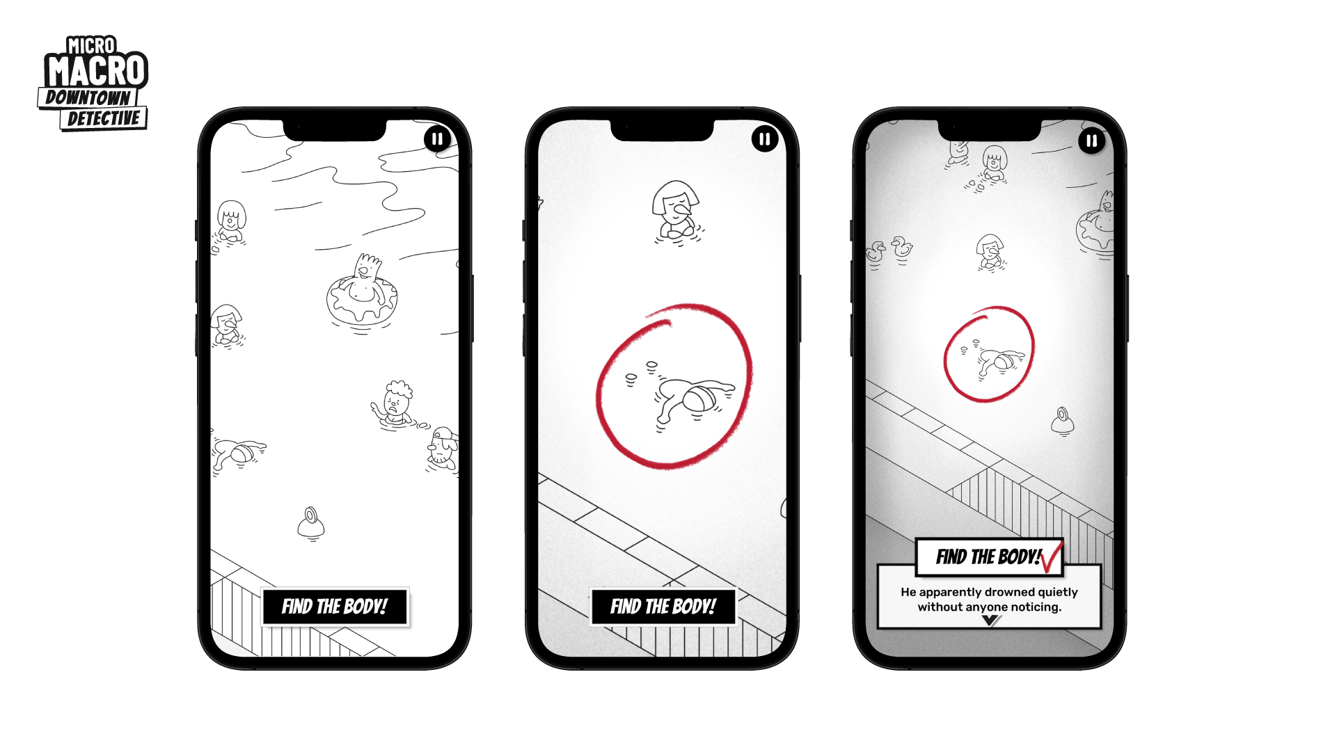
We wanted to create a standalone game that would appeal to new players who don't play board games and also satisfy MiMa fans. And of course, offer something new, take advantage of the digital opportunities. We had many ideas, and we even had to hold ourselves back at times to avoid diluting the concept's original DNA. For example, using animation was tempting, but it would, in a way, contradict the core concept of a still image and create issues with user expectations and experience.
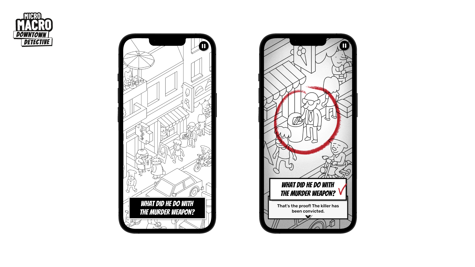
We focused on a few new digital features that enhance the concept organically. Like the possibility to zoom in very deeply. Or, at some points in the story, you will do a search warrant and open up rooms in buildings. Those features gave us new possibilities to create different kinds of stories and puzzles while preserving the spirit of the original game.
The player's feedback is overwhelmingly positive, and we are very excited about it! We recently even published a first expansion. So try it out! :)
What are you reading, listening to, or looking at to fuel your work?
Regarding the stories and puzzles for MicroMacro, I used to read a lot of crime stories and listen to podcasts (crime fiction and true crime) in order to get ideas. And I got a lot of inspiration from playing other detective and puzzle games, both digital and analogue.
I am always looking for games with a strong, consistent story that's deeply interwoven with the puzzles. To mention some games I discovered over the last couple of years, which are outstanding in this quality: The Case of the Golden Idol, Return of the Obra Dinn, Outer Wilds, Perspectives (the last one is a board game, the others are digital games).
Regarding art and storytelling in general, I consume a lot of stories in comic books, movies, TV shows, digital games, animation, and anime. It's incredible how many good stories have been made in the last ten years, and how the art of storytelling has improved. I think that we are living in a Golden Age of storytelling right now!
I am very interested in storytelling and worldbuilding, since I have been working on another project for many years, “Project Asterope”, an epic Sci-Fi story I want to tell in a comic or picture book. But I am far from good enough at drawing and writing, so while I practice my skills, I soak up all the inspiration and ideas I can get.
The greatest artists in this regard, for me, are Hayao Miyazaki and Moebius. Speaking of modern animation art, I guess many of your readers will know the series Love, Death and Robots, Scavengers Reign, and Arcane – this is the kind of avant-garde in worldbuilding and storytelling that I am speaking of. Apart from these giants, I want to mention a few webcomic artists I discovered lately, who might be less known, but tell incredibly good stories:
Evan Dahm (Vattu, Third Voice), Anne Szabla (Bird Boy, Banquet), Minna Sundberg (Stand Still Stay Silent).
Of course, I follow the work of other contemporary illustration artists online. It's incredible how the digital era led to an explosion of artists, designs, and styles.
Finally, where can we find more of your work?
My online portfolio is outdated, so I'll skip it. You can find my work on my Instagram @jojosich.illustration. You will mostly find MicroMacro content there lately, but I plan to release other work from the worldbuilding project I mentioned. It's a long process; there are already many sketches and drawings. So if you're interested in that, follow my account - and have some patience ;)
Regarding MicroMacro, you will find all information on our website micromacro-game.com, and even more content on our Instagram @micromacro_game, like creative process and behind-the-scenes insights. If you are interested in stuff like this, we also have a newsletter where we frequently (but not too often, promise!) share insights from the creative process behind the series.
Enjoying the site? Consider supporting it by sharing the articles you read.
For more great insights into board game art, check out the interview archive.

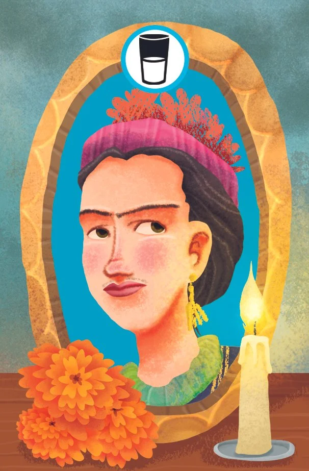
Ofrenda Board Game Art - Honoring Culture and the Dead - Interview with Alex Herrerias (Issue #79)
“This game was an excellent opportunity to teach people more about this Mexican tradition, and I had the chance to explore familiar places. I thought about families from Mexico, but I also wanted to represent the various regions.”
In this board game art interview, I’m speaking to Alex Herrerias, a freelance illustrator based in Mexico. ‘Ofrenda’ is their first board game art project, and I was drawn to its colorful art, captivating theme, and great table presence.
‘Ofrenda’ is a card placement game about creating a colorful altar to honor your loved ones. Upon discovering the game, I was really curious to learn more about Alex, and how he approached the game’s themes and depictions.
The word ofrenda will be said a lot in this interview, both describing the game, and the altar to honor the dead, so for clarity, I’ve capitalized the board game reference and put it in quotes: ‘Ofrenda’. Enjoy the interview!
p.s. Big thanks to Tabletopping for sharing their photography to support this interview.
Enjoying the site? Support it by sharing the articles you read. For more great insights, see the interview archive.
Thanks for joining us, Alex! Could you tell us a bit about yourself?
Well, I’m a freelance illustrator with almost twenty years of experience. I live in Mexico City, so I enjoy visiting the museums (this city has the third most museums in the world) and savoring delicious food from various places around the country. I’m currently working on my new graphic novel, which I hope to publish by the end of this year.


Have you always wanted to be an illustrator?
Well, I remember drawing since I was old enough to hold a pencil. But when I decided to study design, everything became more “serious.” Then, I started working on textbooks, attending book fairs, and uploading my portfolio to Behance and Facebook. I participated in numerous illustration contests and later served on the jury. I joined the Pencil Illustradores agency (in Spain).
Do I ever have a crisis of confidence? Hehe, all the time! Not just professionally, but I have always found time to recover and find calm, with music, movies, and books, talking and walking with friends, or just doing my classes at the faculty. Or even simply just breathing.
What is your process when creating art?
I enjoy the document process, which includes searching for samples, reading the text, and even creating a music list for each project. I’m a graphite lover, and I like to sketch in my actual notebook.
If the project allows me to, I want to incorporate any analog technique because most of the time I’m under a deadline. In my personal work, I used to be experimental. Right now, I’m working on some stamp techniques (etching).


How did you start working on board games?
Initially, Jordan Wheeler from Osprey Games contacted me to inquire about my interest in collaborating on a board game centered around Día de los Muertos (Day of the Dead), my favorite Mexican tradition. They sent me some samples from my portfolio to show the style they were looking for.
At the time, I was actually working on material about Día de los Muertos for a workshop for the Buenos Aires Book Fair in 2024, so I was entirely in the mood. I was thrilled about this project, my first one in the tabletop industry, by the way.
‘Ofrenda’ is a board game about celebrating loved ones for the Mexican Day of the Dead. Can you tell us more about it?
This game was an excellent opportunity to teach people more about this Mexican tradition, and I had the chance to explore familiar places. I thought about families from Mexico, but I also wanted to represent various regions: the north, the south, the center of the country, and so on. I represented artists, luchadores, sportspeople, and students.
In Mexico, we also paint our faces to look like skulls on that day, so it was a good idea to do it for the game.
Can you explain what an ofrenda is, and how it’s made?
An ofrenda is an offering (template) for our relatives who have passed away. Each ofrenda is different for every region in Mexico. Every family that maintains the tradition could add more or fewer elements, but most have the same.
We add some portraits or just photos, their favourite food, water, or some drinks they liked for their thirst, candles to guide them to our place, traditional bread “pan de muerto”, fruits from the station, salt, papel picado for furnishing, and the most beautiful flowers, marigolds (cempasuchil). We sometimes use sugar skulls, and occasionally paper or handcrafted skulls. Each Family uses their resources, including fruits and traditional breads from their region.
How are ofrendas represented within the board game?
I gathered the necessary elements for the game and searched for samples, then attempted to incorporate my style. In my art, I like to represent traditional elements from my culture. I enjoy drawing skulls, luchadores, and diablitos a lot.
I tried to be as accurate as possible with the deep elements of traditional ofrendas, while adding my special touch to the game.
You mentioned traditional face painting. What are the usual elements that make up these designs, and how do they feature in ‘Ofrenda’?
In Día de los Muertos (Day of the Dead), we have many celebrations, such as parties, visiting ofrendas, going to the cemetery to make ofrendas, parades, and more. And it’s so common to disguise or paint our faces with elements from handcrafted art, like Puebla´s talavera (Mexican pottery) or anything that our imagination allows to honor death and tradition. This always depends on the artist or the ideas of the people who want to be painted.
I proposed incorporating this idea of face painting into the portraits in the ‘Ofrenda’ board game. The unlit side of the cards displays the same art from the lit side, but with fewer colors or in black and white. I think it works perfectly.


How did you approach showing the various regions of Mexico?
At the beginning of the project, we had to think about the 65 portraits - characters that conform to the elements of the ofrenda. My first step was to divide Mexico into five major regions - families (north, south, center, southwest, and northwest)- and look for the main elements, ethnicities, and original and ancient peoples. I tried to avoid stereotypes (such as big moustaches and charro hats) and incorporate traditional clothing from Oaxaca, Chiapas, Veracruz, and beyond.
Then, I sought to balance the representation of women and men characters, their ages, and their complexions. And of course, I added my fictional luchador “el Cangrejo celeste” - The blue crab. There was a lot of work, so I asked some of my talented students to help me find references and gather inspiration.
What are you reading, listening to, or looking at to fuel your work?
I have just finished a novel, Pedro Páramo, by Juan Rulfo, a classic from Mexico. Then, I´ll start with Pan´s Labyrinth, a novelization by Cornelia Funke and Guillermo del Toro based on the movie. I’m listening to a lot of movie soundtracks and Radiohead as my safe place, and I just saw The Phoenician Scheme, the latest movie by Wes Anderson. Some graphic novels are about heroes, while others are about monsters or both, such as Batman, haha.
Ofrenda - Photography by Tabletopping
Finally, where can we see more of your work?
You can see my portfolio on:
Behance: https://www.behance.net/AlexH
Instagram: @alexherreriasilustrador

Eternal Decks Board Game Art - Merging Ancient and Modern - Interview with Mujunsha Inc (Issue #78)
“Creating a story is a lot like excavation. The famous Japanese sculptor Unkei once said that carving a Buddha statue was like "releasing it from the stone." This reflects the idea that the figure already exists within the material—and the sculptor’s role is to uncover it.”
In this board game art interview, I’m speaking to Shinmei Yamamoto, a creative based in Japan. ETERNAL DECKS is their first board game art project and, in my eyes, a complete triumph. From the box to the game board, it is stylish, cohesive, and stunning on the table.
Eternal Decks is a cooperative card game that features a satisfying gameplay loop that constantly evolves. This is a game for fans of logic puzzles, and so readability is incredibly important across the table. Thankfully, the cards are not only colorful and clear, but packed with personality.
After playing the game for the first time, I was so impressed that I contacted the creative team behind it as soon as I got home. Shinmei Yamamoto joins me to share an in-depth look into their unique approach to creating art - enjoy!
p.s. A big thank you to No Pun Included for lending me their copy of Eternal Decks to photograph for this article.
Enjoying the site? Consider supporting it by sharing the articles you read.
For more great insights into board game art, check out the interview archive.
Thank you for joining us, Shinmei. Could you tell us a bit about yourself?
My name is Shinmei Yamamoto, and I’m the founder of MUJUNSHA Inc., a creative company based in Shibuya, Tokyo. We specialize in advertising, with graphic design at the core—from concept development to production.
In advertising, we’re expected to constantly read the shifts in lifestyle, values, and public sentiment to deliver communication that fits the times. I’ve also found myself increasingly drawn not only to the new but also to the old. In my personal time, I collect antiques, retro games, stickers, and posters—things that fascinated me as a child.
I also work as a part-time lecturer at Tokyo Zokei University, a fine arts university in Japan, where I teach once a week to support and mentor the next generation of young designers.
Rebranding for Yoshoku Kuronfune-tei, a Western-style restaurant founded in the Meiji era, located in Ueno, Tokyo.
As a mentor, what advice would you offer new designers?
This year, I am teaching a “Visual Communication” class to third-year students. The course mainly focuses on advertising production and branding. In my classes, students are given assignments, engage in group discussions, review their production processes, and receive critiques on their final outputs – all in a practical, hands-on format.
The main advice I always give is that design is built upon two wheels: “ideas” and “craft.” It is essential to identify early on which of these you are stronger at. Of course, there are designers who can stand out with their outstanding technical skills alone. However, I believe that combining both ideas and craft leads to the highest level of quality. Developing your own methods for generating ideas is, in fact, one of the most important skills.
To do this, it is vital to learn basic skills and rules, but above all, to live your life with an awareness as a designer. When you walk through the city, there are countless hints hidden around you – shapes, colors, typography, textures, people’s movements, how things are arranged. For example, the font on an old signboard, the texture of a building’s paint, the way people line up in queues, how spoons are placed on tables. Things that may seem trivial can become seeds for new ideas.
Another crucial aspect is the ability to think about “people’s feelings.” In Japan, there is a unique cultural concept called “reading the air,” which refers to understanding the atmosphere, a person’s expressions, or gestures, and acting accordingly, even if nothing is explicitly said. This is similar to advertising: simply shouting a product’s superiority rarely resonates with people. More sophisticated and subtle communication is required.
In ETERNAL DECKS, there is a special piece called the “Communication Disc,” which players use to express their intentions. This was an idea by the game designer, HIROKEN, and I believe this kind of consideration is a reflection of a uniquely Japanese sensibility.
Have you always wanted to work as a creative?
Yes. Since I was in elementary school, I loved drawing, inventing characters, and creating stories—often making comics of my own. Naturally, I went on to study graphic design at an art university. After graduating, I started my career at a design production company and later spent about 20 years working as an art director in the creative departments of international advertising agencies.
Many of the projects at such agencies are large-scale and team-based, often bound by strict brand guidelines. Over time, I began to feel a certain distance from my personal creativity. As a counterbalance, I’ve continued to pursue more personal creative expression through illustration, comics, and other solo projects.
Can you describe MUJUNSHA Inc. to us? What is your design philosophy?
MUJUNSHA was established in 2019. The name “mujun” means contradiction or paradox in Japanese, and it reflects our belief that original creative value can emerge when differing perspectives or ideas are allowed to coexist.
Our creative process always begins with contradiction. We find value in generating visual tension by bringing together seemingly conflicting elements—for example, using a casual tone to approach a formal or serious theme. We aim to attract attention through these unexpected combinations.
Our logo is based on a regular heptagon (a seven-sided polygon). Interestingly, a perfect heptagon with all sides equal in length cannot actually exist in strict geometry. That contradiction—something impossible that still forms a symbol—is exactly why we chose it as our emblem.
As for our design philosophy, we always keep in mind the idea of the “human era.” Everything is created by humans, viewed by humans, and used by humans. That’s why we believe people must be at the center of every process.
How did you get involved with ETERNAL DECKS?
The game designer of ETERNAL DECKS, HIROKEN, is actually my younger brother. He had worked with other designers on previous titles, but when he began developing this one, he reached out to me to collaborate from the early concept stage. I’ve always enjoyed retro digital games like the Famicom, but I had very little experience with analog games like board games.
When I first saw the paper prototype—filled with rows of numbers—I could tell the game mechanics were intriguing, but I intuitively felt it would be more compelling to tell the story visually through illustrations. Perhaps because I wasn’t familiar with traditional board game conventions, I was able to approach the visual design more freely and take a slightly different direction.
ETERNAL DECKS is a puzzle game at its heart. How do you approach storytelling for abstract creations?
Creating a story is a lot like excavation. The famous Japanese sculptor Unkei once said that carving a Buddha statue was like "releasing it from the stone." This reflects the idea that the figure already exists within the material—and the sculptor’s role is to uncover it.
In ETERNAL DECKS, we began by digging into elements already embedded in the game system—such as the cycle of exchanging decks, characters that hold a bundle of cards and activate under certain conditions, or the multi-stage game structure. From these, we unearthed key themes like "cycle" and "eternity," which eventually became the title: ETERNAL DECKS.
Next, we asked ourselves, “Why are the players doing what they’re doing?” That led us to the core narrative: the players are explorers investigating the mystery of humanity’s shortening lifespan. The story has them confront the truth of life itself. The theme of eternal life is a universal question that has fascinated humanity from ancient times to today. By rooting the gameplay in a theme that speaks to a deep human instinct, we gave the act of playing a sense of purpose.
Assigning meaning to each element and gradually building the narrative layer by layer is a method I’ve refined through years of work in advertising. There, you're often asked to deliver a product’s unique selling point (USP) to a specific target. Sometimes the answer is already set, and the only question is how to convey it—like solving a puzzle with one piece missing. Storytelling for this game followed a similar structure.
ETERNAL DECKS has a stunning box cover, featuring numerous fantastical characters. Can you explain how this was designed?
When we started the project, I first looked at many board game boxes to understand the common visual language of the medium. While I recognized the standard conventions, we wanted to take a slightly different path. Our goal was to create a game that could be loved for years—not something fleeting.
Board games typically spend more time on a shelf than in active play. With that in mind, we wanted the box to feel like an art object—something you'd want to display. Practical information like age range, play time, and player count was moved to the back. With input from HIROKEN, the game designer, we kept the front as minimal as possible and focused entirely on delivering a visual that encapsulates the world.
The color palette is limited, and the front showcases the Eternals—beings sealed within the game’s universe. Opening the box is meant to feel like breaking that seal. To enhance this, we designed the inside manual using the same layout as the cover—but this time, revealing the characters in full color.
This design approach reflects ideas I developed in advertising—such as creating strong first impressions and crafting a meaningful unboxing experience. The goal was for players to feel like the doorway to a new world opened the moment they lifted the lid.
As your first board game project, what did you learn through making ETERNAL DECKS?
In many ways, it felt similar to other creative projects. But one of the joys of this project was being involved from the very beginning—setting the tone, color palette, and shape language. That upstream involvement made it feel more like a personal work than a client project.
The game board uses black as its base color. At the beginning, the board feels calm and quiet. But as the game progresses and colorful cards are played, the board transforms into a vibrant, life-filled space. This visual shift, from black to a flood of color, provides players with a striking post-play experience—one they often want to photograph and remember.
One of the most fulfilling aspects of the project was taking something ancient and making it feel contemporary. ETERNAL DECKS is built on the theme of “eternal cycles.” Characters rooted in myth reappear in modern form. It was about resolving the contradiction between “ancient” and “modern” through design—something that resonates with the meaning of our studio name, MUJUNSHA, which means “paradox.”
One particular detail I obsessed over was the lettering. I custom-designed each letter in the game title so that the typography would harmonize with the artwork and fully reflect the game's visual language. The goal was for the text and imagery to function together as one unified world.
Did playtesting change the art, and in what way?
Balancing the immersive worldbuilding with smooth gameplay was one of our biggest challenges. For example, we went through many revisions of icon and number sizes within the limited space of the cards.
As a result of playtesting, some characters—the Eternals—were either replaced or removed because they didn't fit the game balance. In other cases, character color schemes were revised to better match the deck colors. We paid close attention to how the art and game system could reinforce each other, especially in terms of color design.


Interestingly, sometimes we adjusted the rules after finalizing a character’s illustration. We went back and forth between game mechanics and visual elements many times. That process helped the two sides complement one another and ultimately led to a more polished, unified product.
Since international release was part of our plan from the beginning, we made sure to emphasize non-verbal communication. We minimized text where possible and used iconography to express information visually. For instance, while Japan uses “O” and “X” for yes/no, we switched to checkmarks and Xs for global audiences.
We also addressed accessibility by adding unique symbols to each card color, ensuring colorblind players could still navigate the game smoothly.
What do you think are the most crucial elements of creating great graphic design?
At Mujunsha, we work across a wide range of media, not only in two-dimensional graphics such as logos and posters, but also in video, events, and websites. Regardless of the project, one common approach is to always start by creating a single “key visual.” This is a core graphic that condenses the concept into its purest form, conveying what we want to express in the simplest and clearest way possible.
All graphic design consists of “copy (words)” and “visuals (imagery).” By using visuals effectively, it becomes possible to reduce the amount of text while communicating feelings and meanings more quickly. Emoji, for example, are a Japanese-born culture that conveys emotions like joy or sadness instantly – a great example of visual efficiency.
ETERNAL DECKS - Operational rules for design
Another important aspect is not to produce things in an ad-hoc way, but to first create “operational rules (guidelines).” In ETERNAL DECKS, several of our designers were involved, so we established visual guidelines that defined colors, typefaces, tones, and other elements to ensure consistency. This made it possible for anyone to join midway through the project while maintaining a uniform quality, and we paid close attention to how this information was shared.
However, it is just as important not to become “bound too tightly” by these rules. This may sound a bit contradictory – which is quite fitting for a company named Mujunsha (“Contradiction Inc.”) – but while rules form the foundation, sometimes boldly breaking them leads to new discoveries and expressions. I believe that this balance between rules and freedom is at the core of great graphic design.
What are you reading, listening to, or looking at to fuel your work?
My inspiration comes from “things shaped by human hands,” regardless of era or genre. I enjoy viewing everything on equal footing—from renowned artworks in museums to old candy packaging or collectible stickers found in retro stores—without ranking them in terms of value, and simply seeking what resonates with me.
For example, the wave pattern used on the green token in ETERNAL DECKS was inspired by a detail from Red and White Plum Blossoms, a National Treasure of Japan painted by Ogata Kōrin in the Edo period. Each token in the game represents a different emotion, and the green one symbolizes “harmony.” I felt the imagery of waves flowing between red and white plum trees perfectly captured that concept.
On the other hand, the upgraded cards in the game use holographic foil inspired by Bikkuriman stickers—a massive craze among Japanese children in the 1980s. The “Eternals” in the game emerge from a sealed state into vivid color, expressing their awakening. This transformation from shadow to light represents the return of life. To reinforce that symbolism, we used seven-color holographic foil to give the visuals a vibrant, life-filled glow.
ETERNAL DECKS cards and game token design
Are there any other non-gaming projects you’d like to highlight?
I would like to introduce one of our projects called “WOOD CHANGE.” This was a commission from the Forestry Agency of Japan. The project communicates the benefits of integrating wood into daily life through various approaches, including videos featuring original wooden dolls that tell stories, and workshops where participants can experience woodworking firsthand.


Finally, where can we see more of your work?
You can find more of our work through the following:
Website: https://www.mujunsha.com
Instagram: https://www.instagram.com/mujunsha_inc
We’re planning to host an exhibition in Tokyo later this year or early next year, featuring artwork from ETERNAL DECKS. We’ll announce details on Instagram, so we’d be grateful if you followed us there.

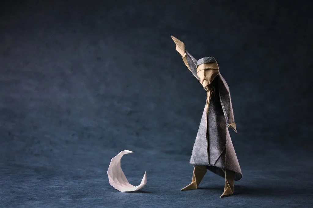
Sea Salt & Paper Board Game Art - Immersing Players in a Sea of Folded Paper - Interview with Origamist Pierre-Yves Gallard (Issue #77)
“The idea was to immerse the players in an ocean of folded paper. To achieve this goal, we established a few guidelines: simple compositions with few secondary elements, a sheet of paper as a background, and lights and shadows to bring depth to the pictures.”
In this board game art interview, I’m speaking to Pierre-Yves Gallard, whose origami and photography bring the Sea Salt & Paper card game to life.
Sea Salt & Paper is a set-collection card game (like Rummy) that combines easy-to-learn rules, a small travel-sized box, and tons of replayability. Since its release in 2022, it’s been charming audiences worldwide thanks in large part to its beautiful use of origami in its artwork.
Origami is the Japanese art of paper folding. Its roots can be traced back to the 7th century, when paper first arrived in Japan from China. Since then, it has developed a rich history through its ceremonial and recreational use. I only have the slightest connection to origami, but there definitely was a time in my youth when I briefly fell in love with the art form.
In simple terms, an origamist's goal is to transform a flat sheet of paper into a sculpture by folding and manipulating the paper to create beautiful pieces of art. Modern origamists generally don’t cut, glue, or mark the paper, with the sculptures created through intricate design, a select choice of paper, and, of course, folding.
Pierre-Yves Gallard and Lucien Derainne created the origami art featured in Sea Salt & Paper. I reached out to Studio Bombyx to see if they could set up an interview, and thankfully, Pierre-Yves was able to join me. Enjoy our chat!
Enjoying the site? Consider supporting it by sharing the articles you read.
For more great insights into board game art, check out the interview archive.
Thanks for joining us, Pierre-Yves! Could you tell us a bit about yourself?
Thanks for inviting me! I live in France, in the Jura, a medium-mountain region that is quite rural and very green, near the border with Switzerland. I teach French language and literature to junior high school students. During my free time, I practice origami. At first, it was just a hobby; with time, I got more and more serious about it until it became an important part of my life.
When not reading books or folding paper, I love being outdoors: hiking, cross-country skiing, gardening, mushroom picking, or taking care of my bees.


How long have you been an origamist?
I used to fold paper airplanes and boats when I was a child. But I really discovered origami as an art form about 10 years ago. Since then, I got more and more involved, to the point that I now feel it has become a part of my identity. Origami gives me a way to express myself, it shapes the way I look at things, and it enables me to keep growing and learning new things. Also, it has given me opportunities to meet many people and to make dear friends.
When did you first start creating your own designs?
The first model I designed was a lighthouse, which I created in 2019. I was looking for diagrams or a video tutorial, and I couldn’t find any. So I thought I would try and make my own. But, the main event in my origami journey was COVID isolation. During this period, I was folding every day, several hours a day, and that’s when I really got into origami creation.
Before that, I used to interpret models from many different creators, among which Jun Maekawa, Hideo Komatsu, Tomoko Fuse, Roman Diaz and Oriol Esteve. These origami artists have played an important part in defining my approach to folding and designing origami.
How did you become involved in Sea Salt & Paper?
Laura Rouquié, the editor in charge of the project at board game publisher Studio Bombyx, contacted me. They wanted to illustrate the cards of Sea Salt & Paper with pictures from actual origami models. The first version of the game was set in a garden, but we eventually decided that the marine universe may be even more evocative and poetic.
The idea was to immerse the players in an ocean of folded paper. To achieve this goal, we established a few guidelines: simple compositions with few secondary elements, a sheet of paper as a background, and lights and shadows to bring depth to the pictures. We also wanted to insist on the texture of the different sheets of paper: some very grainy, some with visible fibers, others with metallic reflections or marbled patterns…


What was your process for creating the origami of Sea Salt & Paper?
Lucien Derainne and I started by making a list of all the sea creatures that would make interesting origami models, and we then started designing them. It was the first time we had worked on a tight schedule and with an imposed theme, so this was an exciting challenge.
Finally, we met, folded the models together, and took the first pictures. This was probably the most difficult part, for neither of us is a professional photographer. But we felt it was important that we took the pictures ourselves, or at least that we should be present during the shooting, so that we could shape the models, choose the point of view, and arrange the lighting so as to complete the optical illusion.


Do you have a favorite piece you created for Sea Salt & Paper?
My favorite cards might be the crabs. However, the model I prefer to fold and exhibit is definitely the penguin: I think it has a good structure and a pleasant folding sequence.
What makes the art of origami so special?
There are several ways to answer this question. I’d say the kind of origami that I love involves both artistic sensibility and “engineering” skills. It starts like a puzzle game, in which one needs to figure out how to transform the sheet of paper by folding it. Nothing added, nothing taken out. All you can do is fold. The magic happens when these combinations of folds somehow breathe life into the paper. This is where the artistic sense steps in and plays an important part.
I am also very attached to the idea that origami works can be taught and reproduced. This goes against the common conception that a work of art should be unique. In the case of origami, I think that a model's reproducibility is part of its beauty. This second idea has become increasingly important to me over the past years. I realized that what brought me the most joy was being able to share my designs and see people putting effort and talent into the interpretation of my models.


Where do you find inspiration for your origami creations?
There is no rule, nor magical recipe for inspiration. I’m often inspired by the nature surrounding me: for instance, I watch birds in my garden and I want to fold them. This is how I created my robins, sparrows, and magpies. Since I got into beekeeping, I started to fold hexagonal sheets because I was touched by the beauty of the honeycombs and their repetitive structure. But sometimes inspiration comes from a book I read or a discussion with friends. I also really enjoy design challenges with other creators, as it is a very good way to stimulate creativity.
Lastly, the idea for a model sometimes comes from the act of folding in itself. I start folding without anything too specific in mind, and if I’m lucky, an idea emerges at some point.


How important is the paper used in origami?
Learning origami is as much about learning folding techniques as learning about paper. The size of the sheet, its thickness, its texture, its transparency… many criteria influence the result you’ll get. That’s why choosing the right kind of paper is a critical step when you want to interpret a model. Most of the time, you have to compromise: some papers will look great in pictures but will tend to fade or loosen with time, some will be very sturdy, or very pleasant to fold, but they will lack texture when you take a picture of your creation.
I have a large collection of sheets of paper in my study, and I experiment a lot - with paint, ink, sometimes even glue (to make double-sided sheets of paper, for instance).
What are some resources for anyone interested in becoming an origamist?
For beginners, I recommend searching on YouTube. There are lots of great origami channels with clear tutorials and fun models. I especially recommend the videos that include diagrams, such as those on Jo Nakashima’s channel. They are a great way to understand the symbols used in books.
Once you can read origami diagrams, the vast realm of origami unfolds at your feet! And since it is even more fun to fold with friends, try to reach your local origami group! There you’ll meet other people who share your passion and who will help you grow as an origamist.
The big shell is designed by Tomoko Fuse - Origami by Pierre-Yves Gallard
What are you reading, listening to, or looking at to fuel your work?
I love to listen to music as I fold. I’m a big fan of the baroque period, and lately I’ve been listening a lot to this recording of “Apri le luci e mira”, composed by Vivaldi and sung by Roberta Mameli.
Finally, where can we see more of your work?
I have a website and an Instagram account, where I share pictures of my models, news about the origami events I participate in, and sometimes diagrams or tutorials for folding some of my models. I’m also working on a book with pictures and diagrams of my models, but this project will still require some time.


Thanks to Studio Bombyx for making this interview possible and to Pierre-Yves Gallard for providing many of the images.
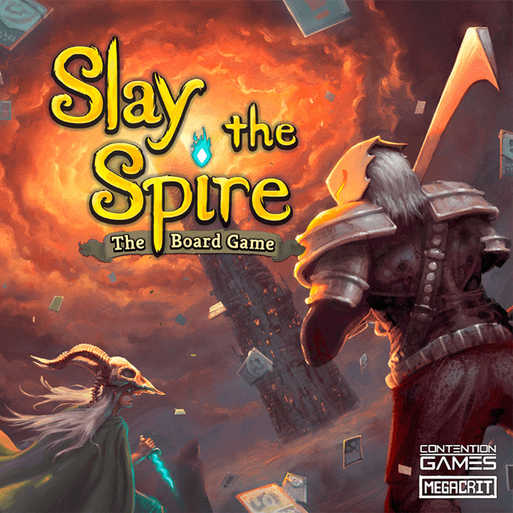
Slay the Spire Game Art - From Screen to Table - Interview with Artists Anailis Dorta & Bruce Brenneise (Issue #76)
Slay the Spire is a phenomenal hit. The video game has sold an estimated 3 million copies and has been adapted into a board game, which is already rated in the top 50 best board games ever on Board Game Geek.
Slay the Spire is a deck-building dungeon crawler with unique art direction that creates a fully original world. In this board game art interview, Anailis Dorta and Bruce Brenneise share how they illustrated this award-winning game.
In Slay the Spire, you play as characters climbing a mysterious tower, encountering strange creatures, discovering relics, and crafting a deck of cards to help you overcome powerful bosses. As soon as I tried it, I was addicted.
Since its release, Slay the Spire has grown into a phenomenal hit. The video game has sold an estimated 3 million copies, and last year, it was adapted into a board game, which is already rated among the top 50 best board games on Board Game Geek.
This interview has been five years in the making. Back in 2020, I was obsessed with the Slay the Spire video game, playing it on Steam, Switch, and my phone. I originally reached out to artists Anailis Dorta and Bruce Brenneise at the end of January 2020 to begin our interview, then a little thing called the pandemic occurred.
Five years later, I was still curious to know about Slay the Spire. Thankfully, artists Anailis and Bruce were kind enough to join me (once more) to chat about their work. Enjoy our conversation!
Enjoying the site? Consider supporting it by sharing the articles you read.
For more great insights into board game art, check out the interview archive.
Thanks for talking to me again after all these years, Anailis and Bruce! Could you tell us a bit about yourselves?
Anailis: Hello! I’m a game artist who has worked on multiple projects for different platforms, including console, PC, mobile, AR, VR, and film. I mainly contribute to the 2D and UI roles, but have filled different titles depending on the job. I was born in Cuba and immigrated to the United States as a kid. I went to college on the West Coast and currently reside in the PNW. Outside of making art for a living, I enjoy annoying my cat, traveling with my partner in search of great coffee, and playing roller derby with my friends.
Bruce: Hi! I'm an award-winning illustrator and game background artist. Most of my work thus far has been for various tabletop RPGs and games, including Magic: The Gathering, Dungeons & Dragons, and Numenera. I grew up in rural Michigan, graduated from the University of Michigan with a focus in scientific illustration, lived and traveled in China for six years, and then moved to Seattle with my wife and son. I still live in that area, albeit on the outskirts, since that’s far more affordable. Aside from art, I love reading sci-fi/fantasy/horror novels, traveling, and following geopolitical news.
Have you always wanted to be an artist?
Anailis: I’ve been drawing for as long as I can remember! A moment that made me think, “This is serious now”, is when I got accepted into an art magnet high school. This was the first time I got my hands on a digital tablet and started creating full-on illustrations. After high school, I left to study Game Art in California. I honestly thought — Hey, I like playing video games, so I’ll probably like working on them too! In college, I was taking figure drawing classes, character/environment design classes, concept art for games, vis-dev for animation, storyboarding, UI, 3D — you name it. I was exposed to many aspects of the industry and had amazing teachers who helped me along the way!
Bruce: I've been drawing since I was a small child, and I was lucky to grow up in a family that encouraged art as a viable career option. My grandfather, Harry Baerg, was also a professional illustrator. I remember reading the art books of Michael Whelan and Keith Parkinson and gravitating to the sort of art they were doing. Graduating from art school, however, felt like hitting a brick wall. It hadn't really prepared me for the sort of entertainment industry work I was interested in. I decided to go teach in China and scratch that travel itch I've always had. Although it was a detour from my professional art career, I think it's had a huge impact on the inspiration and approach I take to art now, so that I wouldn't change a thing about that decision.
What is your process when creating art? Are you more digital or analog?
Anailis: I would say the process for creating art depends on what I’m doing. I would say I am an impatient person who doesn't like to spend too much time doing the same thing, so I rarely go the route of seeing where the idea takes me. I pretty much always have a plan coming into something, and if I’m stumped on a piece, I will ask my coworkers for ideas to springboard off of.
When I was working on STS, my general process for the cards or events was to come up with 2-3 sketches based on the card name or description. If I felt some of the ideas were not strong enough on their own, I would jump into a timeboxed research to get more inspiration, whether that was a different pose altogether or thinking of a more intricate design.
Now, if I were taking on something new, I would always look into research and mood boards first. A good rule of thumb for me is to think about what the final piece I want to make is and deconstruct it from there, and that will fill my research. I will always look at antique or historical objects, clothing, machinery, etc., on which the final subject is based, as that is the base on which you can build your ideas.
Bruce: My process for creating art is changing these days. Most of my experience is with digital art: I was an early adopter back in my college days. Now I’m getting back into traditional painting, starting with a lot of tonal sketches and acrylic paintings for MTG and D&D. Given how much of our daily lives are consumed by screens, it’s been nice to get away from them while I work. Either way, the process always starts similarly from researching references, trying out compositions with thumbnail sketches, and then committing to a direction and exploring what that fully looks like.
What do you think makes great art?
Anailis: What I enjoy most about art is that whatever anyone draws always carries a piece of them. Whether it's the thickness of a line stroke, brush stroke, colors, subject matter, points of references, etc. Almost every piece carries pieces of different inspirations that inspired us. A Lot of the shapes and colors in my work are inspired by games that I LOVED growing up (in my case, that was Beyond Good and Evil, Kya: Dark Lineage, the Sly Cooper Series, and Okage: Shadow King).
Artist-wise, Alexandria Neonakis is an artist I’ve always admired since college because her work is so varied and does a lot of UI and concept work, which was what I was mainly doing at the time. Devon Cady-lee Is also someone who’s work I followed during my college years. I love the shapes they pull out of their pieces!
Bruce: Michael Whelan and Keith Parkinson were two of the great fantasy artists who specifically inspired me. Mian Situ and Piotr Jablonsky are two others who consistently drop my jaw. Take a look at their portfolios for a window into what I like. What I enjoy most in art is intentionality, narrative, elegant mark-making, impactful color/mood, and a whole that is greater than the sum of its parts. That said, art can have many different purposes and intentions, thus there are many ways to be great.
How did you get involved in making Slay the Spire?
Anailis: I had recently graduated from college and would consistently check through some of Reddit’s game-dev subreddits to take on quick freelances. Casey and Anthony made a post looking for an artist on the site to create the art style for the cards in Slay The Spire. I was initially interested because the game was very far along compared to the usual posts on the subreddit, and it immediately looked like a tangible project. That same day (or the day after), I sent them the test art.


Bruce: When living in downtown Seattle, I attended an indie game dev get-together at a coffee shop practically down the street from me. I think everyone else there was a designer or programmer. I happened to sit at a table next to the two guys that formed Megacrit. I showed off my portfolio, they showed off their VERY early prototype of Slay the Spire, and we struck up a good conversation.
I think they were particularly interested in getting feedback from me because I hadn't played any deck-builder games. I left them a business card and didn't hear anything further for about half a year. Then I met them at another indie dev meetup. Anthony approached me about doing backgrounds and promo art for them. They were one of my earliest clients, so it was a pretty exciting moment!
Since I met them at such an early phase of the project, there wasn't really an indication that this would be any different than a million other would-be indie games. It was only playing the Alpha builds of the game as it developed that I understood they had something special.
One cool thing about being such an early contributor was getting to give feedback on many other aspects of the game. When they started a brainstorming session to come up with the name of a game about 'killing a tower', I gave them a list of about ten options, including 'Slay the Spire'.


Slay the Spire is set in an original fantasy world. What inspired your art?
Anailis: Casey Yano (game developer) had already created a bunch of the enemies and other artworks for the game that easily set the tone and inspired much of the art (you can see this especially in the event illustrations). I would say that the inspiration was already there, mood and idea-wise.
Based on the initial art test I did, we hit the style and continued in that direction. The events and illustrations for the character select and some promo illustrations allowed me to add a lot more detail and play with a different style. Different aspects of the game had a variety of styles, but because we all played into similar moods and shapes, it brought many aspects together.
Bruce: Casey Yano (game developer) provided rough concepts and explanations of what he and Anthony wanted for the visual content of the game. A good example would be The City, where the background represents the implied hierarchy between palaces for those who can fly and stony hovels clustered at their bases.
I don’t really recall what they had to say for the intended overall look of the game, if there was any particular inspiration we were aiming towards on that. Because it started as a shoestring operation by folks who’d never published a game before, there wasn’t a style bible or a basis of cohesion from the start, other than not wanting to ape a AAA look/feel that everyone else seemed to be going for.
This was more experimental to begin with, for sure. If things narrowed down at all, it was later in the process when it was clear there’d be at least two other people contributing art, so I had to find points of similarity with what they were doing.
Do you have a favorite piece from your work on Slay the Spire?
Anailis: Card-wise, Ironclad’s Rage is probably one of my favourite pieces. Promo-wise, I really enjoyed creating the Watcher and Defect promotional artwork since it was a nice break from all the cards I was doing at the time, haha.
Bruce: The background art for The Beyond, probably. I really enjoy the organic, melting, bony architecture forms. Another one I’m particularly proud of is the throne the Collector sits on. I wish we could have made each boss room a bit more unique like we did with that one.
How is illustrating game art different from creating for other media?
Anailis: I would say that it generally depends on the project and the tasks needed to determine how collaborative something is. In my experience, I find the entertainment industry to be a lot more involved/ collaborative because things are actively being worked on alongside you and could require things to get cut or reworked. You are also working with your fellow co-workers and getting feedback on pieces!
Whenever I’ve done something more purely illustrative that I’m being brought into at the end of the project, while there is still some feedback, it’s a lot more to the point and requires less collaboration. And to that I would add that it doesn’t mean one is easier than the other, but rather each project will require different things from the artist.
Bruce: Every product type places limitations on the art used for it. Games prioritize gameplay, naturally, so they have to take into account where and how the characters will move within the space, as well as the contrast (readability) as they do. I don’t think we expected the game to port to every conceivable platform early on, so worrying about how well the art works in other formats wasn’t necessarily a thing when it was made.
Has the success of Slay the Spire influenced your work in any way?
Anailis: It has influenced my work by making me feel more confident about my choices or directions on where to take a piece or how saturated I can make it >:), haha.
Bruce: Slay the Spire came very early in my career. When I think about the art for it, I’d say it’s an early glimpse of various tendencies that became more fully realized as my work evolved. It continues to be among my most popular artworks, if I can judge by selling prints and playmats on my website and interacting with fans at conventions. It certainly provided momentum that I’ve been able to take into my career moving forward. During StS development, I remember discussing my hope to someday work on MTG. Anthony and Casey are fans of that game as well and encouraged me. When I finally did work on Magic, it probably didn’t hurt my chances that StS was very popular internally at Wizards of the Coast.
While we’re on the subject, Bruce, what were the highlights of working on Magic: The Gathering?
Bruce: I was hired by Magic specifically for my ability to design weird and alien places, as I’d previously demonstrated with my work in Numenera and StS. My first cards were a cycle of alien worlds in the Unfinity set. I’m probably best known for one of those cards, a total solar eclipse as seen from outer space: Godless Shrine. The thing about illustrating for MTG is that each card is like this perfect little artifact in itself, so it becomes very hard to pick favorites among them.
The card where I had the most freedom of imagination, though, was probably my reprint of Fabled Passage. The brief just called for a portal in a ruined alien cityscape. Everything else about it, from the dominant colors to the design of the world, was up to me. You don’t often see that level of creative freedom with an established game product like Magic.
What are you reading, listening to, or looking at to fuel your work?
Anailis: A few years back I was taking workshops from fellow artists that I admired but lately participating in game jams with my coworkers or my partner (who is a 3D artist and fellow game dev) has brought me so much joy and has been my art outlet outside of work these past few years! Outside of that, I've really taken a step back from the computer and enjoy being outside, seeing the sun, and playing roller derby so that I’m not always sitting in this dang computer chair!
Bruce: These days I read a lot of horror (particularly anything by Grady Hendrix), and listen to a lot of synthwave like Gunship or The Midnight while I’m working on art. I suppose there’s a common retro connection between all those things as well as some of the art heroes I mentioned earlier.
Finally, where can we see more of your work?
Anailis: You can find my portfolio work at Ikazilla.com and game jams at https://ikazilla.itch.io/ :-)
Bruce: You can enjoy all my best art at brucebrenneise.com, or catch my latest released pieces on Bluesky.
Thanks to Anailis Dorta and Bruce Brenneise for sharing their artwork with me and board game publisher Contention Games for sharing the Slay the Spire board game product photography.

The Lord of the Rings: Fate of the Fellowship Board Game Art - Bringing Fantasy Worlds to Life - Interview with Cory Godbey (Issue #75)
“Rereading that chapter in Fellowship of the Ring, the most terrifying part of those visions in the Mirror was Frodo seeing the Eye, and I knew I wanted to bring that image into the moment.”
Interview with artist Cory Godbey
In this board game art interview, I’m speaking to Cory Godbey, an award-winning artist whose work on The Lord of the Rings: Fate of the Fellowship artwork blends classic fantasy, bold colors, and rich, detailed worlds.
From picture books and board games to documentary films, Cory Godbey has worked with a wide range of subjects and styles to create thoughtful, engaging, and award-winning art for nearly twenty years.
Cory kindly joined me to discuss his career, creating fantasy art, and the brand new The Lord of the Rings: Fate of the Fellowship board game. Grab a drink and settle in; this is my longest interview yet at 12 minutes read time. With such great answers, I could easily have talked to Cory even longer. Enjoy!
Enjoying the site? Support it by sharing the articles you liked.
For more great insights into board game art, check out the interview archive.

Thanks for joining us, Cory! Can you tell us a bit about yourself?
Thanks so much! I live in the upstate of South Carolina, which is near the foothills of the Appalachian Mountains. I grew up in a little town called Travelers Rest. Aptly named, I suppose, because just beyond you begin to get into more of those rolling hills of the Blue Ridge Mountains.
As a kid in the 1980s and early 90s, I wandered around in the woods a lot, liked to draw, and played my fair share of Nintendo. Though I’ve gotten taller, those three things haven't changed too much.
Have you always wanted to be an illustrator?
I have, though I probably wouldn’t have articulated it quite that way until later in high school.
Drawing has been one of the major constants in my life. I’ve told the story before, but when I was in kindergarten, one class project was to do a drawing of what you wanted to be when you grew up. I didn’t know (I don’t know what five year old would actually know). But I do remember thinking well, I’ll draw a picture of a cop. I vividly remember drawing an old time-y hat with a badge on it, sitting back, and thinking, hey, now that looks pretty good!
I was always the kid drawing during class. My abiding memory of elementary school is doodling in my textbooks, looking up and realizing I had no idea where the rest of the class was in the lesson, and then going back down to my drawings.
When I was 16, I started working as a textbook illustrator. I would go after school during the summers to a small publisher near my hometown. The serendipity of going on to create illustrations for textbooks that future students would, hopefully, go onto deface and add doodles to, just like I did, was not lost on me!
This year marks 20 years working full-time in Illustration, since 2005, if you can believe it. (Longer still if you count those early days doing textbook illustration.) I feel incredibly fortunate in that I’ve never once wondered what I should pursue.


How do you like to create your art? Are you more analog or digital?
For me, everything begins traditionally. What that usually looks like is a light Col-erase pencil sketch on Stonehenge paper or Strathmore 500 series Bristol. From there, proceeding onto a finished drawing usually alternating between Kimberly’s General 2B pencil, Blackwing 602, and your regular old BIC mechanical pencil, 0.7 mm or 0.9 mm.
Depending on the needs of the project, I’ll move on to watercolor and gouache or digital painting. Oftentimes a mix.
I don’t usually like drawing digitally, however, even if I am drawing in Procreate on the iPad, for example, I still do rough sketches on paper and scan those to begin. Each project is a little different, and over the years I found myself adjusting my process and methods accordingly. My goal is always that no matter how I’m actually working, everything feels consistent.


Your passion for fantasy is clear. What draws you to the genre?
In fantasy art, I can find the three things that I am always looking for with my own work: Draftsmanship, Imagination, and Narrative.
Yes, I was always the kid who drew in school, but really I think it was the 1-2 punch of experiencing the Legend of Zelda: Ocarina of Time and Hayao Miyazaki’s masterpiece, Princess Mononoke during my formative years in high school in the late 90s that sent me down the path on which I still find myself walking.


Your artwork is very dynamic, from the composition to the lighting. Where do you begin when creating an image, and how do you convey a feeling of energy in the frame?
That’s very kind of you to say. It’s a great question, and it’s one that I’m not sure I can quite answer.
I know at least the key to my compositions, (most but probably not all) is a triangle. I don’t even plan it most of the time, it’s somehow instinctual. Makes sense to me, though. It’s a foundational, fundamental shape and it’s something the human eye is simply drawn to. It feels weighted and structured.
As for bringing a piece to life, that's a tricky business. The energy and movement in the piece is a part of it, of course. For me, it’s usually trying to approach a feeling or memory. How on earth something as grand as that, a living moment in time, can ever wind its way through shapes or color or lines is the real mystery.


You recently worked on The Lord of the Rings: Fate of the Fellowship board game. Can you tell us more about this project?
I’d had the chance to work with Matt Leacock on a previous game called Ziggurat. On that project, I illustrated a number of storybook moments for the different “chapters” of the game as well as had the flexibility to create a dozen or so player characters. We had such a good time on that project, Matt was kind enough to invite me on board for this.
The main note I had from the team on Fate of the Fellowship was that these characters could not resemble the Peter Jackson films in any way. Good news to me! As much affection and admiration as I have for those movies, I wanted to do my own take.


In that respect, it was truly the perfect opportunity. Alan Lee's work is my personal favorite glimpse into the world of Tolkien. As such, I have no aspirations to illustrate the books. For me, they have been done. However, getting the chance to do a piece for the cover and spend time thinking about how I might handle the characters? That sounded like a perfect holiday in Middle-earth.
What it looked like for me was going back and rereading certain passages and scribbling through different ways of seeing the characters.
The cover for The Lord of the Rings: Fate of the Fellowship packs in a lot of story. In your opinion, what is the key to creating captivating cover art?
For covers, I tend to defer to the needs of the project. And my own taste and preferences range, as far as what I like to see for a cover. Whether that’s a single, impactful image, or a character portrait or moment from the story. In this instance, they asked for all three of those.
As I recall, the idea was a central image of Frodo and Galadriel at the Mirror with a series of vignettes giving glimpses of other characters surrounding them.
Rereading that chapter in Fellowship of the Ring, the most terrifying part of those visions in the Mirror (famously, “For it shows things that were, things that are, and things that may yet be.") was Frodo seeing the Eye, and I knew I wanted to bring that image into the moment.


“But suddenly the Mirror went all together dark, as dark as if a hole had opened in the world of sight, and Frodo looked into emptiness. In the black abyss, there appeared a single Eye that slowly grew, until it filled nearly all the Mirror. So terrible was it that Frodo stood rooted, unable to cry out or to withdraw his gaze. The eye was rimmed with fire, but was itself glazed, yellow as a cat’s, watchful and intent, and the black slit of its pupil opened on a pit, a window into nothing.”
For me, that Eye was the key to making the entire cover work. Everything else could hang off that. In fact, when I sat down to begin the final art for the cover, it was the first piece I set out to paint. One thing I'm particularly proud of (why this exactly, I'm not sure, but I am nonetheless) is how the piece bends around either end to accommodate the sides of the box. You've got a side that works for stacking flat on the right and a side that works for standing in a row on the left.

You’ve illustrated instantly recognizable characters, from Lord of the Rings to Disney’s Lorcana. What are the challenges of illustrating such well-known worlds?
Each project is pretty different. With LOTR, I had the trust of the team on Fate to approach the characters how I would see them. I felt like I had as much flexibility as I could possibly want planning the characters and developing my vision for them. Something like Lorcana you’re working with established characters and a style guide for the whole world of the game.


My heart lies with the work I’ve been able to do for the Jim Henson Company. I’ve said it a number of times, but truly, it’s always seemed to me that they want the artist's thumbprint on any given project.
Between books and comics, I’ve been doing projects for them off and on these last 15 years. While, yes, it is licensed work with established characters and worlds, it’s always felt like much more to me. I’ve often described it like a garden. It’s not my garden, but occasionally I’m given the keys to go into that garden and tend a small corner of it. When I’m done, I leave my key on a post at the gate. They know all they have to do is ask and I’ll be back with my gardening gloves.


What's your experience been like working in the gaming industry?
The majority of my work over the last two decades has been in publishing and comics. Some animation projects here and there, but mostly publishing and illustration.
However, the last few years have seen a number of commissions coming in from the gaming world. Which I suppose is why we’re talking in the first place! MTG, Lorcana, and of course, Fate of the Fellowship. One particular experience I would love to highlight is Littlest Lantern’s Sea Beasts.
That’s a game coming out later this year, and I could never say enough good things about that project. One of the best, most collaborative experiences I’ve had in my career. Just such an incredible time working on dozens upon dozens of briny, salt-soaked beasts (and the Vikings to battle them). Can’t wait to see that one out, and people getting the chance to explore it.
From projects like Magic: The Gathering to board games like Ziggurat, everyone has been so welcoming and so kind. Wanted to take a moment and highlight that part of the gaming community.


With the demands of being a commercial artist, do you still have time for personal works?
I can trace a very direct line from any significant client project commission back to some piece of personal work. In many ways, my personal work is what fuels my client work. What that usually looks like is an editor or art director referencing some piece of personal work and saying, that's what we want for this project.
Back in 2008 I began creating a yearly sketchbook. The first few were a hodgepodge of whatever sketches and drawings I had done in that year that weren’t for a client or any particular project. But it was in 2011, I hit on the idea of creating a new sketchbook on a theme. Not just the leftovers or whatever I had scribbled that year but an entirely new collection. Giving myself a framework and limiting the scope, I found, to be expansive.
To take a single idea or a theme and try and look at it from every possible angle and see-through it like a prism. It lent so many more ideas than just doing a one off piece here and there. Ultimately, I have found nothing better for my own personal and professional development than creating an annual sketchbook.

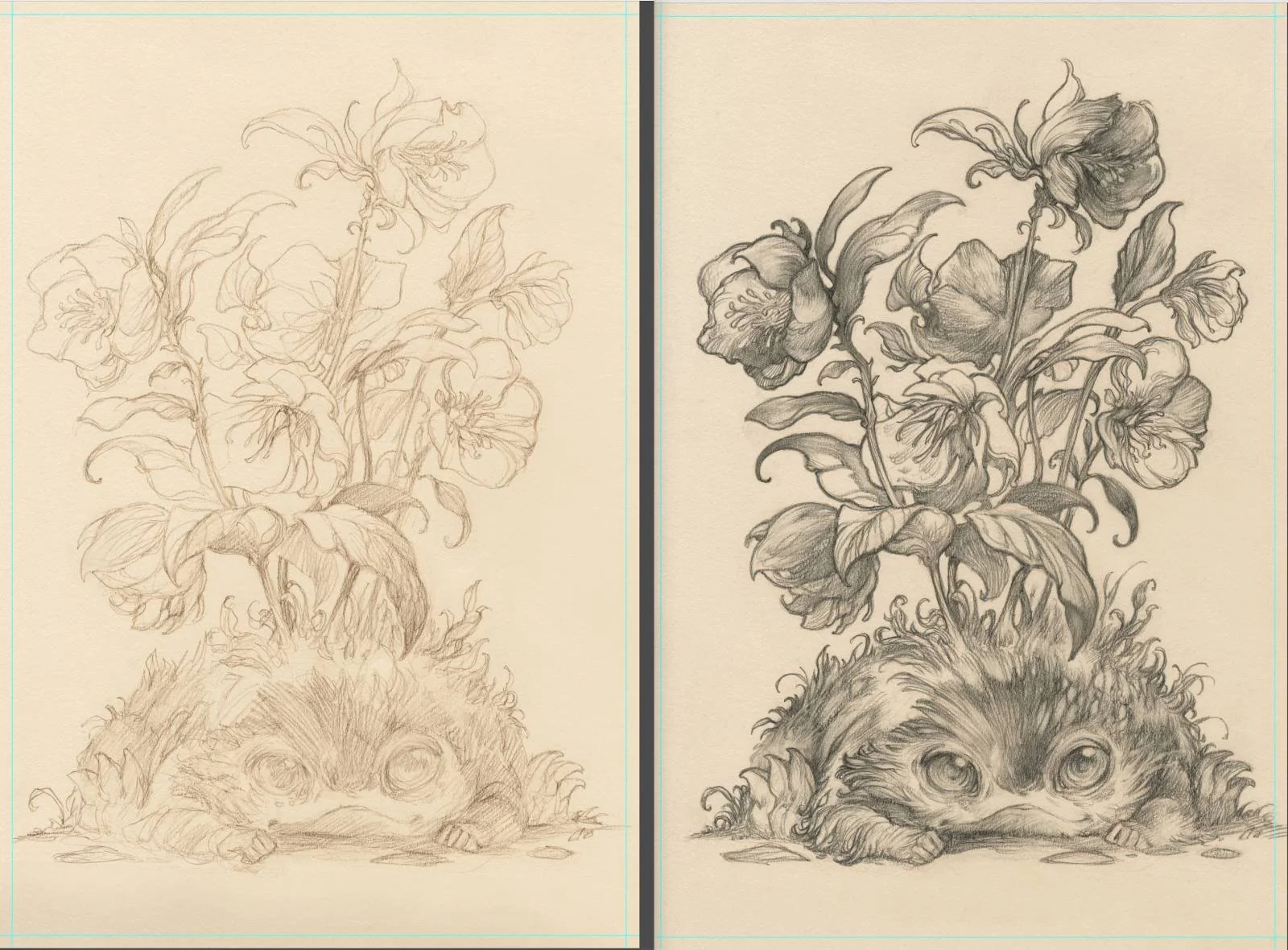
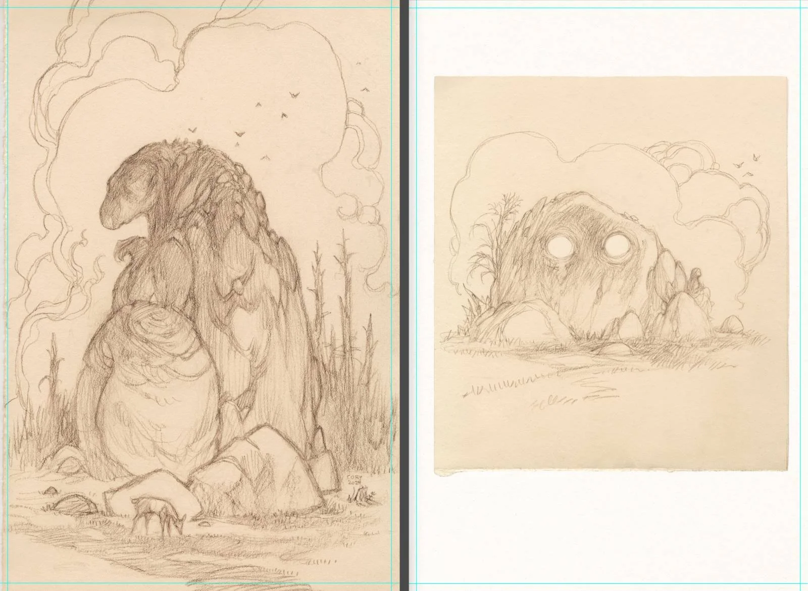

Do you have a favorite piece of art you’ve created?
In 2022, we began construction on a new studio for me. But before I packed up and moved out of my original studio, I wanted to make one last piece to sum up my time in that space. I’d been in that studio for the last 10 years and had to send it off right.
The original drawing for this one is one of the largest I’d ever attempted and based off scribbles for an idea I had back in 2015 but felt unable to fully realize, back then. It also functions as tribute to two of my illustrative heroes, John Bauer and Charles Vess.
The Idylls.
Do you have a dream project?
I love any chance I get to walk in Thra, the world of The Dark Crystal. I’ll draw my way through as often as they ask. And there are a few more stories I'd like to tell from that place.
For projects I would love to illustrate that no one has commissioned yet, I’ve got a list of dream books, of course, but The NeverEnding Story would be the first. Penguin, Penguin Random House (I think they have the US rights). I am speaking directly to you now.
And you know what, I'd get a kick doing something with Pokémon. I've been a lifelong fan and for fun, I entered the TCG art contest back in 2024. I didn't place with my Feraligatr (and trio of Totodiles), but a friend also entered and did place! And that was exciting.
And as for my own personal work, I’ve been working through a massive, sprawling fantasy story called WHENCE for quite a while now. Essentially, this is the well from which I pull most all the imagery and things for my personal work and sketchbooks. Not ready yet, but it’ll get there!


What are you reading, listening to, or looking at to fuel your work?
I’ve read with my three kids every night since they were small but now that they’re a little older we’ve been on quite a journey through a number of books. The last year or so has seen us go through The Hobbit, Mrs. Frisby and the Rats of NIMH, The Neverending Story, and The King of the Copper Mountains. Right now, we’re in the middle of The Chronicles of Narnia (currently reading The Silver Chair).
As for music, I’m often on a Joe Hisaishi kick. Some other musicians I’ve been playing a lot in the studio recently are Max Richter, R. Missing, and Hiatus. I don’t get the chance to really sit down with many movies or shows, despite how much great stuff it seems is out there. I do watch a lot of documentaries while I’m working during the day. Especially, if it’s something easy to just listen to.
If I’m winding down for a little while in the evening, two recent games I’ve replayed are Link’s Awakening on the Game Boy and Pokémon SoulSilver on the Nintendo DS. Still getting in that Nintendo time.


Finally, where can we see more of your work?
A number of places to keep up! From my portfolio site to Muddy Colors. You can also find me on these social media sites: Patreon, BlueSky, and Instagram.

Onoda Board Game Art - Visual Storytelling - Interview with Javi de Castro (Issue #74)
“There are many tragic moments in the story, I tried to reflect them with colors, shapes, and other resources. The board game follows Onoda's life chronologically, and I tried to reflect that in the cards; you can see how he ages.. “
In this board game art interview, I’m speaking to Javi de Castro, a Spanish comic artist whose rich narrative approach to board game art creates deeper thematic connections through play.
When it comes to telling stories through illustration, comic artists are second to none. Recently, I discovered Onoda, a board game based on the life of Hiro Onoda, a Japanese lieutenant who hid in the jungle for 30 years, believing WWII was still ongoing. The game artist is Javi de Castro, an illustrator and author whose own work has been nominated for both an Eisner and a Harvey, the most prestigious comic awards in the world. I was intrigued, and Javi was kind enough to join me for a chat. I hope you enjoy our conversation.
Enjoying the site? Support it by sharing the articles you liked.
For more great insights into board game art, check out the interview archive.
Thanks for joining us, Javi! Could you tell us a bit about yourself?
Thanks for having me! I'm an illustrator and comic artist from León, a small city in the northwest of Spain, and I currently live a bit further north, in Asturias. I love cinema, comics, novels, theatre, everything related to storytelling.
You’re best known for your web comics and graphic novels. Where does your inspiration for these stories come from?
Each project is different; the specific case of webcomics is peculiar. I want to do more because it is a very interesting medium to experiment with, but it is difficult to do without finances. The Eyes was a personal project. I had been stuck for a while and remembered how much I liked short tales and anthologies like The Twilight Zone or Roald Dahl's stories. I wanted to do something similar where the use of GIFs was justified. So each story is born from the use of the GIF itself.
Thanks to this project, the Principality of Asturias asked me for another webcomic where I treated historical facts. I had to document myself a lot, but I also had freedom; I could take it to my field and do what I wanted to do. I avoided doing something boring like a Wikipedia dictation.
Each graphic novel or comic has come from different inspirations, and I have always been able to allow myself to do what I wanted to do. My last published comic is for children and has also been an experiment, ‘Cosmo en el espacio’, which can be read upside down. It will be coming out in English soon.


Have you always wanted to be an artist?
For as long as I can remember, I have liked drawing. When I was a child, I discovered that the pictures in books were called illustrations and were made by an illustrator, and I knew what I wanted to be when I grew up. I was always self-taught, although I also studied illustration when I started making fanzines and webcomics. I was very clear that I wanted to work in drawing, and while there have probably been worse times, I was always stubborn.


Your art features clean lines and bold color choices. What do you love about this style?
It’s hard to say, but I love clarity, so that everything is understood. I always mention artists like Challand, Hergé, Schulz, and Mignola, but I guess an important influence was cartoons like Bruce Timm's Batman. Nowadays, I look at authors like Chris Ware, Joost Swarte, or Aude Picault.
My style emerged naturally; every time I drew, I just wanted to make cleaner lines and simpler shapes. That's what characterizes my art. It's a very useful style for some jobs and sometimes a pain for others, but it's fun to find solutions.


What is your usual process for creating art for a client?
It depends on the time I have, but I really like to document myself well, I have a good time, and I get into what I want to tell. In the case of games, I've always had to work first on the cover of the box, and that's the part I think about, sketch, and test the most. I enjoy making a beautiful object. Then I work on the cards, board, etc., and that part is more direct. Sometimes I have a phrase or an idea, and I try to reflect what it asks for; sometimes I have to be literal, and sometimes I have to look for a metaphor.
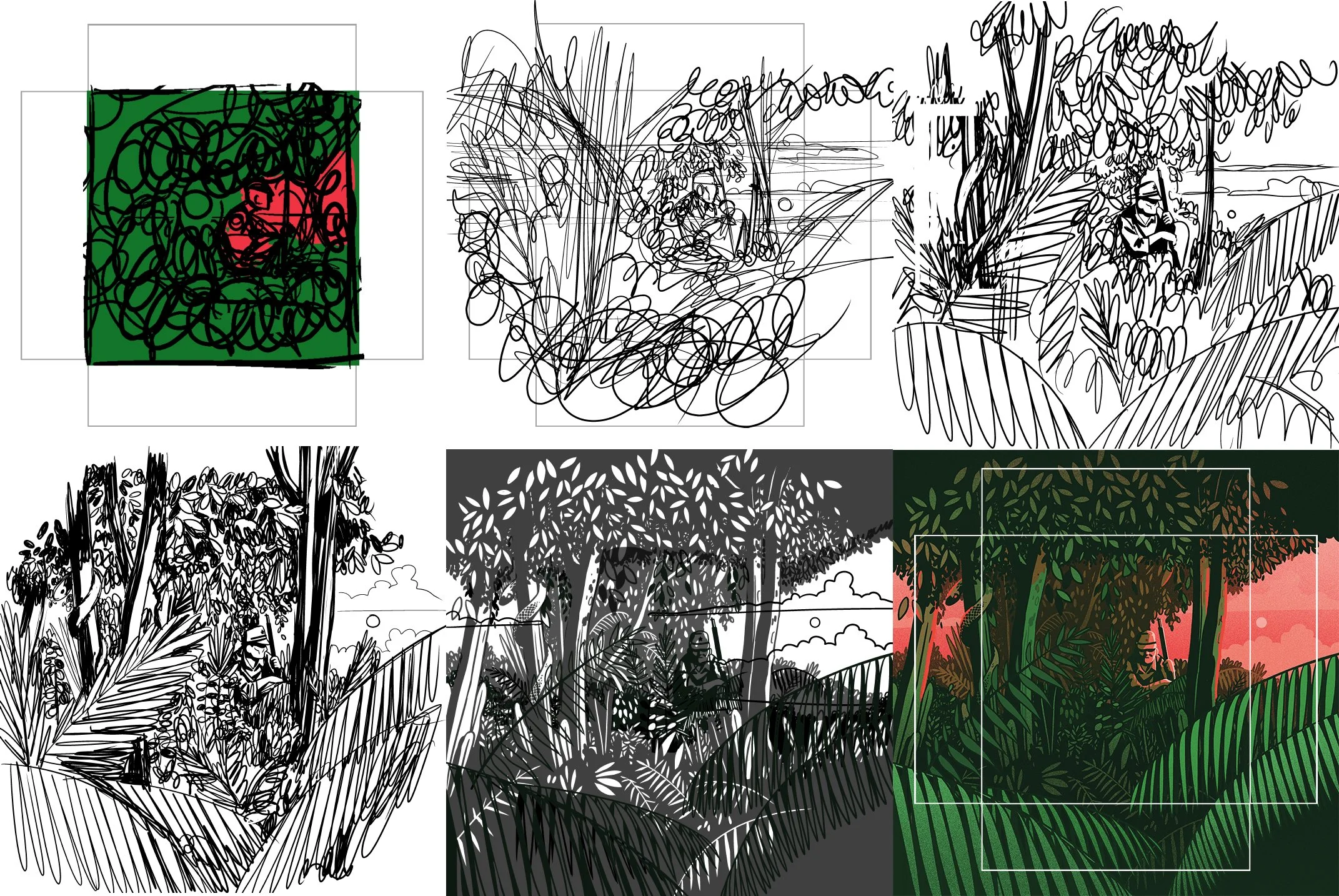
How did you first begin working in the tabletop industry?
I was contacted by Salt & Pepper Games, they had seen my work as an illustrator and they proposed me for a board game. I had never illustrated one before, and I thought it was really cool. The truth is that I don't know much about the tabletop industry. I know the publishing industry well, and for me, this is all new, so I didn't have any preconceived ideas. My work has consisted of illustrating, in that sense it doesn't change much, but it's fun to have so many formats, cards, board, tokens, of course, the box.
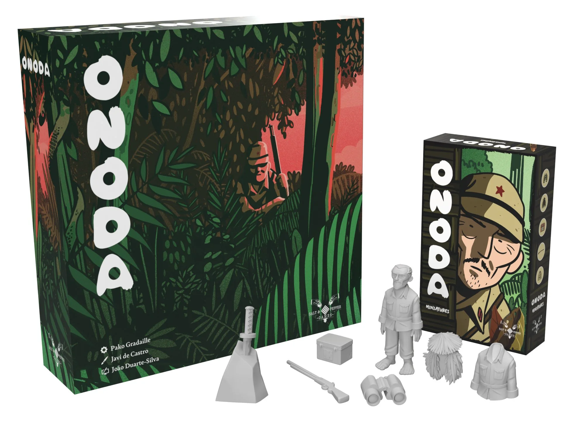


You illustrated Onoda, a board game that follows the life of Hiroo Onoda, a Japanese soldier who spent nearly 30 years holding out, believing World War II wasn’t over. What was it like to recreate this piece of history?
I knew a little bit of the story, but I read a lot about it. Herzog has an interesting book, and recently, a French movie came out. I do a lot of research and try to document myself a lot. There is a lot of information about the war, the uniforms, weapons, and such, but there is nothing about the 30 years that Onoda spent on the island. I designed Hiro Onoda as if I were making a comic, and I designed a character that would remind people of the real person.
Onoda is a controversial character. When I heard his story, I only thought of him as a survivor who spent 30 years without knowing that the war was over. But when you go deeper into the story, you realise what he did. He was an imperial soldier who stole and killed innocent people. He's like Rambo without a cause. He's no hero for me. I didn't want to portray him like that. He's no epic, just a complex man surviving on an island at all costs.


How important was staying true to the history in the art of Onoda?
Onoda allowed me to be more expressive and less literal. There are many tragic moments in the story, I tried to reflect them with colors, shapes, and other resources. The game follows Onoda's life chronologically, and I tried to reflect that in the cards; you can see how he ages. However, I invented the design of his companions and made Onoda my own in his design. I always strive to be faithful to reality, but without obsession; if something can be improved or better understood, I don't mind if it's not entirely accurate.


You’ve also illustrated another board game featuring real people, The Battle of the Divas. In what ways was this project different from Onada?
I illustrated ‘The Battle of the Divas’, which is about Maria Callas and Tebaldi, and it was a very different documentation work. There are thousands of pictures of Callas and Tebaldi's lives. With the Divas, I had to ensure they were always recognizable because they are very famous.


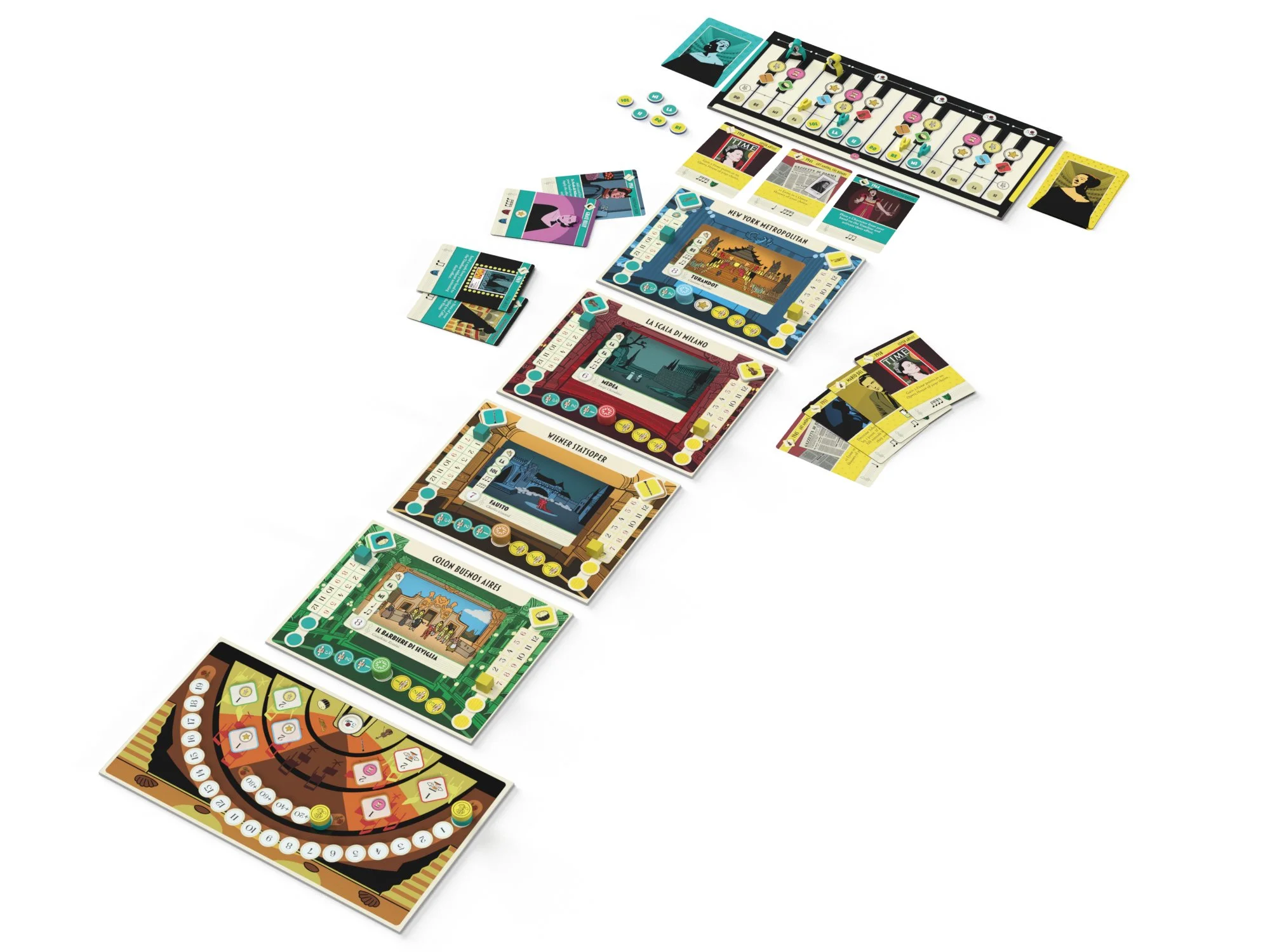
Your work has a cinematic quality. Is there a trick to illustrating scenes that feel dynamic and alive?
I love movies, but I don't know if they inspire me beyond the stories or certain shots. But I think comics are very dynamic! Much more than cinema. Because it's the eye that moves across the page, it's a much more active medium. I can't apply this to cards, sadly. But I work a lot as an illustrator too, so I guess I'm used to making single-illustration comics (that's one way of looking at it haha!) The only trick I know, is to make the viewer's eyes move where you want them to.
As a comic artist, what do you think is the key to illustrating memorable characters?
This is a difficult question to answer. I always look to create characters that are easily recognisable and charismatic. Almost always, the character takes on a life of its own. Without realizing it, I'm modifying it, and it changes; I always have to retouch the first few illustrations because they no longer resemble the character at the end of this journey.


What are you reading, listening to, or looking at to fuel your work?
Lately, I'm obsessed with the work of Antonio Hitos and Jon McNaught, I recommend any of their comics. I'm also reading all of Tove Jansson's Moomintroll strips and I'm loving them.
Finally, where can we see more of your work?
I have a website, javidecastro.com, where you can see some of my work (I have to update it), and you can also read my webcomics. You can also find me on Instagram as @javi_decastro.
Thanks to Javi de Castro and Salt & Pepper Games for providing the article images.

Gazebo Board Game Art - Function vs Personality in Abstract Games & the Rise of AI Art - Interview with A. Giroux (Issue #73)
“My background in graphic design helps me curb my desire to use all the colours, because in the end working with a limited palette is always going to be more impactful.”
In this board game art interview, I’m speaking to A. Giroux, a Canadian artist, whose work on the Gazebo and Gingham artwork brings a whimsical table presence to abstract game mechanics.
Alisha also gave a great talk on the subject of AI artwork called “The Creative Fingerprint,” which I encourage people to watch when they have the time. On a website spotlighting creatives, it should surprise absolutely no one that I’m passionately against any system that profits from others’ work without appropriate compensation and credit.
Alisha has worked with an impressive array of clients, from The Canadian Mint to Shopify, and her talents are now brightening up our board game shelves. Enjoy!
Enjoying the site? Support it by sharing the articles you liked.
For more great insights into board game art, check out the interview archive.
Gazebo board game box art
Thanks for joining us, Alisha! Could you tell us a bit about yourself?
Hello! I’m a Canadian freelance artist currently living life between the capital city of Ottawa and a small rural farm in Quebec. I spend my working days designing stuff for a variety of cool clients, and my personal time gardening, travelling, road biking, and volunteering in abandoned graveyards.

Sketches for the Primrose TTRPG Rulebook
Have you always wanted to be an artist?
Nope, but growing up, I had a strong connection with nature, and it inspired me to draw all sorts of animals and fantasy creatures from the time I could hold a pencil. This, of course, steered me towards a career in the arts. I pursued a post-secondary education in graphic design, which gave me a solid foundation in design principles, but illustration was always a self-taught endeavour, completely fuelled by a passion for wildlife.
My ‘artistic trajectory’ involved working for a design studio for about a decade, then getting a lucky break that got me into tech. There were a few golden years before a sudden mass layoff happened, and I experienced my first bout of unemployment. It disoriented me in terms of how I saw myself professionally, but in the end, I came out of it more confident and with a much healthier relationship with my work (never tie your self-worth to your employment, folks!). Now, I illustrate more than I design, and I have never been happier with my work.


What is your usual process for creating art?
First, a terrible bout of imposter syndrome must arrive and pass. There’s always this kind of panic moment when staring at a fresh blank page that I’ve come to accept as a necessary step in the process. Once I’ve combed through a few design resources, which can be anything from a book on local mushrooms to the old iSpy publications, something eventually sparks. What comes next is mood boarding, googling, and a lot of sketching by hand. I’m a keen believer in starting with pencil and paper first — it’s faster, looser, and ideas tend to tumble out much more quickly without the distraction of a digital screen.


You’ve worked with various industries, from Shopify to The Royal Canadian Mint. How do you usually land your commissions?
I do get this question a lot! And my answer is that it’s almost always been word of mouth.
The Royal Canadian Mint came about when the studio I worked for was designing coin packaging on a regular basis. I not-so-subtly let The Mint know I enjoyed illustration, and they eventually let our studio pitch a series of packaging and five 1$ coins (loonies), which we won. After that, my name was in their system, and I’ve been pitching designs ever since. To date, I have eight official coins, with over half a million minted designs circulating out there somewhere.
By Fire - Illustration
How did you start working in the board game industry?
It all started with a personal art piece called ‘By Fire’. Allplay saw it and reached out to ask if I could do a few more in that style, which were later published as playing cards Lunar. Lunar led to me being seen by Bitewing Games and working on Cat Blues and Shuffle & Swing, and more recently Gingham and Gazebo.
Working with Bitewing put me in touch with Daniel Newman, which led to the Somnia card game, as well as with Facade Games and their latest social deduction game. All of that came from putting a single, quick digital illustration online, which led to this wild, board game-oriented domino effect. Zero complaints.


Cat Blues features an array of hand-drawn cat musicians with big personalities. Where did your inspiration for the art come from?
Something I enjoy doing is creating playlists for specific projects. So for Cat Blues, I created a jazzy playlist handpicked from my grandfather’s record collection, which included some classic artists like Galt MacDermot (Coffee Cold), Ike Quebec, Horace Silver, Herbie Hancock (Cantaloupe Island), and of course Dave Brubeck (Take Five, Unsquare Dance). Catered and thematic playlists like that really help me get into the right headspace.
And if anyone is familiar with the energizing, jazzy cat scene in The Aristocats, that was a huge lightbulb moment in terms of where I wanted to take the game.
(Below is Alisha’s cat Monty, who sadly passed away the day Cat Blues launched on Kickstarter.)


Gingham and Gazebo are charming abstract games. How do you balance function with personality when working on more abstract projects?
This is a great question — It’s always a delicate balancing act. You want colour, but not too much, imagery, but you don’t want to visually overload the players, etc.. My background in graphic design helps me curb my desire to use all the colours, because in the end working with a limited palette is always going to be more impactful. A good example might be the border designs for Gazebo.
They had to have an appealing theme (bird sanctuary, flower garden), be beautiful and enticing, but not distract from the main game board, so I gave them a crisp aesthetic and limited it to three colours only, with one common colour across all four designs to tie it together.
(Fun fact, Nick and I hid a small nerdy easter egg somewhere in the Gazebo artwork. Props to anyone who finds it.)


Gazebo Board Game - Borders
Somnia is tonally very different to the other board games I’ve mentioned. Is there an allure of working on creatively varied projects?
Somnia was a ton of fun to work on! When new clients come my way looking for custom illustrations, I often ask them to pull artwork from my social media as examples of what they’re looking for. I have a few ‘styles’, mostly born of my constant experimentation. I do sometimes worry that I don’t have one solid aesthetic, but on the other hand I personally have more fun trying to flex my skills and see how far I can push something, and it’s led to some fantastic collaborations. Daniel chose my more inky experiments, and so we ran with that.
For Somnia’s theme, I didn’t pull from my own dreams so much as I pulled from weird art I grew up loving — so things like Beetlejuice or Tim Burton were a huge inspiration. I don’t think I could pull inspiration from my nightmares, unless you want a card game about missing important flights or picking up teeth.
Somnia card game. Designed by Kazuma Suzuki. Published by New Mill Industries.
I listened to your fascinating talk on AI, “The Creative Fingerprint.” Where does this technology leave artists and art appreciators?
Oof yeah, this is the sujet du jour in the art community. In its current form, genAI (text to image/video) runs on IP theft, without credit or compensation to the original artists. Unfortunately it’s sold to the public as a kind of digital magic that pulls from the ether, and many people don’t know any better. And when it comes to its ubiquity, I often compare it to other magical things like Radium, which has good, specific uses, but went through a period where it was unashamedly added to everything from sodapop to paint. Yes, I want AI to help me book a plane ticket, no I don’t want it in my dishwasher. You get the idea.
My biggest worry is the impact it could have on budding creatives. The risk is that they may no longer want to pursue a career in the arts, or worse, use genAI and atrophy skills that would have otherwise blossomed without it.
I could go on! To tie it back to our theme, those I’ve worked with in the board game community really seem to cherish and appreciate genuine creativity and ingenuity, and I hope that’s a trend that continues in the face of techbros doing what they do best.


Do you have any advice for new artists?
Something I wish I’d learned earlier was how to say ‘No’ to the projects that don’t feel like a good fit (listen to your gut on this), and ‘Yes’ to the ones that excite but scare you. The work I am happiest with to date came from saying yes to something I wasn’t sure I could pull off. Do it scared, that’s where you’ll experience the most growth.
Lunar board game. Designed by Masato Uesugi. Published by Allplay.
What are you reading, listening to, or looking at to fuel your work?
I find one of the best ways to fuel my work is to take breaks. It’s taken a lot of time (and episodes of burnout) to learn that pauses are a necessary part of the process. For me, that looks like long, pensive bike rides, trips to obscure antique shops, or game nights with friends.
I’ve also got some really great design-savvy friends to bounce ideas off of. Most recently, I was brainstorming for a board game set in the Roman Empire, which I knew very little about, but knew a friend who’d studied it in University. I was able to pick their brain and come out with a much richer approach to the project, which was far more valuable than any level of image googling.
Lastly, consuming a lot of non-design content is paramount. The more obscure hyperfixations and rabbit holes you get into, the more resources and ideas you have to mentally pull from later. So I play games, both digital and physical (currently it’s The Long Dark, Thousand Year Vampire, Into the Breach), read daily (Earth’s Children series, Southern Reach, Hyperion), and listen to a lot of podcasts (The Chernobyl Podcast about the HBO miniseries, Science Vs., Ologies).
'The Comet' Music Video Tarot Cards
Finally, where can we see more of your work?
Here you can see my portfolio and visit my online shop. You can also follow me on BlueSky and Instagram. Find my Graveyard volunteer work (and some art) under the Instagram account Grave Matters.
Lunar board game art.
Thanks to Alisha Giroux for providing the images for this article.

Parks (2nd Edition) Board Game Art - Reimagining the Hit National Parks Game - Interview with Josh Emrich (Issue #72)
“Some connect with an illustration because it captures a personal experience, others are drawn to a particular animal, and some simply love the way the sky makes them feel…”
In this board game art interview, I’m speaking to Josh Emrich, an American artist whose work on the Parks (2nd Edition) artwork gives the hit U.S. National Parks game a new look.
I first interviewed Josh back in 2018 about his work on Campy Creatures and Caper with Keymaster. Updating a well-loved game like Parks is no easy task, but I think the team has done a stellar job. I’ll leave it to Josh to tell you more about the Parks (2nd Edition) art.
Enjoying the site? Support it by sharing the articles you liked.
For more great insights into board game art, check out the interview archive.
Hi Josh, welcome back to the site! For anyone new to your work, could you tell us a bit about yourself?
I can’t believe it’s been seven years since we last spoke! Back then, I had just completed my first board game, Campy Creatures, and my design studio, Emrich Office, was primarily focused on branding for the craft beer industry.
Since then, I’ve added a few more game titles to my portfolio, but the biggest shift has been in our clientele. While we’ve retained a single craft brewing client — Bottle Logic Brewing — we’ve transitioned to building brand style guides and developing creative work for the entertainment industry.


We’ve been fortunate to collaborate with dream clients like Disney, Nickelodeon, Netflix, and TNT/TBS. Much of this growth stemmed from the storytelling ability and diverse skill set we honed through our work in both craft brewing and board games.
But to answer your question, I’m primarily a graphic designer and illustrator, though I tend to avoid strict labels because I love working across different creative disciplines. Ultimately, I love creating experiences that bring people together in the real world. I especially enjoy creating things that help people connect with themselves and with others, which is probably why board games have been such a natural fit for me.
Parks 2E - Photography by Kovray
You’re the artistic lead for Parks (Second Edition). What were your first thoughts when considering this project?
When the license for the 59 Parks artwork in the original Parks game ended, Keymaster approached me to help reimagine Parks for a new generation of players.
At first, I was hesitant — it was a massive undertaking with big shoes to fill. But as we discussed the game’s future and the creative possibilities, I became excited about the opportunity to explore the natural world in a new way. Much of my work is rooted in pop culture, so shifting my focus to the breathtaking landscapes of the National Parks was a refreshing and inspiring challenge.
Parks (Second Edition) looks stunning. How did your existing relationship with Keymaster Games help with the work?
Thank you! That really means a lot, especially coming from someone who appreciates the aesthetic details of board games.
My relationship with Keymaster Games, the publisher of Parks, goes back nearly nine years—which is a long time in the creative industry. Over that time, we’ve built a lot of trust in each other. We previously collaborated on Campy Creatures and Caper: Europe, along with other behind-the-scenes projects.
Caper Europe - Photo by Ross Connell
I’m a huge fan of the original 59 Parks artists and the artwork licensed for the first edition of Parks. Keymaster’s internal design team also played a crucial role, adapting the 59 Parks artwork and crafting the game’s overall visual language — some of which built on our work for Campy Creatures and Caper, especially in the wood grain textures and typography.
There was no way I could match their combined talents, nor would I try. Thankfully, I had an incredible team that included the original Parks developers — creative director Mattox Shuler, game designer Henry Audubon, and game producer Jen Graham-Macht — along with my co-illustrator Lisk Feng and graphic designer Seth Nickerson.
What areas for improvement did you identify when evaluating the first edition?
As much as we loved the first game, Keymaster and I wanted to offer something distinct while still honoring the beauty of the national parks and enhancing gameplay. We focused on three key opportunities. Optimizing the artwork & readability, creating a unified artistic vision, and evolving the game’s identity. Since we were starting from scratch, we could design the artwork specifically for the game and include all 63 National Parks.
Parks 2E - Photography by Kovray
Is there an advantage to using art created specifically for board games?
The original 59 Parks artwork began as 18” x 24” posters, meaning fine details and contrast were often lost when scaled down to playing cards. For the new edition, I tailored the illustrations to maintain just the right level of detail, contrast, and readability for the card format.
We also considered various lighting conditions—whether a well-lit kitchen table or a lantern-lit campsite—and improved readability by incorporating larger, crisper fonts, more distinctive icons, and brighter, high-contrast colors.


Parks 2E - Photography by Kovray
The first edition of Parks featured artwork with a wide variety of styles. Did anything in particular inspire your new approach?
For Parks (Second Edition), it was just Lisk Feng and I handling the illustrations, allowing us to create a more cohesive visual experience. I drew inspiration from three artists known for their ability to capture landscapes with striking simplicity and depth:
Eyvind Earle (an artist famous for his work on Disney’s Sleeping Beauty)—his serigraph prints capture light and shadow cascading over hills, iconic trees, and a sophisticated sense of space and color.
Gordon Mortensen—a reduction woodcut print artist whose work conveys undulating wildflowers, shifting weather, and layered depth that immerses viewers in the landscape.
Ray Morimura—a Japanese woodcut artist known for his unique perspectives and rhythmic compositions, such as lily pads dotting a pond or birds in flight.


How did reimagining the art present an opportunity to evolve Parks’ identity for the second edition?
Every game’s theme offers a distinct point of view that shapes the player’s experience and adds meaning to the mechanics — this, in turn, defines the game’s “brand.” The original Parks evoked a cozy, nostalgic feel inspired by WPA-era National Park posters, dark wood grains, and muted colors.
For the second edition, we wanted to emphasize a more modern sense of adventure, wonder, and awe in nature. To achieve this, we drew inspiration from the bold, energetic aesthetic of the 1980s and ’90s outdoor brands, which are seeing a resurgence today. This design direction is reflected in elements like the hiker, resource, and wildlife tokens, the new player mats featuring canteens and backpacks, the gear cards with modern outdoor equipment, and the topographic textures and fonts throughout the game.
Ultimately, this approach created a more cohesive and distinctive design, giving Parks a fresh aesthetic that not only enhances this edition but also sets the stage for future games in the Parks lineup.
Parks 2E - Photography by Kovray
The new edition of Parks features 63 iconic locations. What is your process when handling such a substantial list?
Like the nerds we are, my wife and creative partner, Katie, and I researched every park and compiled our findings into a massive spreadsheet. We cataloged iconic features, flora, fauna, unique seasons, and notable weather events, as well as notable activities. From there, we grouped the parks into six major categories: Deserts, Mountain West, Alaskan/Northern, Coastal, Geological Wonders, and Forests.
This approach allowed me to tackle the illustrations in manageable batches, grouping parks with similar ecosystems or features. As I worked through each batch, it became easier to ensure distinctiveness by varying the time of day, season, landscape focus, or highlighting different wildlife and human activities. The larger guiding questions I asked myself were:
What is the most iconic feature of this park, and is it the most striking example of its kind in the National Parks?
If not, what’s the next best thing, or can I depict it in a unique way?
How can I capture a sense of awe and wonder — something visitors might experience under the right conditions?


Many of the U.S. National Parks share similar geographic features. Was there consideration taken to ensure they all felt unique?
Sometimes, I feel compelled to feature an obvious landmark — like Delicate Arch in Arches or Old Faithful with bison in Yellowstone — because they’re the best-known representations of those parks, and people expect to see them. Other times, a park may be famous for a particular feature, but a more dramatic example of that feature exists elsewhere.
A good example is Wind Cave: it has the longest cave system in the U.S., and American bison roam its hills. However, Mammoth Cave and Carlsbad Caverns are visually more striking, and the largest and oldest bison herd is found in Yellowstone. Instead, I chose to depict Wind Cave’s rolling hills at sunset with an American elk, an animal I hadn’t yet featured in another park illustration.


How important was accuracy when depicting the National Parks?
Unlike many board game themes, Parks is set in real places — we can’t invent mountain ranges or alter the shape of a waterfall; everything must be grounded in reality. Ideally, we’d visit every park for firsthand reference, but that would be a costly and time-consuming endeavor (though we’d love to do it!).
Instead, we relied on reference photos — many of which are taken from the same vantage points. Often, that’s simply the only place photographers can stand without risking a fall, damaging native plants, or encountering an unfriendly bear.


The US National Parks hold a special place in the hearts of many, but do you have any personal favorites?
One of the things I’ve really enjoyed about this game is hearing which National Park illustrations resonate with people. Some connect with an illustration because it captures a personal experience, others are drawn to a particular animal, and some simply love the way the sky makes them feel.
For me, Rocky Mountain National Park holds a special place in my heart because of my Uncle Dave. He was one of my biggest supporters in becoming a professional artist—attending my art shows and buying my paintings even when they didn’t exactly go with his decor. When I moved from Indiana to Colorado after college to pursue better career opportunities, he encouraged me every step of the way.
Josh & Dave - Rocky Mountains National Park - 2005
Josh’s Uncle Dave in the Rocky Mountain National Park 2005
Eventually, when Katie and I decided to get married in Colorado, Uncle Dave came out for the wedding, fell in love with the state, and bought a house in Estes Park—right on the doorstep of RMNP. Having family nearby was incredible, and we often met up for hikes. Uncle Dave was deeply involved in RMNP, volunteering as a “Road Hog” and Hikemaster guide for the YMCA.
When my sister and her husband visited, he’d take us on epic hikes — whether summiting Longs Peak (the tallest in RMNP at 14,256 ft.) or traversing Flattop Mountain along the Continental Divide, descending by glissading down Andrews Glacier. One of my favorite experiences was snowshoeing through the park in the winter when the crowds were gone, and we could walk across frozen lakes to take in spectacular views.
Sadly, Uncle Dave passed away unexpectedly a few years ago, and working on Parks became a way to honor him. I know he would have loved it. That’s why, on the RMNP card, you’ll find a special tribute — Uncle Dave leading the way as we snowshoe across Lake Helene, beneath Flattop Mountain, Ptarmigan Point, and Notchtop.
Thank you for sharing this story with us Josh.
Josh and Dave, Snowshoeing through the Rocky Mountain National Park Artwork - Parks Second Edition
Final Card Art for the Rocky Mountain National Park card - Parks Second Edition
Last time we spoke, you were reading the Wildwood book series to your kids. What are you reading, listening to, or looking at to fuel your work at the moment?
Yes! I’m really looking forward to Laika’s stop-motion adaptation of Wildwood—hopefully later this year! Lately, I’ve been thinking a lot about how the virtual world—smartphones, social media, pornography, dating apps, video games, online betting, and AI—is shaping our mental health and ability to connect meaningfully in the real world.
As a father of teenagers now, this is especially top of mind. Jonathan Haidt’s The Anxious Generation: How the Great Rewiring of Childhood Is Causing an Epidemic of Mental Illness has profoundly reshaped how I think about my own relationship with technology. It’s a must-read for any parent looking to set healthy boundaries for their kids.
At the same time, my work relies on a deep understanding of people. Art is my primary language, but to create meaningfully, I need to see and know others on a deeper level. That’s why I’ve been reading How to Know a Person: The Art of Seeing Others Deeply and Being Deeply Seen by David Brooks.
He argues that “the act of seeing another person is profoundly creative”—a sentiment that resonates with me. How do we look someone in the eye and recognize something larger in them, and in turn, in ourselves? That’s the kind of connection I strive for in both my life and my work.
To better appreciate how cohesive the new art feels, I turned the cards into this GIF - Ross Connell
Finally, where can we see more of your work?
Keymaster and I have more games slated for release in 2026. I’m working on some fun projects for Disney Parks, but I can’t share details at this point. We continually create new label art for Bottle Logic Brewing, and each release is part of a larger story, almost like a serialized graphic novel. The best way to follow these projects is on my Instagram @emrichoffice.
Thanks to Josh Emrich for providing the images for this article and Kovray for the wonderful photography.
If you are curious to play Parks (2nd Edition) it is now available to buy, or play online at Board Game Arena.

Interstellar Adventures Board Game Art - Narrative Design and the Optimism of 1960s Science Fiction - Interview with Adrián Iglesias (Issue #71)
“If we think about the science fiction of the 1960s, we can say that its main characteristic, in terms of design and thinking about the mechanics of space travel, is optimistic naivety….”
In this board game art interview, I’m speaking to Adrián Iglesias, an Argentinian artist whose work on the Interstellar Adventures artwork combines a comic illustration style with escape room style game mechanics.
Being an escape room-style game, there’s a lot of secret stuff I can’t share, but I hope what I can share sparks your imagination. Enjoy!
Enjoying the site? Support it by sharing the articles you liked.
For more great insights into board game art, check out the interview archive.
Thanks for joining us, Adrián! Could you tell us a bit about yourself?
Hello Ross, thank you for welcoming me and giving me a place in this space. A little about me, I was born in Argentina, in the south of the country, where I graduated in fine arts at the National University of La Plata.
My love for drawing and comics has been a constant in my life since childhood. Even before I learned to write, I was creating simple comic strips based on the animated shows I enjoyed, like Mazinger Z, He-Man, and Space Ghost. These were my initial forays into graphic storytelling.

After completing my education, I took on a few conventional jobs until I decided to pursue my true passion. I left everything behind and, along with some friends, started a comic publishing company. Thankfully, that leap of faith paid off: I landed my first steady role as a comic artist for a series about hackers and spent four years teaching comics at a private multimedia art school. For over fifteen years now, I have been working as a freelance illustrator and comic artist.

You’ve illustrated Interstellar Adventures, a new escape room-style sci-fi board game on Kickstarter. Can you tell us a little about it?
When Harriet contacted me, she mentioned three words that instantly piqued my interest: retro science fiction. As a fan of science fiction, especially the nostalgic variety I enjoyed as a child, I felt a spark of excitement. I realized there was an entire universe of board games related to this theme that I had yet to discover.
With a whole sci-fi world to create, where did you start?
We started working on the design of the characters and the illustrated cards. But little by little the project unfolded before my eyes as something new. It has a richness in the gameplay that I hadn't seen before. Screens to launch missiles, cards that change by overlaying other cards, secret messages, and puzzles that form new paths for the characters. Every detail is thought out. It is a lot of fun to illustrate, and I can't wait to make it a reality and play it.


How did you look to illustrate a world that feels specific to another era?
If we think about the science fiction of the 1960s, we can say that its main characteristic, in terms of design and thinking about the mechanics of space travel, is optimistic naivety. These were stories that took place in space before mankind had ever set foot in space, so there were thousands of fundamental details that were unknown and that later complicated the idea of space exploration. Yes, it was known that it was necessary to wear a space suit. Just contrast the designs of Terrore nello Spazio with Alien.
Keeping this concept in focus, I created the suits and items featured in the game. To complete the project's visual identity, I drew inspiration from 1960s comics. This is reflected in a restricted color scheme, the incorporation of halftones, and a texture reminiscent of offset printing and paper.
This combination of naive design and limiting the vast arsenal of digital tools, I think, is what gives a retro look to the project.

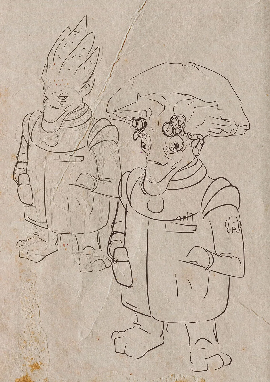
As a comic artist, what do you think is the key to illustrating memorable characters?
That's the key question, isn't it? In my view, one of the most crucial elements in comics and graphic storytelling is the performance. The drawing style, or how the artist depicts reality, offers an almost limitless variety and is heavily influenced by personal preference. I tend to favor synthesis and exaggeration in my drawings. Additionally, character design plays a significant role; creating characters that are instantly recognizable and have distinctive shapes greatly enhances the initial visual impact. However, all of this loses its effect if the characters fail to convey the emotions that the story aims to express when they interact within the two-dimensional world we've crafted for them.

Real-world escape rooms are very kinetic spaces. How did you look to breathe life into the inanimate objects and environments of Interstellar Adventures?
Everything is in function of telling a story and conveying the tone and message of a scene. Of course, this manipulation of shapes and colors must go unnoticed by the reader, and therein lies the skill of the artist. For example, the palette turns to warm tones (reds) if the scene has action and danger. Conversely, it leans towards cool colors (blues) if we need to convey calm, pause, and tranquillity. Something similar happens with lighting. It is manipulated to guide the viewer's eye over the drawing.
We know that we see the areas of highest contrast first, and that is where we put the most important things. The dimensions of the eyes, mouth, and even hands of the characters change based on the emotional requirements of each scene. When it comes to set design, it becomes a character in its own right.
For Interstellar, I envisioned the crew alongside their designated spaces within the ship simultaneously. This means that each crew member's personality is reflected in the set, and the set influences their character as well. A great example of this is Eugine, the robot engineer. His design is quite basic, evoking the look of early 20th-century submarine suits, which aligns with the aesthetic of the engineering section.


The sci-fi genre has a rich history in creative arts. Did anything inspire your work on Interstellar Adventures?
Undoubtedly, my gateway to science fiction was Star Trek, the original series and as such it left an inescapable mark on my imagination. Although I'm also a big fan of cyberpunk, works like Blade Runner, Akira, Neuromancer, Ghost in the Shell, I discarded that whole branch of the genre as the underlying tone doesn't match the spirit of Interstellar Adventures.
To the Star Trek imaginary was added the low-budget science fiction films I used to watch on Sunday afternoons at my grandparents' house: The Day the Earth Stood Still (1951 film), Terrore nello spazio (1965), Forbidden Planet (1956), Invasion of the Body Snatchers (1956), among many others.


Were there any challenges in illustrating an escape room-style board game?
Absolutely, it’s an exhilarating journey! I’ve never embarked on anything quite like this before. Initially, Harriet and I focused on character design, an area I’m quite familiar with and have tackled many times. Once we nailed that down, we shifted our attention to the cards. Although I had never illustrated anything of this nature, I found it easy to visualize each card as a panel in a comic book, which made the process feel even more thrilling.
Then came the box design, which was truly a highlight. Harriet proposed a brilliant concept: to style the packaging like an old television set. This required me to carefully consider the box layout and how each side would contribute to a cohesive concept.

What captivates me the most are the puzzles within the game—paths that shift in the player's hands, crystals that materialize, monsters lurking in enigmatic caverns, and numbers concealed in unexpected places. The gameplay of Interstellar Adventures is extensive and diverse, and I’m eager to dive in and witness how all the intricate elements we’ve crafted will come together to create this captivating adventure.


What are you reading, listening to, or looking at to fuel your work?
I find it fascinating to learn about the art, books, comics, music, films, and literature people gravitate towards, as it offers a glimpse into what fuels their creative spark. It's truly another window into the artist's world.
Currently, I'm rewatching Star Trek, with episodes from ‘The Next Generation,’ ‘Deep Space 9’, ‘Voyager,’ or ‘Enterprise’ perpetually playing on my second screen while I work in my studio. My go-to entertainment choices outside of work are detective stories, whether in the form of series like Columbo, Sherlock, Murder She Wrote, or Miss Marple or novels featuring Cormoran Strike. A particular favorite is the iteration of Dr Who starring Matt Smith alongside Karen Gillan.
For a comic book artist, reading comics is something that, apart from being very enjoyable, is almost obligatory. You always learn from studying the great artists of the medium. Now, I'm following two collections: Angel Wings and Conan, The Cimmerian. I always manage to have Argentinean comics at hand to keep up to date with new releases like Almer, Jobs, Nathaniel Fox; and anything drawn by Eduardo Risso, Mandrafina, and Alcatena. To finish this review, I could mention the literary sagas I've read lately: Liu Cixin's Remembrance of Earth's Past; The Witcher, Patrick Rothfuss's incomplete trilogy; and the one I'm currently reading, Brandon Sanderson's Born of the Mist.
Finally, where can we see more of your work?
Thanks for the question! Searching for 'santaplix' on any search engine will lead you to my social media profiles, where I share drawings, glimpses into my creative process, and geeky content. However, for a comprehensive and organized collection of my work, please visit my website at www.santaplix.site. This is where I showcase my creations: comics, stories, illustrations, and ongoing projects. While most of my content is in Spanish, there's a dedicated section featuring English translations of my comics.
Find out more about Interstellar Adventures, the escape room board game from Minty Noodles, by visiting its Kickstarter page.
All images provided by Adrián Iglesias and Minty Noodles.