
Eternal Decks Board Game Art - Merging Ancient and Modern - Interview with Mujunsha Inc (Issue #78)
In this board game art interview, I’m speaking to Shinmei Yamamoto, a creative based in Japan. ETERNAL DECKS is their first board game art project and, in my eyes, a complete triumph. From the box to the game board, it is stylish, cohesive, and stunning on the table.
Eternal Decks is a cooperative card game that features a satisfying gameplay loop that constantly evolves. This is a game for fans of logic puzzles, and so readability is incredibly important across the table. Thankfully, the cards are not only colorful and clear, but packed with personality.
After playing the game for the first time, I was so impressed that I contacted the creative team behind it as soon as I got home. Shinmei Yamamoto joins me to share an in-depth look into their unique approach to creating art - enjoy!
p.s. A big thank you to No Pun Included for lending me their copy of Eternal Decks to photograph for this article.
Enjoying the site? Consider supporting it by sharing the articles you read.
For more great insights into board game art, check out the interview archive.
Thank you for joining us, Shinmei. Could you tell us a bit about yourself?
My name is Shinmei Yamamoto, and I’m the founder of MUJUNSHA Inc., a creative company based in Shibuya, Tokyo. We specialize in advertising, with graphic design at the core—from concept development to production.
In advertising, we’re expected to constantly read the shifts in lifestyle, values, and public sentiment to deliver communication that fits the times. I’ve also found myself increasingly drawn not only to the new but also to the old. In my personal time, I collect antiques, retro games, stickers, and posters—things that fascinated me as a child.
I also work as a part-time lecturer at Tokyo Zokei University, a fine arts university in Japan, where I teach once a week to support and mentor the next generation of young designers.
Rebranding for Yoshoku Kuronfune-tei, a Western-style restaurant founded in the Meiji era, located in Ueno, Tokyo.
As a mentor, what advice would you offer new designers?
This year, I am teaching a “Visual Communication” class to third-year students. The course mainly focuses on advertising production and branding. In my classes, students are given assignments, engage in group discussions, review their production processes, and receive critiques on their final outputs – all in a practical, hands-on format.
The main advice I always give is that design is built upon two wheels: “ideas” and “craft.” It is essential to identify early on which of these you are stronger at. Of course, there are designers who can stand out with their outstanding technical skills alone. However, I believe that combining both ideas and craft leads to the highest level of quality. Developing your own methods for generating ideas is, in fact, one of the most important skills.
To do this, it is vital to learn basic skills and rules, but above all, to live your life with an awareness as a designer. When you walk through the city, there are countless hints hidden around you – shapes, colors, typography, textures, people’s movements, how things are arranged. For example, the font on an old signboard, the texture of a building’s paint, the way people line up in queues, how spoons are placed on tables. Things that may seem trivial can become seeds for new ideas.
Another crucial aspect is the ability to think about “people’s feelings.” In Japan, there is a unique cultural concept called “reading the air,” which refers to understanding the atmosphere, a person’s expressions, or gestures, and acting accordingly, even if nothing is explicitly said. This is similar to advertising: simply shouting a product’s superiority rarely resonates with people. More sophisticated and subtle communication is required.
In ETERNAL DECKS, there is a special piece called the “Communication Disc,” which players use to express their intentions. This was an idea by the game designer, HIROKEN, and I believe this kind of consideration is a reflection of a uniquely Japanese sensibility.
Have you always wanted to work as a creative?
Yes. Since I was in elementary school, I loved drawing, inventing characters, and creating stories—often making comics of my own. Naturally, I went on to study graphic design at an art university. After graduating, I started my career at a design production company and later spent about 20 years working as an art director in the creative departments of international advertising agencies.
Many of the projects at such agencies are large-scale and team-based, often bound by strict brand guidelines. Over time, I began to feel a certain distance from my personal creativity. As a counterbalance, I’ve continued to pursue more personal creative expression through illustration, comics, and other solo projects.
Can you describe MUJUNSHA Inc. to us? What is your design philosophy?
MUJUNSHA was established in 2019. The name “mujun” means contradiction or paradox in Japanese, and it reflects our belief that original creative value can emerge when differing perspectives or ideas are allowed to coexist.
Our creative process always begins with contradiction. We find value in generating visual tension by bringing together seemingly conflicting elements—for example, using a casual tone to approach a formal or serious theme. We aim to attract attention through these unexpected combinations.
Our logo is based on a regular heptagon (a seven-sided polygon). Interestingly, a perfect heptagon with all sides equal in length cannot actually exist in strict geometry. That contradiction—something impossible that still forms a symbol—is exactly why we chose it as our emblem.
As for our design philosophy, we always keep in mind the idea of the “human era.” Everything is created by humans, viewed by humans, and used by humans. That’s why we believe people must be at the center of every process.
How did you get involved with ETERNAL DECKS?
The game designer of ETERNAL DECKS, HIROKEN, is actually my younger brother. He had worked with other designers on previous titles, but when he began developing this one, he reached out to me to collaborate from the early concept stage. I’ve always enjoyed retro digital games like the Famicom, but I had very little experience with analog games like board games.
When I first saw the paper prototype—filled with rows of numbers—I could tell the game mechanics were intriguing, but I intuitively felt it would be more compelling to tell the story visually through illustrations. Perhaps because I wasn’t familiar with traditional board game conventions, I was able to approach the visual design more freely and take a slightly different direction.
ETERNAL DECKS is a puzzle game at its heart. How do you approach storytelling for abstract creations?
Creating a story is a lot like excavation. The famous Japanese sculptor Unkei once said that carving a Buddha statue was like "releasing it from the stone." This reflects the idea that the figure already exists within the material—and the sculptor’s role is to uncover it.
In ETERNAL DECKS, we began by digging into elements already embedded in the game system—such as the cycle of exchanging decks, characters that hold a bundle of cards and activate under certain conditions, or the multi-stage game structure. From these, we unearthed key themes like "cycle" and "eternity," which eventually became the title: ETERNAL DECKS.
Next, we asked ourselves, “Why are the players doing what they’re doing?” That led us to the core narrative: the players are explorers investigating the mystery of humanity’s shortening lifespan. The story has them confront the truth of life itself. The theme of eternal life is a universal question that has fascinated humanity from ancient times to today. By rooting the gameplay in a theme that speaks to a deep human instinct, we gave the act of playing a sense of purpose.
Assigning meaning to each element and gradually building the narrative layer by layer is a method I’ve refined through years of work in advertising. There, you're often asked to deliver a product’s unique selling point (USP) to a specific target. Sometimes the answer is already set, and the only question is how to convey it—like solving a puzzle with one piece missing. Storytelling for this game followed a similar structure.
ETERNAL DECKS has a stunning box cover, featuring numerous fantastical characters. Can you explain how this was designed?
When we started the project, I first looked at many board game boxes to understand the common visual language of the medium. While I recognized the standard conventions, we wanted to take a slightly different path. Our goal was to create a game that could be loved for years—not something fleeting.
Board games typically spend more time on a shelf than in active play. With that in mind, we wanted the box to feel like an art object—something you'd want to display. Practical information like age range, play time, and player count was moved to the back. With input from HIROKEN, the game designer, we kept the front as minimal as possible and focused entirely on delivering a visual that encapsulates the world.
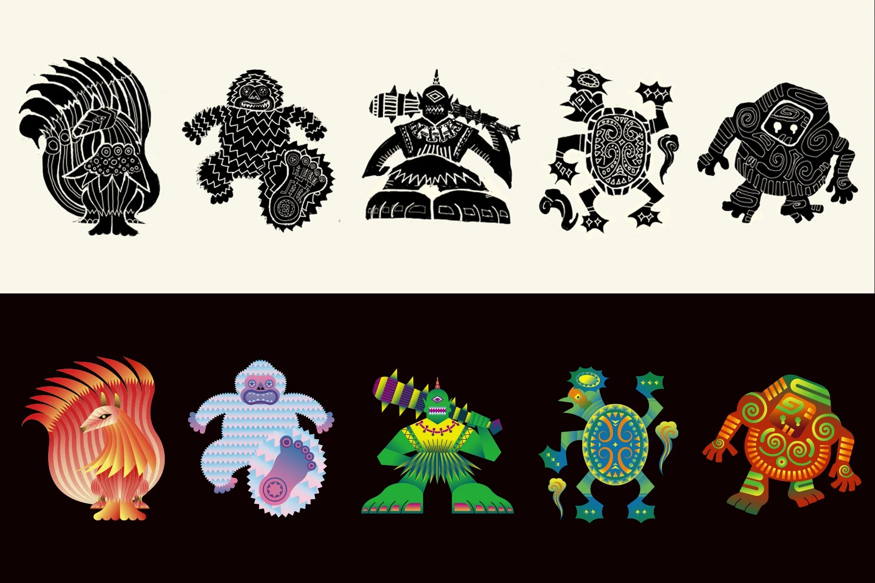
The color palette is limited, and the front showcases the Eternals—beings sealed within the game’s universe. Opening the box is meant to feel like breaking that seal. To enhance this, we designed the inside manual using the same layout as the cover—but this time, revealing the characters in full color.
This design approach reflects ideas I developed in advertising—such as creating strong first impressions and crafting a meaningful unboxing experience. The goal was for players to feel like the doorway to a new world opened the moment they lifted the lid.
As your first board game project, what did you learn through making ETERNAL DECKS?
In many ways, it felt similar to other creative projects. But one of the joys of this project was being involved from the very beginning—setting the tone, color palette, and shape language. That upstream involvement made it feel more like a personal work than a client project.
The game board uses black as its base color. At the beginning, the board feels calm and quiet. But as the game progresses and colorful cards are played, the board transforms into a vibrant, life-filled space. This visual shift, from black to a flood of color, provides players with a striking post-play experience—one they often want to photograph and remember.
One of the most fulfilling aspects of the project was taking something ancient and making it feel contemporary. ETERNAL DECKS is built on the theme of “eternal cycles.” Characters rooted in myth reappear in modern form. It was about resolving the contradiction between “ancient” and “modern” through design—something that resonates with the meaning of our studio name, MUJUNSHA, which means “paradox.”
One particular detail I obsessed over was the lettering. I custom-designed each letter in the game title so that the typography would harmonize with the artwork and fully reflect the game's visual language. The goal was for the text and imagery to function together as one unified world.
Did playtesting change the art, and in what way?
Balancing the immersive worldbuilding with smooth gameplay was one of our biggest challenges. For example, we went through many revisions of icon and number sizes within the limited space of the cards.
As a result of playtesting, some characters—the Eternals—were either replaced or removed because they didn't fit the game balance. In other cases, character color schemes were revised to better match the deck colors. We paid close attention to how the art and game system could reinforce each other, especially in terms of color design.


Interestingly, sometimes we adjusted the rules after finalizing a character’s illustration. We went back and forth between game mechanics and visual elements many times. That process helped the two sides complement one another and ultimately led to a more polished, unified product.
Since international release was part of our plan from the beginning, we made sure to emphasize non-verbal communication. We minimized text where possible and used iconography to express information visually. For instance, while Japan uses “O” and “X” for yes/no, we switched to checkmarks and Xs for global audiences.
We also addressed accessibility by adding unique symbols to each card color, ensuring colorblind players could still navigate the game smoothly.
What do you think are the most crucial elements of creating great graphic design?
At Mujunsha, we work across a wide range of media, not only in two-dimensional graphics such as logos and posters, but also in video, events, and websites. Regardless of the project, one common approach is to always start by creating a single “key visual.” This is a core graphic that condenses the concept into its purest form, conveying what we want to express in the simplest and clearest way possible.
All graphic design consists of “copy (words)” and “visuals (imagery).” By using visuals effectively, it becomes possible to reduce the amount of text while communicating feelings and meanings more quickly. Emoji, for example, are a Japanese-born culture that conveys emotions like joy or sadness instantly – a great example of visual efficiency.
ETERNAL DECKS - Operational rules for design
Another important aspect is not to produce things in an ad-hoc way, but to first create “operational rules (guidelines).” In ETERNAL DECKS, several of our designers were involved, so we established visual guidelines that defined colors, typefaces, tones, and other elements to ensure consistency. This made it possible for anyone to join midway through the project while maintaining a uniform quality, and we paid close attention to how this information was shared.
However, it is just as important not to become “bound too tightly” by these rules. This may sound a bit contradictory – which is quite fitting for a company named Mujunsha (“Contradiction Inc.”) – but while rules form the foundation, sometimes boldly breaking them leads to new discoveries and expressions. I believe that this balance between rules and freedom is at the core of great graphic design.
What are you reading, listening to, or looking at to fuel your work?
My inspiration comes from “things shaped by human hands,” regardless of era or genre. I enjoy viewing everything on equal footing—from renowned artworks in museums to old candy packaging or collectible stickers found in retro stores—without ranking them in terms of value, and simply seeking what resonates with me.
For example, the wave pattern used on the green token in ETERNAL DECKS was inspired by a detail from Red and White Plum Blossoms, a National Treasure of Japan painted by Ogata Kōrin in the Edo period. Each token in the game represents a different emotion, and the green one symbolizes “harmony.” I felt the imagery of waves flowing between red and white plum trees perfectly captured that concept.
On the other hand, the upgraded cards in the game use holographic foil inspired by Bikkuriman stickers—a massive craze among Japanese children in the 1980s. The “Eternals” in the game emerge from a sealed state into vivid color, expressing their awakening. This transformation from shadow to light represents the return of life. To reinforce that symbolism, we used seven-color holographic foil to give the visuals a vibrant, life-filled glow.
ETERNAL DECKS cards and game token design
Are there any other non-gaming projects you’d like to highlight?
I would like to introduce one of our projects called “WOOD CHANGE.” This was a commission from the Forestry Agency of Japan. The project communicates the benefits of integrating wood into daily life through various approaches, including videos featuring original wooden dolls that tell stories, and workshops where participants can experience woodworking firsthand.


Finally, where can we see more of your work?
You can find more of our work through the following:
Website: https://www.mujunsha.com
Instagram: https://www.instagram.com/mujunsha_inc
We’re planning to host an exhibition in Tokyo later this year or early next year, featuring artwork from ETERNAL DECKS. We’ll announce details on Instagram, so we’d be grateful if you followed us there.