

Chronicles of Crime Board Game Art - Interview with Matijos Gebreselassie (Issue #57)
The art director should be in charge of the final stitching of art components so they come together as one. You try to avoid the effect of a Frankenstein being put together from lots of different elements. It doesn't mean that only your art style goes on top of the last edit, it could be anyone's from the team, it's just a matter of keeping it all consistent at the end.
Welcome to Issue 57 in my series sharing the stories behind board game art. I first noticed Matijo’s great work on Dinosaur Tea Party before discovering he’d worked on Chronicles of Crime, a board game I’d supported on Kickstarter. I knew I wanted to find out more about his particular style and of course his photo realistic work on Chronicles of Crime. Enjoy!
For more great insights into board game art, be sure to check out the interview archive.
Hi Matijos, thanks for joining me! For our readers who aren't aware of your work could you tell us a bit about yourself and what you do?
Hi Ross, thank you for reaching out to me. Yes, I always wonder where to start with introducing myself- I'm a Pole, mulatto with Ethiopian Roots that was born in Sankt Petersburg, Russia. It usually works on job interviews as from the start everyone is curious about the combination.
I got my education in Poland and lived there from my early years. I've always been very passionate about drawing and expressing myself through illustrations. With the right mix of my other loves, cinematography and comics, I guess I figured out a characteristic art style for myself; cartoony and atmospheric with heavy outline. I also started experimenting with bringing my artwork to life and that led me to graduate from Polish National Film School in Łódź.
NetEnt character from Lost Relics game
This was a great place that gave me the skills to execute animation in a professional way. While still studying I moved to the capital city and started working on animated movies, then later on, mobile games. Then I traveled to Kraków and that happened to create many opportunities for me. As an Art Director there I guided teams and was creating slot games. But by night I continued on delivering freelance passion projects - like board games.
Right now, I'm quite fresh after a relocation to Malta where I continue to work on slot games, this time with some additions in game design along with the art.
Gandalf Set - Vikings Gone Wild
So how did you first get involved in making board games?
While moving to Krakow I was already in contact with Lucky Duck Games. Everything started with that company. Earlier I saw an ad that they were looking for a supportive artist for their new title Master of Elements, an expansion of the successful ‘Vikings Gone Wild’. I was attracted by the fantasy theme and cartoony art style that this game had and I knew it wouldn't be a problem for me to deliver something similar after hours. I drew a couple of cards for a start but soon the Kickstarter campaign turned out to be such a huge hit that fans started reaching almost every stretch goal planned within a day or even a few hours. New artwork for cards was needed to be done extremely quickly in order to update the campaign. It was a very pleasant time full of challenges and late night emails: 'We need 3 more!'.


When the dust has settled the CEO and Founder of Lucky Duck Games, Vincent Vergonejeanne invited me to the office with an offer of a wider collaboration. He showed me the prototype of Chronicles of Crime invented by David Cicurel with only placeholders on a print. Everything was yet to be filled with proper art and I was absolutely blown away by the whole gameplay concept and innovation.
Once again full artistic freedom was given to me by Vince with lots of trust and professionalism. In my previous experience that wasn't very common. So board games with LDG became my true passion!
Chronicles of Crime - photo taken by More Games Please
Your work spans quite a number of fields, from animation, film, concept and game art. How do you think this experience changes how you approach each new project? What key lessons do you think you've learned that you can apply throughout your work?
At the beginning I tried to grab almost every job opportunity in the industry there was. As they joke:
“So why do you want this job?”
”Well, I've always been passionate about not starving to death, sir”
Personal artwork
My girlfriend at the time, now wife, supported me all the way in order to stay focused and on track no matter the obstacles. So I was always doing art. Art in different forms that each time brought me joy. My goal is to use cinematic eye wherever I can, to leave a characteristic mark on everything I do. Now I've got this privilege to get involved in new projects only because I'd like to, not because of necessity and board games are a perfect example of this.
I realized that in every job I have I use the same skill set package that is learned once. No matter if it's VFX for the film, costume or scenery design for a theater, mobile, slot or board game. It's always sketching, storyboards, polishing in different art styles and animating. Each field somehow needs to use those tools.
I loved to work on my own but as an Art Director I guess I've learned to focus on teamwork more and I like the different chemistry that it brings. Everyone learns from each other and push projects forward at a pace that you'd never achieve on your own.
Sketch art for Dino Tea Party
I first came across your work in ‘Dinosaur Tea Party’. It’s characters are larger than life, so how did you create them?
Thank you, glad to hear that. At first I was given the theme and a core idea: 'Let's imagine dinosaurs wearing Downton Abbey clothes having a tea party'. With my character design I aimed for something family friendly and witty. I suggested my take on a single outlined sketch, it depicted a dino wearing a bow-tie, a hat and a monocle holding a bubble pipe. Then Restoration Games were kind enough to leave the entire art approach to me afterwards.
I was provided with a list of Dinosaurs names, not species types, actual names like Betty or Bob, which were gathered in Excel. This list contained visual characteristics required for the game play, assets like hats, glasses, flowers, patterns on the skin etc. Then I did some research on the different dinosaurs looks for inspiration. In the end some of them are based on real species, but with some mix of features as my imagination dictated. I just tried not to repeat myself visually. For the polishing part I used a technique in Photoshop that was new to me at the time, grey-scale maps. It was worth taking a shot at using it, as it's an extremely time saving technique, good for tight deadlines and it helped to keep everything consistent in style.


You mentioned you’ve learned to change how you work now that you’re an art director. What do you think are some of the most important aspects of this role?
To me it would be overall vision of the entire project and consistent art guidance towards the final product, plus creating a friendly atmosphere for the team because only then you can outperform the project in every aspect. For a long time in my artistic education I was very self-centered and tried to be self-sufficient in everything I did. The role of an art director (AD) opened different doors for my workflow model.
Chronicles of Crime - Draft box cover
The first thing is to know your team members; their strong fields of profession, even their attitudes toward different tasks. Only then you can assign the right one and control the development. The second very important aspect for me is the final composition. The AD should be in charge of the final stitching of art components so they come together as one. You should try to avoid the effect of a Frankenstein being put together from lots of different elements. It doesn't mean that only your art style goes on top of the last edit, it could be anyone's from the team, it's just a matter of keeping it all consistent at the end.


Chronicles of Crime ties it's narrative into real locations. How do you go about creating these art assets with the real world in mind?
At the beginning of the project I just needed to find the right style. I started with the character design of our victims/suspects cards, where with the studio we've chosen black comic book outline and a slight exaggeration of some features as a guideline for the entire game. It's actually something in which I feel the most comfortable.
Then I aimed in translating this to the location cards and 360 VR panoramas, which was a bit different because this time I wasn't designing from my imagination. The locations are based on the real London districts so I needed to stick to the right look. I began with photo research, and I created a library of references. Sometimes it takes half an hour, but with more complex views it may even take a couple of days.
Chronicles of Crime - VR scenery
Then comes the most engaging and important part of the entire process, compositing photos together. After this there's a time for the outline, which basically does major part in compositing because it blends everything nicely. Then a couple of Photoshop filters and lots of brush over-painting, that simplifies the shadings and gradients which gets away from the realistic feel and brings in more of an illustrated effect. The best part is this last stage where you already see everything in its place and the only aspect left is playing with the light, rim lights, reflections and gentle touches of brush stroke.
I learned this technique at the beginning of my freelance path where I was designing Hidden Object Games using photobashing.
Chronicles of Crime Location - Camden Town
Photobashing is the technique of combining photographs or images, using painting and editing to create larger pictures. Although it's a common technique in digital art some have accused it as being "cheating". What would you say to people with this opinion and how does photobashing help illustrators work?
Photobashing is for sure an excellent technique for concept art and the mood board stage. In many fields in the industry it helps artists deliver multiple high quality illustrations in a short time. It works similarly to story boarding in a sense, in that it clarifies visually where you’re aiming with the style and overall look. But when doing your final renderings it's of course all about being smart and having in mind intellectual rights, with heavy editing a must. This means cuts and edits, with strong over-painting that will change the basic look. It's just another technique you can reach for if you decide to achieve a photo realistic effect, it goes along with over-painting 3D models and pasting photo textures which is absolutely fine with me. If you manage to do it right, you can have unique and fresh visuals out of pre-made materials.
Chronicles of Crime Location - Soho
You mention looking to leave a charismatic mark on everything you do, so in a practical sense how do you approach each piece of art to ensure you do this?
When working on different projects that vary from each other I want to find the right technique that supports the core vision and a story, but my relatives always mention that they can spot my style in everything I do, so I guess I'm not that elastic after all and fail with each trial!
Of course, cartoon looks and black lines comes naturally as I sketch at the beginning of everything. Even when I decide to skip the outline in polishing I usually go for very strong rim lights (that does almost the same job but with opposite, bright colors) and that was the case of Dinosaur Tea Party made for Restoration Games for instance.


But aside from the technique, I guess I always go for a certain look of a human or monster body that is taken from the pop culture that I value. I push with a specific character design that I developed naturally through my learning process. So it doesn't matter if it's a scary and realistic horror project (concepts for a theme park attraction with VR technology) or concepts for more friendly Fireball Island board game - you'll always find my way of drawing muscles, eyes or hands. Even, or only, those small details.
How do you keep the balance between your work as a freelancer? Do you have any advice?
Actually I don't think I keep the balance at all. I should be the last person to give advice on that matter, but if I have to:
”Kids, if you'd like to follow my footsteps I suggest unhealthy little amount of sleep, late chocolate snacks and a good playlist in your ears”.
Night is perfect for art challenges, it's like winning an extra day.

The Bridgevale Train Company Conductor
What are some non-game related creations (books, music, movies, etc) that you’re currently enjoying?
I'll refer to something that I enjoy listening to while working on my projects. My playlist is always very strange because it mixes Rammstein with Vivaldi and Max Richter, but as a polish, patriotic move I'll recommend to all amazing bands like Bass Astral x Igo and Kwiat Jabłoni. I also look for interviews with writers and people of cinema, recently the Hollywood Reporter gave nice insight releasing on Youtube 'the Roundtable', a series of discussion panels. I think that cinema is something that I’ve had in my blood from birth, but while working I limit myself to audio only. I think almost every stand-up on Netflix I've got checked as 'watched'.
Screen from music video for Bass Astral x Igo and Sistars
Finally, if we’d like to see more of you and your work, where can we find you?
Feel free to check my Instagram where I usually post more often. Then there is my ArtStation account where I try to keep my work organized.
(All images supplied by Matijos Gebreselassie)
If you’re new to the site, why not stick around a while? There are interviews with some of the best artists in the industry and if you’d like to read more you can them by heading over to the Interview Archive!

Magda Markowska: Art in Board Games #56
To tell you the truth, when I started to work as an artist I decided to learn from the absolute basics. I spent almost the whole year, at least one hour each day, just learning anatomy from tutorials on the internet or books…
Welcome to Issue 56 in my series sharing the stories behind board game art.
Conventions are an amazing place to discover new board games. Walking the floor of Essen Spiel, I saw a small boxed game whose art made a big impression on me. As soon as I returned home to the UK, I found the artist, Magda, and reached out to discover more about her work. Enjoy!
For more great insights into board game art, be sure to check out the interview archive.
Hi Magda, thanks for joining me! For our readers who aren't aware of your work could you tell us a bit about yourself and what you do?
Hi, Ross! I'm really happy to have this opportunity to speak with you. I started working as an illustrator and then also as a concept artist somewhere around 2008, so that would be almost for 10 years now. I work on board games, animations, advertising, applications.
I always wanted to be an artist but at that time and place (Poland in the '90s), I thought that this kind of dream would be completely beyond my reach. Also, my parents were against it. So I abandoned that plan, and instead, I went to a school that was chosen by them. Drawing was more like a hobby. Mostly I illustrated novels written by my younger sister, made sketches of animals or created designs for characters in our roleplaying game campaigns.
And then, one day, when I was still in high school, I went to the cinema instead of taking classes. I was the only person in the cinema hall and the movie they showed was "Spirited Away". (I didn't hear about someone like Hayao Miyazaki at the time - whose films are now one of my greatest inspirations). That movie reminded me that I had always wanted and still wanted to illustrate such stories. That I wanted to work as an artist. Time passed, but I only got more determined. I learned everything on my own: anatomy, color theory, composition, etc. or software (like Photoshop or Flash). Thanks to this at some point something that was only a hobby was finally my job. Later, I started working in an animation studio in my hometown. And now I'm a freelancer.
Apart from art, I still love pen and paper RPGs, board games, samurai movies, and anime. I'm also very interested in anthropology, history and animal behaviorism.
You're part of a small collective called All Blue Studio, how do you think small studios help artists such as yourself and what are you hoping to achieve with the project?
As I mentioned before, even as children, we created stories along with my sister. She wrote scripts and I made illustrations. Our first serious project as All Blue Studio - which was 'The Thief of Wishes' an interactive book for kids - was something that we always wanted to create together. The fact that my fiancé, who is a developer, also joined in, allowed us to finish this as family and friends. We were very lucky that our skills are so compatible and perfect for this project. Of course, it was still a complex process and there were plenty of other difficulties.
At first, we had the ambition to create something much more advanced. But unfortunately, we did not have all the necessary resources to do it, only our own skills and will. It is not easy to sit down after a hard day of work (or simply on a day off) and continue working. But we have learned a lot during this project - also about our own limitations and how to cooperate with each other. It was extremely satisfying to see 'The Thief of Wishes' in AppStore and we are so incredibly happy that now we can work on another app.
So how did you first get involved in making board games?
I always wanted to illustrate board games, because this is also one of my hobbies. (We have an entire wardrobe filled with games). So when the opportunity came, I was very happy. The first project I made was a game for the Polish Customs Office. It was an educational game that's supposed to teach the players about the dangers of smuggling of animals and plants. After this, I started to work on a more commercial game with the title “3 Wishes”. Strawberry Studio contacted me and asked if I could create illustrations for the cards and the box cover. I received a list with phrases that described wishes and I was allowed to interpret them freely. I had a lot of fun with it. I decided that the more devious the wishes would be, the more interesting result we will get. Just like as the wishes were fulfilled by some malicious genie. After that, I cooperated with Strawberry Studio also on other games.


Much of your work has a very painterly style full of beautiful textures. As a self-taught artist, how did you develop your style and what kinds of resources did you use to help you?
Thank you, Ross. That was very kind of you. To tell you the truth, when I started to work as an artist I decided to learn from the absolute basics. I spent almost the whole year, at least one hour each day, just learning anatomy (drawing each muscle and bone) from tutorials on the internet or books (like Classic Human Anatomy by Valerie L. Winslow and Figure Drawing for All It's Worth by Andrew Loomis). I also bought and read every book recommended by other artists whom I admire. At some point, I decided to try workshops and lectures (like CGMasterAcademy, Schoolism) and lately, I’ve discovered Gumroad.
I think that my style has evolved thanks to all of those sources. Previously I just focused on gathering knowledge and at some point, then I noticed I started to use a very particular colour pallet, or techniques, or brushes. Another thing is, I often spend a lot of time on one project (a few months or more). After some time of using a specific technique or style, I’m getting tired of it, and I try to do something completely new during the new project. (Just to learn more, see what I can change or do differently.)


What is your creative process when working on a board game? Can you talk us through it?
After I learn about a general idea, I always try to understand gameplay (or even test it) and see if I can suggest some solutions that can benefit a game designer. For example, what symbols or illustrations we can add or how to put text on cards to make it more “player friendly”. It is something that we can call “user experience”, but only on the level of my competence as an artist.
Other than that, I gather as many references as possible. For example, if a game has a historical or anthropological theme (which are favorites of mine), I try to learn more about a topic to which game is referring. Once, when I worked on puzzles about old Slavic, I went to a historical fortification (which also happens to be a museum) and spoke with an archaeologist who worked there. I also always attempt to collect books, go to art galleries or other places which are inspirational to me or simply aid understanding the game.
After that, I try to create the game universe in my head. Conceptualize things such as: who are heroes, (if a game has them), what they are doing, what will make this universe more realistic. As far as that point, I also focus on things like lights and colours which should be used to get the desired effect – they help me to select the best style for the specific project. I often create the colour pallet at the same time as conceptual sketches.
Your character illustrations are filled with personality, so what do you think are some key things an artist should try to include to create memorable characters?
In the art book of the Tangled, Glen Keane mentioned that Ollie Johnston (who mentored him) was always wanting the idea, "What [are they] thinking," to be considered. I always try to remember this. As I mentioned before, from my childhood I created stories with my sister. Her characters give an impression that they are real people and not just random heroes from books or RPG scenarios. So, I think that I’ve learned a lot about storytelling from her.
From a more technical perspective, the book which was the greatest help to me when it came to expressions was and continues to be The Artist's Complete Guide to Facial Expression by Gary Faigin. I have really learned a lot from it. It made clear to me how to correctly emphasize a wide range of emotions by just using three correctly drawn lines.
When it comes to drawing animals, I think simple observations taught me the most. As a child, we had various animals at home. I’m also a huge fan of documentaries about animals (and shorts about cats or dogs on YouTube). I observe them for a very long period of time (especially birds). Instead of sketching (because otherwise, I would focus mainly on a drawing), I try to just spend some time noting their behavior and personalities. In their eyes, there is always such an incredible curiosity about the world around them (or at least I interpret it that way as a human). So for example, when I create personified animals, I try to use observations combined with the knowledge I have about human expressions.


Are there any projects that you're working on at the moment you're able to tell us about?
As the end of 2018 and the first quarter of 2019 were overwhelming with work for me, I'm trying to take fewer client jobs now. The last Christmas I was involved in a very interesting project that was made for Samsung. My work was to design and prepare characters to an animated part of a commercial. You can see the results here.
Also, two games are coming out - this year, I think - that I illustrated for Strawberry Studio. Unfortunately, I can't share any of my other client works until they will be made public - probably in fall 2019. At this particular moment, the only thing I'm working on now is an application for kids. It's going to be a charming book about sheep in which the reader becomes the main character.
Along with my team, we are also developing another application, but it's still in a very early phase.


Do you have any advice for anyone trying to get into the industry or find work as a professional illustrator and concept artist?
I think I wouldn't enjoy working on board games that much if I didn't like them myself. Knowing this industry means knowing some gameplay nuances you need to take into account when designing illustrations. Because I play board games myself, I know which elements can draw the attention of the player more, and which ones don't have to be so detailed (as they will be covered with icons and other information).
So my main advice is to play boardgames yourself to better understand players' expectations, read some reviews on game orientated websites and meet their authors. It's also worth visiting some conventions (I love the mood of SPIEL in Essen!). This way you'll be able to learn about the market or meet the game designers in person and exchange contact info. In my opinion, without a dose of personal commitment, it's hard to start working in this industry.


What are some non-game related creations (books, music, movies, etc) that you’re currently enjoying?
I finally found some time to play the Unravel (such a beautiful game!), and now I'm listening to the soundtrack from it. Surprisingly it also slots perfectly as background music when you draw fields with sheep (my current project). And I just can't wait to start the second part of this game!
As for the reading lately, I've been enjoying the Book of Barely Imagined Beings: A 21st Century Bestiary by Caspar Henderson and it's absolutely fascinating.


Finally, if we’d like to see more of you and your work, where can we find you?
You can check my portfolio on Behance, and I’m also on Facebook and Instagram.
My project with All Blue Studio can be found here and the latest information about us is here.
All artwork copyright of Magda Markowska.
If you’re new to the site, why not stick around a while? There are interviews with some of the best artists in the industry and if you’d like to read more you can them by heading over to the Interview Archive!

Sarah Keele: Art in Board Games #55
The Salem witch trials was a dark time in American history and there were a lot of innocent victims, self righteous individuals and perpetrators. Lots of death, fear, lies and betrayal…
Welcome to Issue 55 in my series sharing the stories behind board game art.
I first spotted Sarah’s art through her work on the Dark Cities Series by Facade Games, which I supported on Kickstarter. Seeing the complexity and quality of the art grow as the series continued inspired me to have this conversation. I hope you enjoy it!
For more great insights into board game art, be sure to check out the interview archive.
Hi Sarah, thanks for joining me! For our readers who aren't aware of your work could you tell us a bit about yourself and what you do?
Hi Ross! Thanks for having me. First off I want to say, this is a really cool thing you are doing here. There are a lot of talented and amazing individuals you’ve brought together, and I’m really honored that you’ve invited me to answer your questions and be a part of this community.
Now, a little about me, I’m a member of the Church of Jesus Christ of Latter Day Saints (that drives a lot of my life and how and why I do the things I do) and I live in the great state of Utah in a cute little 1950’s home (with a sporadic layout and lots of add-ons) with my husband, Josh and two little daughters, Juliet and Sivenna. I don’t have a day job, so I work exclusively on my freelance work which consists of games, custom portraits, book covers and magazine illustrations as of late. When I’m not doing freelance work or spending time with my family, I’m learning how to cook something new, gardening, contemplating our next renovation designs, collecting coins, or working on my graphic novel, GreenThumb.
So how did you first get involved in making board games?
My first board game, well card game, was Salem 1692 by Facade Games, but back then they weren’t Facade Games yet, they were just Travis and Holly Hancock, and they were fellow college students at Brigham Young University. I had never met them but they were looking for an artist for their first game so they posted a listing on the illustration job board. I saw the listing and I remember getting excited about it thinking it was fun, but then seriously debating on if it was a good idea to embark on such a project as a student.
At the time it sounded like a lot of work. And at the time for me it was. I was a student and things were already so busy, but again, it looked like it would be a lot of fun, so I did a sketch of Ann Putnam, sent it off, and they loved it. That sketch is now on the cover of the rule book but the character ended up being Mary Warren. I don’t think anyone could have predicted how much Salem would take off! Travis and Holly only imagined their friends and family playing it and supporting them. They had the funding goal of $6000 on Kickstarter, so when it reached $100k we were all absolutely blown away.
With hindsight, I think the tabletop game industry was in the beginnings of a boom with a subtle rebellion against screen time and with new crowdfunding platforms readily available to shift how new game designers could now get themselves published. Salem hit a nerve in the market. I see it being a big stroke of luck. From there Travis and Holly took advantage of the success and quickly got started on Tortuga 1667 and officially created Facade Games, which was another raging success from what our expectations were and now Deadwood 1876 yet again exceeded our expectations. They keep thinking it’s a fluke. And maybe it still is, but now they have loyal supporters and people who want everything they do. I think I’ll keep going with it.


In what way do you think your education prepared you for industry work and looking back how did you feel less prepared when starting?
It’s funny you ask this because going into the tabletop industry was not something I ever could have anticipated. My training was for doing visual development for video games and/or film. I don’t think any of my teachers even entertained the idea “oh you could do board games.” I don’t think they were against it or anything, it’s just more popular to dream of working for Pixar or Blizzard or even doing children's books and editorial work. Those industry’s seemed more “prestigious” maybe? Perhaps that’s not the best word. At the very least they are very structured and the path to success in a lot of those industries is clearly mapped out with lots of resources. There didn’t seem to be as easy access into finding out what industry standards were for the board game industry back when I first started or I just didn’t know where to find them. I think this site alone would have been a fantastic resource for someone like I was starting out.
I think maybe the Hancock’s struggled as far as what would be our standard as a business relationship between designer and illustrator. We learned a lot together, and now I think we have figured out a system that works for us. I feel like they trust me to do my best work and because of that every game I’ve done since Salem has felt like “mine” and I’ve got to push myself artistically a little bit more each time.


When it came to working on Salem 1692, how did the subject matter, the witch trials of this time, guide or affect the way you illustrated the characters themselves?
I did make a conscious effort to make all the characters moody. The Salem witch trials was a dark time in American history and there were a lot of innocent victims, self-righteous individuals and perpetrators. Lots of death, fear, lies and betrayal. Mary Warren (the first one I did, and the one I actually initially envisioned as Ann Putnam) was a perpetrator. She’s the one who started the witch hunt. When drawing her I wanted her character to feel ominous. Drawing her also set the tone for the rest of the art in the game.
Is the art and everything completely historically accurate? No, Not even close! While I did loosely reference images of individuals we were including in the game, those references were also another artists representation of what the actual individuals may have looked like. As there are no photos of that time period there was a lot of freedom for me to put my own twists into how these characters.. er.. people may have looked. I did have a few I kept close to their portraits, like character William Phipps for example.
I’m not sure whether the Hancock’s or I ever articulated this to each other, but for me the goal was not to be historically accurate. It was rather to simulate, to the best of our ability, the mood we wanted the players to feel while playing the game so that people could have fun and enjoy the game. The bios included in the rule book are the most accurate part.
I can imagine the first game presented plenty of challenges, both with time management and through the learning curve of the project. As you started on the follow-up Tortuga 1667, what did you look to do differently?
With Tortuga I was no longer a student, so I was ready to put my full and undivided attention into the game. Seeing the success Salem had, I knew I needed to step up my game. With Salem, I’ll be honest, I see a lot of flaws in my drawing skills in the art due to a combination of things like a lack of experience, feeling rushed, being a student and not being very good at managing my own time.
I was still familiarizing myself with digital painting programs like Photoshop, which is partly why the colors are so muted (aside from purposefully trying to keep things moody), things like that. It was no ones fault and it was the best I could do back then. With Tortuga though, I felt the urge to really push myself. and again I had quite a bit of freedom to just go for it in terms of taking charge of the direction for the style of the art. Plus, I had the time to do it. So I took my time and put a lot of love into those characters.


The latest game in the series, Deadwood 1876 features some of your most detailed work yet, with the characters giving off not only a sense of era but also a presence too. How did you look to bring more energy into these illustrations and what are some ways an artist can make their work seem more alive?
In Tortuga I put a lot of research into the 1667 pirate era and spent much of that time learning about what the characters should look like, but I kept the backgrounds fairly minimal. For Deadwood, I decided to put as much effort as I could into the backgrounds as I did the characters. So, for example you have the Saloon bar behind Kitty Leroy. In Tortuga I also kept characters in similar or simple poses only showing above the torso. For Deadwood, I made a point to make them look more natural and reveal enough of their body to get a feel for what their poses were, what they maybe were doing and where they were. The character, Al Swearengen for example was a pretty sleazy guy, so I have him doing the classic greasy hair swipe. He was one that did not have readily available old photos to refer to so with my artistic license I gave him big dark/villainous buggy eyes, inspired by actor Richard Harmon.
One of the more tricky ones for me to depict was Reverend Smith. If you notice in all the other deadwood characters, there’s not too much variety in the facial expressions (this might even be something I’ll try to better at on the next game I do for Facade Games). However, with Reverend Smith, I really wanted him to look like he really believed in what he was saying, and I wanted to feel like I could hear the tone of his voice as he was speaking, so I referenced preaching pastors from videos and paused them on frames where I liked the pose. I also gave him glasses to hint at the fact that maybe he studies the small words printed on pages of the bible often and wears out his eyes. His is mouth open and wide mid sentence and hands up passionately.
To really give a character life and light, it really helps to use references. Videos help me find new poses that I might not have thought of otherwise, plus it’s natural. For Poker Alice, I imagined her being fidgety during a bluff. She’s a definite gambler, but if she loses this round, (even though she looks like she’s winning now) she might be in really big trouble. She keeps her poker face up though, and is always fashionable. You just find ways to personalize them and give them subtle dimensions. Sometimes those things are big and obvious like a certain pose or expression, but sometimes they are little details like a pocket watch, or a pair of reading glasses. Those details make an impact.
Now as far as making a game look really good, it’s not just about the character, there’s a lot that can go into the supporting cards as well. I had loads of fun with those too and it gives me lots of practice drawing things that aren’t human.
When it comes to illustrating inanimate objects, what are some of the challenges in keeping these items interesting and engaging?
There are a few things you can do to make an inanimate object interesting or give it life. Depending on the style or feeling you are trying to evoke with your work whether it be humorous, moody, calm, etc, you can give your design a bounce to it by pushing the shapes and proportions and avoiding complete symmetry and equal repetition. Color is another powerful tool to evoke mood. One thing I had in mind as I drew the item/action cards for facade games was the pose of the objects or things.
I drew the bucket of water in Tortuga with the bucket tilted and pouring water out as if actively putting out a fire as it’s action was intended for the game rather than resting stagnant. In the Deadwood, the Cash card has a big messy pile of money as if someone threw or stuffed it in the safe in haste with some falling out because the door has just been opened and those bills no longer had a support. I could go on. All the art in the game should enhance the story behind it even if it’s not noticed at first. Players will feel it even if they can’t explain why when the art has been done well. Supporting cards are not usually in the spotlight like character cards are, but they are equally vital to creating a world players can get lost in.
How have you grown and developed your skills as an illustrator during the time you've worked on these games?
I’m always looking at other illustrators artwork, especially those whose skills proceed my own. I’m also looking specifically at the art of other table top games. Since, as I’ve said, there didn’t seem to be a whole lot of resources when I first started as to what makes a good game art design for board games, I’ve had a bit of trial and error. However, if you are a new illustrator looking to make your mark in the board game industry, it doesn’t hurt to always be honing in on your skills.
There are endless resources on how to improve drawing and painting skills. I went to college for my education but I know plenty who didn’t and are still doing great as artists/illustrators whether in the all encompassing entertainment industry or not. The first key to success as an illustrator in any platform is to make good art. Make good art and good things will come. The Second key though is just as vital. Make your work seen. If no one sees how great you are, then all your hard work is for naught. Sometimes this means getting out of your comfort zone and reaching out to people and doing more than just waiting for someone to find you.
Do you have any other projects underway, or coming up that you’d like (or are able) to tell us about?
I have a few that are still secret at this time, one of them is the next Dark City game from Facade Games! Ah! Then I have my ongoing Custom Character Cards on my Etsy shop where I do custom portraits of people (or pets/animals) in the style of one of the 3 Dark City games and print it on a character card so players can play themselves. (Examples attached include Façade Games creators Travis and Holly Hancock, repeat customer Jason Smith with his family and the fantastic Pirate Enthusiast and pirate game reviewer JW Cornelius of Pirate's Parley Gaming).


I did a book cover for upcoming author Cami Murdock Jensen, whose book is titled First Earth, the first in The Arch Mage Series about a girl who survived an explosion as a baby and grows up a burn victim before being catapulted into another world full of magic and demons where she gets treated a little differently than what she’s used to.
I recently did the cover for a children’s magazine called The Friend for the May 2019 issue. I grew up reading this magazine so it was very special that I’ve been able to do work for them.
I was also pleased to participate in a podcast with Artifice starring Emily Merrell who is launching our conversation sometime in June where we discuss creativity and how many different forms of creative careers overlap in experiences and challenges more info:
I’m always working on my comic GreenThumb when I have a minute, but I still have a long ways to go on it. I was taught however to always have a personal side project to work on for dry spells in freelancing.
Man, I'm seriously sooooo excited about all of these!
What are some non-game related creations (books, music, movies, etc) that you’re currently enjoying?
Resources: Will Terry’s Youtube channel. He talks about the basics and goes into depth about the business side of illustrating. He doesn’t go into the business side of board game art, but he does talk about negotiating and dealing with clients who are so savvy at speaking the lingo of artists. I have found his knowledge and experience to be helpful to me.
Color and Light by James Gurney is always a great book to have in your repertoire. Schoolism is a great resource for those with a little bit of money they are willing to invest in themselves with. Some of the schoolism teachers have youtube channels with great educational videos or interviews with leading industry artists.
There’s also always the good old fashion, find someone who you think you can learn something from and reach out to them and ask them if you can ask them some questions. Seriously, there are so many things!
Finally, if we’d like to see more of you and your work, where can we find you?
I have my main website that I’m still building on, and of course you can find me on Instagram, Facebook, Etsy, Pinterest, Artstation and even Deviant Art.
I also will be sending out email newsletters for those who might be interested in that.
All artwork copyright of artwork Sarah Keele. Photography property of More Games Please.
If you’re new to the site, why not stick around a while? There are interviews with some of the best artists in the industry and if you’d like to read more you can them by heading over to the Interview Archive!

Feudum - Justin Schultz and Mark Swanson: Art in Board Games #54
When Mark and I discussed the art style, Mark had a very specific vision in mind, which can be a double-edged sword! A lot of people struggle with vision and don't know what they want (or don't want) until they see it. Mark knew exactly what he wanted…
Welcome to Issue 54 in my series sharing the stories behind board game art.
Feudum caught my eye back in 2017 when its campaign on Kickstarter launched to huge success. You voted it into your Top 10 Best board game art of 2018, and since then it had another very successful run on KS for the Rudders and Ramparts. I’ve long been a fan of the art, so this conversation was overdue. I hope you enjoy learning more about the series.
Check out the interview archive for more great insights into board game art.
Today I'm being joined by Mark Swanson and Justin Schultz, designer and illustrator on Feudum. Thanks for joining me! For our readers who aren't aware of your work, could you tell us a bit about yourselves and what you do?
Mark: Great to be here, Ross. I guess you could say I’m a toymaker, living in the suburbs in a small town named Columbia, Missouri. To me, tabletop games are toys—albeit advanced toys that stimulate your mind. I also have a side gig as a Professor teaching strategic communication at the Missouri School of Journalism.
Justin: Hello Ross! I'm an artist living in Jackson, Mississippi. I work at an advertising agency during the day as a Sr. Art Digital Art Director and illustrate/design posters (and now, board games!) in the evenings.


How did you two first start working together? Can you remember those first few conversations?
Mark: This is going to sound a bit far-fetched, but it’s 100% true. I walked into an Ice Cream shop called “Sparky’s” and saw a poster for a band on the wall (some examples of these are above). It featured a giant monster traversing the countryside, and I immediately thought… “that has to be my artist!” When I found Justin’s email on the internet, I wrote a long and rambling email asking him to consider working on game art. To my surprise, he wrote back.
Justin: Yeah! Like Mark said, he sent me an email with something like "a guy with a dream" as the email title. I was like "oh great, here we go!" haha - just assuming it was another request for some free work for "exposure." But it really ended up being this thoughtful, heartfelt email about Mark's dream of creating a tabletop game. To an artist/designer, it sounded like a real dream project! Mark seemed very intelligent, creative, passionate and honest - so I was intrigued to say the least!
Marks Handmade Prototype - Feudum
Mark’s Daughter playtesting Feudum
Alright, elevator pitch time, what is Feudum and what makes it so special?
Mark: I had been playing Eurostyle (or German Board Games as they used to be called) for nearly 15 years. I immersed myself in the creations of Knizia, Teuber, Wallace and Seyfarth thinking that I’d find the holy grail of games! One with a working economy, with depth, with a wide open-world with multiple paths to victory. I couldn’t find what I was envisioning! So, I invented Feudum.
Justin: One thing that makes Feudum unique (design-wise) is the cohesion of the icons/graphics with the game itself. When researching tabletop games I was always baffled by the icons being completely detached from the rest of the design. Harsh outer glow effects and dark drop shadows on vector icons that were obviously designed without taking the original artwork into account. I suppose it was the result an illustrator not putting much thought into leaving "blank" areas for icons to live, and icon designers wanting to make sure their elements stood out - but to me, the end result looked like this mish-mash of design. Nothing felt like one complete, cohesive project - so one of my main goals artistically was to make sure Feudum felt like a timeless "artifact." Mark and I agreed that using iconography that was language independent was also important.


Let's talk for a moment about the world you've built with Feudum. Where did the initial idea for the theme come from and how did you decide on the visual style you ended up creating?
Mark: I discovered Eurostyle games in the late 90s and became a quick fan of legends like Reiner Knizia, Klaus Teuber, Martin Wallace and Andreas Seyfarth. However, I was not satisfied. I kept envisioning the holy grail of games. One that was an open-world sandbox. One where you could eke out your medieval existence. One that featured a working, cyclical economy. I couldn’t find it, so I invented it! Many games influenced Feudum including the multiple roles in Puerto Rico, the action programming of Maharaja, the area control of El Grande, the resource gathering of Settlers of Catan. But, I knew I needed a unique mechanic that I could call my own. That’s when Feudum’s economic ecosystem was born! Once the mechanics were in place, I knew I needed striking art! I’ve always loved Expressionism with its thick black lines, etchings and muted color schemes. (French Expressionist painter Bernard Buffet in particular). This is probably why I like Alexandre Roche (Artist for the game Troyes), and of course, why i like my artist/illustrator Justin Schultz!
The very first image Justin sent Mark - Feudum
The second image Justin sent Mark - Feudum
Final Knight with colour - Feudum
Justin: When Mark and I discussed the art style, Mark had a very specific vision in mind, which can be a double-edged sword! A lot of people struggle with vision and don't know what they want (or don't want) until they see it. Mark knew exactly what he wanted, which may seem a little constrictive creatively, but he was always very open to my input and ideas. Plus, I really loved the world he had created and his feedback always improved my illustrations (as much as I hate to admit it, haha). Mark is also a pretty great artist in his own right! He had the board all laid out and the characters mostly concepted, so really I just had to "re-skin" his designs. I like to joke I can only draw about 25% better than Mark, which is how I got the gig! He also inundated me with hundreds (and hundreds, no kidding) of reference images! At one point, I asked him to narrow the references to maybe five-ish images per topic - which he agreed to - but then would be like "well... here's 20 more images that I think really help show what I'm trying to convey". When we were at SXSW recently, we went through a lot of the old images/references and laughed about the whole process. It was such a beast of a job, but definitely one I could not be more proud of.
Early full game board - Feudum
Early map planning - Feudum
The board is a huge part of any tabletop game, both in the sense of its presence but also in connecting players to the world and Feudums does a great job of selling the theme. How long did it take to create this board and how did it change during the initial projects development?
Mark: I started thinking about the archetypal medieval roles (farmer, merchant, alchemist, knight, noble and monk) and the symbiotic relationships one might have with the other. I drew a large circle on piece of poster board to plot everything out. (I still have this, actually). The original map I drew evolved a little over time as did the vessel routes. I was inspired by the length of the Shogun (based on Wallenstein) board and how it gave everyone ample space for their personal playmats! Originally the Guilds, Military Service Track and Epic Voyage Track were detached from the board.
Early Map Art - Feudum
After a year of playtesting this in this detached manner, I figured out a visually efficient way to combine everything. Playtesting with my friends was critical to its evolution! My friend Dan inspired the Tax action while my friend Andy inspired the individual vessel routes. I like that there are two games happening at once. Players must think about playing their dutiful role in the guilds, while minding the empires they are building on the map. I’m most proud of the integration between these two elements.
Game board final design - Feudum
Justin: This was all Mark! Like I was saying earlier, he had a very clear vision of what he wanted, I just tried not to mess it up! There were definitely a few iterations along the way, but the bulk of the board remained the same (by the time I was included in the process).


Rudders and Ramparts is now your third Feudum Kickstarter, so what do you think this process has taught you about game design and about crowdfunding in general?
Mark: I never planned on launching three Feudum-related Kickstarter campaigns! It all happened organically. Midway through the first campaign, people began insisting that I create a solo variant—so The Queen’s Army was born. Then, midway through that campaign, one of my fans emailed me to show me some 3D components he designed. I asked if we could bring my artist into the mix to improve upon his design, and suddenly, Rudders & Ramparts was born! I’ve learned to be flexible, listen to fans and seize opportunities when they present themselves. Feudum’s worldwide success took me by surprise! The epic theme and mechanics of the game captivated people from many cultures. The game is offered in German, French, English, Spanish, Italian, Chinese, Russian, Portuguese, Dutch, Polish and Korean! Needless to say, building relationships with localization partners around the world is very rewarding…and time consuming. There are lots of stakeholders I must satisfy including distributors, retailers and customers. I never want to let anyone down!
Justin: Like Mark said, I've learned to be open, be more flexible. He's such a good listener and really takes the fans requests seriously. I've tried to be more like him and just go more with the flow as of late. In the beginning, it was challenging, but by RaR, I've realized it's just part of the process!
Feudum with Rudders and Ramparts expansion - photography by Anthony Jinson
The new expansion Rudders and Ramparts just funded on Kickstarter, congratulations! How do you think it expands and improves the base game?
Mark: Artist and miniatures painter Bruce Monson partnered with 3D sculptor Scott Ryan to create custom, fan-made Feudum vessels and castles. I was so enamored with their work, that we began to discuss how my artist, Justin Schultz might be able to put add Feudum’s signature art style to the pieces. After the pieces were born, I was inspired to create a combat variant of the game to capture both form and function. Because the base game features enough complexity, all Feudum expansions, including Rudders and Ramparts, add light, yet elegant nuances to the game! In particular, this expansion rewards the pursuit of fuedums (Latin for fiefdoms).
Justin: I was just happy to be involved! When I saw Bruce & Scott's original vessels and castles, I was floored! I gave the tiniest amount of feedback so they'd match the game a little more is about all I can take credit for! I also have to say they are some of my favorite elements of the game.
Game prototype carvings - Feudum
Starting player marker - Feudum
Feudum has some of the most distinctive "bits" of any game I've seen so far. What inspired you to invest so much time and creative energy into their design?
Mark: One of the joys of playing tabletop games is their tactile nature. There’s just something mesmerizing about handling wooden cubes, resin figures and colorful punchboard. Because of this love for componentry, I was determined to work with Justin to create something that reflected the highest level of craftsmanship. Both Justin and I shared the vision of creating—not just a game—but a work of art. This meant lots of trial and error. Lots of revisions. And, lots of samples from Panda Manufacturing (who also deserves lots of credit for helping us realize our visions). As an example, the vessels underwent several revisions so that they reflected the artwork of the game, while still being functional. To capture the detail I wanted, each mini has an impressive number of hand-painted applications.
Mark’s early sketches - Feudum

Feudum - Game pieces
Justin: It was an extremely fun (and unique) opportunity. I mean, how often does a designer get to design bits for a game!?! It was definitely intentional that the bits be unique from other games (and like Mark said, major props to Panda for being patient with us also!) We wanted the pieces to have a weight to them. To feel authentic, and handmade, like perhaps they had been through the test of time already. I like the idea that someone in the far future may come across Feudum and not be quite sure of the time or location from whence it came.
Game pieces art - Feudum
Do you have any advice for those interested in launching their own Kickstarter game?
Mark: You want to make sure you’ve built sufficient community around your game. This means that you’ve been posting game progress on places like Facebook, Instagram, twitter, Reddit, BoardGameGeek and the BGG Designer’s Forum. Second, you want to make sure you have your art ready, manufacturing quotes in place and shipping all planned out beforehand so that you can focus on being responsive to backers during the launch. Building rapport with your following is a critical part of building a favorable brand!
Justin: Try to make your page as informative as possible. Be responsive (Mark is great at this!) Have everything ready in advance, including lots of stretch goal options. Share it in advance (before it launches to get feedback). Most importantly, just go for it!


Photography by BoardGameShot
What are some non game related creations (books, music, movies, etc) that you’re currently enjoying?
Mark: I’m watching the final season of Adventure Time. I’m reading Piers Anthony. I’m playing lots of worker placement games! Creativity doesn’t happen in a vacuum. A lot of it happens by osmosis after immersing myself in art and pop culture.
Justin: I just finished 1Q84 by Japanese writer Haruki Murakami and am working on Let's Go (So We Can Get Back) by Jeff Tweedy (frontman for the band Wilco). I've been listening to the band Khruangbin a lot lately. They are an amazing instrumental 3-piece out of Houston (TX). I also can't stop listening to this great metal band Witch that J Mascis (from Dinosaur Jr.) plays drums in.

Feudum with Rudders and Ramparts expansion - photography by Anthony Jinson
Finally, if we’d like to see more of you and your work, where can we find you?
Mark: Follow me on Facebook or @Feudumgame on Instagram and Twitter. This year I’ll be at SXSW Gaming Expo and Geekway and Gen Con after that!
Justin: www.the-flying-chair.com
As mentioned at the start of the interview, if you’re interested in picking up the game and the expansion you can jump in and late back the Kickstarter right here.
All images artwork by Mark Swanson and Justin Schultz. Photography by Anthony Jinson and Mateusz Zajda (BoardGameShot) and supplied by Mark.
If you’re new to the site, why not stick around a while? There are interviews with some of the best artists in the industry and if you’d like to read more you can them by heading over to the Interview Archive!

Vast: The Mysterious Manor - Nick Brachmann: Art in Board Games #53
If people keep interpreting something "wrong" they may just be right. Its not always worth fighting against human nature. If people keep interpreting something a particular way, see if you can leverage that expectation..
Welcome to Issue 53 in my series sharing the stories behind board game art.
To create truly great board game art, I believe you need to marry it with effective graphic design. So far on this site, I’ve done a good job of covering the illustrations, but graphic design has been sorely ignored. I’d like to change that, and this interview (conducted late last year) is the first of many I’ll be doing to cover this area.
Check out the interview archive for more great insights into board game art.
Vast: The Mysterious Manor - Photography by Ross Connell
Hi Nick, thanks for joining me! For our readers who aren't aware of your work could you tell us a bit about yourself and what you do?
Thanks for having me Ross! I'm a graphic designer living in Hopkins (just outside of the Twin Cities) currently working as a graphic designer for Leder Games! Outside of board games I'm also really passionate about art toys and model making. Lately, I've been trying my hand at making molds and casting my own resin figures and have recently developed an obsession with Gundam models.
How did you find yourself working in the board game industry?
During my education and professional development, I always had in mind I wanted to be involved in tabletop games, but I never really knew what that would entail. I just knew I wanted to be involved in the process. Like many people my friends and I would attempt to make our own games but nothing that made it past the kitchen table. I had a couple interviews at Fantasy Flight Games that didn't go anywhere before I saw a job posting for Leder Games. Patrick and I had a brief back and forth then 2 weeks later he was asking me to start!

Vast: The Mysterious Manor - Photography by Ross Connell
I was originally brought on with the main purpose of making and updating play-test kits for our upcoming title Vast: The Mysterious Manor, but as the position developed it was obvious that I could be more involved. As of late, an average day for me probably includes a meeting with Patrick or Cole discussing rules and developing ideas, then we break off and I’ll go and make any new game assets or changes that we'll need if we're play testing that day. I also may be coordinating with our foreign language partners to answer questions or creating marketing assets for our Sales Manager, Clay. I honestly couldn't have gotten luckier to be so involved in the game creation process - I know most companies don't operate like Leder but I think the process shows in the product.

Vast: The Mysterious Manor - Prototype Set Up
Where was your experience based before joining Leder Games and how did that prepare you for the job?
Outside of freelance projects my largest experience doing graphic design was for a department at the University of Minnesota, where I graduated. I think that job was more stereotypical of what people think when they hear "Graphic Designer". Me and the team would plan new initiatives, create assets for fundraising campaigns, and coordinate with printing services. We operated like a marketing team, and in that setting, the amount of information we needed to communicate was often small as well as being simpler. Because of that, solutions were more varied and we were working on new things constantly.
My position at Leder Games on the other hand, is a combination of graphic designer and usability developer. I'm working on one game at a time where my focus currently is on clarity of information and mechanics. So when I'm designing components like player boards for example, my attention is on effective and clear communication rather than an amazing visual element (after all that’s why we have Kyle Ferrin). I've actually found working like this to be more similar to the work I did while pursuing my product design minor - it's about focusing the design on the person who's going to be using it. There are still similarities as well - our need to iterate rapidly, and quickly tear down and rebuild ideas (prototypes) feels more similar to my time at the university job.

Vast: The Mysterious Manor - Photography by Ross Connell
Based on what you’ve learned so far at Leder, what do you think makes for good graphic design?
For me, its about successful communication of information. The last thing you want a user to experience is not knowing how to interpret what’s in front of them. To put it simply, board games are complicated and its my job to visually minimize that complexity. Compared to designing for advertising or logos, there's much less opportunity or reason to be "clever" and anyone who has done design stuff knows what I mean when I say "clever". Board game graphic design isn't the place for a logo that has two images hidden in it or an abstract representation for your icon. Board game graphic design is the time to be clear and concise, sometimes this means you don't get to do the "clever" idea and I think that's where a lot of board game graphic design fails.

Vast: The Mysterious Manor - Prototype
When it comes to being clear and concise, what are some of the most important things you’ve discovered?
Tough question, and I mean I'm still very new at this but if I was going to name some of my biggest lessons. If something seems awkward to communicate, it probably is. Explaining something should never feel uncomfortable, if it is, try to express it differently or recognize the rule/mechanic is weak. Physical mechanics, written rules, and thematic components always need to work towards the same purpose and can often inform each other. I.E You can answer a lot of questions about how something should work mechanically by asking why it works thematically and so on. If people keep interpreting something "wrong" they may just be right. Its not always worth fighting against human nature. If people keep interpreting something a particular way, see if you can leverage that expectation.
Vast: The Mysterious Manor - Photography by Ross Connell
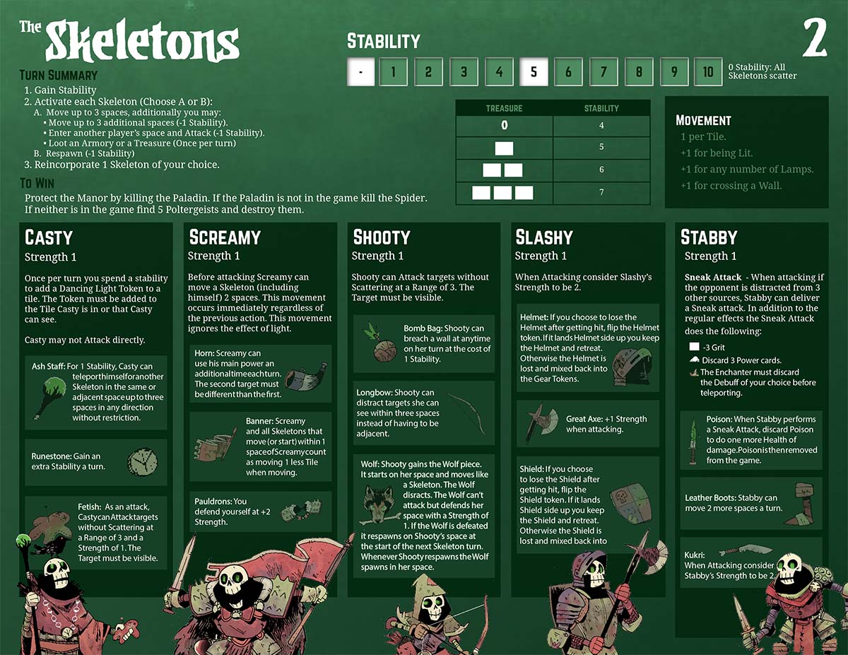
The development of the Skeleton Player board:
This was one of the most satisfying to figure out! Early on, the board was swamped with text and explained every possible thing you could know about the skeletons. As we refined the role during development, we learned how we can split up the necessary information. also, escaping the common 8.5x11" board gave us the freedom needed to make the player board fit the role. (a theme that's repeated throughout the design)


How much does play-testing and feedback shape your work?
Next to direct feedback from Patrick and Cole, I'd say our play-testers are the people with the largest impact on graphic design changes. I'm actually writing this at a time where our rules editor, Josh Yearsley, is in town, and we're doing what I believe is one of the most important steps in this process. We bring in as many groups as possible who have little to no experience with what we're working on (currently Vast: The Mysterious Manor) and we watch them learn to play the game. Often, it's completely blind - we ask one player to read the rules, then they teach the others, and they all play. We watch, take notes, and try to allow them to learn and figure things out themselves, only helping when necessary. Josh distills all that feedback and we work together to re-organize information to deal with any problems we saw. These are often small changes with huge positive impact, both in language and presentation. Additions of simple things like small arrows, adjusting leading between text, and word choice like "all" vs "every" can remove minutes of rules checking and frustration. And that’s always been one of my biggest personal goals working in the game industry - making games easier to learn and less frustrating for the players.
Vast: The Mysterious Manor - Photography by Ross Connell
Is there a minimum amount of time you think should be spent on the feedback loop of play-testing and changes?
It is near impossible to give a time frame for testing - it is definitely more of a feeling, especially given how different every game's development is. That being said, I've made some observations about what to look for to know its ready (some of these would apply to many games, not just asymmetric ones!)
You should see questions being answered by the other people in the game and their own materials rather than referencing the rule book.
You should see people asking each other about their specific rules.
You should see people surprised/impressed/jealous of what others can do.
You shouldn't have any rules you don't like explaining.
You shouldn't see people attempting things just because other players can.

Vast: The Mysterious Manor - Photography by Ross Connell
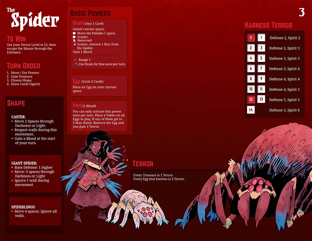
The development of the Spider Player boards:
I am showing these as a sort of counter point to the skeleton player board. Where the Skeleton board required less space, we found the most intuitive change for the Spider was actually giving them 3 separate player boards. Usually you want fewer components, but by splitting the forms into 3 boards and controlling exactly what information is accessible to the player, we've found it's easier to teach and understand.


Is there any advice you can pass on to those who are trying to get into the industry or find work as a professional graphic designer?
Be persistent, cast a wide net, attend local events, and play to your strengths. The gaming industry is busy and hectic - don't assume that because you haven't been contacted back its a dead end. It can feel discouraging when emails and applications don't get a reply, but seriously: follow up, and follow up again. I'm not recommending you spam your prospective employer, but sometimes it takes multiple weeks and emails for companies/teams/individual people to respond. Be patient, but be persistent. For attending events I've still found Facebook to be the best tool. I'll regularly visit the Events area and search "games" "game design" or "tabletop". These can vary week-to-week but most of the time you can find something going on - local designers play testing games (Protospiel anyone?) or indie video game jams - whatever it is you find, these are other people who are trying to work in the game industry also. Sign up for their newsletters, bring business cards, and stay in contact.
Vast: The Mysterious Manor - Photography by Ross Connell
What are some non game related creations (books, music, movies, etc) that you’re currently enjoying?
While I'm working I usually just put full albums on. This year has been a lot of Denzel Curry, Anderson, Paak and Kanye West - anything high energy to keep that forward momentum. For reading lately I've been loving Andrew MacLean's Headlopper comic and catching up on Hellboy as they reprint them all. For television I can't recommend 'Nirvanna the Band the Show' enough, a genre-bending buddy comedy with some of the most unique production I've ever seen.
Finally, if we’d like to see more of you and your work on or offline, where can we find you?
Best place to find me is on Twitter @BickNachmann and I very recently made an Instagram! I’m also currently working on an art toy in my free time and trying to post the progress, hopefully of some Gundam kits and possibly embroidered hats in the future!
All images supplied by and copyright of Nick Brachmann and Leder Games.
Did you enjoy this interview? Do you want to hear more about graphic design in board games? Let me know in the comments below!
Finally, whilst you’re here, why not check out some of the other wonderful interviews on the site via the archive or the Top 10 Best Board Game Art of 2018 as voted for by my readers!

Wingspan Board Game Art - How the Hit Board Game was Made - Interview with Elizabeth Hargrave, Jamey Stegmaier, and Natalia Rojas (Issue #52)
Birds are the perfect subject to learn how to draw and to practice. There are so many species, different looking, so many colors, textures, etc and that’s why I enjoy it. Every bird illustration offers new challenges and more learning opportunities…
Welcome to Issue 52 in my series sharing the stories behind board game art.
The Wingspan board game is a global hit, selling millions of copies and being talked about everywhere from The New York Times to your local game store. In this interview, I speak to publisher Jamey Stegmaier, artist Natalia Rojas, and game designer Elizabeth Hargrave about creating the game. Enjoy!
Check out the interview archive for more great insights into board game art.
Thanks for joining me! For our readers who aren't aware of your work could you tell us a bit about yourself and what you do?
Jamey: I’m Jamey Stegmaier, and for the last 6 years, I’ve run a board game publishing company called Stonemaier Games. I run this company full time from my home office in St. Louis, Missouri, which is a fairly large midwestern city. In addition to designing games, playing games, and doing a lot of business-related stuff, I love to cook and try new food (and old favorites) at local restaurants, watch movies, read fiction, and play/watch soccer. I have 2 cats that demand quite a bit of time and attention as well.
Natalia: Thank you for having me. I am a 33-year old artist from Medellin, Colombia, currently living St. Louis, MO. I’ve been married for 13 years and we have two daughters (ages 7 and 4) and a cute puppy named Pinto. I’m a dedicated mother and work around their schedules as I don’t want to miss out in their childhood.
I have a curious mind and like to learn about everything, so I read a lot and jump from one hobby to another. I do jewelry, watercolor painting, yoga, gym, and of course color pencil drawing. My family and my art are the most important things in my life. I do commission art work and Wingspan is my first big gig as a freelancer illustrator.
Elizabeth: I'm Elizabeth Hargrave, and I live in the Maryland suburbs of Washington DC. I moved here to work for the federal government, but now I'm a freelance consultant, which gives me some flexibility to do game design work and also to travel. In addition to birding I'm an all around nature geek: I'm on the board of the local mushroom club and I help my spouse with his landscape design work.
Photograph of Wingspan board game - Instagram @MoreGamesPlease
Natalia, as a self-taught illustrator, when did you start drawing?
N: Drawing has always been something so natural to me that I never saw it as something special. I’ve always done it, but the first time someone mentioned how good I was at it was my kindergarten teacher. Drawing was something I did just to pass the time or to take my mind away from places. I’m an avid reader and I used to get in trouble during my scholar years for drawing and/or reading instead of doing classwork. I wasn’t very academic and used to get in trouble because my mind was always busy with drawing stuff or reading books (I love Stephen King, Ken Follett, and other authors who write historic novels).
Natalia’s art studio
I never really set my mind to learn how to draw, I would just try to copy an image I liked such as book covers or Dragon ball notebooks, people from magazines, or anything I could find. After graduating from high school I didn’t consider art as a career, I guess because my passion for books was bigger than my passion for art. So, I wanted to study philology but was discouraged by my parents because, like with art, it’s hard to make a living out of books. I tried three different careers including business administration and journalism and dropped them all. I’ve also had normal jobs, too; I’ve done customer support, finance, procurement, etc. However, some years ago I finally came to the realization that I’m a natural artist and that’s what brings me joy. It took me many years and several jobs to take art seriously but when I did, I found my calling. It’s a funny to think how art was always there and I kept ignoring it.
Natalia’s art studio
After my epiphany I decided to try to get better at drawing and I just knew I needed to take my time and work slow to get the level of detail I like. I started to follow some great artists like Jay Depalma and Ileana Hunter on social media. Sometimes they’d share tools and materials that I would get and use on my next little project. After moving to United States in 2012 I started going to an amazing art studio for painting nights and got more involved in the artistic community.
Even though I say I’m self-taught I’m thankful to have received great advice from other artists like Ana Martinez with whom I partnered to create the illustrations for Wingspan, and my husband who is always a tough critic, in a good way. He helps me see where I need to improve. I like to do research, and I use every available tool like books and videos but what has really worked for me is the practice and the patience to take my time in every piece.
I don’t really know how to explain it other than there’s a great connection between what I see and my ability to transfer it on paper.
Bird illustration by Natalia Rojas
Wingspan’s theme feels unique. What inspired you to make a game about bird enthusiasts? What came first, theme or mechanics?
E: It was definitely theme first, and in direct reaction to the fact that I'm not particularly excited about any of the themes that show up most frequently on board games.
J: When she (Elizabeth) pitched it to me, I was entranced by the idea of collecting different combinations of beautiful birds that each had different mechanical impacts on my strategy. So the theme itself was never a question—it was birds from start to finish. As much as I loved the theme and thought it would capture peoples’ attention after they played it, I wasn’t sure how quickly it would catch on. So I went with a fairly conservative number of games for our first print run (10,000 is conservative for us), which has turned out to be far too low.
Photo of Wingspan board game
Can you describe Wingspan to us and what makes it interesting?
J: Wingspan is a bird-collection, card-driven, engine-building game for 1-5 players. It features 170 unique bird cards, each with its own art and unique abilities. You’ll use these bird cards to enhance the core abilities of your habitats while also continually comboing the abilities of cards you’ve played in each of those habitats.
What makes Wingspan interesting to me is the wide variety of birds, which leads to every game feeling different. I like that there are a number of paths to victory, but even if I don’t win, I have a strong sense of satisfaction from my birds and what they’ve done over the course of the game.


How did you try to evoke the theme of birds more in the production?
J: This is where the artwork and components came into play. I wanted an Audubon look to the game, as I thought that would best trigger that “collectors” aspect that originally drew me to the theme. Fortunately, Natalia’s style and attention to detail was a perfect match for this style.
N: From the very beginning I knew they were looking for realism art and Jamey mentioned Audubon so I started to research him, and I offered Jamey a colored pencil drawing of a bird so they could decide if I was a good fit for the project (I was competing with other artists I think).
J: As for the components, I like to publish products that have a special, tactile, and attractive table presence. I want component hooks, basically. Elizabeth thought of the birdfeeder dice tower, and I pursued the egg miniatures, the fancy insert, chunky wooden dice, and large, journal-like player mats.
Image of Wingspan board game - image cred Kim Euker (supplied by Jamey Stegmaier)
Natalia, what inspires you when illustrating birds, and what do you look for in each drawing?
N: Accuracy is key when doing scientific illustration. I do my research of the bird and the differences according to genre, season, location, age, etc. Ana and I always look for the image that best represents the bird’s characteristics. However, we also wanted to include images that would present a challenge so we can continue to learn and grow artistically.
Elizabeth was a great coach and helped us learn about birds for this project. To be able to accurately illustrate birds we got in touch with wonderful wildlife photographers and we got permissions to draw from their pictures. Nevertheless, when we couldn’t find the perfect image we had to use several pictures and a lot of imagination to guarantee an unique illustration that would represent the bird as if it was alive.
Birds are the perfect subject to learn how to draw and to practice. There are so many species, different looking, so many colors, textures, etc and that’s why I enjoy it. Every bird illustration offers new challenges and more learning opportunities.

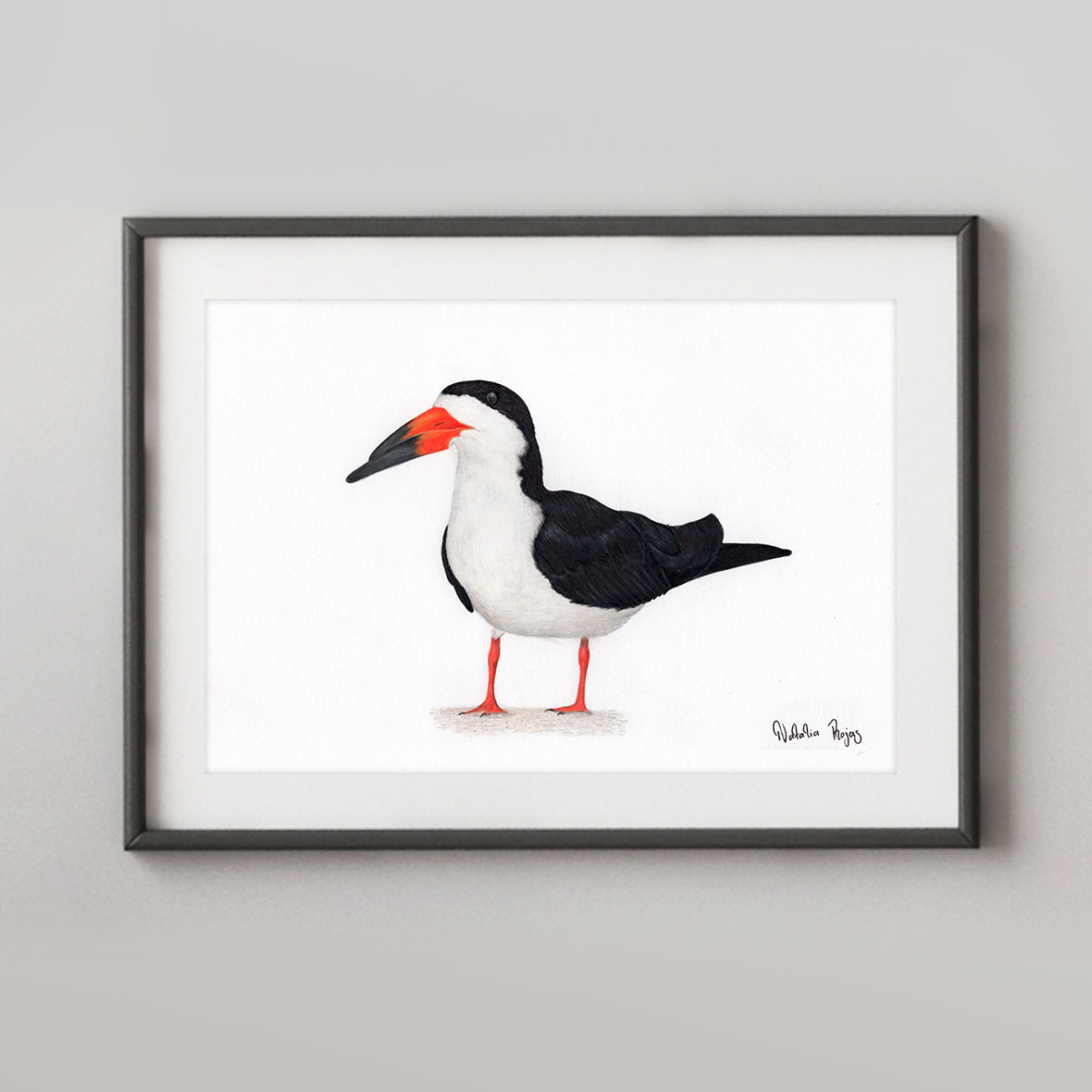


Illustrations by Natalia Rojas and Ana Maria Martinez Jaramillo, featured in the board game – Wingspan are available to purchase via Natalia’s shop
Playtesting is the real litmus test for how close a game is to being ready. How long did Wingspan spend in this phase, and how did it change during its development?
E: I worked on the game for a couple of years before pitching it to Jamey, and then I went back and forth with him on development for another year or so before sending it out for blind playtests. It got heavier over that time, but kept the streamlined feel of those simple base actions at its core.
I tweaked the layout of my prototype cards a lot over that whole process, to make them as clear and user friendly as possible, based on what people had trouble with in playtests. That definitely helped from a UI perspective -- and Christine (the graphic designer) left a lot of things in the same positions they were in on my prototype after all those iterations. But then she made everything prettier and gave it a more cohesive feel.
Image of Wingspan board game - courtesy of Instagram @ellalovesboardgames
J: I’ll speak specifically to the blind playtesting part of the process, as local playtesting (mostly by Elizabeth, some by me) is very different than having a bunch of people around the world playing the game all at once. The blind playtest process for Wingspan actually only took about 3 months (1 month per wave), as the game was in good shape by that point. It was really all about fine-tuning it, testing different paths to victory, and making sure the rules and the text on the birds and bonus cards was as clear as possible.
Natalia was working on the bird illustrations throughout the design and playtest process—we knew which birds were going to be in the game, so playtesting had no impact on the art (and vice versa). Even the player mat, which Beth Sobel illustrated, was firmly established before blind playtesting began, though we tweaked some of the graphic design elements of it as the result of blind playtesting.
N: I learned that creating a board game is a creative and complex process that requires great attention to detail and coordination in many different areas. When I started working on the illustrations I knew this project was a big jump in my career and I gave my best to make sure the art in Wingspan was a good representation of my work.
In all honesty, I knew very little about board games from my childhood but it was a big surprise to learn how big the gamer community is. I just learned how to play wingspan a few days ago and it makes me very happy that not only I did part of the art but that is the first board game I ever played. It makes it extra special.
Working with Stonemaier has taught me great lessons about managing my time in a more efficient manner and to keep clear communication with my clients to set timelines and expectations.
Wingspan illustrations - Natalia Rojas
Do you have any other projects underway, or coming up that you’d like (or are able) to tell us about?
J: Natalia is currently working on the art for a Wingspan expansion (for which we have not announced details), and spring/summer Stonemaier Games releases include an expansion for Euphoria and a modular board for Scythe.
N: I’m currently working on the first expansion for Wingspan and already have a waiting list for a few portraits. People, dogs and more birds are on my list. I’m super excited because I’m having great exposure thanks to Wingspan and I’m making a living out of art which is not easy.
E: I'm working on a Wingspan expansion. I have an 18-card game called Tussie-Mussie that will come out around May from Button Shy, which is based on the Victorian fad of flower language. I have high hopes that it will also be beautiful, just in a much smaller package!
What are you currently reading, listening to or looking at to fuel your work?
J: I find thematic inspiration in the variety of forms of fiction I consume; right now I’m reading the Broken Earth trilogy. I find mechanical inspiration in the games I’m playing (recent plays include Dice Throne, Aeon’s End Legacy, and AuZtralia). And I find business inspiration in certain podcasts and YouTube videos, like a recent Daniel Pink talk I listened to and the Masters of Scale podcast.
E: I try to keep taking in a lot of information about the world, and I use that to keep a running list of things that might make good board games. I love the podcasts Radiolab, Curiosity Daily, and Outside/In. When I worked on Capitol Hill, a speechwriter once told me the Washington Post obituary page was a source of great stories, and it's true -- there are many fascinating things that have happened in the world, and a lot of them end up there.
N: I’m studying a book about birds but can’t say the title without spoiling the expansion. I’m following a lot of artists and photographers in Instagram because I’m constantly looking for images to use as references for the drawings, but the main source of inspiration these days is my bird feeders and daily walks around the neighborhood. Wingspan not only gave me an opportunity to grow as an artist, but it gave me the love for birds and nature. Before starting working on this project I didn’t know anything about birds and never cared but now I’m full into bird watching and the whole family loves it to the point that my daughters dressed up as a Quail and a Blue Jay for Halloween. Is great to sit by the window with a coffee to watch all the different birds that visit the backyard.


Illustrations by Natalia Rojas and Ana Maria Martinez Jaramillo, featured in the board game – Wingspan are available to purchase via Natalia’s shop
Finally, if we’d like to see more of your work, where can we find you?
J: The hub for all things Stonemaier is www.stonemaiergames.com.
N: My websites is www.nataliarojasart.com or you can find me on Facebook and Instagram.
E: I’m active on BlueSky as @elizhargrave.
Thanks to Ella Loves Boardgames for sharing some images of Wingspan with me. You can find her on Instagram over here! (All other images are courtesy of Natalia, Jamey, and if no note given, myself)
If this is your first time visiting the site then why not stick around a while! I’d really recommend checking out the communities Top 10 Best Art of 2018 to see some absolutely gorgeous games and then head to my interview archive for a wealth of wonderful stories.

Dragon Castle - Cinyee Chiu: Art in Board Games #51
I'll look for lots of references, in 2 ways. One is to look for existing works with similar topics, to see how people approach this topic, and to find a way to demonstrate that in a fresh way so it can stand out. Another way is to grab whatever I feel is interesting visually, which can be illustration…
Welcome to Issue 51 in my series sharing the stories behind board game art.
Cinyee’s art feels truly unique in an industry that can often be a little guilty of playing it safe. I was absolutely delighted to discover her work and reached out to learn more. Enjoy our chat!
Check out the interview archive for more great insights into board game art.
Hi Cinyee, thanks for joining me! For our readers who aren't aware of your work could you tell us a bit about yourself and what you do?
Hello people! I'm Cinyee Chiu, I'm a freelance illustrator from Taiwan and now traveling the world with my husband. I draw for books, products, animations, packages and more. We started the trip in September 2017, and have finished time in South America, stayed a few months in Colombia with my husband's family, and a few months in Taiwan with my family. Now we’ve been in Europe for 3 months already, staying in Spain, Portugal, France, and Germany. We are going to visit the rest of Europe and Africa in the following 6 months. The trip won't last forever, it probably will finish in 2019, then we might try to stay in Canada.
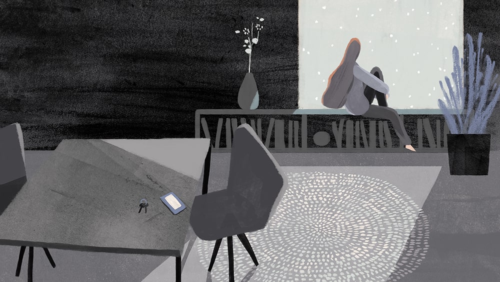
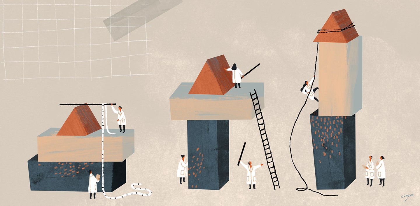
Could you tell us a bit more about your education in the arts? How did you learn to illustrate and how have you developed as you've gained experience as a professional artist?
Sure! I went to the US to study illustration and got my MFA degree in 2016 from the Maryland Institute College of Art. Before that, I had worked in the game industry for 3 years in a Taiwanese indie game company, where I mainly did character design. I actually didn't study art before that, my undergrad major was economics but I always enjoyed drawing since I was a kid.


I mostly learned drawing by myself, with tutorials online, from Pinterest, Youtube, and some drawing forums, etc. I started with digital painting (I thought it's less costly since you don't need to constantly buy paper and drawing materials) but then I started to draw more and more with traditional media, especially after I graduated from MFA in 2016. I’ve had a rather stable art style since 2017, but I believe it's still developing, I want to have more freedom in my work.
When beginning to work on a new project what are the first few things that you do?
I'll look for lots of references, in 2 ways. One is to look for existing works with similar topics, to see how people approach this topic, and to find a way to demonstrate that in a fresh way so it can stand out. Another way is to grab whatever I feel is interesting visually, which can be illustration, photo, product design, or something else. I collect the references into a mood board, and from that, I jot down the ideas that pop into my mind.


You've got a couple of board game projects under your belt now, so how did you first get involved in making games?
The first game came to me was Harvest Island in 2016, I believe they saw my 24 terms animal series so they decided to contact me. The game was actually about fruits and harvest, but they decided to make me draw animal and fruit combinations. I was always dreaming of drawing for a board game and they gave me all the freedom I needed, even letting me pick which animals to draw. The topic was something I really feel attached to, so it was a happy experience working with them.
I discovered your work from the gorgeous Dragon Castle, could you tell us a bit more about the game and your collaborative process working on it?
It was actually a longer process than I expected when signing the contract. When they approached me, they actually were asking for some "Chinese infused visual style" art maybe with a tone of ink wash painting somehow? I thought it could be interesting to explore a bit on the styles, but when the project keep moving after a few style test back and forth they decided to go with a very digital direction. The content I needed to draw also changed because they'd been developing and fixing the game mechanics, from drawing lots more symbolic spots, to 36 animal and dragon character cards. In the end, I was very tired of drawing characters and I decided I'm not drawing for board games that have more than 12 cards anymore, haha.


The dragons in Dragon Castle are all based around virtues. What were the challenges in trying to portray these and how did you approach illustrating them?
Some virtues are easier, some others took a longer amount of time. For example, for the Wisdom virtue I thought of an old man with a long beard immediately, and for Loyalty, I thought of dog and chain/lock. The challenging ones are those somehow similar in concept, like Fortitude and Perseverance, Power and Majesty....actually many were challenging.
I tried to illustrate them as differently as possible, in color and in the posture. So I decided the color for the easier ones first, like a cold color for Tranquility, or a transparent/white for Honesty. For the rest, I just picked a color I hadn't used, like red for Perseverance. The postures were difficult and it was hard to get them all different but I tried my best.
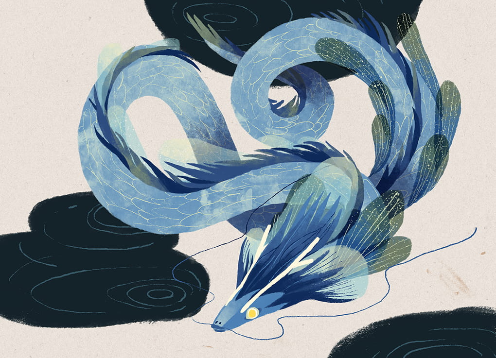
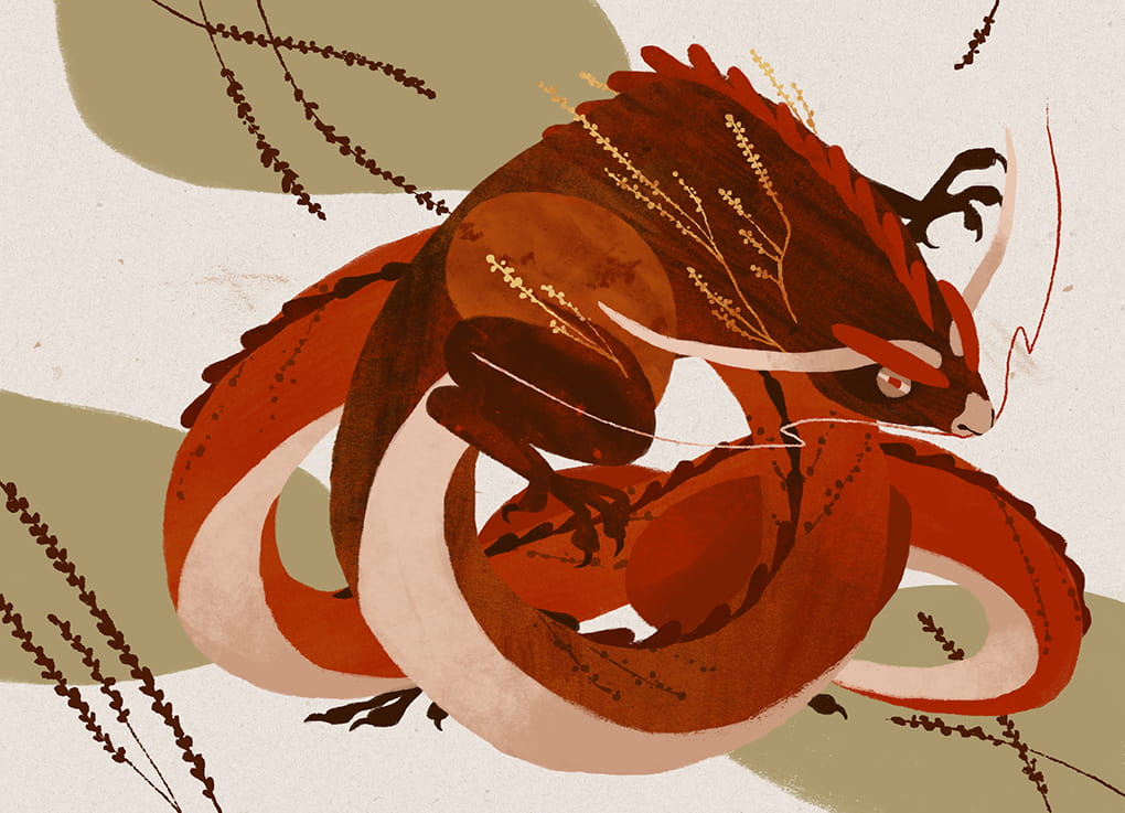
I love your use of colour so I’m curious what draws you to certain ones and where the inspiration comes from?
I think I do have some preferences toward earthy and warm colors, I find myself enjoying using rust orange, olive green, denim blue, etc. When I'm working on a new project, I first build the mood board, and one way I often use to set the color palette is to find an abstract art piece which gives the emotion that fits the project. From the abstract art piece, I gather the colors and make some adjustments from that if it feels right.
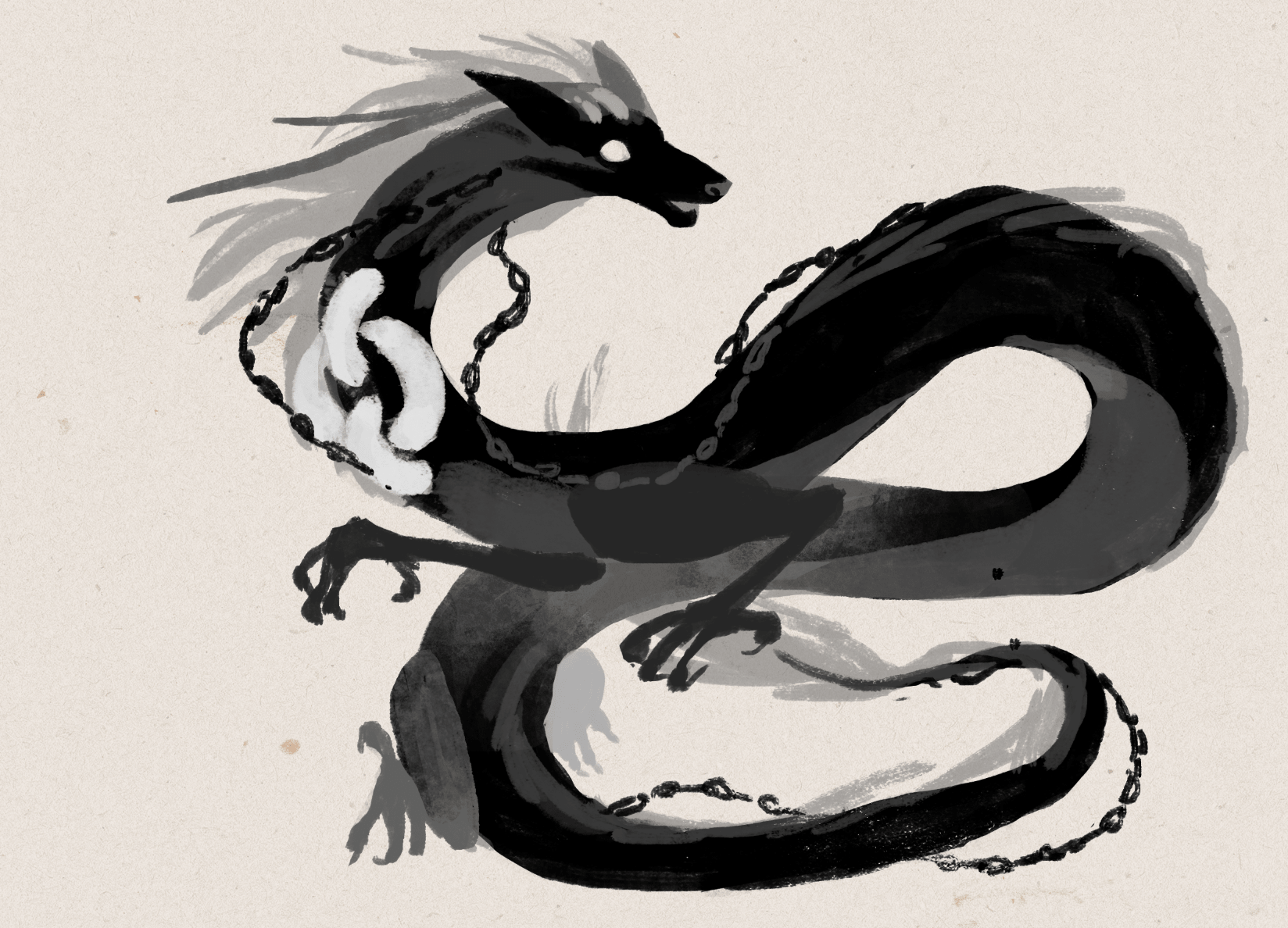
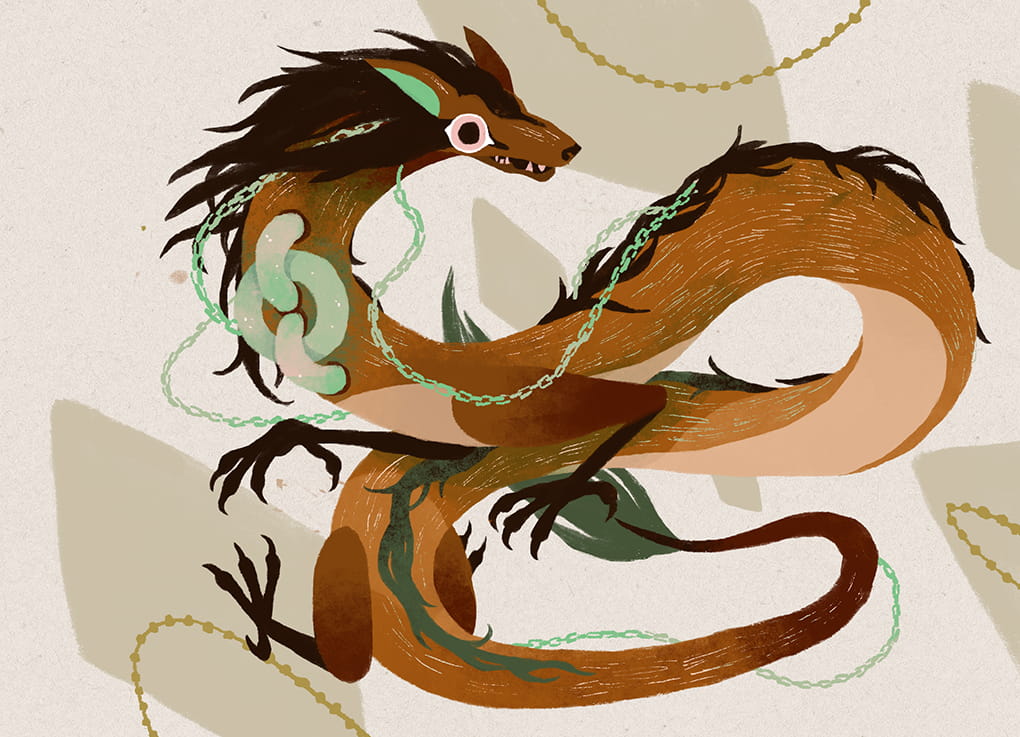
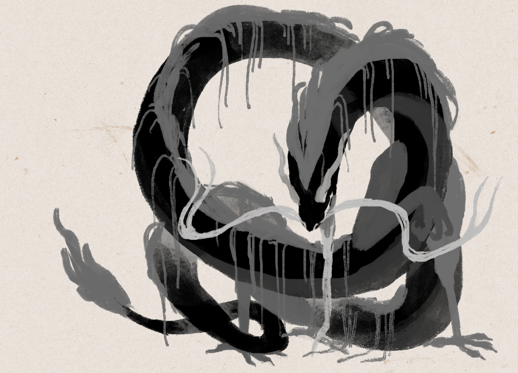
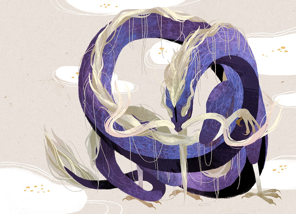
Based on your experiences so far, how should a client best approach work with an illustrator and what are some key things they can do within that relationship to improve the process?
For a board game, it's best if the game designing part is already complete, which means the game mechanics are done and the requirements for the illustrations are not going to change.
I have worked with 2 types of clients, one comes with a clear idea what they want, how many illustrations in which size they need, we sign the contract and I draw exactly what the contract mentioned I need to draw, within the deadline in the contract.
Another type of client comes to me when the game is maybe 70% developed, and it might either turn out later that I need to draw something different from what we agreed because they decided to change the mechanisms (I gave the quote based on the request), or they took longer than they planned to finish the designing part and that then affects the schedule I might have planned for other tasks once they are ready.
So I think it'll make the process easier for both if the client knows clearly what they want when they approach the illustrator. For the visuals, it'll help if client prepares some references to show what they wanted (eg: we want some floral frames like this), and which works from the illustrator's profile makes them think he/she is the good fit (eg: we like your illustrations for the XXX series..).


Do you have any advice for anyone trying to get into the industry or find work as a professional graphic designer?
The purpose of the portfolio is to show the client what you can do and how they can use you, so make it easy for this purpose. You should only present what you want to do. If you'd like to work on character design then make sure you have it in your portfolio with a clear category. Make it so the client doesn't need to dig through the whole portfolio to find what they are interested in among illustration for books, package design, or other distracting works. Save their time, they'll appreciate that. Also, just present your best works and presenting 15 great works is better than 15 great works + 10 so-so works, the later one shows your instability. The last thing, remember to add your email.
What are you currently reading, listening to or looking at to fuel your work?
When I work, I mostly listen to ambient yoga/meditation music, I find it less distracting but sometimes it also puts me to sleep, but I don't mind when that happens. For reading materials, I enjoy the references and researching process. So I'll dive into the related knowledge and expand it to other fields, for example from 24 solar terms to Wu Xing system, I enjoy learning new things. I also enjoy reading fiction, for this year I want more literary works in my reading list and to maybe work on my writing. I suppose writing and drawing skills would complement each other.
Finally, if we’d like to see more of you and your work, where can we find you?
You can find my website here: cinyeechiu.com. I’m also on Facebook, Instagram and Behance.
(All illustrations supplied by Cinyee Chiu, 2019)
If this is your first time visiting the site then why not stick around a while! I’d really recommend checking out the communities Top 10 Best Art of 2018 to see some absolutely gorgeous games and then head to my interview archive, as there are a wealth of wonderful stories in there.

PARKS Board Game Art - Communicating Through Color and Illustrating the National Parks - Interview with 59 Parks Project(Issue #50)
A commercial artist isn't in the field just to execute someone else's vision. We like to approach the series as a collaboration and most feedback starts or ends with "what do you think?". That's because we value each artist's insights and ideas. Artists also work incredibly hard on their craft…
Welcome to Issue 50 in my series sharing the stories behind board game art.
Today, I’m talking to JP Boneyard, one of the founders of the Fifty-Nine Parks print series. Parks is a board game that combines the gorgeous art of this series with game mechanics from Keymaster Games. It’s a wonderful celebration of the US national parks, well worth seeing. Check it out below!
Check out the interview archive for more great insights into board game art.
Hi JP, thanks for joining me! For our readers who aren't aware of your work could you tell us a bit about yourself and what you do?
Thank you for making the time! I provide creative direction for The Fifty-Nine Parks Print Series. The series is a celebration of National Parks, design, and printmaking. Our origins are tied to DIY music, screen printed posters, and a love of the parks. During high school friends and I set up all ages art and music events in our small town. 100 of those shows took place in a backyard shed and we hosted bands from all over the world. As a necessity to promote those events friends and I developed a love for design and printmaking. Little did we know we'd later have a career in both!
In the early 2000's we spent a lot of time touring the country in bands and on road trips. This is where we developed an awareness of and appreciation for the parks. Being from a small isolated town in Massachusetts we couldn't believe some the awe inspiring natural wonders out there! 18 years and 350+ events later we've combined all of our favorite things into our full time focus. We still tour often but now it's with a traveling collection of gig posters and parks prints!
You helped found the Fifty-Nine Parks Print Series. Can you explain the series and what some of the biggest challenges were in creating it?
The parks series began shortly after I moved to Austin, TX for a design job in 2015. One of the biggest challenges is finding the combination of the right artist with the right park. It's really important to find a scene that really represents the park, too. We're incredibly mindful about each artists strengths and interests. That often informs which park folks work on. Another challenge has to do with time. Since each posters costs about $3,500 to produce we have to be intentional and strategic about which park we release and when. Especially since we can only afford to release two posters a month. We know some parks only have a few thousand visitors each year. Since we've committed to making a poster of every park we know we won't recoup that initial investment for a year or two — and that's okay. But since each new release essentially kickstarts the next we have to be savvy about our release schedule. The first two years were pretty lean for us. Fortunately it feels like we're starting to gain some momentum now that we have almost every park represented.
In terms of cohesion we rely on the beautiful typeface Riley Cran designed and a simple but effective poster template. The rest is curation, some art direction, and careful color choices.
You're working with Keymaster Games on the card game PARKS. How did this collaboration happen, and what made you want to get involved?
We've loved Keymasters work for a few years now and we often travel with a copy of Campy Creatures on road trips — it's one of our favorite games we own! We were in touch with Keymaster after meeting Josh Emrich who did most of (or all of?!) the design work for Campy. The quality of the products, the game mechanics, and the appreciation for solid design really makes them stand out. I have a philosophy that basically says "swing at everything" and don't fear rejection. It was a long shot but we talked with Mattox at Keymaster and it turned out they were aware of the series! Shortly after a few enthusiastic conversations we began collaborating on PARKS! We're stoked to work together!
What kind of research goes into finding those scenes? Do you have guiding principles, or is it more instinctive than that?
We research every scene with each artist. Sometimes this is easier if we've been to the park ourselves. Some parks — like the ones in Alaska — are tougher to get to so we often reach out to friends or other artists who may have been. We also do as much visual and historical research as possible via the internet. We prefer basing each composition on our personal photos and experiences whenever possible though. When picking a scene we like to play to an artists strengths and choose something iconic enough to represent the park. We also like to include a loose narrative in each poster — that's often why you'll see hikers or wildlife in each poster.


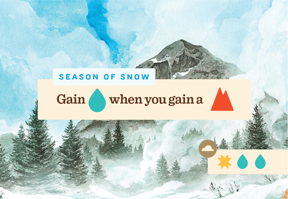
How do you use colour to communicate more about the parks themselves?
We use color to represent each park in the best light. In most cases we're being pretty faithful to the natural colors found within the parks. Some artists take a more stylistic approach to their work so we may have a color palette that is stylized but somewhat representative. We also have constraints with the number of colors we can use since each poster is a 6-8 color screen print. That in itself is a fun challenge. Showing the parks in the best light possible often means leaning towards vibrant scenes that evoke a sense of wonder and awe. This is largely conveyed through the rendering of each park and the scene we choose — the color palettes help drive this home though.


How do you go about translating the larger prints of the Fifty-Nine Parks project into the much more scaled-down version we see here in the game?
Most of the illustrations were designed to look great large and still read well somewhat small. That's because we're considering what the images look like as a print and what they look like (smaller) online. The only snag we really hit was with longer park names. In some instances we had to make some tweaks to park name or the background of an image. Otherwise the illustrations felt like they worked pretty well within the context of the board game!


How has your perception of the board game industry changed while working on this game?
We had no idea how much play testing went into board games. It's brilliant! Usability testing exists in so many other fields, why not here!? I'm not sure why this was a surprise to us but it really speaks to the dedication of both game publishers and players!
With this project you’ve collaborated with a lot of different creatives, so what advice would you give to anyone wanting to work with artists?
I'd say the biggest consideration is respect. A commercial artist isn't in the field just to execute someone else's vision. We like to approach the series as a collaboration and most feedback starts or ends with "what do you think?". That's because we value each artist's insights and ideas. Artists also work incredibly hard on their craft. Respect in communicating what may not be working and acknowledgement of what is, is crucial. Almost every email exchange ends with "thank you". That's because I really do appreciate that someone made the time to work with us — and in many cases — made something pretty remarkable in the process.


Additionally, what advice would you give to anyone who wanted to work as an artist?
Stick with it. Practice. No matter what. And don't take design feedback or rejection personally — it's all in the interest of refining your craft. If you really do goof up on something, own it, learn from it, and move forward. At the same time be mindful of who you listen to. Message boards and comment sections are filled with critics who haven't put in the work themselves. Art is subjective and your worth as an artist — or as a human — isn't derived from other peoples approval. It's derived from loving what you do and doing your best at this moment in time. If your best doesn't feel like enough continue to work and refine your craft — you'll get there eventually!
What are you currently reading, listening to or looking at to fuel your work?
Art directing the series means I'm working closely with dozens of artists at once. For books anything by basketball coach John Wooden, NBA legend Bill Russell, mythologist Joseph Campbell, or anything on stoicism. This is often where I go for insight into working with others or finding more inspiration to enjoy this whole experience — meaning my work but also being alive! Music is all over the place but Minutemen, Kendrick Lamar, Sam Cooke, Aaliyah always do the trick. Instagram is a great resource for inspiring images of parks and finding new artists to work with.
Finally, if we’d like to see more of your work, where can we find you online?
You can find us on Instagram at @fiftynineparks and online at 59parks.net. 5% of each poster sale is donated to the National Park Service and we screen print every poster here in the USA! Thank you for making time to talk with us!

PARKS: The Board Game, a game about exploring and discovering the US National Parks is on Kickstarter until 20th Feb!
(All images courtesy and copyright of Keymaster Games and the Fifty Nine Parks project).
If this is your first time visiting the site then why not stick around a while! I’d really recommend checking out the communities Top 10 Best Art of 2018 to see some absolutely gorgeous games and then head to my interview archive, as there are a wealth of wonderful stories in there.

Fireball Island: Art in Board Games #49
Just as in any artwork, an artist's most valuable tools are composition, scale, contrast, tone, color and pose. When dealing with large, detailed scenes with complete background and many characters it's very easy to become overloaded..
Welcome to Issue 49 in my series sharing the stories behind board game art.
This interview features talented artist George Doutsiopoulos, who joined me on the site last year (you can view that interview here). I’ve long wanted to take a closer look at how box art is created, and George was kind enough to let me interview him about his work on Fireball Island and its expansions. Enjoy our chat!
For more great insights into board game art, head to the interview archive.
Hi George, great to have you back on the site! Since we last spoke you've been working on the wonderful remake of Fireball Island. Can you tell us how you got involved in that project and what was your role?
Hi Ross, I'm really happy to be back, thanks for having me for a second time! Back in October 2017 I was approached by Jason Taylor, the art director from Restoration Games, who was looking for artists for the new Fireball Island board game. There was lots of art that needed to be done: boxtop art, card art, etc and the styles of the participating artists had to look good together and not clash with each other, so that part took time. Jason was very considerate and let us propose what kind of art we would rather take on. I felt I was a better fit for the boxtop art and Jason assigned it to me.
Fireball Island box cover - Initial sketch concept art
When creating the cover art for the Fireball Island base game box, what kind of mood or style were you looking to create and how did you try to achieve it?
Thankfully, the brief I received was great, as was the communication with the art director: detailed, thorough, concrete and fun. There were very specific comments regarding the color palette and the elements of the illustration (for example the burning tree, collapsing bridge, cut off rushing rapids were there from the beginning). Regarding style, Restoration games wanted to go for something that was epic but with healthy doses of slapstick and fun. Something with toon sensibilities but not childish, and detailed enough to attract all ages. That was really amazing because this artistic style that is part realism and part cartoon comes very natural to me.
Fireball Island box cover - Second sketch concept art
We also wanted an illustration where the island itself is prominent (mainly, Vul-Kar the volcano) and wanted distinct levels (foreground, midground, background). At first, as you can see in the sketches, I focused too much on the epic and slapstick aspects and created a concept that was fun but very busy. With the valuable guidance of Jason, we finally came up with a composition that had fewer characters but was more powerful.
Fireball Island box cover - Final sketch concept art
You also worked on the box art for the expansions, 'Wreck of Crimson Cutlass', 'The Last Adventurer' and 'Crouching Tiger, Hidden Bees'. The artwork on the box for the last two made up a greater image when combined so how did you manage to make both boxes interesting, yet work together in this way?
That idea was entirely Jason's (Editor: Jason contacted me to state the idea originally came from designer Rob Daviau) and I loved it as soon as he mentioned it. I hadn't done something like this before but I welcomed the challenge. Of course, creating a composition that needed to work as a simple illustration AND as two standalone illustrations sounded difficult at first, but it turns out it was easier than I feared. I worked with a lot of quick drafts, first focusing on the separate boxes without minding myself with the larger composition yet, to make sure the separate compositions were interesting by themselves.
Fireball Island - The Last Adventurer Expansion box art
Fireball Island - Crouching Tiger, Hidden Bees Expansion box art
When sketching I kept the Fireball Island logo in place because it's a very prominent visual element of the box and I wanted to take it into account from the beginning. When I came up with drafts I was satisfied with I combined the ones that worked into the larger composition, made any revisions necessary and was ready to start sketching and painting. I painted the final artwork as a single illustration, mainly to make sure the separate boxes join perfectly when standing next to each other.
Fireball Island - The Last Adventurer and Crouching Tiger, Hidden Bees Expansions complete box art
The box covers are packed full of energy, so what are some ways an artist can inject that into their creations?
Just as in any artwork, an artist's most valuable tools are composition, scale, contrast, tone, color and pose. When dealing with large, detailed scenes with complete background and many characters it's very easy to become overloaded, so I keep my approach as simple as possible: start from the big and overall and end with the small and detailed. That means that during the sketching phase I was at first concerned with the overall volumes and shapes (very important for the impression of movement and speed), with focal points and compositional axes (to create an appealing composition that helps guide the viewer's eye), with scale (to create the illusion of depth and perspective) and with pose (to create dramatic poses and expressions that further help create the illusion of action and movement). Then I experimented with color drafts, before moving on to painting the actual illustration. For me, making all the colors work in very large compositions is probably the hardest part so I spend as much time as I need to figure my palettes out.
Fireball Island - Crimson Cutlass Expansion box art
Choosing the local colors is not enough, not by far. I need a chromatic theme for consistency and character (Fireball has a lot of warm colours, for obvious reasons) and I needed to separate areas of primary, secondary and tertiary interest using warm and cool colors, contrasting and complementary hues and tonal contrast. I'm still getting the hang of this and feel I have a lot of room for improvement!
Fireball Island - Final product shot
Before you leave us again, what are you working on next?
Right now I'm working on a few different projects, the most fun and interesting one being the work I am doing for Arkhane Asylum Publishing in France. They are a classic role-playing game publishing company and I am currently illustrating the characters for their upcoming game "Malefices", set in Paris of the 1900s. They reached out after seeing some vintage ink illustrations in my portfolio which they felt were right for their book. It's a style quite different from Fireball Island but one I also really love working in!
EDITOR: You can find George’s portfolio here and see more about Fireball Island on Restoration Games website here.

(All illustrations copyright of George Doutsiopoulos, product shot by Restoration Games)

Up to 4 Players: Art in Board Games #48
From the illustration side, it takes about 10 hours to produce a page (back when we did short strips it was more like 3-4 hours). I wish I could reduce it somehow, but I wouldn't want to sacrifice either the style and level of detail we established, or the "amount" of plot we manage to get into every page; since we post a new page only once a week, we want each update to be worth the wait.
Welcome to Issue 48 in my series sharing the stories behind board game art.
While this isn’t quite board games, I couldn’t be happier to be speaking with the two creative minds behind Up to 4 Players, a weekly web comic that tells the story of a group of friends playing an RPG together. They’ve also created a roleplaying game based on the Crystal Heart comic strip, currently on Kickstarter. Now on to the interview!
For more great insights into board game art, head to the interview archive.
Hello Aviv and Eran, thanks for taking the time to speak to us. Firstly, could you tell us a little bit about yourselves?
Aviv: Hi Ross! Thank you for having us on, even though we don't technically do art in board games. I am a freelance illustrator, specialising in character art and comics. My passion for drawing started with the animated X-Men series from the 90s (of course I created my own super-hero group that was almost, but not quite, EXACTLY like the X-Men), so action, fantasy, and colourful, bigger-than-life characters have always been my cup of super-powered tea. Later, thanks to Eran, I got into the amazing hobby of roleplaying games, and that has become a major inspiration too. I've lived in Israel most of my life, and thanks to the internet I was able to expand my knowledge, skills, and social network, especially around those hobbies that were (and still are, although to a lesser extent) somewhat fringe in our small country. I moved to London 5 years ago because I've always LOVED this city, and I'm so happy to find it's just as lovely to live in as it is to visit and watch on screen.
Eran: Heyo, I'm Eran, and I'm definitely the writer, because when I do art, people cry. I've been a roleplayer ever since I discovered the D&D Red Box around 1990, and it quickly became a passion, then a career. I've worked as a game translator, a professional game master for social skill development, gaming store owner, and probably a few other things, all with "game" in the title. Like Aviv, I'm from Israel originally but I moved to London around 2012 following my wife's career - she has a PhD in English literature, specialising in "London and the Fantastic". Yeah! I love nothing more than to explore new worlds, even though I'm usually the game master, which means my players get to do most of the exploration. Aviv and I share a love for high-action, light-hearted fun, and so we got to create a few octane-fulled narratives over the years, trying out various approaches and concepts.
Tell us more about Up to 4 Players! What inspired you to start it and what have been some of the highlights for you so far?
Aviv: Eran and I first joined forces about 13 years ago on V-Squared, a webcomic for the online video game magazine he was writing for and editing at the time. I'm still kind of amazed to remember that I actually got paid for drawing comics back when I was 21! We had a really good connection working together, a mutual sense of humour and very compatible way of looking at things. At some point, though, V-Squared had run its course and ended. Years later, we both itched to work on something similar again, and the idea for Up to Players was born. (It actually originated as a Stretch Goal for a crowdfunding campaign Eran ran for his roleplaying podcast, On the Shoulders of Dwarfs.)
We had a couple of brain-storm meetings, thinking about the structure of the comic and the main characters, and we decided to combine jokes about board games - a hobby we both share - and anecdotes about Israelis moving to London - which we both are. It was great fun to do a steady 3-panel (more or less...) comic together again, but after almost 150 strips we wanted to try some longer-form storytelling, and talk about our even bigger mutual hobby - roleplaying games. Thus Crystal Heart was born.
Eran: Since Aviv covered the history, I'll cover some of the highlights. Several of our strips got some global attention, thanks to being shared by the likes of Blizzard's Heroes of the Storm, Fantasy Flight Games, Czech Games Edition, and others. That was always exciting, watching the next-day figures in our analytics, but most of the time, they didn't translate to tens of hundreds of new followers - most people enjoy what they enjoy, and have no interest in next week's joke, which will be about some other game. Discovering that despite this we have a large enough fan base to allow us to open and maintain a successful Patreon page, THAT was awesome. We have nothing but respect to the people that seem to have respect for us, and I think that's a good relationship between creator and consumer. The next step was having a table at UK conventions, which is what we've been doing for the past year, and also definitely going to continue doing in the foreseeable future.
I have to say the illustrations in your webcomic are absolutely gorgeous, where did the look and feel come from and how has this developed over time?
Aviv: Thank you! A huge inspiration on my style back when I did V-Squared - and still today - was the webcomic Penny Arcade. I've always loved Mike Krahulik's character designs, extreme expressions and smooth line work, and it's been a highlight in my career when I recently got to work with Penny Arcade on Thornwatch! In Crystal Heart there is also a lot of inspiration from animated shows like Gravity Falls and Steven Universe: I am awed by how much atmosphere and personality they create with very simple, minimalist lines and beautifully balanced colours, both in characters and in environments. And always in my art there are Disney influences, because I spent my childhood mesmerised by all the old and new classics.
Eran: Aviv mentioned a lot of cartoons, and for a good reason. We not only use a cartoon-inspired art style, we also have cartoon-inspired character personalities, humour, and storylines. High-action, light-hearted fun! Also, in order to publish weekly instalments (first strips, now pages), the art style HAD to be simple. Even though we nowadays have a Patreon and sell some merch at conventions, we mostly use this money to pay for what we need to maintain the webcomic. Aviv is still doing this in her spare time!
In regards to time, how long would you say each comic takes to produce, considering both illustrations and writing?
Aviv: From the illustration side, it takes about 10 hours to produce a page (back when we did short strips it was more like 3-4 hours). I wish I could reduce it somehow, but I wouldn't want to sacrifice either the style and level of detail we established, or the "amount" of plot we manage to get into every page; since we post a new page only once a week, we want each update to be worth the wait. As far as burn-out goes, I think the fact that this is a weekly webcomic helps tremendously: every week we get to hear readers' feedback and know that there are people out there who enjoy what we do. It makes it much easier to keep going, rather than if we had to draw page after page and keep them under wraps for future publication.
Eran: Writing-wise, we both decide on the main plot for the current storyline, and then I start turning it into pages. I already have a feel for how much panels/pages each plot point is going to take, but it's a fluid estimation that changes as we progress into the story. Each page is pretty straightforward, taking about 45 minutes, with lots of revisions and some research (mostly into our own archive, to maintain consistency). I decide what plot and dialog we should have in every page, and then provide a general storyboard which Aviv then develops into the final layout. The work process between us includes several back-and-forths and has been tried and tested to perfection, which is insanely important in this kind of creative endeavour.
Of course, I couldn't interview you without talking about Crystal Heart. Elevator pitch time, what is it and why should we be interested?
Aviv: Eran, I'll let you answer that one fully because OMG I really need to get on Monday's page!
Eran: Crystal Heart is our ongoing storyline, a webcomic about four players (exactly!) playing a roleplaying game. We show what's happening in the imaginary world, with all the special effects, crazy shenanigans and cool characters that should be there, but we also show what's happening around the table, between the players themselves. We want to cover the full experience of an RPG, and that means in-play action but also off-play remarks, misunderstandings, and problems that arise naturally in these kinds of games.
The world of Crystal Heart is one in which people have stones for hearts, in a very literal sense. Some people can replace their heart with a Crystal, ancient artifacts from before recorded history, and thus gain superpowers! But also get a bit deranged. You see, the Crystal influences your personality, giving you strange quirks or new thought patterns. It's meant as a fun exercise for the players - remember, this is a setting for an RPG, not just "a fantasy world"; It must have RPG sensibilities. The player characters are Agents of the powerful organisation Syn, scouring the world in search of new Crystals.
When we switched our webcomic style and started telling an ongoing story about roleplayers, we obviously lost some of our readership, who liked our focus on board games. However, we didn't actually lose that many people, and at the same time, we gained lots of new ones, making Crystal Heart popular enough to have us consider publishing it as an actual game you can play. So that's what we're doing!
The concept of turning a webcomic about people playing an RPG into an RPG people can play is so meta. I love it. Let's talk about the game itself, when did this idea come about and in broad terms what is it?
Eran: We created CH for our own gaming group, many years ago, and played several awesome sessions in it. Ever since then it remained in our hearts, pardon the pun; I actually started considered making it into a Savage Worlds setting several years before we even had the comic. There's a ton of roleplaying potential in the basic concept, of having interchangeable superpowers that also influence your personality, and also, I never got to tell the REAL STORY, the secret history that will eventually be revealed in the comics, so I was keen on finding a way to publish it in some form. Then the comic came, and now, the game follows suit.
In CH you play as Agents working for the powerful organisation Syn, sent to find and retrieve the ancient Crystals that are scattered all over the continent. If this feels like the plot for an anime-inspired video game - good! In the wild, the Crystals are feral and unpredictable, creating various dangerous magical effects. Syn developed a method that allows its Agents to implant "tamed" Crystals, and turn these effects into tools and weapons. The only problem is, the Agent has to give up their own heart, and the Crystal which replaces it comes with some emotional baggage. This concept, while unique, is also pretty straightforward, which is very important to us - we wanted the comic to be approachable and we want the game to be accessible, which is why we've released a free Starter Set with most everything one needs to play.
You've chosen to power the world of Crystal Heart with the Savage World ruleset. Why is this ruleset special and what makes it the perfect fit for your RPG?
Eran: Savage Worlds is advertised as being Fast, Furious Fun, and it really is. That's the kind of comic we wanted to have, full of quick actions and pulp-inspired twists and turns. SW works very well with unusual settings - it has about a dozen official settings, all of them weird in some way! Also, and that's super important, it's an easy system to explain and understand - you just roll a die and need to get a 4 - because we had to explain the rules as we were telling the story. It's a story about people playing a game, so the game is one of the main characters.
Originally we were thinking of using a more narrative-based system, like Fate, or a Powered by the Apocalypse game. These systems help the players create an awesome story simply through the process of being played. After some consideration though, we realise that WE are the ones that need to have control of the story, not the rules - what works around the table doesn't necessarily work for stories being told ABOUT what's going on around the table. We also have only good things to say about the owners of Savage Worlds, the people at Pinnacle Entertainment Group, who support their community (and us) very well.
The webcomic has built a rich narrative story, so what were some of the most important things you wanted to bring across into this game?
Eran: Oh, what a question! Most of the things we now bring into the game were established during the first few months of the comic, because Nadav, the game master, had to make some decisions when creating the campaign he's running (that is, we had to make these decisions, so that his game will be realistic). So, for example, the fact everyone is working for a powerful, mysterious organisation is a big deal both in the comic and in the actual game. We've replaced money with Requisition, meaning that if you want something, Syn will provide it, but you need to prove yourself (raise your Req points!). We created a reputation table, to help game masters decide on how people react to the player characters; it's called Everyone Has an Opinion About Syn. We add rules for special teamwork, training, rival Agents, Syn facilities, and more.
The second important aspect we import from the comic is the themes. Each Crystal has a theme, each Land has a theme, campaigns should have a theme. Themes help keep a tight narrative, they guide you toward a specific path and keep you from wandering off, and that's a powerful tool in any improv environment and especially roleplaying games. We explain all the themes and also give some guidelines and rules as to how to use them.
Finally, we wanted to bring the colourfulness of the comic, both literally - the book is going to be very colourful, I mean, just look at the cover art - and figuratively, by having rich, diverse populations. The entry for each Land, for example, focuses on what makes it different from the others. Everyone has politicians, sure, but in what way are Bogovian politicians different from Zingamaian? (the former lie to the public, the latter poison their enemies). We'll also have characters from many colours of the rainbow, many genders and races and whatnot. It might seem like a game about Crystals, but it's actually a game about people; and there sure are a LOT of kinds of people in the world, so we'll have them in the game as well.
A big part of the world you've built is shown through the art. How does the game continue that and what differences are there if any?
Aviv: We plan for the book to have A LOT of art in it. Probably more than the average Savage Worlds setting book, because as you said - that's a big part of the world. The main difference to what we've been doing so far is that it's not going to be sequential art, but individual illustrations that support and illuminate the lore, mechanics, and world building; so I am free to invest more time and energy in design, concepts and making every bit of this world as awesome as possible, because I don't have to worry about re-drawing these things for the next 30 comics pages! In terms of style, I think we've established a pretty strong artistic language through the comic and several other pieces of content we've created for our patrons (some of which would become available during the Kickstarter), so I don't see it change much for the setting book. It's also fairly unique in the world of RPG art, which I'm quite happy about!
Your Kickstarter for Crystal Heart launched on November 20th, so finally for anyone still on the fence why should they back?
Aviv: For those who enjoy Savage Worlds for its pulpy, fast, furious and fun adventures, I think Crystal Heart does all of that with a nice shiny crystalline gleam! It's a setting full of colour where so many settings nowadays go for the dark and gritty. There's plenty of drama and darkness to be found in Crystal Heart for sure, but you can also play it super lighthearted and fun (I have recently GMed a short one-shot where everyone ended up dancing to the beat of a disco-ball Crystal in the middle of a jungle).
For people who haven't played Savage Worlds, it's a fun, fairly simple system to learn (we actually explain the basic rules to it in a 2-page comic), and it's just finished very successfully Kickstarting its newest edition, so it's a good jumping-on point. And Crystal Heart is one of the first settings that will be be available for the new edition, so - join Syn, exchange your heart for a superpowered Crystal, and get adventurin'!