Steven Preston: Art in Board Games #31
When I first started on Skyward I made an inspiration folder on my hard drive and kept filling it up with artwork I found. I'd never really drawn any isometric art before, I didn’t know how long it would take or what style…
Welcome to Issue 31 in my series sharing the stories behind board game art.
This week I'm joined by Steven Preston, an artist and art director who recently worked on Skyward: The Airborne City (which was voted into your Top 10 Best Board Game Art of 2017) with Rule and Make. Enjoy!
For more great insights into board game art, head to the interview archive.
Hello Steven, thanks for taking the time to speak to us. Firstly, could you tell us a little bit about yourself?
Sure! Well, I currently live in Brisbane Australia and I love comic books, watching Japanese animation like One Piece and I also tend to waste a lot of time playing video games when I should be working on other things. I’ve studied a lot and have a diploma in graphic design and a bachelor’s degree in interactive and visual design.
Now we know a little more about you, I have to ask, as a child what did you want to be when you grew up?
When I was young I was always drawing a lot. Art was one of my favourite subjects in school, but as I got older I wondered if there was a career to be found in being an artist. So I tried some different things; like labourer, kitchen hand and other jobs which I was never really happy with. It wasn’t until I discovered comics that I realised there was a job you could have as an artist, which brought me back to wanting to be one again. I started working on becoming a comic artist, which eventually led to me studying graphic design and being an illustrator.
So how did you first get involved in making board games?
The very first board game I worked on was Robots & Rockets from Rule & Make. I got involved in that by chance really. I’m friends with the game's designer Sye Robertson and I remember they were posting a lot of work in progress (designs of the game) on their Facebook page. Sye was doing all the art and design for the game at the time, so I wasn’t involved at this stage and I remember there wasn’t even a budget at the time for the art, which is why he was doing everything himself. He approached me about creating some art for the game and originally just wanted a single robot done, but as he was happy with what I did it lead to me creating all the artwork.
An interesting part of the design was the need for a variety of head shapes in the robots so they were easily recognisable. Each one shown is busy at a different task, so they’re not all doing the same action. You can also see how the back robot changed from my initial sketch to the final drawing. I made the perspective a lot more prominent in the final just by changing the head angle. One thing Sye wanted with the cards was for the robots not be gendered. So for the card above originally, I was going to do a hat similar to a female air hostess, but that was later removed in the final illustration. The development of that game between myself and Sye was really great and it changed the way the game was originally going to be published. I think it was a real case of being in the right place at the right time.
When you are working on the art of a board game can you give us a quick overview of your creative or thought process and has this changed at all since you first started?
When I first started on Robots & Rockets there was no set template for the design of the cards. I had to design something that was really flexible and what I came up with was the idea of torso type shots and characters with no backgrounds. Another trick was to have a circle in the background and use the circle as a guide for keeping the art centralized.
Now I try and have the template design for the cards done fairly early in the art process, if possible, so I have an idea how much of the art will be covered up by the design. Of course, this template design can evolve as more art is produced and you can see if the design works on multiple cards with different art. As far as my thought process goes with the art itself, I tend to get my ideas fairly quickly just from the name of the cards and what the cards do. I then whip up a bunch of sketches and see if I’m on the right track with what I have in my mind.
You were involved in the creation of Skyward, so could you tell us a little bit about what that involved and what were the biggest challenges you faced?
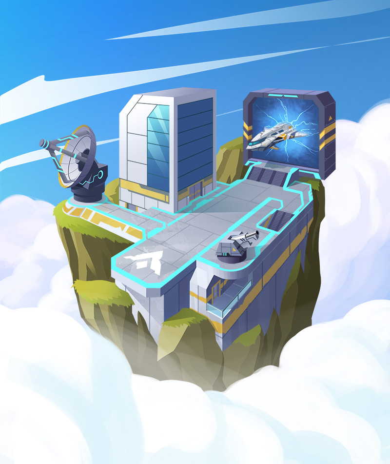
My original role on the project was to create all the illustration work for the game, but as the game progressed it became evident that if we were going to make the deadline of having all the artwork completed before Kickstarter launch I would need help. This deadline was a big challenge for me since the art style we'd originally planned for Skyward was fairly time intensive. It would have been a struggle to do all the artwork myself as originally planned so the decision was made to bring in more artists to lighten my load and to change the art direction of the project which would also speed up the process.
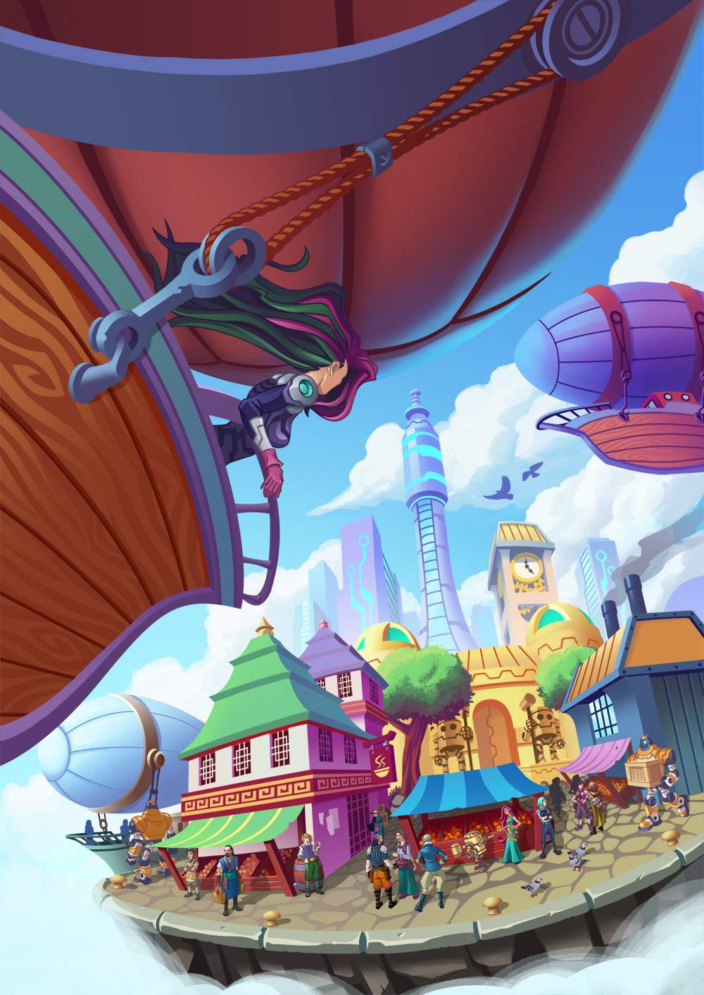
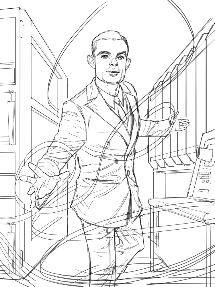
The Skyward cover art was developed from concept to finished piece as a collaborative process. The original sketch and base lines – Steven Preston. Characters – Ellie Jang. Colours – Neil Martin. Final touches – Steven Preston.
My role in the project also changed to Art Director, so I was overseeing the art as well as paint overs and making changes. Even though I felt kind of bad at no longer being the sole artist on the project, I really enjoyed working with other artists, making suggestions which improved the art and hopefully helped them grow as artists as well. I know for myself that Skyward would look very different today if I was the only artist on it.
What was the inspiration or core idea that drove your work on Skyward?
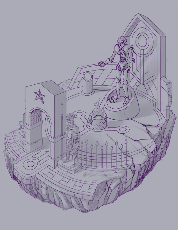
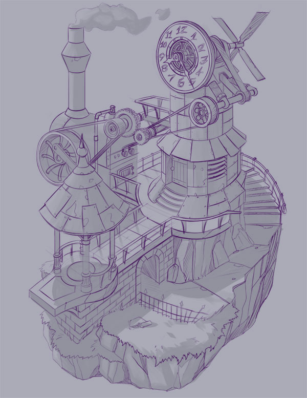
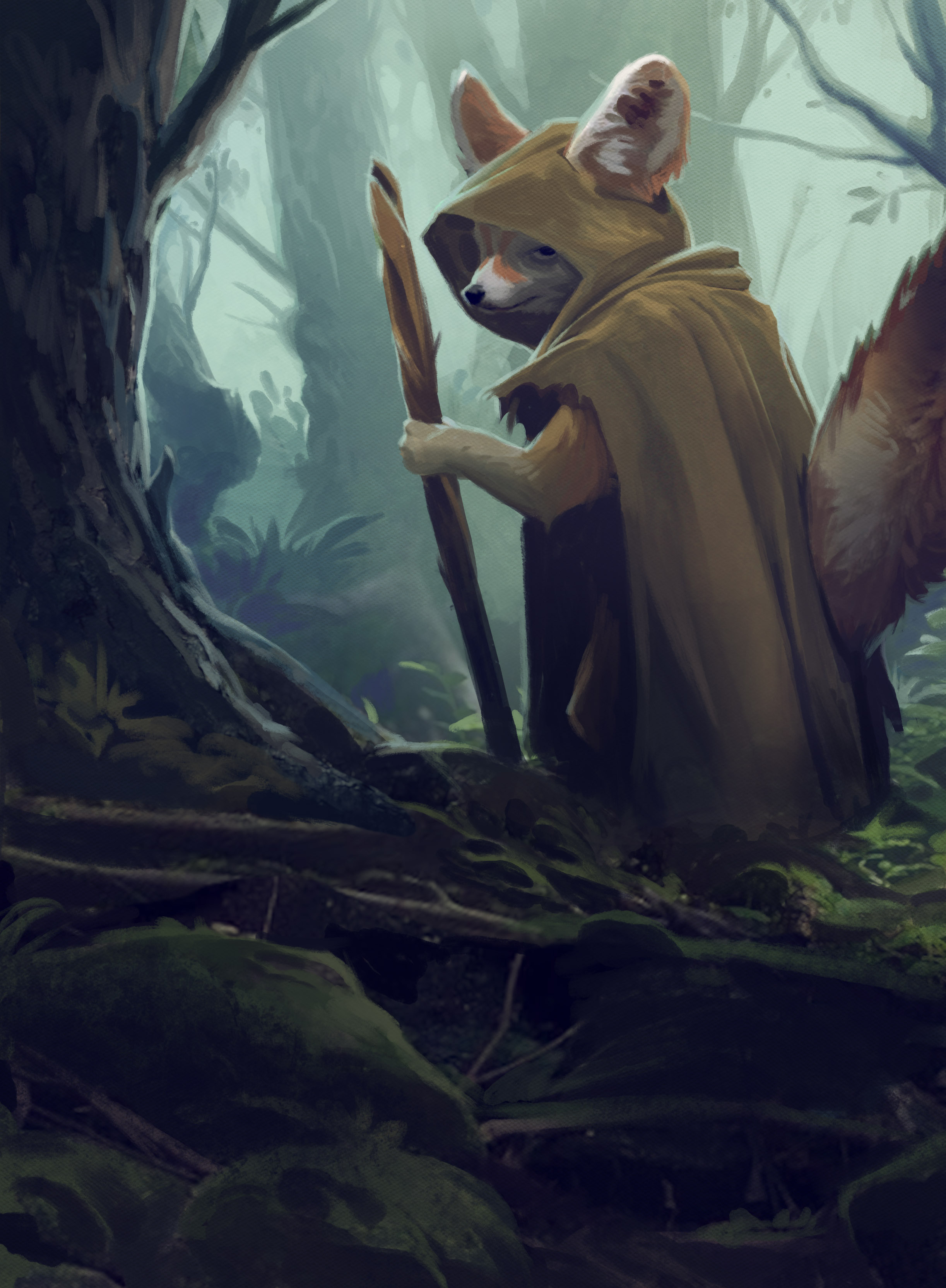
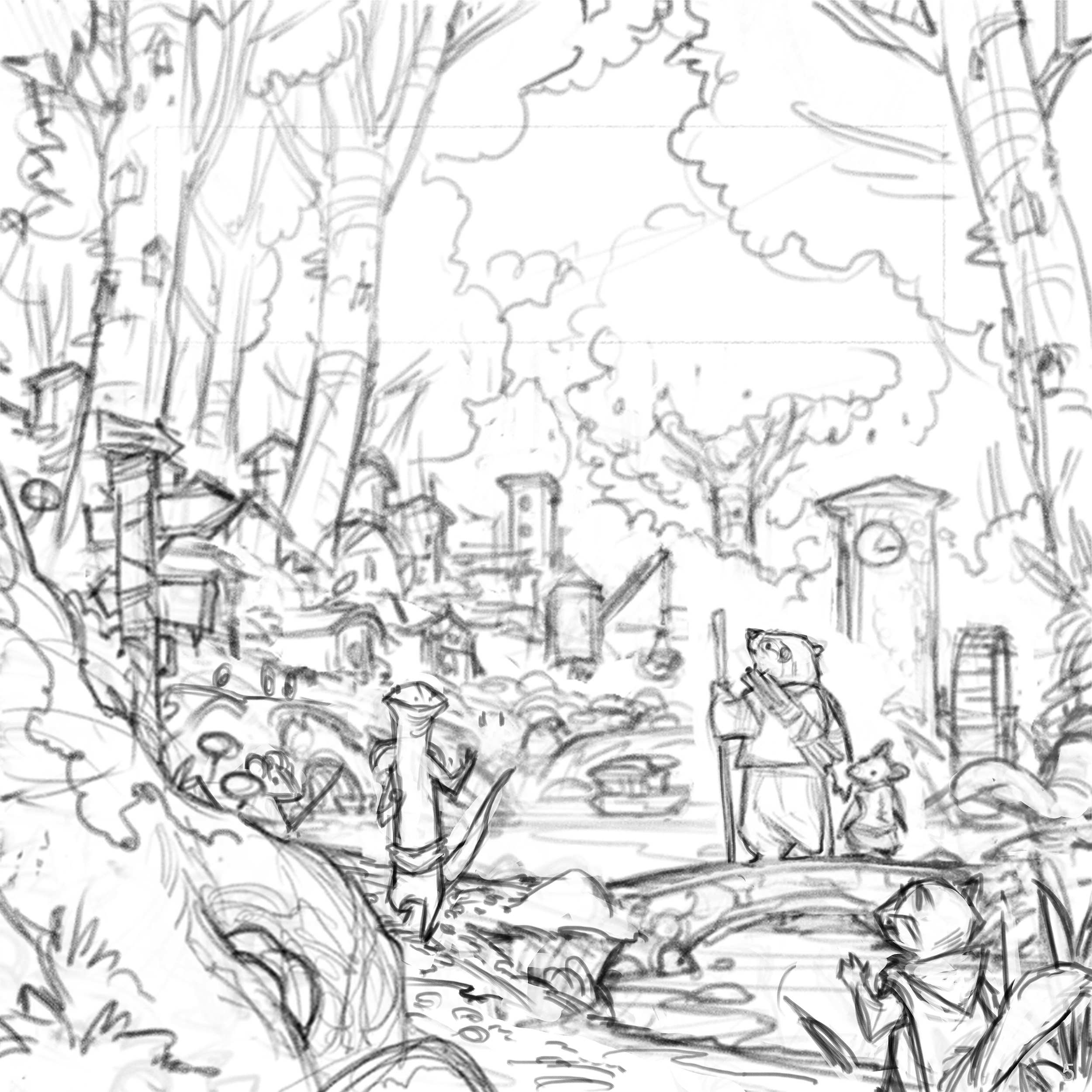
When I first started on Skyward I made an inspiration folder on my hard drive and kept filling it up with artwork I found which I thought was cool to use. Originally it was mostly isometric art from video games, since that was the style it was going to be. As I'd never really drawn any isometric art before, I didn’t know how long it would take or what style to do it in. I did some test pieces in different styles to see what worked.
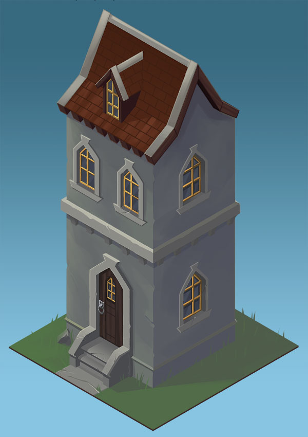
These didn’t really work, so I started looking at more pieces still in an isometric style but with a lot more detail, like something out of an RPG. It wasn’t until I saw a piece by Alex Shatohin that I found the inspiration for the art style of Skyward. I could imagine this small fortress separated from the ground, floating in the sky and people being part of this world which gave it that RPG element that I liked.
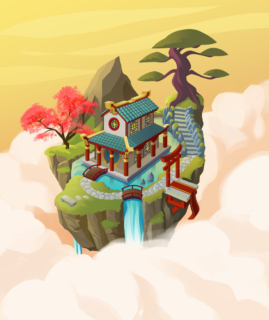
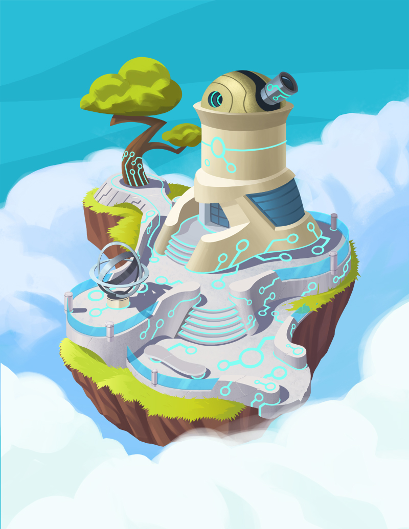
I would have loved to have done all of the Skyward cards like this, but we found that it was just taking too long and had to find a different style that was faster to complete. I was then inspired by a piece of art by Sergi Brosa which was closer in perspective while still having that feeling of being in the clouds. The use of depth of field in the piece was also something that we used in a lot of Skyward art as well.
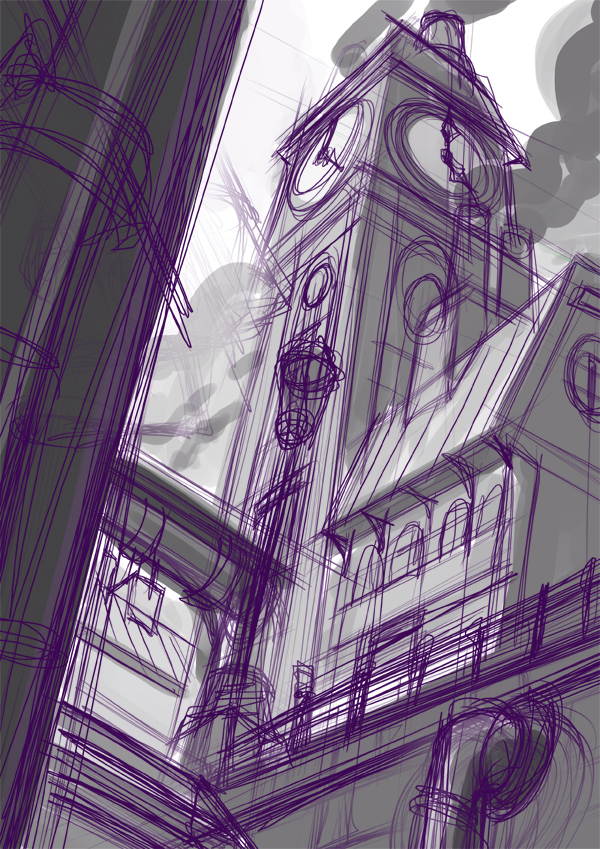
Clock Tower art from Skyward was my first piece for Skyward which ended up in the final version, so this became the template for the style of art used for the rest of the game. You can see the use of depth of field with the buildings in the background.
Once we settled on the art style for the game the next challenge was coming up with the graphic design elements of the card. Originally the plan was to have a ribbon type graphic on them which had some texture to it which I had created. But an issue we found was it was hard to work some of the game elements into that design, for example, the launch costs of the cards. It was also taking up a lot of room which took away a lot of the art. It wasn’t really until most of the card art was finished that Allen Chang came up with the design we have for the cards now, which is more modern with some interesting elements like a vertical strip that changes colours depending on the card faction.
What are you currently reading, listening to or looking at to fuel your work?
I can’t work without music so I’m listening to a lot of EDM when I’m working. Like I said in my intro, I play a lot of video games, so I’m always looking at game art for inspiration especially people like Blizzard. I don’t read much in terms of novels, but I do love reading a lot of webcomics. I especially love reading Stand Still, Stay Silent and Awaken.
What advice would you give to anyone wanting to work in the board game industry?
This is a hard question for me to answer because I kind of fell into working in the game industry from my networking really. But I will say that when Allen Chang from Rule & Make was looking for artists to help me out on Skyward he had a few contacts from people he’s met at conventions. So I say networking at conventions is important. Also using places like Artstation or Deviantart is good since I was also using those sites to look for local artists to help out.
Skyward character designs by Steven Preson. These characters were later redrawn for the game by artist Dmitriy Logunkov.
Do you have any current projects underway, or coming up that you’d like (or are able) to tell us about?
At the moment I’m not involved in any projects, but I’ve been talking with Rule & Make about something which I can’t say at the moment.
Finally, if we’d like to see more of you and your work, where can we find you?
Sure, if you want to see more of my work my main portfolio site is http://designinfusion.com/ but I also have a DeviantArt page which tends to have a lot more work on there, such as sketches.
(All images supplied by Steven Preston, 2018)
Donning the Purple: Art in Board Games #30
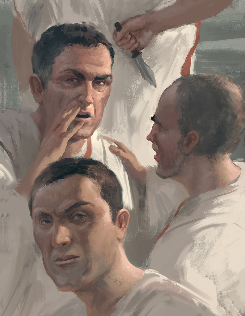
Joeri Lefevre provided all the card art and the amazing box art. I wanted his art pieces to be classical and to depict different situations in the daily life of Roman people [..]
Welcome to Issue 30 in my series sharing the stories behind board game art.
I often talk to game designers and artists involved in Kickstarter projects, so it seemed only right that I give this some more attention. I'm happy to be joined by Petter Schanke Olsen, of Tompet Games, to discuss the art of his Kickstarter game Donning the Purple.
For more great insights into board game art, head to the interview archive.
Hello Petter, and thanks for taking the time to speak to us. Firstly, could you tell us a little bit about yourself?
I live in Norway and I’m a movie producer by day and a board game designer by night. I launched my first game on Kickstarter in 2016 and that was a light war game called ‘Kill the King’. Now, I'm Kickstarting my second game which is called ‘Donning the Purple’.
I also run a blog where I interview other board game creators about the different tactics they use on Kickstarter.
I have played board games all my life but kind of rediscovered them again when I played games like Dominion and Agricola 3 or so years ago. Now I tend to play medium to heavy strategy games. The longer the better!
So, can you describe your Kickstarter game to us and what makes it interesting?
Donning the Purple is an asymmetrical king of the hill game with a bit of worker placement. Each player leads a powerful family in ancient Rome, trying to get the most victory points during 4 rounds. If your family member becomes the emperor and manages to hold the position he can earn lots of points. However, he will also become the target of the other players, as they will try to dethrone him and become the new emperor themselves.
How long have you been working on this game? What made you launch the campaign now?
I have worked on the game for 1.5 years. It is now finally complete and we have come to a place where we want to be in regards to the marketing so this seems to be a good time to launch. February is also a good month to launch in general.
Why Kickstarter?
We have paid for the art and prototypes ourselves but we need your help to get the funds to print the game. We chose Kickstarter as our crowdfunding platform because that is where the board gamers are.
What was the inspiration or core idea that drove your work on the art?
I have two different art styles in the game:
For the game board, I wanted an old and detailed styled map. So I contacted Daniel Hasenbos who is a cartographer and we worked out a style for the map and it has now become the main attraction of Donning the Purple. Daniel carefully illustrated every palm tree, monument, and coastline. He has a great eye for detail and by intense research has added historically correct buildings and monuments throughout the Roman empire.
Joeri Lefevre provides the other art style in the game. He has made all the card art and the amazing box art. I wanted his art pieces to be classical and to depict different situations in the daily life of Roman people and I think he has done an awesome job. I gave Joeri this sketch when I was telling him how I wanted the box art to look and this is what he turned it into.
Could you tell us about the biggest challenges you’ve faced in creating the art for this game and how you’ve overcome them?
I'm going to let my artists answer this:
Daniel Hasenbos:
"My job was to design the map for Donning the Purple. The map needed to show the Roman Empire at its height, covering most of Europe and the lands around the Mediterranean.
With this came the first challenge. The map needed to give an impression of the geography of the land, but at the same time, it shouldn't distract the players from the game itself. I decided to go for a muted color palette, as not to take attention away from all the other elements of the map, and of course the game.
The map also needed to capture the feel of the Roman Era, while keeping all elements of the map clear, and visible. Throughout the map, I made sure to hide famous features and structures of that time. In addition to that, each capital city is drawn in a style that identifies that area's architecture. This was a great way to show different architectural influences around the Roman Empire.
The result is an elegant map of the Roman Empire, with many hidden details for players to explore. These details, together with the overall feel of the map help people immerse themselves in Donning the Purple!"
Joeri Lefevre:
"One of the interesting aspects of the project is that it’s based in history. How did the people dress at that time? What did the environment look like? I tried to find the answer to these questions in archaeological finds, other artists interpretations of that time, and photos of real-life re-enactors. That’s the formal stuff, but the real challenge is balancing this historical background, with the requirements of the board game and my own artistic interest.
A goal of the image is the story it needs to tell when playing the game. How do I show the player who they are and who the enemy is? Poses, expressions and the colors of garments help to tell the story. To create this, I looked at good reference photos or when needed, shot my own.
Artistically, I aimed to give the box art a hint of a neoclassical painting. With this aesthetic, I hope to introduce the viewer to the historical setting of the game. In the cards, I take a more direct perspective if the concept allows it. To do everything in a manageable timeframe I chose an impressionistic loose way of painting. In the end, it’s an interesting mix of challenges that come together in the images I make."
Do you have any stretch goals involving the artwork? If so how will you manage them?
Yes if we are so lucky and reach some of our stretch goals there will be more art! But I can't say more than that at the moment
What advice would you give to anyone looking to launch a Kickstarter game?
Make sure you bring a crowd with you to Kickstarter. Do not rely on Kickstarter providing the backers you need and also read these blogs! Kickstarterlessons.com & Jamesmathe.com
Finally, if we’d like to see more of you and your work, where can we find you?
You can check out the Kickstarter for Donning the Purple over here and the links for Joeri (www.joerilefevre.com) and Daniel (www.danielsmaps.com)
(All images supplied by Tompet Games, 2018)
Neverland Rescue - Jacqui Davis: Art in Board Games #29
When I started out I tried to do everything for fear of upsetting people, and I still catch myself falling into that mindset every now and then. But I think it’s better to be upfront with clients at the start about deadlines, or whatever the issue may be, rather than dropping nasty surprises on them later..
Welcome to Issue 29 in my series sharing the stories behind board game art.
This week I’m joined by Jacqui Davis, an artist who has worked on games such as Ex Libris, Euphoria, Manhattan, Purrlock Holmes and Skyway Robbery and with companies such as Stonemaier Games, Dice Hate Me Games, IDW Games, and Game Salute. Her artwork charmingly echoes that of Disney, and I was curious to hear more about her work,.
For more great insights into board game art, head to the interview archive.
Hello Jacqui, thanks for taking the time to speak to us. Firstly, could you tell us a little bit about yourself?
Hi! I’m a board game artist and kid’s book illustrator currently living in Lytham St Annes, a little town in north-west England. I really love it because one of my favourite things to do besides drawing is to go on walks and when the weather allows, this is England after all, there’s plenty of places to go to unwind.
Now we know a little more about you, I have to ask, as a child what did you want to be when you grew up?
It might sound cliché but I always wanted to be an artist ever since I realised that could be a way to make a living. There was a brief period where I considered becoming a scientist so I could invent either a morphing cube (thanks Animoprhs) or a stargate, but that didn’t pan out.
So how did you first get involved in making board games?
Originally I had studied to be an animator but I discovered you need a certain sense of timing that I don’t possess. I also can’t dance, much to my ballet dancer mother’s disappointment!
I got involved in board games after I graduated university. During my studies I followed a few artists who worked in board games, and a good friend Katy Grierson already worked in the industry so I learned a lot from her. The first two clients I had that really got me into the industry where Jamey Stegmaier of Stonemaier Games and Dann May at Game Salute, I really owe them a lot of thanks.
When you are working on the art of a board game can you give us a quick overview of your creative or thought process and has this changed at all since you first started?
I work almost entirely digitally in Photoshop on my trusty Cintiq. Typically my process goes; sketch – colour rough – final, with changes done in-between as I get feedback from my clients. I find the sketching stage the hardest because often if a brief is really exciting I’ll have a finished image in my head and I just want to skip to that and ignore all the boring bits.
Sometimes we nail a design on the first round of sketching, but on others, things get changed along the way. If the brief asks for something specific I’ll always do research while I sketch and I often end up with files filed of references after a project.
You were involved in the creation of upcoming game Neverland Rescue, so could you tell us a little bit about what that involved and what were the biggest challenges you faced?
I think the biggest challenge I had with this game was that we didn’t want to reference Disney’s version of Neverland. You’d think this would be easy, but for me at least that’s where I go when I think of Peter (Pan) so to break that mental image was a bit tough. It was hard not to do a foppish Hook or an impish Peter.
Though the temptation was there I didn't watch or look at images of the Disney versions of the characters. Some things still snuck in, Peter's a redhead, though we tried black hair and decided it didn't work. I went back and looked at the original book illustrations and stills from several stage productions to get ideas since Peter Pan has been a stage tradition for years.
What was the inspiration or core idea that drove your work on Neverland Rescue?
In the case of Neverland Rescue, this one’s pretty easy; we wanted to stick close to J.M Barrie’s version of Peter. Dan Letiman was really great with providing descriptions and images from his copy of the book before I started sketching. He and the team also caught me out when I was leaning too close to Disney and away from Barrie. We got rid of Michael Darling's (Wendy's brother) top hat since that was a Disney invention.
There were a couple of things other things about Barrie's version I didn't know about prior to the game. First of all is the existence of Gentleman Starkey, a member of Hook's crew who has impeccable manners and is 'dainty in his way of killing' (and my new favourite character). The second was that apparently, Tink is 'embonpoint', something I had to look up, which means plump. Also, that mauve faires are boys, white are girls, and 'blue are sillies who don't know what they are'; Tink seemed to me to be a silly.
What are you currently reading, listening to or looking at to fuel your work?
What I listen to doesn’t always come through in my work. I enjoy having Netflix or an audiobook on in the background because it tends to keep me in my seat more than music. Currently, I’m working my way through Hell on Wheels, listening to the Silk Roads: A New History of the World and reading the King’s Curse. Anything about history has my interest and often this finds it’s way more inter my personal art than my professional work.
What advice would you give to anyone wanting to work in the board game industry?
I think my advice would be to make good contacts and be honest about what you can and can’t do. When I started out I tried to do everything for fear of upsetting people, and I still catch myself falling into that mindset every now and then. But I think it’s better to be upfront with clients at the start about deadlines, or whatever the issue may be, rather than dropping nasty surprises on them later in the day.
Do you have any current projects underway, or coming up that you’d like (or are able) to tell us about?
Well, I’m currently working on Neverland Rescue with Letiman Games that I’ve spoken about above that I’m pretty excited about. I’ve also recently done a game with FoxMind Games that will be previewing at Nuremberg Toy Fair that I think will be a lot of fun for kids and adults. It also involves pirates, the last month or so has been pretty fun with all the swashbuckling going on in the office.
Finally, if we’d like to see more of you and your work, where can we find you?
I tend to be most active on Twitter and Instagram, my handle is @logicfairy.
My portfolio is over at jacquidavis.com.
(All images provided by Jacqui Davis, 2018).
Escape the Dark Castle - Alex Crispin: Art in Board Games #28
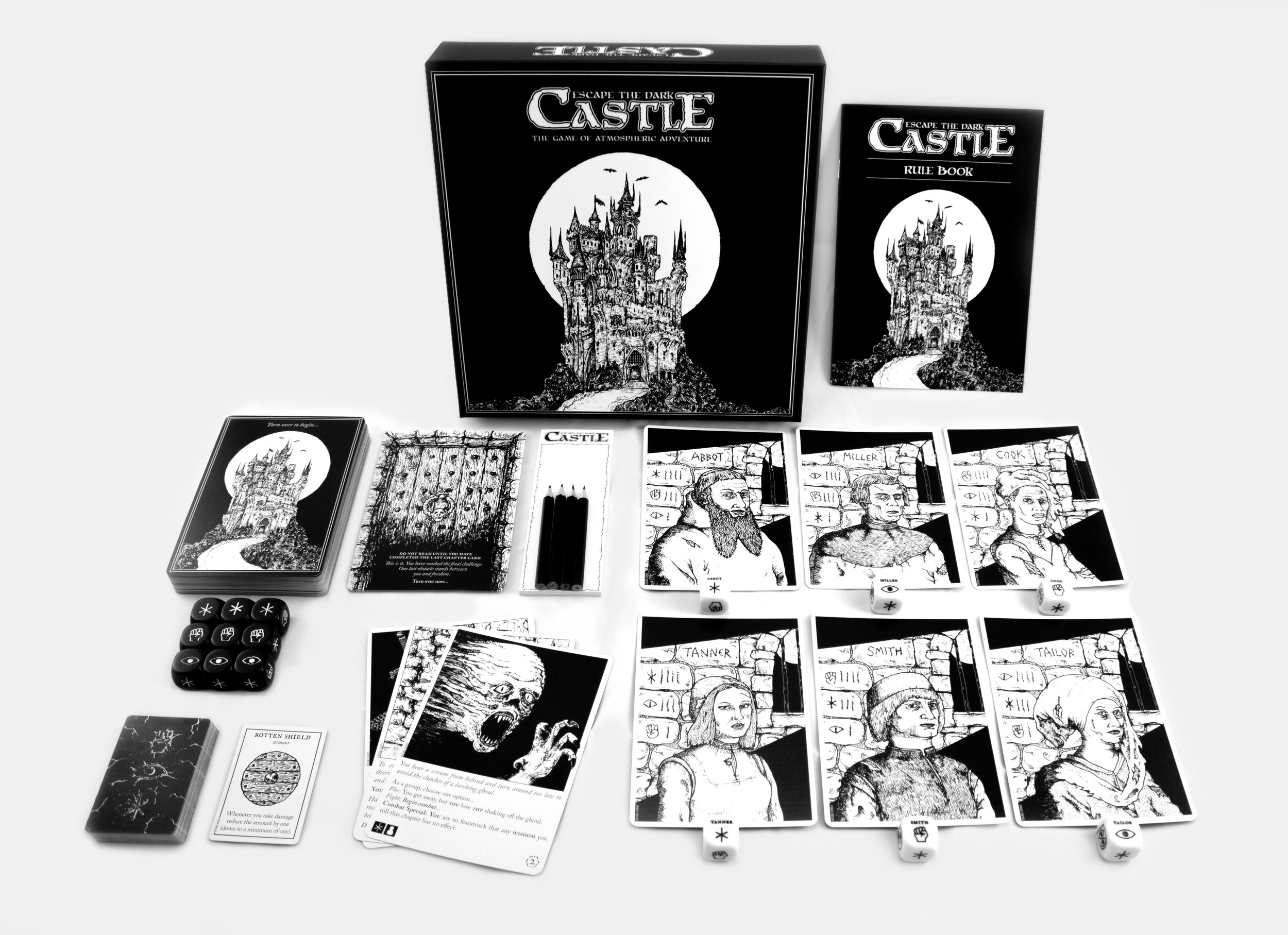
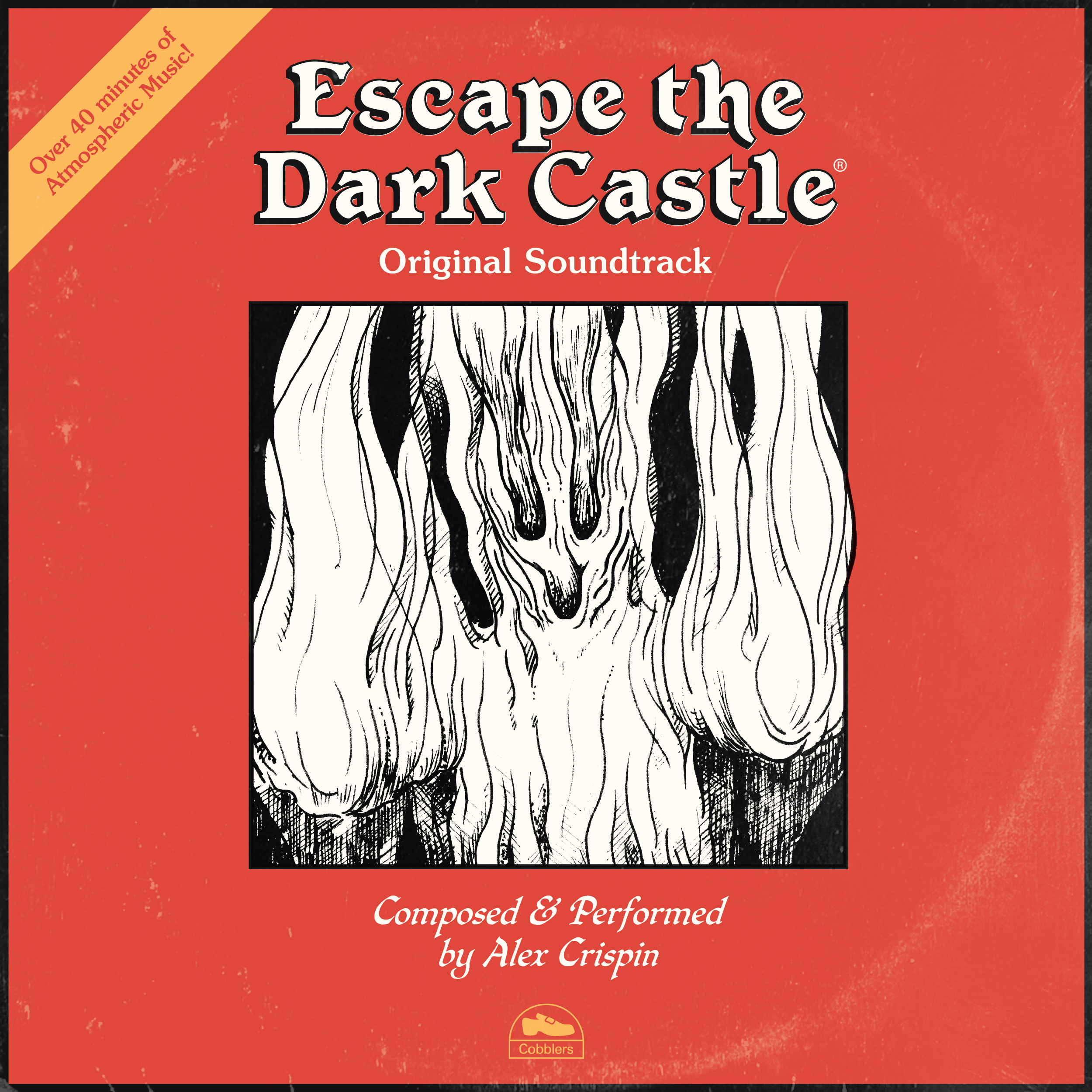
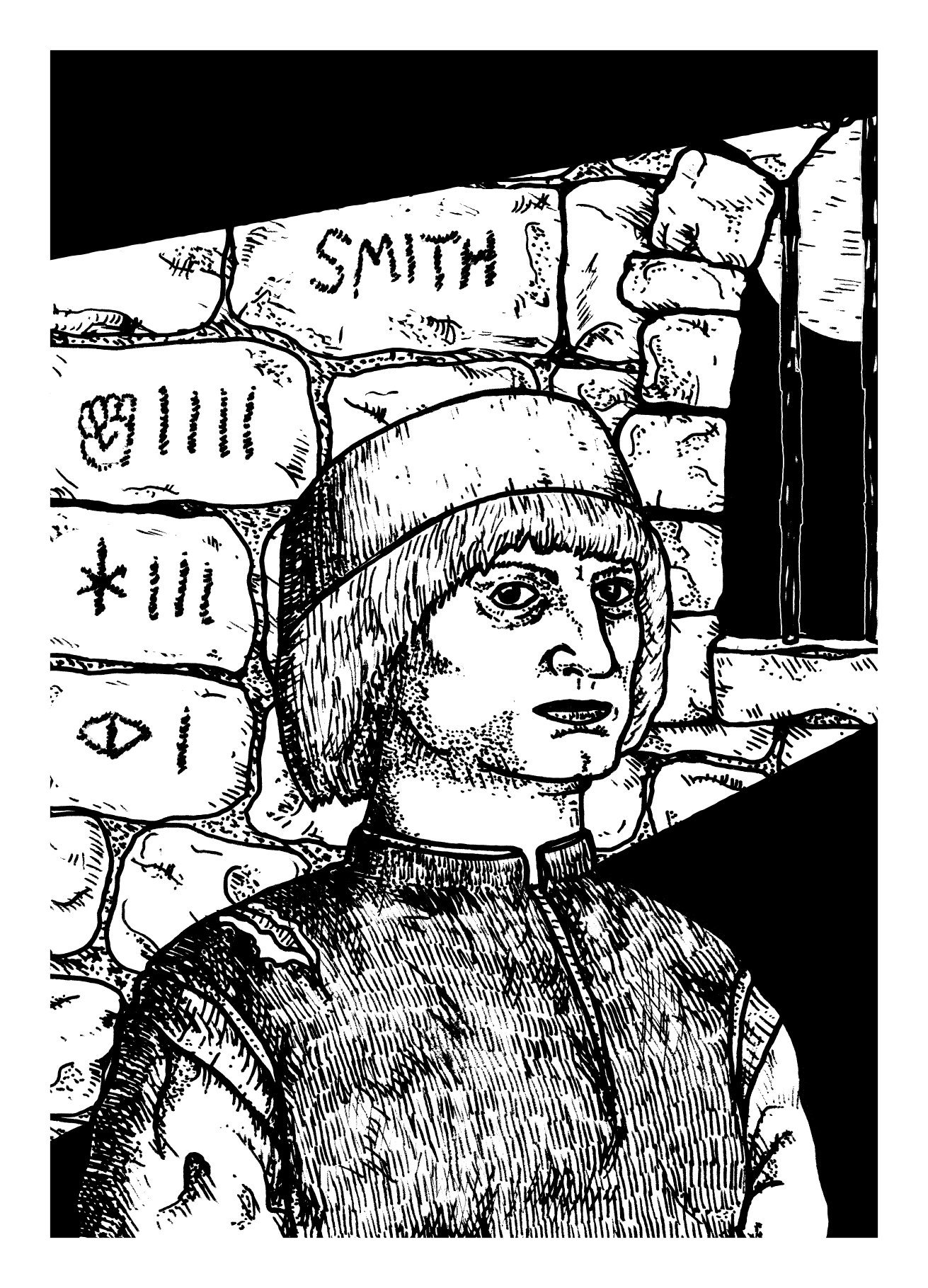
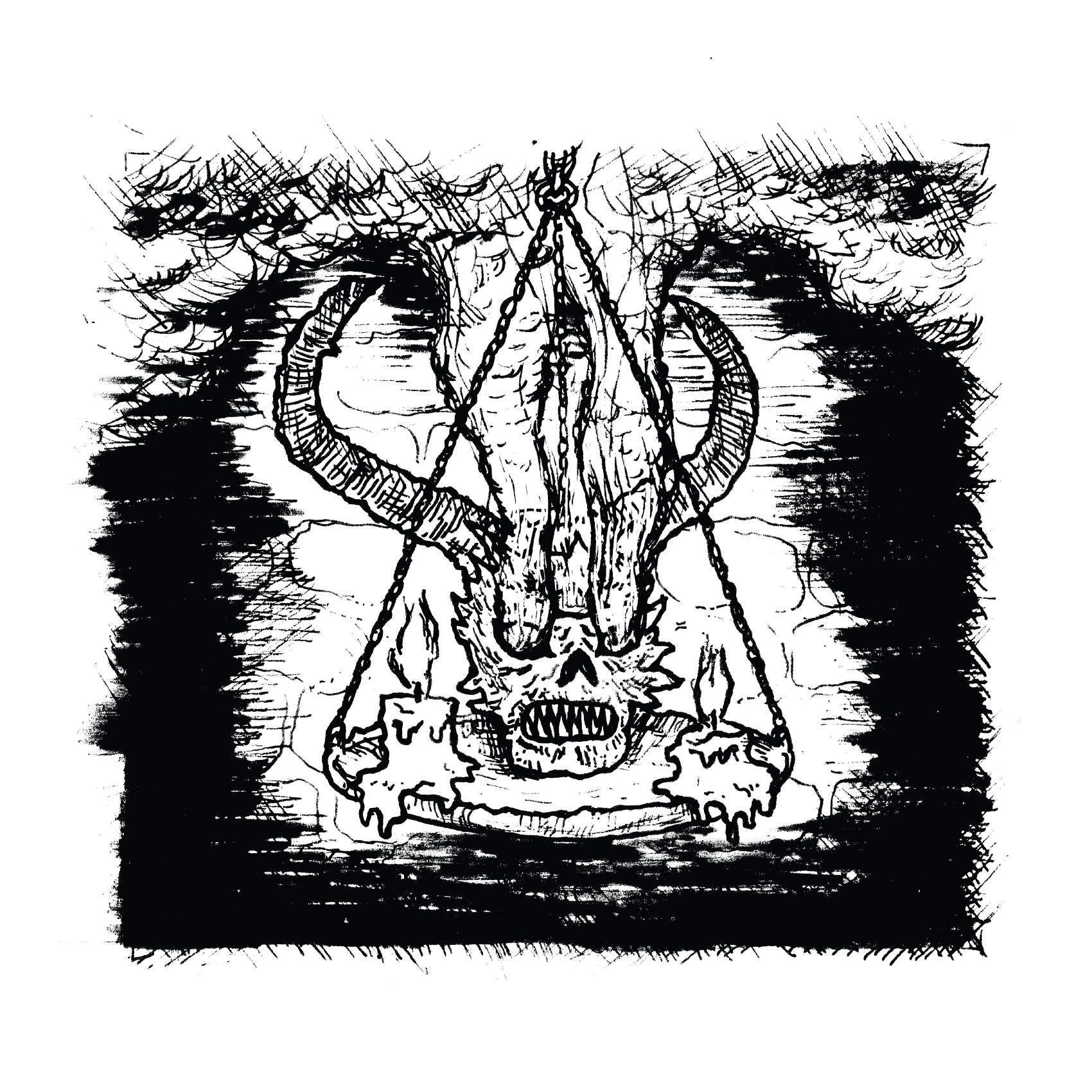
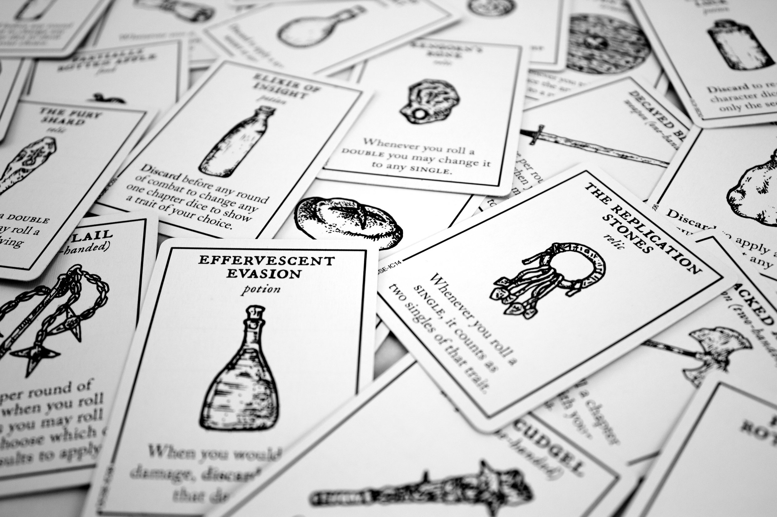
This week I'm interviewing Alex Crispin the illustrator of brand new game Escape the Dark Castle by Themeborne. As we both live in Nottingham it seemed only right we meet up in person to have a face to face chat.
Welcome to Issue 28 in my series sharing the stories behind board game art.
This week, I interviewed Alex Crispin, the illustrator of the Escape the Dark Castle board game from publisher Themeborne. We both live in Nottingham, so rather than send emails, it seemed only right that we meet up in person. This audio format is probably a one-off, and the audio quality on my side leaves a lot of room for improvement, but I hope you enjoy our chat!
Check out the interview archive for more great insights into board game art.
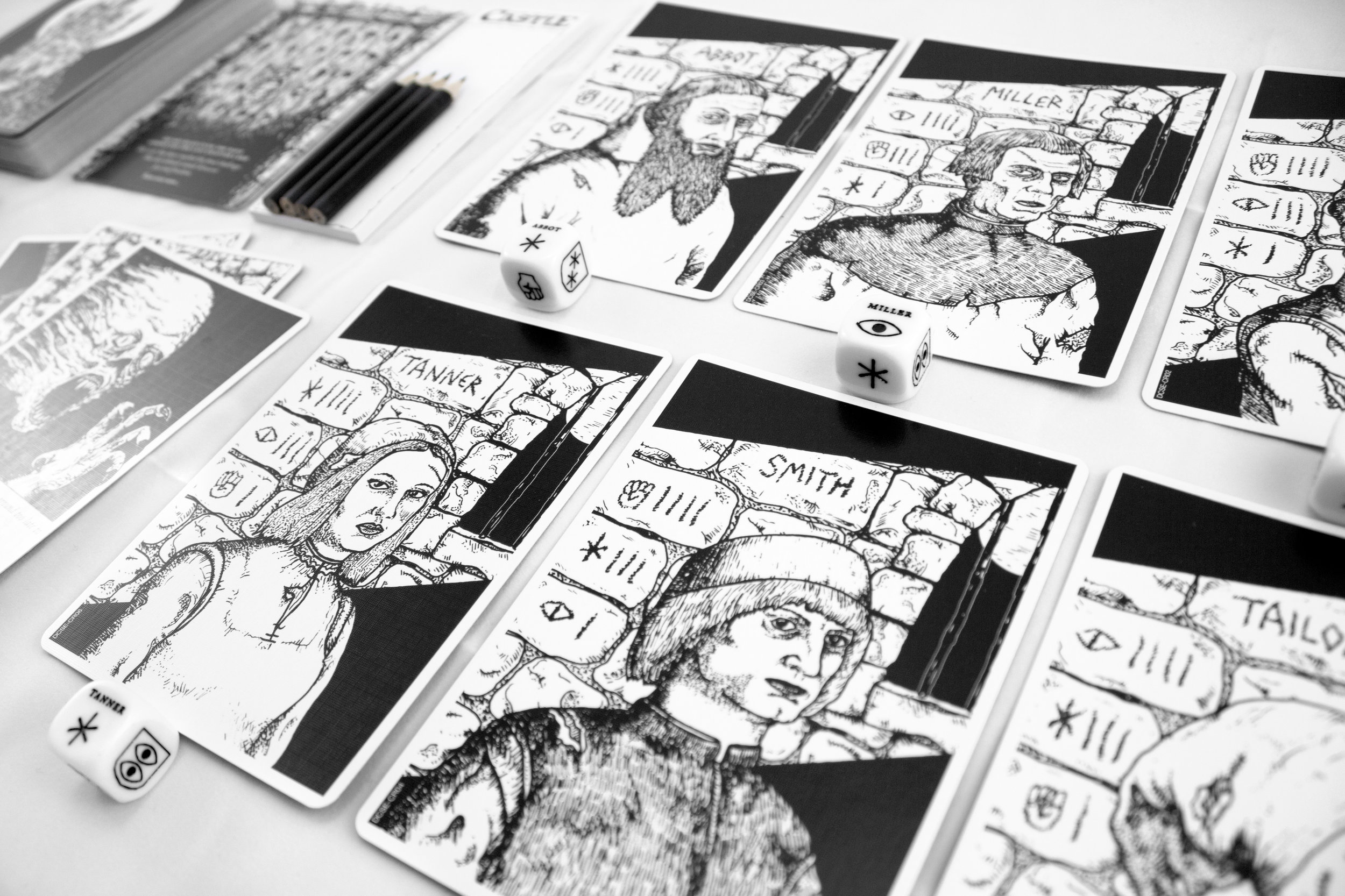
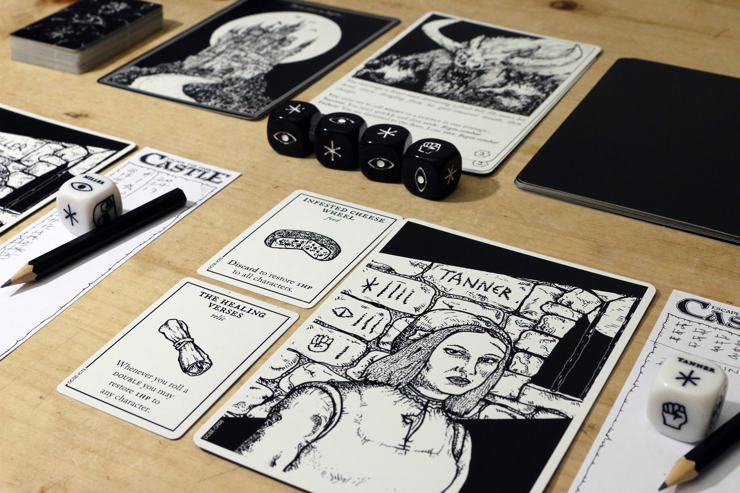
Also included is a gallery of game images so feel free to look through these whilst listening.
Unearth - Jesse Riggle: Art in Board Games #27
I'd also recently moved to Europe for a stint and loved seeing all the old castles and wanted to do something with that. So I combined that with my affinity for isometric projections and started to play around and liked where it went. The game features a bunch of unique environments, such as..
Welcome to Issue 27 in my series sharing the stories behind board game art.
This week I’m joined by Jesse Riggle, an artist and illustrator whose stunning work on the game Unearth with publisher Brotherwise Games caught my eye.
For more great insights into board game art, head to the interview archive.
Hello Jesse, thanks for taking the time to speak to us. Firstly, could you tell us a little bit about yourself?
Sure, aside from commercial work I do a lot of pop culture related paintings for gallery shows and I try to do a fair bit of personal work in my free time. I’ve also spent as much time as possible traveling the past several years.
Now we know a little more about you, I have to ask, as a child what did you want to be when you grew up?
I wanted to be an entomologist (insect scientist) or a cartoonist. I decided in my early teens to pursue the art thing instead of the science thing, but I still sometimes like to imagine a life living in a jungle looking for new bugs.
So how did you first get involved in making board games?
I’ve only worked on one game, and it was something that kind of found me. I did a series of pieces in an isometric style that resonated with the right people and it grew from there. I was super excited to work on the project, as I am a fan of board games and am impressed with the volume of amazing games coming out these days, it seems to be a rapidly evolving art form.
When you are working on the art of a board game can you give us a quick overview of your creative or thought process and has this changed at all since you first started?
My main focus is making art that people will enjoy looking at. It’s kind of secondary to the gameplay, but I think something that is aesthetically interesting adds another layer to the whole experience. I’m also concerned how to keep the art consistent, but unique enough that the different parts are identifiable at a glance.
You were involved in the creation of Unearth, so could you tell us a little bit about what that involved and what were the biggest challenges you faced?
For Unearth I was given the task of creating the overall look and feel of the game. It was based on a style I had already worked in so it came pretty naturally, but I was faced with creating a large number of pieces with unique settings. The biggest challenge was trying to remain consistent whilst keeping the imagery from being too repetitive, which I tackled during the rough sketch phase. I tried to think of larger overall shapes for each piece and then picked different details to focus on as a sort of two-tiered approach. One detail might be a single central structure dominated by a water feature and another a series of smaller structures connected by stairs. I think it helped to try and sketch out as many pieces as possible before moving to the final stages.
What was the inspiration or core idea that drove your work on Unearth?
As I mentioned, the style was based on some personal work I had done just for fun. I often draw strange somewhat lumpy characters and faces, so I had a desire to do something more sculptural and environmental in nature just to mix things up. I'd also recently moved to Europe for a stint and loved seeing all the old castles and wanted to do something with that. So I combined that with my affinity for isometric projections and started to play around and liked where it went. The game features a bunch of unique environments, such as a desert world and an island world, so for those, I drew on my travels around the world to influence the visual language, shapes and color palettes of each environment.
I'm actually doing something similar at the moment in a totally different style to scratch the same itch in mixing up what I do.
What are you currently reading, listening to or looking at to fuel your work?
I’ve been listening to a lot of podcasts recently. My favorites are probably The Adventure Zone, Judge John Hodgman, The Greatest Generation, and Lore. I also have a tendency to have old Star Trek shows playing in the background while I work.
What advice would you give to anyone wanting to work in the board game industry?
Stick to your artistic morals. It seems to be a growing and evolving world with a lot of room for fun and experimentation, so just have fun!
Do you have any current projects underway, or coming up that you’d like (or are able) to tell us about?
I’ve mostly been focusing on some personal projects and gallery work recently, so nothing concrete at this time, but hopefully something fun will come along!
Finally, if we’d like to see more of you and your work, where can we find you?
I’m on Instagram and Twitter under the handle @jessealso and I’m also on tumblr at jesseriggle.tumblr.com.
My main website is jesseriggle.com.
(All images are copyright of Jesse Riggle, 2018).
Andrew Bosley: Art in Board Games #26
Never stop learning and practicing! As my professors used to tell me, it’s the mileage that matters. There are plenty of people with pure, raw, exceptional talent, that have their path laid out for them. But the rest of us just need to work hard. For both art and game design..
Welcome to Issue 26 in my series sharing the stories behind board game art.
This week, I’m joined by Andrew Bosley, an illustrator, concept artist, and game designer who has worked on games such as the iconic Everdell. He’s also worked with companies such as Asmodee, Game Salute, and Ubisoft. I’m sure we’ll see more of his work in the years to come. Enjoy our conversation below!
Check out the interview archive for more great insights into board game art.
Hello Andrew, thanks for taking the time to speak to us. Firstly, could you tell us a little bit about yourself?
Sure! I grew up in Southern California with a passion for drawing. Had very supportive parents that helped me follow that passion. Took a pretty typical art journey that led to studying illustration at San Jose State University, with my aim to become a visual development artist in feature animation. I interned at Hallmark Cards the summer before my senior year, finished up my BFA in 2006, and then changed directions a little and took a job in video game concept art. I worked in-house at Ubisoft for seven years and then decided to go freelance in 2013. Now I live in cool, northern Arizona with my wife and five kids.
Now we know a little more about you, I have to ask, as a child what did you want to be when you grew up?
I always wanted to be an artist. For a long time, I thought that meant being a Disney animator. Then I decided I wanted to be a children’s book illustrator. I was only exposed to the type of work I ended up in after entering SJSU.
So how did you first get involved in making board games?
I have always loved board games! But it was never something on my radar when it came to work. It was just something I liked to do. After starting my first job as a concept artist in the video game industry, I looked for ways to scratch my illustration itch through freelance work. I got lots of RPG art commissions from the smaller companies. Then some of the bigger publishers took me on. By the time I went full-time freelance, I thought the only options for illustrators in tabletop games was in the RPG market. I went to a fantasy illustration convention looking for opportunities with the biggest publishers and failed miserably. But while there, I met an artist that would soon become a good friend named Bryan Fyffe and he pointed me away from the fantasy illustration rat race towards board games. It was the perfect fit for me and my style. I was fortunate to have established some good connections in the industry and board game jobs starting coming in. Also, when I moved to Arizona, I also started developing my own board game. That led me to GenCon, which led me to lots of new board game clients. While I still do a lot of video game concept art for work, I feel like board games will soon be my long-time home.
When you are working on the art of a board game can you give us a quick overview of your creative or thought process and has this changed at all since you first started?
When it comes to creating the actual illustrations, the process has evolved as I’ve changed as an artist. The process of making the art itself is probably pretty boring to normal people. But I have always had a love of art direction, graphic design, and brand identity and that is probably the thing that I enjoy the most when it comes to creating art for games. Helping to form the overall look of a game/product. When I work of others, I rarely get to look at the big picture in that way. But for my own brands, whether they’re games or apps or stories, I love the process of creating meaningful, iconic themes in style and storytelling.
You were involved in the creation of Mission: Red Planet, so could you tell us a little bit about what that involved and what were the biggest challenges you faced?
Yeah, I had the privilege of doing the cover art and all the character card art for the rebooted Mission: Red Planet. Mission: Red Planet is a great game with some history. Bruno Cathala and Bruno Faidutti created the original back in 2005 with a great artist named Christophe Madura. My job, ten years later, was to create a new look that had some of the influence of the previous version, but could hold up on it’s own and still represent the brand well. Asmodee was a publisher that I had worked with previously and they felt my style would be a good fit for their redesign. Though, I didn’t get to work with either designers during the process, I learned the game and tried to capture the themes and style of the game’s narrative. Then I got to have a lot of fun executing what I thought would make for a cool look!
What was the inspiration or core idea that drove your work on Mission: Red Planet?
It was pretty serendipitous that I was on an Edgar Rice Burroughs binge at the time. I listened to most of the Barsoom audiobooks during the illustrating process. It didn’t necessarily inform the art directly, but it helped me get in the right frame of mind. It wasn’t hard to think about Mars colonization in 1888 with some early 1900’s adventure stories playing in my ears.
What are you currently reading, listening to or looking at to fuel your work?
I really love to listen to audiobooks and podcasts while I work. I recently finished 1776 by David McCullough for the millionth time and I’m now starting the Lord of the Rings series for the millionth time. The podcasts on my regular list are Hardcore History, Trailblazers with Walter Isaacson, the Art of Manliness, and Ludology. Sometimes I throw in some bluegrass music, movie soundtracks, or Enya (that’s right!) when I’m in the mood.
What advice would you give to anyone wanting to work in the board game industry?
If it’s board game art, probably the same advice I’d give to any aspiring artist. Never stop learning and practicing! As my professors used to tell me, it’s the mileage that matters. There are plenty of people with pure, raw, exceptional talent, that have their path laid out for them. But the rest of us just need to work hard. For both art and game design, there are so many fantastic resources out there these days. Both are very generous communities. You just need to grab those resources, study, limit the pointless distractions in your life, and start making!
Do you have any current projects underway, or coming up that you’d like (or are able) to tell us about?
I just finished work on the upcoming game Everdell by Starling Games (Game Salute) which kindly showcased my work handsomely. It’s a great game centered around forest themes and woodland critters. When the publisher first pitched it to me, it reminded me of the Redwall book series I grew up reading and I fell in love. Starling Games was very trusting with the art and allowed me to run with it in fun directions. It’s turned out quite charming! On the personal side, my big project currently underway is a new game coming to Kickstarter this summer. It’s a card drafting, tableau building game set in a fantasy Golden Age of Aviation called Planecrafters. I created it with a good friend and we’ve been working on it for over 2 years now. It’s got a unique game style with a unique art style (that I had lots of fun designing) and it’s something I’m really proud of! Jump to our site www.paisleyboardgames.com for more info!
Finally, if we’d like to see more of you and your work, where can we find you?
My portfolio site is www.bosleyart.com, but you can also find me on Facebook, Twitter, and Instagram.
(All images provided by and copyright of Andrew Bosley).
Tania Walker: Art in Board Games #25
Achieving my life’s dream at 21 was eye-opening. Setting aside the 70-hour working weeks, what I found at Disney was that I didn’t enjoy being a cog in an enormous machine. Turned out what I really wanted was not to work with a specific company, but rather, the chance to shape my creative work in a meaningful way...
Welcome to Issue 25 in my series sharing the stories behind board game art.
This week I’m joined by Tania Walker, an art director, illustrator, and graphic designer who has worked on games such as Dracula’s Feast, The Lady & the Tiger, and Goblin Quest, and with companies/publishers such as Jellybean Games, Rule & Make, and Greater Than Games. Discover more about her work below.
For more great insights into board game art, head to the interview archive.
Hello Tania, thanks for taking the time to speak to us. Firstly, could you tell us a little bit about yourself?
Hi, thanks for having me! Aside from spending most of my time making adorable games, I write as a sideline and have been published in several speculative fiction magazines. I live in Tasmania where it’s nice and cold (fun fact: parts of Australia are, occasionally, snowy!) and, outside of my assorted creative work, my proudest accomplishment has been teaching my cat to walk on a leash. I love tabletop roleplaying games and it’s a bit of a life’s dream to work as the Art Director on a project along those lines - so if you’re reading and you’ve developed something like that... (makes the ‘call me’ gesture).
Now we know a little more about you, I have to ask, as a child what did you want to be when you grew up?
At first, I wanted to be a vet, like James Herriot. Then I realised this would require putting down a substantial number of animals, and I’m too much of a softie for that. Next, I got obsessed with Disney films and decided I wanted to be a Disney animator. That one, I never grew out of – by the time I was 21 I was working for Walt Disney Animation Australia.
So how did you first get involved in making board games?
Achieving my life’s dream at 21 was eye-opening. Setting aside the 70-hour working weeks, what I found at Disney was that I didn’t enjoy being a cog in an enormous machine. Turned out what I really wanted was not to work with a specific company, but rather, the chance to shape my creative work in a meaningful way. After that, I spent years bouncing from one kind of art job to the next, looking for the elusive role that would let me feel like I had creative freedom and trust within a team of like-minded people.
During that time I also started playing modern tabletop games. Killer Bunnies was first. I recall looking at the art and deciding: “I could do a better job of it. I’d love to do this someday.” Yet it didn’t occur to me to aim for a job making boardgames; I didn’t think that was something you could do in Australia, and I had already decided against moving overseas for my career, as I love where I live.
So I continued freelancing and periodically working for companies in a wide variety of art and design jobs. One day an old acquaintance from Brisbane approached me – I’m sorry, this is the most Australian employment story ever – he was a guy who’d once bought a fridge from me, and he’d decided on the basis of my DVD collection that we should be friends, and added me on Facebook. We’d loosely kept tabs on one another ever since. That guy was Peter C. Hayward. He told me he’d started a boardgame company – Jellybean Games – and as he admired my art, would I like to come on board as a freelancer to work on a game called ‘Dracula’s Feast’?
What I found at Jellybean was a team of like-minded people who shared my creative goals and sense of humour, and who valued my contributions. Jellybean quickly became my core client, and I’m extraordinarily proud of the games we’ve made together.
When you are working on the art of a board game can you give us a quick overview of your creative or thought process and has this changed at all since you first started?
My role has deepened – initially, I was just a freelance illustrator with Jellybean, but as an art director I get a more substantial opportunity to shape the look and feel of our games. What I love about this role is that I get to think about the art of our games both from a macro and micro point of view – I have to consider how all the elements will work together as a package, but also have to zoom my attention close in to every tiny illustration and icon and border and make sure that each of these works individually. For tabletop games, illustrations in particular need to stand up to repeated scrutiny, because they’re going to be looked at again and again, sometimes for extended periods of time. If an illustration is low quality or if some detail is wrong, people will notice, and it’ll bother them.
So, at the start of a new project the whole team develops a theme for the game. It must reinforce the game's mechanics, must be relatively original (or at least be an original take on an old theme), and to be honest it has to be a theme we can all get excited about – because if we’re not interested in it, the art won’t be interesting and the players won’t be interested either.
I then start to think about broad art decisions like what kind of style and colour palette communicates this theme best? Realistic? Stylised? Cartoony? Pastel watercolours? Dark and gritty digital painting? What feel does this choice create; what expectations will it set up about the nature of the game? There’s a whole world of choices and approaches out there. I also consider what else is currently in the marketplace, and how we can make this game stand out from that crowd. For this last reason, I avoid the straightforward ‘semi-realistic saturated digital painting’ style, because no matter how well it’s done, it’s so prevalent right now that any game using it will visually merge into every other game on the shelf. I also consider: what are my strengths as an artist, and am I the best artist to create the kind of art this game needs?
Once all this is nailed down to the team’s satisfaction, I begin to gather references and visual inspiration, and from there I create my first card for the game (or the box art, in games that aren’t as heavily card-based), and that becomes both my place to experiment with technique and, when it’s done, my touchstone for the game art that follows.
I also do a lot of the graphic design for Jellybean, and I tend to develop that in conjunction with the illustrations, which allows me to get a more visually cohesive approach going than you’ll often get when a designer comes along once the illustrations are done and just designs around/over them.
There’s so much more to it than this, but you did say “briefly”, and I think I’ve blown past “brief” some time ago. I’ll add that the above encompasses what’s changed for me since I started with Jellybean: I’ve gone from creating illustrations on spec, to developing the look and feel of a game before I begin illustrating.
You were involved in the creation of The Lady & The Tiger, so could you tell us a little bit about what that involved and what were the biggest challenges you faced?
The great thing about L&T is that Peter just happened to approach me with this game idea that ticked all my personal creative boxes. I’ve always drawn cats of all kinds, and I adore drawing women, and here was a game entirely built around women and (very large) cats. Furthermore, we quickly agreed that my ‘core’ style – clean, bright and Disney-influenced – would be ideal for this game, which removed the usual start-of-project period I spend figuring out how to pull off a brand new style.
I really do enjoy working in a variety of styles; the challenge is fun and it keeps me from getting bored. But it was so nice to go with the flow on this one. The clear dichotomies in the suits in this game – Lady/Tiger and Red/Blue – set limitations that fostered creativity, really. The limited colour palette, rather than constraining me, kept that side of the project fairly simple. Constraints foster creativity; never let anyone tell you otherwise. The scariest thing in the world is complete freedom and a blank sheet of paper.
Probably the biggest challenge in this project was that for every Lady in the game, there was a Tiger, and it was getting difficult to come up with new ideas for the tigers (there are eight in the game, and I wanted each of them to be distinct). With Ladies, you can work with distinct ages, body shapes, ethnicities, clothing, body decoration, hairstyles, etc. Tigers lack a lot of these differences, and while they really do have a lot of variety (after studying dozens of tiger photos, I can confirm this!), we’re not trained to notice it so much. So getting eight big stripey cats to look distinct from each other required a lot of jiggery-pokery. (That’s the technical term.)
What was the inspiration or core idea that drove your work on The Lady and the Tiger?
Peter’s interest in it was piqued by a combination of the famous story, The Lady and the Tiger, and the They Might Be Giants song based on the same. He popped that onto the game as a working theme, meaning to replace it later, but when I heard the premise I was so excited to work with it we ended up keeping it.
Part of my excitement comes from the flipside of The Tiger Problem – the Ladies! Women are woefully underrepresented both in the board game industry and within games themselves. Generally, I aim to depict gender parity in every game I illustrate, but this one allowed me the opportunity to draw just women from start to finish: young, old, all different shapes and sizes and ethnicities and attitudes. Honestly, I wish I’d been able to draw even more – I had so many ideas I didn’t get to use!
What are you currently reading, listening to or looking at to fuel your work?
I’m constantly buried in a speculative fiction novel or two – just finished a streak of reading recent Australian YA post-apocalyptic books, and topped that off with ‘Who Fears Death’ by Nnedi Okorafor, and I’m listening to the audiobook of Stephen King’s ‘Sleeping Beauties’ now. Sadly I can’t listen to books while I work; it’s too distracting. Even music with lyrics is sometimes a bit much, so when working I tend to find one of those Youtube “eight hours of study music” compilations to put on in the background.
I’m always looking at everything; I draw a lot of inspiration from the natural world where I live in Tasmania, and aside from that I encounter amazing artists and art daily on Twitter and Pinterest. I’ve also got my own big reference library of art technique books on illustration, character design, digital painting and so on, and I turn to that when I need to figure out how to do something specific I haven’t done before. Beyond that, there’s always Google.
What advice would you give to anyone wanting to work in the board game industry?
Get your skills up. Chances are companies will need you to do a little of everything, so if you’re precious about only ever working with one style or one subject matter you’re gonna have a hard time. Master working digitally, as that’s how games are made now. For goodness sake, if you’re drawing only anime, stop. If you’re only drawing women with big boobies, move on from that too, because the industry is moving on and you don’t want to be that one embarrassing dinosaur left behind.
Take on all kinds of freelance work anywhere you can; every job teaches you something. Find mentors (formal or informal) in the industry and ask advice. Formal schooling is not a must-have, but it doesn’t hurt! If you decide against formal schooling, make sure you’re incredibly self-driven and constantly learning – technical books on the craft of illustration are increasingly in-depth and easy to find, and the internet is a rich resource for tutorials (but be critical about what advice you take, and find what works for you). Approach your work with humility and the understanding that you can always grow.
Games art isn’t just about technical skills either. You’ll be working with (and for) others, so stow your ego. A game is a team effort. Your art will have a lot of fresh, critical eyes on it and they will notice things you don’t. Sometimes your piece will be technically great but simply doesn’t get across the message or feeling required for that part of the game, and you’ll need to take another run at it. The ability to listen to and apply constructive feedback will get you a long way. Nothing you make is so perfect it can’t be improved.
Oh, and be kind to people. Not just the people ‘above’ you in the industry, but everyone. It’s a small industry. People talk. Make sure you give them nice things to say.
Do you have any current projects underway, or coming up that you’d like (or are able) to tell us about?
I just finished up the design for Jellybean’s next release, ‘Show & Tile’. Imagine Pictionary but with tangram tiles, so you’re building artworks out of mostly triangles. It’s a big laugh both with kids and as a party game. Creating the art for it was fun; we went down an abstract colours-and-shapes route that’ll visually leap off the shelves. Nice change of pace!
Now I’ve switched over to working on Village Pillage, a card game of warring medieval villages, best described as “Game of Thrones if all the roles were played by Baldrick”. I’m going with a broad cartoony style for that, lots of super varied characters with extreme expressions. This puts me back into another part of my comfort zone so I’m having an absolute blast.
Finally, if we’d like to see more of you and your work, where can we find you?
I’m most active as @TaniaWalker on Twitter, where you’ll find a heady mix of art WIPs, daily life nonsense and inappropriate jokes. You could always keep an eye on my portfolio at www.taniawalker.com too, but know that I’m usually too busy making art to keep it properly updated, which is very naughty of me. Finally, keeping tabs on Jellybean Games at www.jellybean-games.com and on various social medias as @PlayJellybean is a great idea; they’re way better at promoting my art than I am! Be sure to visit our web store while you’re there. ;)
All images provided by Tania Walker
Pyramid Arcade - Eileen Tjan: Art in Board Games #24
The biggest challenge is that there’s no literal interpretation of the board game outside of the pieces. So, we had to concept an entire art style and brand around two pieces of information: there are many games you can play with pyramids, and the pieces themselves...
Welcome to Issue 24 in my series sharing the stories behind board game art.
This week I’m joined by Eileen Tjan, a Designer who has worked on games such as Pyramid Arcade, Zendo, and Fluxx. She also develops branding, collateral, and online marketing graphics with companies such as Looney Labs and Asmodee Digital. Enjoy our chat!
For more great insights into board game art, head to the interview archive.
Hello Eileen, thanks for taking the time to speak to us. Firstly, could you tell us a little bit about yourself?
I’m a designer and art director from Chicago IL but I’m splitting my time between working in Chicago and Detroit on a magazine called Grand Circus Magazine, an arts and culture publication! In Chicago, I run a design practice called OTHER Studio. We’re a multi-disclipinary studio but I think we’re most known for branding. In the past, I’ve worked on award-winning projects; across many industries and tasks: advertising, production, traditional branding, print and digital. But right now, I’m really enjoying the work I’m doing with my clients at OTHER and spending free time teaching a little, lecturing, hosting community events, and developing the magazine with my partner Alex Trajkovski.
Now we know a little more about you, I have to ask, as a child what did you want to be when you grew up?
My elementary school yearbook said I wanted to be an ACCOUNTANT! Totally different path haha. Other kids wanted to be astronauts, cowboys, or vets but young Eileen dreamed of being an accountant!
So how did you first get involved in making board games?
I was leaving my full time job to pursue freelance design and the Looneys were my first freelance client. At first, they just wanted some assistance designing a newsletter template and it ended up in a relationship to assist with their branding! When we went through the branding process and started to develop a good design relationship, they approached me with the Pyramid Arcade project, a compilation of their most popular Pyramid games.
When you are working on the art of a board game can you give us a quick overview of your creative or thought process and has this changed at all since you first started?
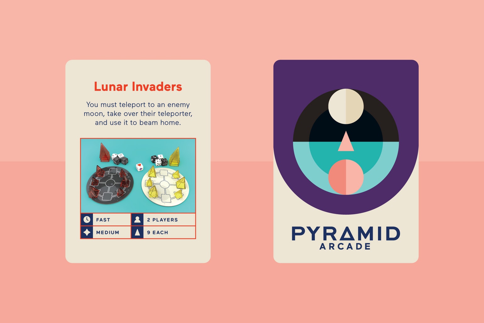
I think with a lot of game art boxes, there’s a very specific story or theme that can inform the game art. You can say oh this game is about space or animals, and immediately you have some visual information. Pyramid Arcade is a special case because it’s actually the compilation of 22 games each with different back stories, and the game pieces and boards themselves are not always literal so we had to be very conceptual with the art.
When we were tackling Pyramid Arcade the studio had recently brought on a young designer, Abe Zieleniec and he worked on this massive project with me. We start all project processes the same, we create mood boards to represent all the different conceptual directions we could explore. From there we dive into first round designs based on selected mood boards.
Before the Looneys landed on Pyramid Arcade, the set was called “Pyramid Throwdown” which is what you see in our preliminary art. We looked at logotype, general art elements, and tried to best assemble those pieces together. The box art front was the easiest place to start visualizing the look/feel of the game. I think we presented 3 options, 2 of mine and 1 from Abe. We ended up working out and producing the entire game based on the original pitched artwork. It’s pretty similar to what you see out now!
You were involved in the creation of Pyramid Arcade, so could you tell us a little bit about what that involved and what were the biggest challenges you faced?
I sort of touched on this in the last question, but the biggest challenge is that there’s no literal interpretation of the game outside of the pieces. So, we had to concept an entire art style and brand around two pieces of information: there are many games you can play with pyramids, and the pieces themselves. It had to be flexible to accommodate the many ways the game manifests! We chose a very flat, graphic, illustration style that was as playful as the pieces themselves. Then to represent each game, we made mini logos and patches for each game using geometry to drive the logic of those illustrations. The main artwork also tried to encompass the idea of many layers of games. You can see in the tunnel-like arch there are different environments and games represented. What we ended up with was a very colorful and diverse style of artwork for the game!
What was the inspiration or core idea that drove your work on Pyramid Arcade?
The core idea for this art style was inspired by the game itself. The pyramids are minimal, graphic game pieces so the style of pieces informed the style of the art. I like the fact that there can be an ever-changing number of games to play! People can make their own games and worlds. So we wanted to create art that felt fun and inviting but was also systematic so it could grow with the game. I’m pretty happy because it feels like something different when it sits on game shelves.
What are you currently reading, listening to or looking at to fuel your work?
I have a big compilation illustration book that I picked up from Kinokuniya and I am in love with all the work. I’m trying to study the way these artists are portraying fabrics, materials, and textures. I love anime so I’m bias, but also I’m just in love the range of work in this curation!
What advice would you give to anyone wanting to work in the board game industry?
PLAY A LOT OF GAMES AND HAVE FUN!
Do you have any current projects underway, or coming up that you’d like (or are able) to tell us about?
We’re working on some animations and an anthology issue of the magazine I mentioned before. We’ve got a few branding projects too. So there’s quite a variety in-house right now. I would LOVE to work on designing for more games; it’s so fun and really exercises my mind on what it means to “brand” and “design”. If you hear of anyone looking to work with a designer, let me know! ;)
Finally, if we’d like to see more of you and your work, where can we find you?
You can find me on other-studio.com and eileentjan.com.
My Instagram accounts are instagram.com/_otherstudio and instagram.com/eileentjan which I update way more often. :)
(All artwork supplied by Eileen Tjan, 2017)
STEM: Epic Heroes - George Doutsiopoulos: Art in Board Games #23
The timing was perfect and so was the theme of the board game. Some of my favorite things in the world are science, character illustration and board games, and STEM perfectly combined all three. What is more, I absolutely love vintage themes...
Welcome to Issue 23 in my series sharing the stories behind board game art.
This week I’m joined by George Doutsiopoulos, an artist who has recently worked on board game STEM: Epic Heroes and with publishers such as Hologrin and Desyllas Games. Seeing his work bringing scientists to life in STEM: Epic Heroes made me curious to know more about his process. Enjoy our chat below!
For more great insights into board game art, head to the interview archive.
Hello George, thanks for taking the time to speak to us. Firstly, could you tell us a little bit about yourself?
Hi Ross! You are very welcome and thank you for the kind invitation. I am a full-time freelance illustrator living in Thessaloniki, Greece. I work with publishing houses and companies, painting for storybooks, book covers, games, and advertising.
Now we know a little more about you, I have to ask, as a child what did you want to be when you grew up?
An artist! There were, of course, the occasional dreams about becoming an astronaut, an archaeologist or an astrophysicist, but I have been passionate about sketching and drawing ever since I could hold a pencil.
So how did you first get involved in making board games?
Well, to begin with, I absolutely love board games! Things like the fun memories of being a kid playing Hero Quest have stayed with me and inspire me both as an adult gamer and as an artist. Looking back, it is very clear to me that I have always wanted to be a board game illustrator, although I took it more seriously rather recently. A couple of years ago I did a few boxtop illustrations for Desyllas Games, a big board game company in Greece. I remember thinking “hey, I really like doing this”! The next step was to enrich my portfolio with some personal work that I felt would attract the kind of board game jobs I would prefer the most.
When you are working on the art of a board game can you give us a quick overview of your creative or thought process and has this changed at all since you first started?
It’s really not very different from the process of creating any other illustration project. The first thing is to make sure I have a very detailed and thorough brief. The preferred art style, palettes, target group, theme, dimensions, etc. are things I need to know beforehand. When I have everything I need I just stare at the brief for a few minutes (or tens of minutes!) and try to visualize the finished game – what it looks like, what playing it feels like, how my friends and I would react to it and what kind of art would make it as fun and memorable as possible. The next step is research and finding a reference from online sources. I love doing research for the visual elements of my illustrations (faces, clothing, buildings, etc) because it also serves as a form of brainstorming, although it can become time-consuming. The rest is pretty straightforward. I draw my sketches as close to what I envisioned as possible and try to figure out the final palette. When all is approved I move on to the finished artwork.
You were involved in the creation of STEM: Epic Heroes so could you tell us a little bit about what that involved and what were the biggest challenges you faced?
STEM is a card game that centers around prominent figures from the realm of Science, Technology, Engineering and Math, and their inventions/discoveries. My job was to paint character cards. In order to create rich and accurate illustrations, I needed to do extensive research for every character and find a reference for their face, body type, clothing, inventions and so on. A good facial likeness was important to me but sometimes finding appropriate reference was difficult, especially if the character lived before the 20th century. Another important challenge was keeping balances. I needed to find a good equilibrium between realism and cartoonism, historicity and superheroism, seriousness and colorfulness, all while making sure that the likeness of the characters and emotional impact of the cards were as good as possible.
What was the inspiration or core idea that drove your work on STEM: Epic Heroes?
First of all, STEM was an absolute godsend. It came at a time when I had become very tired of working mostly on children’s books and had been longing to work on something more realistic and adult. The timing was perfect and so was the theme of the game. Some of my favorite things in the world are science, character illustration and board games, and STEM perfectly combined all three. What is more, I absolutely love vintage themes. Aaron Hanna, a great art director and person to work with, noticed this and assigned to me characters mostly from the late 19th and early 20th century. So, this perfect mix of science and progress, character illustration, past eras, and gaming was more than I could wish for inspiration!
What are you currently reading, listening to or looking at to fuel your work?
Oh, all kinds of things. I’m halfway through “The Shortest History of Europe” by John Hirst, finishing Jeff Smith’s “RASL” and about to begin Phillip Pullman’s “The Book of Dust”. Which are very indicative of my favorite genres: history and science, graphic novels and fantasy literature.
What advice would you give to anyone wanting to work in the board game industry?
First of all, I’d say make sure that you love (or at least, like) board games. Liking the object of your work makes things so much easier and more pleasant. Also, take the time to play lots of different board games, whenever possible. It’s the best way to become familiar with great board game artwork, different game mechanics and get lots of inspiration (and fun)!
Secondly – and very importantly, make sure that you’ve put some thought into what kind of games your artistic style would look better in. As soon as you have the answer, hone your skills and build a portfolio with appropriate art.
Do you have any current projects underway, or coming up that you’d like (or are able) to tell us about?
I’m always working on books, but I’ve also begun working on a very fascinating board game for Restoration Games! I am not sure I can share details at this point but please stay tuned!
Finally, if we’d like to see more of you and your work, where can we find you?
My primary gallery is in Behance but I also hang around in Artstation and Facebook.
(All images provided by George Doutsiopoulos, 2017).
Todd Sanders: Art in Board Games #22
In taking apart another designer’s work and re-visioning it, you learn the inner workings of the mechanics and how the game is put together, thereby learning something about the design process. I suppose the best thing I have learned is to be open with my work [..]
Welcome to Issue 22 in my series sharing the stories behind board game art.
This week I’m joined by Todd Sanders, an artist and designer who has designed games such as IUNU, They Who Were 8, and Aether Captains with companies such as LudiCreations and MAGE Company.
He’s created a variety of Print and Play (PnP) games, and it was a combination of this work, plus the marvelous Mr. Cabbagehead’s Garden, that caught my eye. Enjoy our chat!
For more great insights into board game art, head to the interview archive.
Mr. Cabbagehead’s Garden - Photography by Ross Connell
Hello Todd, thanks for taking the time to speak to us. Firstly, could you tell us a little bit about yourself?
I live in Pittsburgh where I work as a graphic designer, furniture maker and publisher. I have a degree in architecture but have worked as a graphic designer for over 25 years. My publishing company, Air and Nothingness Press (which is also the name I design games under - www.aanpress.com) publishes translations of French surrealist poetry, science fiction, and fantasy, and makes handmade artist books.
Now we know a little more about you, I have to ask, as a child what did you want to be when you grew up?
From an early age I always wanted to be an architect. I was an architectural designer for a few years upon graduation but then moved into graphic design due to the work availability in Pittsburgh in the mid-1990s.
So how did you first get involved in making board games?
I began by redesigning older games and I’m most known for my re-visions of Barbarian Prince (over 3000 downloads on BoardGameGeek.com) and for Hammer of Thor. Both of these were originally released in the early 1980s, long before computers or better printing techniques and there is a mystique about them, but both are long out of print and therefore inaccessible to most players.
Barbarian Prince is one a lot of people wish would be reprinted. You play a barbarian trying to find gold to save your kingdom, wandering a map of various terrain types, rolling dice to find events and encounters on various tables. It combines aspects of wargames, RPGs, and Choose-Your-Own Adventure style games. I completely redesigned the entire map, created new rule and events books and a series of player sheets and counters to give the game a better scope. It took me a couple of months to complete but I think the changes make it feel more like a modern game.
Hammer of Thor is a very strange game from around ‘83 that can apparently support between 1 and 65 players, although 1 or 2 players is probably best. You play Viking gods and visit locations throughout the nine realms encountering various types of creatures and humans. You combat these beings and in turn, can make them part of your clan. The game mainly uses cards (which were originally badly printed on construction paper) and a large map of Yggdrasil, the world tree of Viking myth. My work included redesigning (and correcting the errors of) over 720 cards, designing 1100 counters and I updated/redrew the map. On top of this, I completely rewrote the rulebook to remove a huge number of errors in the original text and updated the language for modern board gamers. It was over 6 months work and I really didn’t design anything for many months afterward because the task left me exhausted.
For both games what appealed to me was the challenge of taking older games and giving them a fresh modern look. As a graphic designer, I am attracted to projects where a design overhaul can give a value and prominence to games in our history that are overlooked by many. For Barbarian Prince I also wanted a copy to play and this was a fun way for me to make that happen.
From there I entered several of the designer contests that the Print and Play community sponsors and slowly began learning to process of design games. There are several of these contests every year on BGG. The Solitaire PnP contest (every summer), the PnP Wargame contest, the 18 card contest, and the Mint Tin contest where all components must fit inside of an Altoids tin. In the past there have also been game contests with constraints like only using dice, fitting the game on a single sheet of paper, or only being able to use 9 cards.
Mr. Cabbagehead’s Garden - Photography by Ross Connell
When you are working on the art of a board game can you give us a quick overview of your creative or thought process and has this changed at all since you first started?
I tend to work on both the structure and mechanics of the game while doing the artwork. It’s a very organic process and both elements grow together. I am not an ‘artist’ artist, meaning I don’t really draw or illustrate anything by hand ever, I do all my work on the computer using InDesign and Photoshop, often using those applications as you would Adobe Illustrator (but I don’t own a copy of that).
Early on I tended to do redesigns of earlier games. In taking apart another designer’s work and re-visioning it, you learn the inner workings of the mechanics and how the game is put together, thereby learning something about the design process. I suppose the best thing I have learned is to be open with my work and let people interact with it as it is being designed. Everyone has different experiences and knowledge. Their input can only make a game stronger, especially since one tends to design in a bubble so you can quickly convince yourself that something works. This is because in your head it does, but you often find that once you write rules other people find holes in this logic as you didn’t impart that understanding within the framework of the game itself.
You were involved in the creation of IUNU, so could you tell us a little bit about what that involved and what were the biggest challenges you faced?
IUNU, which made its debut at Essen 2017 is a game where the basic idea came very quickly: 9 types of cards where the point value of the card is the direct inverse of the number of cards in the deck. The game spent about a year of development with LudiCreations and I’m lucky in that I am the graphic design/artist for my own games with LC. Part of the appeal of these games is my minimalist artwork. LudiCreations staff and I work pretty well together after several years of my doing graphic design for other games in their catalog.
There were no real challenges but we ended up increasing the number of Afterlife cards and this meant doing a lot of research into Egyptian dynasties (which I found quite interesting) and then matching historical points in that timeline with bonus actions for the game. For example, one card gives bonus sets of bakers, merchants, and farmers in your tableaux. These are all lower ranking citizens and the dynasty of Amenhotep was one in which the people had more power and there was a golden age. Another example is that the bonus cards Peret, Akhet, and Shemu are seasons in ancient Egypt which cycle around the rise and fall of the Nile river, celebrating abundance and harvest times. This idea matched cards where you gain a bonus if you have a majority of one type of citizen at the game’s end. I like to, as much as I can, match real facts/events with the mechanics in my games to strengthen the game narrative and thematic elements
What was the inspiration or core idea that drove your work on IUNU?
Often I find this is the case with my designs – the best and most elegant games come fully formed in under a half hour. As previously mentioned, I conceived of an idea where the kind of cards and their frequency in the deck had an inverse relationship to their value. So one Pharaoh is worth 9 points, 2 Scribes are each worth 8 points, three Nobles are each worth 7 points and so on down to nine Farmers each being worth 1 point.
The Egyptian theme for the game was suggested by this idea of 9 which is three 3s or the three main pyramids at Giza in Egypt. This tied nicely into three 4-sided dice, a great visual link to Ancient Egypt thematically. A quick bit of research led me to 9 types of citizens and their hierarchical order, and from there I was off and running. Each of these types of citizens then meant I could have a separate action for each, thematically tied into their caste when the cards are played in sets.
Also, the money in the game is labeled as ‘debts’. The ancient Egyptians didn’t have coins, instead, they used slugs of copper of various sizes as their monetary unit, equaling the weights to the worth of goods or services. So it wouldn’t have made sense to use coins as we know them. In my original PnP version, I sourced out small wooden ingots in a muddy brown and orange because the copper that was more refined was worth more and so the color difference suggests this.
What are you currently reading, listening to or looking at to fuel your work?
I listen mostly to ambient electronica. I find the rhythm of the beat helps my design process. Currently I am reading Virconium by M. John Harrison that my friend, the author Steph Swainston, sent me a copy of. I read 2-3 books a week and this is a wide-ranging mix of fantasy, science fiction, books about landscape and nature, fairy tales and books on interesting ideas floating around in the world. All of this input does suggest game ideas to me as it all mixes together in the background.
What advice would you give to anyone wanting to work in the board game industry?
Read all the rulebooks you can get your hands on. Understand not only how a designer creates a game but also how the rules explain those ideas. Learn both from the success and mistakes in these texts. Finally, never feel afraid to share your work. No one is going to steal it. Share and receive back tenfold.
Do you have any current projects underway, or coming up that you’d like (or are able) to tell us about?
I am currently working with Alban Viard and his AVGS imprint to bring my PnP game – Pulp Detective- to print. I am currently converting the artwork over to print-ready status while creating a 2 player variant and going back and forth, day to day, with Alban, as his team does playtests, to adjust and strengthen the game mechanics. This game has been under PnP development for over 2 years (one of my longest n the drawing board) and I am very happy to finally get it to the stage where it will be ready for players.
Finally, if we’d like to see more of you and your work, where can we find you?
I maintain a very large and rambling current projects thread on BGG. I also actively post on my blog. You can find some of my illustration work at http://locusgraphic.com/illustration and finally, I am on twitter at @lackriver.
(All images provided by Todd Sanders 2017).


