

Endogenesis - David Goh: Art in Board Games #47
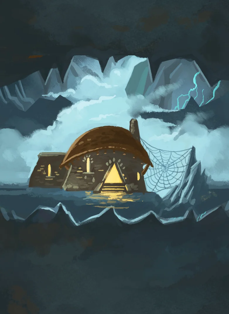
Star charts have an amazing aesthetic that feels foreign and esoteric, but mesmerizingly detailed. Combined with the use of astronomical symbols, I sought to create an art direction that gave the sense that you're peeking into this whole other alien universe through the perspective of its inhabitants.
Welcome to Issue 47 in my series sharing the stories behind board game art.
Upon seeing the Endogenesis Kickstarter, I couldn't help but be impressed by the production quality from a first time creator. I reached out to designer and artist David Goh to discover more about the project.
For more great insights into board game art, head to the interview archive.
Hello David, thanks for taking the time to speak to us. Firstly, could you tell us a little bit about yourself?
Sure! I'm a freelance art director hailing from Singapore, and I'm 30 this year. I grew up being surrounded by gaming — as a teenager, the medium of choice was video games, from old-school RPGs like Chrono Trigger to thriving new releases then like DotA. But in the last decade or so, I've been slowly steered towards tabletop gaming, primarily due to its social nature. There's just something about sitting down with a group of friends at board game night that video gaming just isn't able to replicate.
As for designing games, I've always wanted to make them since I was 15. Regardless of medium, I believe that games are the next greatest art form, and that's why I'm obsessed with them! I just enjoy taking them apart and studying them, and try to understand how some games can be so engrossing, and others evocative. The idea that games are really just a collection of rules, visual aids and predictable logical outcomes that combine to captivate the human mind with a compelling experience is just mind-blowing, and still is to me.
My first foray into tabletop game design was with a fan-made card game called 'Final Fantasy Boss Battle.' It was created as a birthday present for my wife, made quickly in 2 months as it was intended to be less of a working game and more of a really cool looking gift. We played a couple of games with our friends at board game night, and while the game was clearly unpolished and a little frustrating at times, it was actually fun for a few sessions.
Seeing how I had created something that brought enjoyment to the game night table, I felt inspired to keep creating, if only to make games that my friends would enjoy. And so I did! Over the next 9 years, I'd designed prototypes to bring to the table. Many were pretty much trash, while some had potential. One other project that went beyond the table was 'The Award Winning Game', which I worked on as part of a team of two. While we did bring it to Kickstarter a few years back, a combination of inexperience and logistical difficulties led to the project not succeeding, so we published it via The Game Crafter instead. Having a group of friends to test out game concepts has been such an amazing learning experience, and I'm glad to have such patient friends!
Looking at the present, can you describe your current Kickstarter game to us and what makes it interesting?
Endogenesis is a competitive card game that features free-for-all combat, which means it focuses heavily on direct conflict! What I think makes it interesting is that the gameplay is designed to be highly customizable and interactive. Everyone starts off with the same blank slate, but as the game goes on, you build a customized power set with the Skill cards that you're dealt with. If you like the experience of building a character that starts out weak but incrementally grows until you're a behemoth of cosmic power later in the game, then you'll enjoy Endogenesis!
While the round and turn order are quite structured, what you do during your turn isn't. You're given freedom on how you perform actions, both in their order and frequency. This includes using Skills to attack others, equipping new Skills or leveling up your character with Shards (which are a bit like stat points). With a bit of creativity, you can pull off really powerful combinations of actions, but at the same time, just a bit of miscalculation can cause your plans to fizzle. There's also an element of intrigue, where you can interact with the active player's turn with Reaction Skills, which are hidden, allowing you to set up traps when you know what a rival player is planning.
Because of my background in video games, a lot of inspiration came from that medium. A key point of influence for Endogenesis was from a custom game mode from DotA called DotA LOD, which is the precursor to the Ability Draft mode in DotA 2 now. Each session of the game sees you crafting a character from a random pool of abilities, effectively building your own synergies and combos. My goal was to recreate that experience in the tabletop medium, and Endogenesis was the result of that attempt.


How long have you been working on this game? What made you launch the campaign now?
I've been working on Endogenesis for a little over two years. Like all my previous designs, Endogenesis started out as a prototype I brought to game night, with the intention of creating something my friends would enjoy. However, the response to Endogenesis was much better than usual, so I decided to focus more effort into refining it, eventually bringing it beyond my circle of friends to other board gamers, and later on to blind testers.
I would say that Endogenesis is the culmination of a few concepts I've been wanting to try out with the tabletop medium for a long time. Quite a few prototypes died along the way before I arrived at Endogenesis, and I feel that after a few hundred playtests and 6 major revisions, it's finally ready to be released. I've witnessed a lot over the course of testing the game; the intensity over a very close battle, the excited spark in a player's eye as they execute an elaborate game-winning combo, and their rage at having said combo be completely countered by a well-placed Reaction Skill or Wonder... I'm excited to let gamers around the world try out the game, and see what experiences they encounter as well!
Where did the world and lore of Endogenesis come from and how does that feed into the player experience?
Prior to working on the world and lore of Endogenesis, the gameplay came first. And a key part of the gameplay was the existence of Skills that would come from different categories: Cosmic, Mythic, Entropic, Organic and Mechanic — all of which meant to be very different from each other. This was the first spark that led to the direction we took while building the lore; given how different these categories were, we needed a setting that would serve as a plausible container for all of them. Thus the idea of a universe in which beings explored other planes of reality was born.
As for why the setting takes place in a tabula rasa universe with alien beings, I think that came from my love for creation myths in general. Combined with the challenge of building a setting that would see the clash of different planes of existence, I saw the opportunity to redefine the entire tone of the story by building it ground up with a whole new creation myth.
A big part of what Endogenesis offers is a "power fantasy." The journey you take starts you out as being weak, but you incrementally grow stronger and stronger until you're inches away from literal godhood. This lore feeds into the player experience by creating an epic setting that players operate in, so as to make that power fantasy feel magnified to cosmic proportions!


This lore also seems to have fed into the artwork and style, showing a mixture of astronomical symbology crossed with arcane monsters. What were some of the most important factors in making you take these visual choices?
As a huge fan of RPGs, I find world building to be incredibly fun! I also had two writer friends (Ryan Mennen and Sathya Seth) who were excited to lend their expertise, and as such we pushed ourselves to go as deep as we could with the lore behind Endogenesis.
Having a detailed setting to work off helped tremendously as I was creating the art direction of Endogenesis. One of the most important considerations was trying to decide how the universe would look. How does one portray an entire universe feels completely alien from ours? This wasn't just in a different galaxy — it was an entirely different reality, with its own physical rules and destiny.
To that end, I decided that the simplest way to do this was to avoid trying for a realistic portrayal of that universe. Instead, I imagined how the inhabitants of the universe would have illustrated their visions of how they perceived their surroundings instead — not unlike how early humans would make rudimentary cave paintings of their environments to store information. In doing so, the Endogenesis universe could actually be made to feel even more alien, since an exact representation of that reality is never seen.
With that direction in mind, I researched the ways humans have of recording observations and information across the ages. I eventually settled on star charts and runic symbols as a key visual reference. Star charts have an amazing aesthetic that feels foreign and esoteric, but mesmerizingly detailed. Combined with the use of astronomical symbols, I sought to create an art direction that gave the sense that you're peeking into this whole other alien universe through the perspective of its inhabitants.
How did playtesting and community feedback guide you in this project? What lessons did you learn and was there anything that surprised you along the way?
Besides the obvious improvements that heavy playtesting brings to a board game, the feedback I've gained also revealed a lot about me as a game designer, as well as the blind spots I didn't know I had. As someone who's still very new to the scene, this was especially important for my growth.
I would say that one of the biggest changes in my mentality as a designer was towards the inclusion of catch-up mechanics. In the early half of the game's development, I was rather against including catch-up mechanics. For some reason, I felt that doing so might make the game feel better for casual players, but worse off for experienced ones, and that that trade-off simply wasn't worth it. But on the advice from a few blind testers and early reviewers, I decided it was worth a shot.


And I was so glad I did. The game became a lot more interesting as a result, because now gaining power comes at an increased potential cost. The more you have, the more you stand to lose, so you have to consider carefully how you go about gaining power. Being able to snowball without much thought might give you a fleeting sense of power and invincibility, but it's nowhere compared to the intensity of having to watch your back. On the flip side — for weaker players — the less you have, the less you stand to lose, so you can be more proactive and fearless in pursuing opportunities, therefore giving you more agency to better your situation. I was so surprised at how much of a positive change a few catch-up mechanics brought.
You collaborated with a number of people to help create the look and feel of this game. Who was involved and what did they bring to Endogenesis?
For the creation of the Endogenesis myth, I worked with Ryan Mennen and Sathya Seth. Both of them are writers, and have unparalleled knowledge when it comes to pop culture and mythology. They're both also my closest friends and amongst the first few to try out Endogenesis, so it just made sense to work with them.
For the creation of the monsters from the Realm of Chaos, I worked with an illustrator named Yang Shao Xuan. These Monsters were inspired by Lovecraftian horror — they're creatures that emerged from the source of pure entropy, and are powerful enough to serve as threats to cosmic beings. Shao Xuan was a great fit for this, given his keen eye for detail and skill for portraying anthropomorphic characters. His monster illustrations were very flavourful and distinct, which was no easy task given that they're just silhouettes!
Lastly, being a project made in Singapore, I sought to work with as many Singaporean talents as possible for the needs of the project. Not that there's anything wrong with looking abroad for help — I just wanted an opportunity to showcase the works of local talent!
I think it's really important to support your local communities when you can. So what should people be doing to make them a part of their projects?
The best way to start is to definitely go out there and make connections. It's never too late to start, and it's incredibly easy to do so. Go to flea markets, artist alleys, youth events and meet people. Join groups on Facebook where artists gather and interact with them. Find out they care about, and see how you can help. Another thing you can do is to look up old friends, school mates and see what they're doing right now, and see how you can trade expertise with them.
Do you have any advice for people looking to launch a Kickstarter game?
I'm still in the midst of my first Kickstarter, so I kinda feel ill-equipped to give advice. I can, however, speak from personal experience and talk about the things I felt I could've done better.


While I did a great deal of preparation work for the campaign, the campaign went off in a direction I never dreamt of, which led to me feeling like I was in catch-up mode for the first week. Initially it made me wonder if I didn't do enough prep work, but looking back now, I think that it's just down to the simple fact that unexpected things happen. Especially if it's your first time — no amount of discussion with other creators or reading of articles can fully prepare you for how people will respond to your work. So I'd say do as much prep work as possible, but expect that the unexpected will happen.
Another thing would be to not underestimate how difficult it will be to say no. It's one thing to say no to a stranger, it's another to do so to someone who's investing in you and your vision. The latter takes a lot more out of you. Saying no is something I feel like I've been doing fine at so far, but I just never expected that it would be so difficult. In hindsight, I suppose I should've been more prepared (though, how does one really prepare for that?!)
That's all I have at the moment, I'm sure I'll have more thoughts and ideas once I'm further along the campaign.


Are there any artists and designers in the community whose work you’re inspired by?
This is probably something you hear a lot of, but I'm a big fan of Jamey Stegmaier. His approach to crowdfunding, customer engagement and competence as a game designer just wows me. I think it's safe to say that many board game designers (including myself) would not have found success on KS if it weren't for his articles.
I'm also just blown away by Daniel Aronson and the work he did for The Isle of El Dorado. I came across his campaign very late, but I was just wowed by the game's level of polish and how the campaign was designed. I've never seen anyone use pre-1900 art in such a way that looks so attractive and modern. And as someone who had to build most of the art in Endogenesis single-handedly, I'm amazed at the amount of resourcefulness Daniel had in conceptualizing his game's art direction.
Lastly, there's a game designer who frequents the game design forums on BGG by the name of Jeremy Lennert (Antistone). Every time I come across a post by him, I stop and take the time to read it carefully. He's so incredibly knowledgeable, insightful and eloquent, whenever I read his stuff for just 5 minutes, I feel as though I've squeezed in an hour of game design classes. Absolutely riveting.
What are you currently reading, listening to or looking at to fuel your work?
I'm watching Psycho-Pass now, a cyberpunk anime that's mind-blowingly good! If you haven't guessed, I'm a big fan of sci-fi :D I'm also doing a playthrough of the entire Dark Souls series with my wife. Dark Souls is a huge source of cognitive dissonance for me — there are so many design choices I disagree with in the game, and at times I'm very frustrated by it... and yet, it's brought about some of the most memorable and enjoyable moments I've encountered in my life as a gamer. I recently played a game of Rise of Moloch too, and while I didn't enjoy the heavy usage of dice combat, I find the asymmetric gameplay to be very attractive. I'm hoping to get back to it soon (as soon as things with the campaign get less crazy!)
Finally, if we’d like to see more of you and your work, where can we find you?
You can check out Endogenesis on Kickstarter.
My personal portfolio can be seen at http://www.awesome.sg and my illustrations at http://www.hyperlixir.com.
(All images supplied by David Goh)

Campy Creatures - Josh Emrich: Art in Board Games #46
A memorable color signature can really help a game stand out. Like any design decision, color should always point towards the story or experience you think will engage the audience. I always want to find colors that are unexpected and complex, but functional and serve the story and setting.
Welcome to Issue 46 in my series sharing the stories behind board game art.
When I created this site, Josh Emrich was among the first people I contacted. Their work is exceptional, and you seem to agree, voting Campy Creatures in the top 10 for the Best Board Game Art of 2017. Enjoy the interview, I can’t wait to see more from this talented studio.
Check out the interview archive for more great insights into board game art.
Hi Josh, thanks for joining me! For our readers who aren't aware of your work could you tell us a bit about yourself and what you do?
For as long as I can remember, I always wanted to be an artist who made things other people could enjoy. Which is crazy because I grew up in a blue-collar family in the industrial midwest USA. My parents had no artistic background and I had to explain to them what makes good art and why I was doing a particular thing. Many artists aren’t great at articulating their ideas, so I credit my parents in helping me develop this skill.
When I went to study art at university, I had a hard time picking one thing — I loved it all — but ultimately studied visual communication design because it touches multiple disciplines — graphic design, industrial design, illustration, etc — with a commercial or strategic purpose. I have since worked as a creative director, designer and illustrator at brand design agencies, eventually becoming a founding partner at a design firm. Eventually, running a firm became a strain on my family, and I got burned out. My wife Katie is also an artist and together, we have four artistic kids. We decided to simplify and make design and illustration the family business. In 2013 we created Emrich Office, a brand design agency that specializes in creating identities and packaging for craft beer and spirit brands. We work from home in a 1000-sq-ft studio filled with vintage action figures and midcentury furniture.
Because we work with a lot of craft breweries, these clients can’t all look the same, so we have had the opportunity to develop and master new art styles with every project. This unique skillset is what brought us to the game industry.


When beginning to work on any new project what are the first few things that you do?
As a movie buff, I like to think about my projects like a film director thinks about a film — the story is the most important thing. If you don’t have an interesting story, you don’t have much to stand on. It’s something I really try to draw out of my clients. The first step is identifying the audience and crafting a unique message that’s engaging. The next step is fleshing out our guiding principles: what world this story takes place in, who are the characters, and what will the experience be? Like a method actor, I have an obsessive personality and will get really immersed in the research — watching any relevant films, reading books, studying history, finding forgotten illustrators, listening to music, etc. Because most of the story is told visually, Pinterest has become a great resource for collecting inspiration and sharing it with my clients.
This creates a foundation of intentional and well-articulated rationale for everything I do. It shows my clients that my creative decisions are focused and not arbitrary, ensuring that I’m delivering something that fulfills their purpose.


Your first board game project was the absolutely gorgeous Campy Creatures. So how did you get involved in that and what do you remember about it all?
Let me start off by saying I’m new to the board game industry. The first things that struck me is that much of the game art (in the industry) shares a similar formula and style. There’s a large emphasis placed on illustration, but often the graphic design is not very well integrated or well executed. Much of it is not very sophisticated. This creates an opportunity for game publishers and artists to break some stereotypes and attract new people who are normally turned off by board games into the fold.
I put a lot of work into research and understanding the project before I dive in. I don’t like presenting tons of options. I think that’s a cop out — like throwing a dart at the wall. I want to have everything worked out before I present anything and nail it on the first go. So I watched tons of the old Universal and Hammer horror films and collected vintage posters in Pinterest. I wanted to honor those films and characters while making Campy Creatures it’s own thing — knowing the exact right points to adhere and deviate.
Keymaster Games, the publisher of Campy Creatures, is run by two graphic designers, Mattox Shuler and Kyle Key, who really understand what it takes to create a game with street cred and still have a broader appeal. They are willing to take risks and invest in production details. They also encouraged me to share my in-progress work on social media to help generate interest in the game, which is a different experience for me. Usually, my clients want me to keep things tight-lipped until the beer is released. It became a little focus group and the reaction was really positive so it gave me a lot of confidence in my approach.
From this experience, I am now hooked on board games and I’ve found a great partner in Keymaster.


You make a good point about board game visuals largely playing it safe. When you talk about taking risks, what stylistic risks did you take with this game?
I guess I don’t see it as taking risks as much as finding ways of differentiating to stand out. Before I started working in board games, I was a brand consultant. Coming from that perspective, it’s a bigger risk to blend in. For Campy Creatures, we could have made it look either very cartoony or like the standard concept art style that pervades the game industry now. Instead, we really embraced the classic horror movie poster vibe, not only with pulpy illustration but also with the type.
Campy Creatures was Keymaster's second game and they really wanted to capture the feeling of classic monster films. Many of the original movie posters from this era were created by commercial artists who could not only illustrate but could also integrate lettering and type. These days, illustrators and designers tend to be more specialized and often work separately under an art director. This can lead to some mixed results where the illustration and type are not working together. In order for Campy Creatures to feel authentic, Keymaster needed an artist who could work like an old-school commercial artist integrating both illustration and type. Mattox had seen some pulpy, b-movie-inspired beer labels that I had designed and illustrated and thought that I could pull it off.


You also mentioned the need to inject a distinct character into the creatures you drew. So what is the trick to creating memorable and captivating characters in your work?
One of the major points of deviation was that many of the original horror monsters tended to be male, so we reinterpreted several of the creatures as female. I always try to push past a general trope by adding a humorous detail or element that allows the viewer to start imagining a larger story around the creatures. For instance, the Invisible Man in Campy Creatures has a Film Noir vibe and is in the process putting on leather gloves. Not only does this create a threatening posture, but it implies that he’s about to commit a crime. Hopefully this sparks the viewer’s imagination and they begin to fill in the rest of the story.
The only creature that received any major revision was the blob. A blob by nature doesn’t have any defining features, which creates a difficult problem when it needs to be a distinct character. My initial thought was to feature a melted victim within the blob to give it some structure, but that was a little too scary for younger players. We ultimately decided to give the blob an eye and to suggest a more defined character.


One aspect I love about your games is the very distinct color palettes you use. How do you use these colors to set the tone in these games?
A memorable color signature can really help a game stand out. Like any design decision, color should always point towards the story or experience you think will engage the audience. The colors for Campy Creatures are rooted in classic movie posters and pulpy lighting, while the colors for Caper are inspired early 1960s European fashion and interior design. Some things that I think stand out in our work is our use of color on Caper. It’s offbeat and sophisticated, using pink, mint, and metallic gold, evoking a Wes Anderson aesthetic. I never want to use a “standard” color palette — basic red, blue, green, etc. I always want to find colors that are unexpected and complex, but functional and serve the story and setting.


Speaking of Caper, can you tell us a bit about its theme and how that developed?
Caper was designed by Unai Rubio and was originally published as “It’s Mine” by Mont Taber in Europe. When Keymaster approached me about helping bring this game to U.S. audiences, I had two suggestions. First, there are a lot of games set in Europe, but if we pick a specific time period, that will help build an interesting world and refine our design choices. We decided 1960-something Europe would be a fun place for players to visit, evoking the great heist films from that era like Pink Panther, To Catch a Thief, or The Italian Job. Second, the characters and gear really help set the tone, so they need to be eccentric, humorous and interesting. The best way I could describe what my approach would be to Keymaster was “what if Wes Anderson directed a Pixar-animated heist film?”


Did your experience working on Campy Creatures change your approach when it came to Caper?
Not really. The two games are completely different, which is refreshing for me. I get bored easy, so I really like charting new territory. The characters in Caper were less defined so I had an opportunity to explore my own ideas. There’s also a lot more art in Caper — 24 thieves, 24 gear items, and 23 locations — so I had to work quickly, which helped inform the vintage gouache style I used to render the illustrations.


What advice would you give to anyone wanting to work as an artist?
Art is not just copying something you see or letting your imagination run aimlessly. To me, it's visual communication and the best artists are able to cut through the clutter and deliver an engaging message. Obviously, you need to develop your skill and technique through constant learning, experimentation and practice. But the most important thing is being able to empathize with others so that you can speak to them. Lastly, you can’t be drawing all the time — you must have your own experiences too so that you have something of value to share.


What are you currently reading, listening to or looking at to fuel your work?
I’m sort of between major projects at the moment, but I’ve been reading the Wildwood book series to my kids during their summer break. The series is written by Colin Meloy of the Decemberists and illustrated by Carson Ellis — part of the same team that developed the beautiful game Illimat with Keith Baker. It’s inspiring to see other artists and storytellers that do not confine themselves to one discipline!
Do you have any current projects underway, or coming up that you’d like (or are able) to tell us about?
Umm…I hear there are more Campy Creatures in the works! And Emrich Office, the brand design and illustration practice that I run with my wife, Katie, is turning 5 years old. We are going to partner with one my favorite collaborators, Bottle Logic Brewing, to produce a limited release beer to celebrate. We hope to raffle the bottles off in the Fall to help raise money for arts education.

Finally, if we’d like to see more of you and your work, where can we find you?
Instagram is where I post my most recent collaborations. You can follow me @emrichoffice.
(All images courtesy and copyright of Emrich Office, 2018)

Ryan Laukat: Art in Board Games #45
There's an inner child in me that guides almost everything I work on. The sense of wonder I had when experiencing new worlds when I was young is one of my biggest reasons for creating games and settings.
Welcome to Issue 45 in my series sharing the stories behind board game art.
There are a few artists whose work inspired me to start this website. Ryan is one of them. His work features in a number of board games in my collection, and whenever I play them, I feel immediately drawn into worlds that feel magical and inviting. Enjoy our chat!
Check out the interview archive for more great insights into board game art.
Hi Ryan, thanks for joining me! For our readers who aren't aware of your work could you tell us a bit about yourself and what you do?
Hello! I'm a board game designer and illustrator. I've been lucky enough to work in this industry for around ten years. I started as an illustrator and then founded Red Raven Games so that I could publish my own designs. Some of my games include Above and Below, Near and Far, and Eight-Minute Empire. I live with my wife, Malorie, in Salt Lake City, Utah, right up against some beautiful, snowy mountains, and within two miles of where I grew up! We have a daughter and two sons.
Red Raven Games has become synonymous in the industry for combining great art with captivating worlds and stories. When you're creating a game what is your general thought process? Where do you start?
My obsession with creating games started when I began inventing tabletop role-playing games as a teenager. I loved to create worlds to explore and creatures to inhabit them. So naturally, that influences how I approach most of my board game designs today. When creating a game, my motivation is usually to build a world and use the game mechanisms to allow players to explore it and experience it. I think about who the players will get to be in the game, and where they will go, and start there. I think it helps create a more immersive experience.


Last year you successfully kickstarted Empires of the Void 2 the follow up the 2012 original. What can you remember about that time (2012) and what made you want to return to this project?
I'd wanted to revisit the game for many years. I actually made many redesigns of the original game but never published any of them. I wanted another shot at the setting because I felt my skills as an illustrator and game designer had improved. Of course, Empires of the Void was my first published game. I'm proud of what I accomplished, but there certainly were things that I didn't do quite right. The rule book in that first game was not sufficiently clear and left too many things unexplained. The trading did not pan out as well as I had hoped. Some players left the game with a frustrated feeling because of a multiplayer direct conflict problem where two players can gang up against a third, leaving no way to catch up. I wanted to solve these and many other problems, and so I attempted it in Empires of the Void II.
In terms of the illustration, when you worked on Empires of the Void 2, how did you aim to develop the originals aesthetics into this sequel? What have you learned about graphic design and art since the original and how did that impact your choices?
My goal this time around was to create something a little more on the realistic side when compared with, say, Near and Far, and indeed, the original Empires of the Void. I wanted to make a beautiful space map like the original had, and of course many of the of the original aliens and planets, but with an updated vision that I felt would be more immersive. I looked at a lot of hard sci-fi art, especially the covers of books from the 60s and 70s. This meant painting with more subdued tones than usual and experimenting with new brushes.


You are arguably best known for your work on Above and Below and it's sequel, Near and Far. So starting with the original, how did you create this world and was there any inspiration you drew from in developing it?
When creating Above and Below, I actually sketched the cover before I even designed the game. That sketch worked as a compass for me, and I designed the rest of the look and the game mechanics around it. I was trying to pin down the feelings and memories that I had playing Super Nintendo games as a child, and that helped me build the friendly, colorful setting. At the time I was also very interested in making my games look as natural as possible, letting the art easily incorporate symbols or information, rather than have obvious graphic design boxes to keep art and information separate.

So thinking about that first sketch of the box cover, how did you get from that initial idea to the game we see today?
I took that sketch and taped it to my computer monitor, hoping to get the same sort of feeling that was in the sketch. Sometimes it's hard to replicate the feeling that is present in a thumbnail or sketch, and it can be pretty frustrating. Thankfully, this time, I threw down the colors quickly and it was like a seed sprouting into a huge, blossoming tree. The Above and Below cover took around four hours, and it didn't change too much after that. Sometimes I repaint the covers for my games multiple times (like with Near and Far), but this time, it felt right pretty much from the get-go.
I used a lot of blue and green, especially on the box, as a message to players that the game is pleasant and inviting. Just as important is the chalky brushwork and painterly style, which is meant to remind the viewer of a children's book. It says, "There's a story in this game."
I paint using a Wacom tablet, but I've learned to watch the monitor so I don't have to use the tablet's screen (it's much faster and more efficient for me if I don't have my hand in the way of the painting). My method has changed over time, but it's been pretty consistent for the past five years, besides updated brushes and the way I choose colors. I paint exclusively with Photoshop, and I'm pretty particular about having the right brushes, shortcut keys, and layout.
When you came to work on Near and Far, how did you aim to base it in the same world (as Above and Below) yet still take the player new places?
I made sure to keep the painterly style and chalky brushwork, but the yellow and orange tones are more associated with risk, exploration, and adventure. Western movies and art were a big influence on the look of the game. At the same time, people need to know that this is in the same universe, so animal races play a big part in the setting! I also decided to include some inked drawings instead of detailed renders on some components, such as the World Cards and the Treasure Cards. I feel like this matches the "wild frontier" feel I was going for.
You talked about nostalgia towards childhood games, so how important has it been when illustrating your games to create worlds that are inviting for all ages?
There's an inner child in me that guides almost everything I work on. The sense of wonder I had when experiencing new worlds when I was young is one of my biggest reasons for creating games and settings. And with my kids, it's like I get to experience that sense of wonder all over again as they dive into books and games. A common inner thought I have is: Would 10-year-old me get excited about this?
As someone who has experience working in all areas of a games production what advice do you have for designers, publishers and illustrators to help them successfully collaborate?
Good illustrators are in this business not only because of their skill with a brush and their time spent honing their craft, but also because of their imagination and ideas. A good publisher and designer will give some creative liberty to the illustrator and not be too picky about how every little thing should look. Of course, for me as an illustrator, I want tons of creative freedom and it's hard for me to get interested in a project if I don't have it. Any good collaboration is going to require some give and take on everybody's part though. One thing I'm still learning is that I need to listen to all suggestions and know how to look through another person's eyes to see the project in a different light. What I might prefer personally might not be the best thing for the game.


Upcoming release from Red Raven Games, Megaland, is the first to have your partner Malorie as co-designer with yourself. Can you tell us a bit more about how this came about and what effect that had on the creation of the game?
It was a lot of fun designing a game together, but truth be told, Malorie has always been very involved in my game design projects, so it was only a slight change in dynamic. It didn't start out as a co-design. I was trying to design a light, push-your-luck game, but nothing was really working out. Malorie helped me solve mechanical problems with new ideas. We both have strong opinions about what works and what we like, so there were moments when we had some strong disagreements about this design. But I think that kind of thing is the forge fire that gets the design where it needs to be. I'm sure we'll do another co-design in the future.


What are you currently reading, listening to or looking at to fuel your work?
I've been reading Homer's Odyssey and The Count of Monte Cristo by Alexandre Dumas. Reading the Odyssey has been especially eye-opening and enlightening. It has an amazingly timeless quality. I've also been playing Pillars of Eternity, an excellent successor to the Infinity Engine games I enjoyed so much as a teenager.
Finally, if we’d like to see more of you and your work, where can we find you?
You can follow me on Twitter @ryanlaukat. We also post lots of photos of our games on Instagram @redravengames.
(All images provided by and copyright of Ryan Laukat and Red Raven Games)

Ian O'Toole: Art in Board Games #44
The gaming industry allows the rare opportunity for me to create a complete product. For most of the games I work on, everything in the box, and the box itself, is designed by me (apart from the game itself of course!), and that level of ownership is pretty rare.
Welcome to Issue 44 in my series sharing the stories behind board game art.
This week, I'm joined by one of my favorite creatives in the board game industry. He's been involved in some of the best-looking games of the last few years, proven when he grabbed the top 2 places in your Best Board Game Art of 2017 vote. Enjoy our conversation!
Check out the interview archive for more great insights into board game art.
Hello Ian, thanks for taking the time to speak to us. Firstly, could you tell us a little bit about yourself?
Sure! I was born in Ireland, where I grew up, received my education and met my wife, Sarah. We moved to Perth in Western Australia a little over a decade ago and have since had two children. I still have not acclimatized to the heat.
I read a lot of comics growing up, and my artistic development was always directed by that. I can’t remember entertaining the idea of doing anything else. When it came time to go to college I decided on Graphic Design because I knew there was a clear career path there, I could leave college and get a job. Fine Art was a little more nebulous, which didn’t entice me at all. I’ve worked as a graphic designer/illustrator for my entire professional life, in a wide variety of roles and industries, including marketing, advertising, packaging design, publication and spatial design.
Mysterium Poster - part of the BoardGameGeek Artist Series
For the past five years I’ve worked for myself, and board games have grown to occupy almost the entirety of my workload. This allows me to work at home which is ideal for me, giving me flexibility as well as the opportunity to see my kids more during the week.
I’ve always been a gamer to some degree, and played a lot of Dungeons and Dragons when I was a kid, as well as Games Workshop 40K games. I started playing modern board games about 9 years ago, when a friend bought me Catan, and shortly afterwards Dominion. I found a local gaming association and my interest in the hobby exploded from there.
As regards other hobbies, I really have very little time. I read when I can, and play guitar intermittently, but it’s mostly gaming.
The Gallerist
So how did you first get involved in making board games?
When I decided to work for myself, I reached out to the community on Boardgamegeek.com in an effort to diversify my client base. At the time I was working mainly in designing exhibit booths for petroleum companies, so I was hoping for something a little more fulfilling to work on. That got a bit of interest, and I ended up working on a few games. Some were very small Kickstarters, like Mage Tower, for which I only created a small part of the artwork, and others were full board games such as Fool’s Gold.
I quickly realised that having skills as both a graphic designer and illustrator set me apart from a lot of others in the industry. Publishers were very happy to hear that I had years of experience working with printers and manufacturers, so I already knew all of the ins and outs of setting up punchboards, box dielines etc.
Escape Plan box art
At some stage early on I wrote to Vital Lacerda, one of my favourite designers, about some of his upcoming games, as I was considering dabbling in publishing at the time. That didn’t work out but he did need artwork created quickly for The Gallerist, and asked if I’d like to take a look at it. The Gallerist ended up being one of the games that most people know me for, so that was really down to luck, and being proactive in trying to create opportunities. It has led to a very fruitful working relationship with Vital, and we are just now completing our fifth game together, Escape Plan.


Another such lucky opportunity was meeting Martin Wallace at PAX Australia, and joining him for a playtest of Ships. During the game we chatted and I told him about some of the work I’d been doing, and he asked if I’d be interested in working on the second edition of A Study in Emerald, to which I quickly said yes!
Working in games professionally also afforded me the opportunity to attend the Spiel in Essen in 2015, which would otherwise have been prohibitively expensive. That was the year that I got to see most of my games for the first time, as coincidence saw a few of them being released there. It was the first time I saw The Gallerist, A Study in Emerald and Fool’s Gold in the flesh, and also got the opportunity to meet a lot of designers and publishers, so that was a big year for me.
A Study in Emerald
Having stepped into the board gaming industry from a different background, what do you think are the key differences?
From the perspective of the work that I produce, the gaming industry allows the rare opportunity for me to create a complete product. For most of the games I work on, everything in the box, and the box itself, is designed by me (apart from the game itself of course!), and that level of ownership is pretty rare. It’s also the perfect industry for my particular blend of skills, which have struggled to find equal footing in other projects. Here, graphic design and illustration are both of very high importance.
Looking more widely at the industry itself, there really are no standards of any sort because it’s so young. Every publisher handles things differently. This can be especially apparent when it comes to discussions about licensing and contracts. It very much feels like it’s driven by passion rather than profit at the moment, and I think there are some growing pains on the horizon as the mean profitability of the industry creeps upwards due to its growth.
Miskatonic University
What is your creative process when working on a board game?
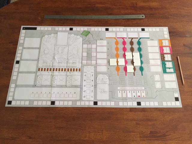
The first thing I always do is play the game. I’ll make a prototype, or sometimes the publisher will provide one, and I’ll get some people together and play it. During this I’m thinking about how the players interact with the pieces and the board. Is there a more elegant solution? Do we need all of those counters, or can we use a track instead? Is there a clearer way to present the information that will help players learn and play easier?
Then I start sketching ideas for each element, all rough thumbnails on paper. This is time for all of the big ideas. Do we need a board at all? Should the layout be portrait instead?
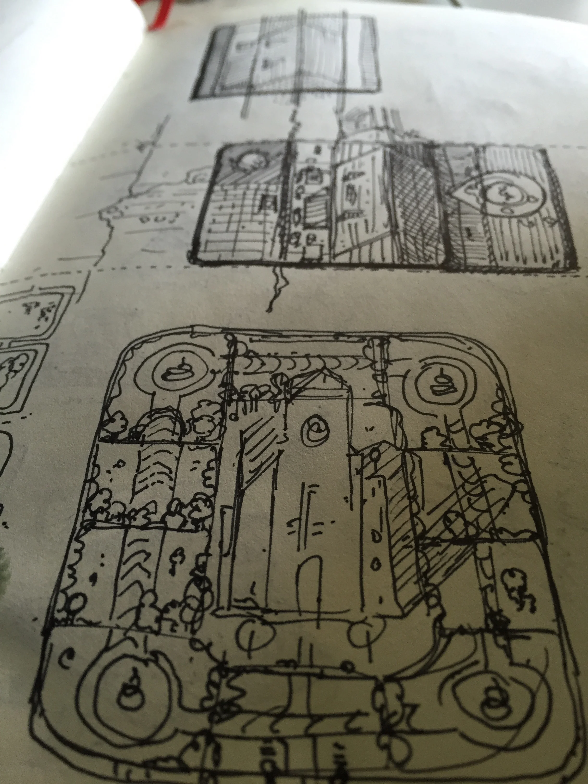

Depending on the game, there is sometimes a period of research involved at this point. For historical games I’ll look into the style of visual communication that was prevalent at the time, things like fabric patterns, building materials, costumes etc. Lisboa is a good example of this, as the artwork is very much rooted in the time period. Nemo’s War is another example of a game that needed a LOT of research, as I decided to find a reference for all 100+ ships depicted in the game.
After that I start to make a very rudimentary layout, using only boxes and circles to denote spaces etc. No “artwork” whatsoever. Depending on the complexity of the game I’ll usually make another prototype at this stage. The game should be fully playable, and this gives me a sense of the changes I’ve made to the ergonomics of the prototype.
Lisboa in progress overview
If I’m happy with that, then it’s just a case of tackling the finished artwork in the most logical way. Sometimes that’s iconography first, or card layouts, or maybe the board. I tend to vary my style a lot for each game, so there’s always a stage of visual development and experimentation as well. I don’t tend to submit options on style or layout, preferring to commit and put my effort behind the solution I think will work best. The other reason for this is that the style often emerges during the first few hours of development, so creating a sketch in advance is often impossible, as I myself don’t know what it will end up looking like.
Once the game is almost finished, I’ll make another prototype and play it again, to catch little things that only become apparent when you ask people to play it.
Vinhos Deluxe
As regards tools, I use a pen and sketchbook a lot. Once I move to the computer I use the Adobe Creative Suite, primarily Photoshop, Illustrator and InDesign. I also do some 3D work in Cinema 4D. I typically build a 3D version of the game as I’m developing it, as I like to see how each element looks as part of the whole.
If you want to read more about the process of creating Lisboa, I’ve written a post on boardgamegeek detailing the development of the visual style, as well as the changes that were made to gameplay as a result of graphical solutions. You can find that here.
Nemo's War - Ship Counters
You mentioned finding references for all the ships in Nemo’s War, so in broad terms, how much of a project do you spend on research, and how important is this phase in shaping what you create?
Reference is really important to me, if it’s available. For any game that even dips its toe in the real world I want to look at as much relevant reference as possible. Design styles of the time, common pattern forms, fashionable colours etc. Sometimes that reference becomes the heart of the visual identity of the project (Lisboa is the obvious example of this). Sometimes I will mix it with other anachronistic elements, such as in The Scarlet Pimpernel. It all depends on how important I feel that authenticity is to the game experience itself.
For Nemo’s War, it’s not enormously important that each ship is 100% accurate to its real-life counterpart, but what is important is that the seas are populated by ships that are unique, so that the narrative of the game comes to life that little bit more. Given that all of the ships did exist in real life though, it seemed obvious that seeking real reference was the thing to do.


You’ve been working on Stephenson’s Rocket recently. Could you tell us a little bit more about it?
Stephenson’s Rocket was an interesting project for me, because the game already existed, fully formed. So it was easy enough for me to play it and assess the game very quickly. The very first thing that occurred to me was that the game felt old fashioned. This was mostly down to the fiddly nature of using paper money and stock cards, which kept the banker very busy. It became clear very quickly that the money was entirely unneeded, as players never spent it during the course of the game, it was simply points, so my first suggestion was to ditch it and move to a points track on the board.
Stephenson's Rocket overview
Another feature that bugged me was constantly having to visually check, or ask for, the number of shares in each company that a player was currently holding, so that was also removed for share tracks on the board, making all of that information easy to access and track.
The last, and somewhat more tricky part of the puzzle was the industry markers. In the original game, every city has three industry markers, each depicting one of a number of industries. The markers are small cardboards tokens, with the colour of the city and its name in very small writing. During setup, all of these need to be sorted and placed out on the board, it’s a big pain, and feels really clunky. After a bit of experimentation, I came up with a table system that lives on the main board, onto which players place their cubes instead of claiming markers. This has many benefits for gameplay. Firstly, it completely eliminates setup entirely. Secondly, the players can very easily see which cities provide which industry, and lastly, it allows the assessments of majorities in each of the industry types (for which points are awarded at the end of the game) very quick. The other benefit that this solution offers is that, as more maps are created for Stephenson’s Rocket, new industry markers are not required to maintain thematic accuracy (this is also true for currency).


The last element that was added was a player board, featuring an iconographic guide to the various scoring methods of the game, which can be a little tricky to remember at first. Other interesting elements to the project included creating a miniature for the famous locomotive, and coming up with a wooden design for the stations that could be placed on a hex at the same time as a locomotive. I also designed a pair of custom passenger meeples, replacing the tokens of the original game, which I think add a nice element of character to the overall presentation. We also added track joiner tiles as an aesthetic upgrade.
Stephenson's Rocket
All of these changes leads to Stephenson’s Rocket feeling a lot more modern without actually changing any rules (only the expression of them). Overall Stephenson’s Rocket was very enjoyable to work on, and Grail Games were very supportive of me taking a wrecking ball to a much-loved game.
This interview isn't the first time you've been featured on my site. You gained the top two places in my best Board Game Art of 2017 public vote. How important is that feedback to you, and do you seek it out yourself?
I’m fairly active on Twitter, so I usually get pretty immediate feedback when my work is released. Users on Boardgamegeek are also never shy about sharing their feelings! Good feedback is always really important. I’m pretty isolated over here in Australia, and only get to travel and meet most of my gaming contacts once a year at Spiel, so keeping in touch online is essential.
Nemo's War - box art
Hearing players get excited about the games I’m working on is also really gratifying, and of course, seeing them being played all around the world is really rewarding as well. I subscribe to all of my games on BGG, and do keep an eye on the threads. As long as feedback comes from a good place, and is respectful, I’m always happy to engage with players.
Certainly awards such as the ones you’ve created provide a nice opportunity for me to stop and reflect on the fact that players are enjoying my work, so that’s really great.
What are you currently reading, listening to or looking at to fuel your work?
I’m reading Authority, the second book of Jeff VanderMeer's Southern Reach trilogy, which I’ve only just started. I liked Annihilation a lot (and also loved the film). Before that I had just finished the Red Rising trilogy by Pierce Brown, which I enjoyed a lot. I’ve also just finished reading The Hobbit to my kids, which was a big deal for me.
Red Scare
What advice would you give to anyone wanting to work in the board game industry?
Get to know as many people as you can, don’t be afraid to ask questions. Try to help other people as much as possible and support what they’re doing. Engage with content creators, designers, other artists. Not just about work but about the games they’re playing and the things they create. That’s how opportunities are made. And speaking of opportunities, don’t wait for them to come knocking, you have to go out and make them happen.


Do you have any current projects underway, or coming up that you’d like (or are able) to tell us about?
Yes! Stephenson’s Rocket should be going into distribution very soon. Also hitting distribution soon is Smiths of Winterforge, from Rule & Make and Passport Games, for whom I’m also wrapping up on Hand of Fate. I’m almost done with Escape Plan, Vital Lacerda’s newest game about escaping a city after a bank heist gone wrong. The last game I worked on with Vital, CO2: Second Chance, should be going into production very soon. I’ve also finished up The Scarlet Pimpernel, by Brian Kelley and Eagle Gryphon Games. Victoriana is a cooperative game from Games Afoot that was funded on Kickstarter that I’m also finishing up, after completing many many card illustrations.


I’ve just wrapped on the graphic design for The Reckoners, an adaptation of the book series by Brandon Sanderson, by Nauvoo Games. Miskatonic University: The Restricted Collection is a light push-your-luck game from Reiner Knizia and Chaosium that’s wrapping up its crowdfunding campaign soon. I’m right in the middle of Black Angel, the spiritual successor to Troyes, coming from Pearl Games. As well as all that there are about six other games I can’t talk about! Some of which will be announced soon I believe, others are more long term.
Phew deep breath, that was a lot of games. Finally, if we’d like to see more of you and your work, where can we find you?
Twitter is probably the best place to find me. I’m @ianotooletweets. My website is www.ianotoole.com. If you have any questions about the above, don’t hesitate to contact me.
(All images supplied by and copyright of Ian O'Toole)

Paper Tales - Christine Alcouffe: Art in Board Games #43
Working freelance isn’t for everybody. You have to manage your time and your workload as well as deal with crunch periods (or self-doubt in the opposite situation). It’s often a good idea to go for projects for which you don’t necessarily think you’d fit, as they often are a good opportunity to try out some new things.
Welcome to Issue 43 in my series sharing the stories behind board game art.
This week I am joined by the talented Christine Alcouffe, an artist who worked on the gorgeous Paper Tales boardgames from Catch Up Games. Keep reading to discover more about her work.
For more great insights into board game art, head to the interview archive.
Hi Christine, thanks for joining me! For our readers who aren't aware of your work could you tell us a bit about yourself and what you do?
Hi Ross! Thanks for suggesting that we do this interview. I’m an illustrator in Lyon, France and for those who don’t know, Lyon is a city where people LOVE food. There’s a ludicrous number restaurants. Also there’s an art school, called Émile Cohl, where I graduated in 2010. I’ve been working as a freelance illustrator since then for various clients. I worked on 2D art for video games, a whole bunch of activity books for children (with stickers, coloring pages, games and the like), some school books recently, and also the board game, Paper Tales.


Paper Tales, was your first board game project so how did you get involved and what can you remember about it?
It’s a combination of various factors really. I’ve known Sébastien (who is one half of Catch Up Games) for some time, and a while back I ended up spending an evening with him, Clément (the other half) and my boyfriend Maël playing Vorpals, which is the original Japanese version of Paper Tales.
I really liked the game, and later that night we started talking about how it could be adapted to the French and European markets. I also ended up mentioning how it can be difficult to get work proposals with enough ‘creative wiggle room’ for me to experiment new things or just shake my habits. They must have liked the ideas we’d come up with that night because they contacted me a few days later to see if I could send them some tests for the game.


Could you talk us through your process when you were creating the distinctive and layered style?
There was some fairly extensive visual research to get to the style used in Paper Tales. We had to factor in a bunch of things to strike a good balance. It had to be both varied enough to be used on 42 different Unit cards without feeling tired and stylized enough to be easily identifiable and stand out from the crowd. We spent quite some time experimenting with various degrees of textures and motifs before we settled on what became the final result. The idea of using a style reminiscent of papercutting or collage was mentioned during that first evening, and the various tests led us to what you can now see on the cards.
Regarding the production of the illustrations, I always start with a pencil sketch, which I then send to the publisher so that they can tell me whether this fits their idea of the character. Once I have their approval, I can then move on to the colorization using Photoshop, first by applying flat tints to distinguish the characters while making sure I coherently arrange the different layers. After that I add cast shadows in various colors and degrees of intensity depending on the layer so that if looks as if the illustrations are made of superimposed paper cuts. Finally I add some texture/grain to the various layers.


Is there anything in particular that inspires you in your work?
I mostly draw my inspiration from artists I like! For instance Ben Wiseman and Malika Favre who both draw using flat tints, or, on the paper cutting/pop-up books side of things, Princes and Princesses by Michel Ocelot and Alina Chau.
Editors note: See the work of Ben Wiseman, Malika Favre, Michel Ocelot and Alina Chau, in order below.


I like a lot of artists in who work in various fields, with various styles, but these are probably the ones that influenced me the most considering our artistic choices that time.


You mentioned it being difficult to get creative wiggle room in work proposals, how important is artistic freedom on a job and how can the client allow this whilst ensuring a brief is met?
I usually don’t have a lot of creative leeway in my work. Most of the time, the publisher (be it of books, activity books or board games) comes to me with a set of specifications, the exact number of images I will have to produce as well as a style-- usually because of an illustration they liked in my book. It’s not necessarily an issue, however it explains how one can end up doing the same thing over and over again and become a bit rusty.
When Clément, Seb and I started talking about Paper Tales, however, they hadn’t settled on anything regarding the style. That’s what allowed us to discuss it together, explore some ideas that ultimately led me to something very different from what I had done before… so now people can get it touch with me for the whole “paper cut” technique. Hopefully they will also contact me for new styles entirely!
From the publisher’s point of view, I think it’s pretty simple. When they have a precise idea of what they want, they can put it in the brief. Obviously, if they are still searching for a style, they can mention it as well. There are several validation steps to check whether everything is going the right way. I usually create an illustration (or a series of illustrations) from the ground up, possibly with composition sketches so they can have a broad idea of the style they should expect. During these various steps, the publisher can validate, guide or ask for modifications on the work that’s being done, both on technical and artistic aspects. Ideally, the artist and the publisher can discuss freely, as equals. This is when it gets really interesting, because it makes the visual aspect of a project even better thanks to that back and forth.


When projects dictate that you stick to one particular style what do you think you can do to expand your portfolio and keep yourself artistically fulfilled?
First and foremost, even when working with a style you think you’ve seen from all sides, there’s always something to learn. For instance, I’m currently working on a board game aimed at children. The style my client asked for is something I’m used to doing, however it has a superhero theme, which I had never really thought about for my work. It brings me to consider the visual codes of superheroes and work on the postures as well as my compositions. I’m sure some of that dynamism will carry over in my future work!
When I feel like I’m stagnating, working for myself is usually a good way to shake things up a bit. I can make illustrations for my book with a specific purpose in mind, whether in style or in substance (this one would be nice for a board game publisher, that one for a schoolbook, that other one simply for my Facebook page…), but I can also get more creative and experiment with a new technique. I have to say I often have trouble with the latter though, as it’s not necessarily natural to go down the ‘disinterested’ road when you work freelance.


This year an expansion to Paper Tales, called Beyond the Gates is released. What did you learn working on the original and how did that influence your work on this expansion?
Working on the expansion was a very different process from the base game. The visual style was already set, so no additional research was necessary. On the contrary, I had to immerse myself in the base game to make sure there wasn’t going to be any discernible technical difference between it and the expansion.
A novel aspect for me, however, was the “fresco” on the cards for the single player mode. For the first time, I had to illustrate several cards destined to be placed one after the other, and that gave me a lot of creative freedom. I drew several characters, several layers, with architectural elements and some tidbits that added atmosphere to whole thing. I also had to arrange the illustrations on the various cards so that each one of them could remain interesting on its own but still provide more and more intensity up to the last card for the end of the game.
It turns up I’m pretty happy with how it turned out, and I really enjoyed doing this!


What advice would you give to anyone wanting to work as an artist?
That’s a huge question. Maybe I’d start by warning people that working freelance isn’t for everybody. You have to manage your time and your workload as well as deal with crunch periods (or self-doubt in the opposite situation). I would also suggest being adaptable and upright. It’s often a good idea to go for projects for which you don’t necessarily think you’d fit, as they often are a good opportunity to try out some new things. However, unacceptable work conditions and unrealistic deadlines shouldn’t be tolerated.
One last thing: during our whole life we’re always getting better. When I think back on what I did when I graduated, eight years ago, I can’t help but notice how much I evolved! Both in my relations with book and game publishers (since my professional network is much bigger now) and in my technical and artistic skills. It’s pretty reassuring when you think about it!


What are you currently reading, listening to or looking at to fuel your work?
My work is influenced by a lot of other artists. I follow a lot of illustrators on social networks, such as Benjamin Lacombe, Pénélope Bagieu, Amandine Piu, Pernille Orum or Yrgane Ramon. I really love what they do. I have a folder on my computer where I save a lot of images from various artists and in various styles. Whenever I face an artistic or technical issue I can’t quite solve by myself, I browse that folder to find solutions that other people have found for similar problems they may have encountered.
I also read a lot, mostly fantasy. It’s usually more for entertainment purposes rather than inspiration, but there are some books I recently read which make me feel like maybe I should start working on more personal projects, possibly as an author this time. Right off the top of my head I’m thinking about The Mirror Visitor Quartet, by Christelle Dabos (which will apparently start being published in English in september), which is an absolutely stunning series of novels.
Regarding the audio background, whenever I’m laying down some concept art or sketches, I don’t listen to anything. I need to focus and I’m afraid even instrumental music would push me toward a specific (and possibly unwanted) atmosphere. Once I’m done with preliminary sketches, however, I often listen to the TV. I’m aware it must sound weird, however since this is a very solitary line of work, I tend to like hearing people chat... Makes me feel like as if I’m part of the outside world! Which I know is pretty pathetic obviously.
So I basically have this daily routine where I listen to—more than watch—my favorite shows. I also watch a bunch of Netflix series. But I don’t think either of those really “inspire” me.


Do you have any current projects underway, or coming up that you’d like (or are able) to tell us about?
I recently signed two contracts for two additional games! One is a board game for kids, and it’s a very interesting and informative project for me (it’s the first time I have to draw an actual board, and I’ve been wanting to do this for a while now), and the other one is a regular card game, but with very stylized monsters I’m really going to love imagining. It will probably be my most creative project to date, I can’t wait to get started!
Apart from that I’m still working on another activity book for kids, one with a lot of sceneries. It’s a good challenge for me since I usually work on characters above all else. Here’s to hoping my client likes it!
Finally, if we’d like to see more of you and your work, where can we find you?
I have an online portfolio where I post my finished drawings.
I also have a Facebook page and an Instagram account where I post things my regularly, not just final drawings but also work in progress, informal messages etc.
(All images supplied by Christine Alcouffe)

Fantastic Factories - Joseph Z Chen: Art in Board Games #42
With any game design, before making a big change, you have to understand what the problems are that you are solving. My process is to find what's fun about the game and design everything else around it in support of that fun.
Welcome to Issue 42 in my series sharing the stories behind board game art.
Fantastic Factories is on Kickstarter until June 29th, 2018. It's already nearly at 500% of its initial funding goal after only the first few days, so if you are curious then go check out the campaign. The interview below is with Joseph Z Chen the designer and artist on this project (co-designed with Justin Faulkner) who was kind enough to drop by to tell me more about it all.
For more great insights into board game art, head to the interview archive.
Hello Joseph, thanks for taking the time to speak to us. Firstly, could you tell us a little bit about yourself?
I live in Seattle and have lived in this area for my whole life. I've always been a gamer at heart, although not a big tabletop gamer until right after college. During that time I really got into some of the classic gateway games like Settlers of Catan, Dominion, and 7 Wonders. I had a couple of really competitive roommates and we would play the same games over and over again. Just to give you an idea of how dedicated we were, sometimes we would set up Catan and discuss what the optimal placement of all the starting settlements were for half an hour. Once we agreed, we would reset the board and do it all over again.
Eventually, a group of us decided that we wanted to make a board game, combining the mechanics of some of our favorite games. My particular design took off, and I kept working on it week after week with the help of others. At one point I decided I was tired of staring at blank cards so I started making placeholder art, which turned out pretty good. My only prior experience with art was dabbling in graphic design in high school, but with the help of my wife and other graphic design mentors, I was able to create the art for Fantastic Factories!
Like many game designers, I work as a software engineer for my day job.

So, can you describe your Kickstarter game to us and what makes it interesting?
In Fantastic Factories, players race to build the most efficient set of factories. You must carefully manage your blueprints, train your workers, and manufacture as many goods as possible in order to achieve industrial dominance! It's a dice-placement engine-building game. It's all about trying to find the best combinations of factories and figuring out the puzzle of where and how to place all your workers.
There are a few unique aspects to the game. Much of the game is played with players taking their turns simultaneously, which cuts down heavily on player down time. The game also has a lot of interesting options and different strategies. Often in games with dice, a larger roll is better. However in Fantastic Factories, every roll has its advantage in the right situation so the game is less about depending on hitting certain rolls and more about how you can leverage those rolls to your advantage. A huge feature of the game is the many ways you can manipulate the dice rolls in your favor, so each turn is a satisfying puzzle of how to alter and assign your workers.
I also think the art and overall aesthetic is really quite fantastic! So many games are fantasy or space themed and use serious and monotonous colors. I wanted to make a game with bright colorful art. I aimed for simplicity and elegance throughout the art, graphic design, and game design. Together, I think it makes the whole package stand out and feel approachable.
How long have you been working on this game? What made you launch the campaign now?
My team and I have been working on Fantastic Factories for about 2 and half years at this point. It's been a slow and steady process with a lot of playtesting. I would say that under normal circumstances, it wouldn't need as much time as it has had, but we underwent a couple major redesigns to really nail down and tighten up the gameplay. One of those redesigns came after we won a regional game design competition (NW LUCI Award) that was judged by industry experts. At the time we felt the design was complete and while we did win, they had plenty of constructive criticisms for us. This challenged us to do better and revisit parts of the design. After the redesign, it meant a whole new round of playtesting. It really is a labor of love.
Over those 2 and a half years it was a continuous iterative process of design, playtest, prepare for a convention, and then starting all over again with all the new feedback. All the while, working on the art and graphic design as well. Things take a little longer when you have to split your time between game design, art, and community building. Oh, and my wife and I had our first kid in the middle of it all that!
I'd like to say we had some grand plan with the timing of the campaign launch, but really we just gave the game as much time and love as we felt was necessary. Once we felt the game design was complete and the majority of the art was complete, we set a date a few months away in order to prepare review copies, figure out manufacturing/logistics, and plan our Kickstarter campaign.
Having taken the game through a few redesigns what are some of the biggest changes you've implemented? What do you think you've learned from this feedback loop creative process?
With any game design, before making a big change, you have to understand what the problems are that you are solving. My process is to find what's fun about the game and design everything else around it in support of that fun. With that in mind, it's unsurprising to see that the soul of the game has remained consistent and largely unchanged since the very beginning. For Fantastic Factories, that core fun comes from two angles -- discovering cool combinations of factories that work well together and solving the puzzle of where to place all your dice to maximize your output.
One problem I had was the way buildings were built. Building a blueprint used to require two matching dice. This was problematic for a number of reasons. While rolling a pair of matching dice with 4 dice is a likely 72% chance, there is still a decent chance you won't roll a pair for a couple turns, which really can set you behind. For a while, I used a single die double build cost solution, but it was clunky and complex to explain. Another issue I ran into was that using half your dice to build a factory is quite costly, and newer players often were building cards they didn't need just for the sake of building.


This is where things get a little interesting. In a neat and ideal world, you solve each problem with some design solution. Or even better, you solve all your problems with a single design solution. In this case, I ended up with a solution that greatly simplified a number of mechanics and solved a series of problems but had a dramatic cascading effect that touched almost every part of the game.
I ended up changing the way building cards worked. I introduced four new tool symbols. Each blueprint would have one of these tool symbols. Building no longer required any dice but instead required that you discard another card with the same matching symbol. This created a card-as-a-resource mechanic that really helps players sift through the deck finding the engine pieces they need and also providing an outlet for cards they don't want to build. This also created more tension in the marketplace draft since there would be multiple reasons why players would want a particular card.
However, this created a gaping hole with the basic actions where you used to use dice to build, the choices when using the basic actions were no longer interesting. My co-designer, Justin, solved that problem by introducing a matching bonus, which ended up being a very satisfying mechanic. The use of the extra dice and the matching bonus ended up infusing the game with a lot more resources so all the cards had to be rebalanced. These game systems did not exist in a vacuum so for each design change we made, it would affect another part of the game, which would then need further patching or adjustment. It was a lot of work, but in the end every change made to fix an unintended side effect left the overall game design even better.
Before we made all these changes, I had developed this somewhat irrational fear of making big changes. Sometimes we get attached to a particular design and grow accustomed to the shortcomings and flaws of that design. Making big changes is exhausting and time consuming, and can entail throwing away a lot of previous work. However, I've learned that great design can often require dramatic changes and that we shouldn't be afraid to pursue those changes if it will make your game better. I only wish I had made that leap earlier. I think being willing to make that kind of leap requires a receptive ear and a great community of people around you who are willing to point out the flaws within your game. That's why I think having a co-designer is so important. They are there to keep you accountable and honest.


As you've stated, you didn't necessarily have much experience in the artwork department before beginning this project. How do you think this shaped your choices when creating the aesthetic and how has guidance from others helped bring the game to where it is today?
My lack of experience with creating art has definitely influenced the aesthetic direction of Fantastic Factories very heavily. I've always been somewhat interested in visual design, and I'd like to think that I know what good visual design looks like when I see it, but actually creating the art is a whole different beast. The largest source of inspiration from early on was Tim Moore, a graphic designer and illustrator who I worked with at my day job. His illustrative style is very clean, colorful, and minimalistic. When I saw how strong of a visual impact he was able to make with such simple shapes, I felt inspired to imitate it.
Ultimately, the illustrations in Fantastic Factories do not require much technical ability. The secret lies in the simplicity, consistency in style, and a little creativity. I have picked up a few skills here and there from Tim, my wife, and online tutorials, but for the most part, all the shapes are quite basic. There's actually a lot of vector factory art out there, and I studied a number of those examples to develop my own style. As a engineer, I started deconstructing the characteristics of the factories I was illustrating. I defined rules and developed a certain visual vocabulary. For example, smokestacks are always red. Buildings in the backdrop have a gradient shadow. Most buildings have these particular ornamental decorative bits. The color palette is limited, which forced me to keep things simple. As I created more art, I developed a richer and deeper visual vocabulary to use within the world of Fantastic Factories. Sometimes I would go back to older pieces of art and add in those elements.
In a way, I took my limitations as an artist and used it as a strength to create a colorful, minimalistic, and creative feel to Fantastic Factories.
In terms of your playtesting, how did feedback guide your graphic design choices in terms of iconography and positioning?
The iconography and positioning/layout of the cards has always been on the forefront of my mind when designing Fantastic Factories. The goal has always been to make an approachable and intuitive game so before I made the card layout, I studied the design of a bunch of different games. I even wrote a blog post about it. Some of the ideas are very basic but some people don't give it enough thought. The trickier thing about Fantastic Factories is that cards exist both in hand and on the table. Designing a layout that is effective for both requires some consideration.
For the most part, playtesting has gone well in terms of the iconography and card layout. Occasionally I've received feedback about the size of the icons, which is challenging because a lot of times the usability of a card is at odds with the aesthetic and artwork of the card. Striking that balance is important. The key thing when playtesting for iconography and card layout is that players won't always identify the issue. Instead, you have to observe when players are either having trouble interpreting a card or are simply missing important details. The root issue may or may not be the iconography and/or layout.
For example, I've received a lot of feedback that new players don't hire the contractors. At first I chalked that up to unfamiliarity with the cards, but now I realize that all the text on the card can be intimidating. I'm now playing around with using some new iconography on the contractor cards. Icons are less intimidating and can be identified more easily once learned but do require learning so there's a tricky balance there as well.
The game has always had color blindness in mind as well. Every element of the game that is functionally colored also has a visual indicate either with a shape or text to distinguish between elements. The only exception is the dice. The dice colors are player colored and don't interact with any other player dice so they provide only aesthetic appeal. I've had a few colorblind players play the game with no issue. I also have a nifty phone app that I can use to analyze the color palette, which has been very helpful.
What advice would you give to anyone looking to launch a Kickstarter game?
Do your research. Immerse yourself in the community. Build connections. Support each other. Don't go into it for the money because this is an industry of passionate people and being anything else will become apparent. Don't ignore feedback from others, especially if you hear it multiple times from multiple sources.
Honestly, you could fill volumes and volumes with all the Kickstarter advice that's out there. It's endless and can be intimidating. But if you're having fun doing it and connecting with people you otherwise wouldn't have met then it becomes second nature to be a giant knowledge sponge for Kickstarter advice.
The few places I would start are Stonemaier Games blog, James Mathe's blog, Tabletop Kickstarter Facebook groups, and Twitter.
Are there any artists and designers in the community whose work that you are inspired by?
Yes! So many. Beth Sobel (Viticulture, Herbaceous, and tons more) is an inspiration. Herbaceous is so gorgeous. My vector art style was inspired by Tim Moore, who isn't a tabletop game artist but is still a talented illustrator. I also love Kwanchai Moriya's colorful style (Flip Ships) and J. L. Meyer (Fox in the Forest). I'm not sure if I could ever do what they do but I love the bright refreshing look they bring to tabletop games!
As for designers, I'm mostly inspired by local designers who are somehow able to pump out such great designs with very functional and elegant graphic design. Shawn Stankewich, Randy Flynn, Dawson Cowals, and Chris Glein just to name a few.
What are you currently reading, listening to or looking at to fuel your work?
Sometimes I'll put on a board game podcast or a tabletop youtube variety show but when I really want to concentrate I usually work in silence. When I'm not actually doing art, I try to soak in everything I can. I subscribe to more podcasts than I can handle and constantly browse Twitter and Facebook for the latest tabletop news and advice. Some of the podcasts and youtube videos that have been helpful include Ludology, Board Game Design Lab, Breaking Into Board Games, and Daniel Solis' video tutorials.
Finally, if we’d like to see more of you and your work, where can we find you?
I don't have a site specifically for my art, but you can visit www.fantasticfactories.com to find out more about Fantastic Factories. You can also find me on social media:
Twitter: @fanfactories
Facebook: fantasticfactories
Instagram: fantastic.factories

High Society - Medusa Dollmaker: Art in Board Games #41
I was so pleased to be able to work with such a diverse brief because diversity REPRESENTS. The idea was to include several characters with some cultural-anatomical features. Latin people, Asian people, Arab people, white people, gender fluid or/and androgynous people/trans people, curvy people, gay people. I think this is the right direction to work in. Visibility matters.
Welcome to Issue 41 in my series sharing the stories behind board game art.
For full transparency, I received an advanced copy of High Society from Osprey Games prior to the game's release. However, I had already contacted and arranged an interview with Medusa Dollmaker, as her beautiful art was something special. If you’d like to see for yourself, keep reading below!
For more great insights into board game art, head to the interview archive.
Hi Medusa Dollmaker, thanks for joining me! For our readers who aren't aware of your work could you tell us a bit about yourself and what you do?
Hello readers! I'm Medusa Dollmaker (Asuncion Macian Ruiz) an artist and countryside woman from Spain. I'm specialized in vintage and retro styles like art nouveau and work in both traditional and digital media. I'm working hard to, hopefully, buy with my husband our own country house this year. We love to live in the countryside with our cat daughters.


You describe yourself as self-taught, so when did you get started and how did you get to the distinct style we see today?
I was heavily influenced by animation movies, museum artbooks, "Fallas" from Valencia (artistic buildings that we burn out every year) and Spanish art (porcelain painting, filigrees, baroque and gothic styles, architecture, renaissance, art nouveau). Also, religious images were an inspiration in my art, since Spain has a long religious tradition. As I grew up, I learned other international styles which influenced me in my work. My style is a mixture of influences.


You have recently worked on the Osprey Games release High Society. Can you tell us more about that project?
It was one of the most pleasant clients I ever had, in one of the most amazing projects I've worked on. They contacted me for quotes and such, and we started to work together. I thought this project was perfect for me, because I'm specialized in art nouveau, so I was really excited! Osprey were so easy to work with. They gave lots of inspiration maps, detailed briefings and such. Like dream clients.


It's wonderful to hear when a client makes is easy to work with. What are some of the most common mistakes you think clients make when working with an artist and how can these be avoided?
It's pretty common for us artists and clients to make mistakes. Some of them are ok, but some mistakes that should be avoided by clients are: being disrespectful, giving very little time to complete the commision, or telling the artist that it's way too expensive for their work.
Also, especially when you're a woman, if a client tries to hit on you or patronizes you. Or when they try to contact you by phone every day while you're also living or working on other's clients commision. That is kinda horrible.


What do you think it is about the art nouveau style that has inspired you so much?
I think art nouveau appeals to me so much (and has so many followers) because it connects allegories, nature and botanical motifs and elegance. The result is a very interesting composition with strong, expressive lines and washed off colors that shout VINTAGE with every stroke. Art Nouveau is the definition of elegance, and being able to translate the art nouveau style across so many topics is very interesting.


When it came to illustrating the characters, how did you decide on the look and feel of those depicted?
Yeah, Osprey did a good job planning this. They definitely wrote all the details in the brief for me to work on them. I was so pleased to be able to work with such a diverse brief because diversity REPRESENTS. The idea was to include several characters with some cultural-anatomical features. Latin people, Asian people, Arab people, white people, gender fluid or/and androgynous people/trans people, curvy people, gay people. I think this is the right direction to work in. Visibility matters.


Generally speaking how much time goes into each card illustration in the game and could you talk us through your process for creating a piece? Do you start with sketches or dive straight in?
They definitely allowed my creativity to flow, working with them was a pleasure. There were not many big changes, but reasonable suggestions and stuff that definitely improved the quality of the cards.
I always start with some sketches and then the talking starts working from those sketches so adjustments can be made. Sketching, fleshing out the details, studying references and the briefing, and that definitely is so time-consuming but it's part of the work. After that initial big step comes the inking phase. I send regular ink previews so any new changes and adjustments can be made over the ink. Once that's approved, I start coloring the artwork.
I usually spend between 1- 2 weeks to a month with every illustration, depending on things like; how busy my commission schedule is, how detailed the illustrations are or how many changes the client asks for.
For this project I started very slow but as I got closer to the deadline, I managed to work almost 1 card a day. I must say that this required a lot of focus and little sleep time but it was done and Osprey were so kind once they received the results. This commission redefined a lot my timings, and I learned a lot so I'm now a bit faster.


What advice would you give to anyone wanting to work as an artist?
Be patient, be humble, work hard and be respectful but take no shit from anybody. There's no compensation without hard work. Don't procrastinate, that definitely will not pay your bills. Before judging others work, improve yours, focus on what you may achieve if you focus that energy into building a career. Bear in mind that almost 90% of the time the customer will ask for adjustments on the commision you're working on. If that pisses you, don't answer the phone, emails, whatever (better to chat through email) immediately and take your time to calm and think about it.


Also: if you want to succeed, you need to work not only in your art skills. Sadly, you may need to work on your taxes, to advertise your work, to build a following, some networking, and take care of your social media. It's very romantic the concept of gallery discovers an artist and sells their paintings, but you may die waiting for this to happen. So drag your ass to work, know your tools, know your goals and the media, know the platforms and sell your art.


What are you currently reading, listening to or looking at to fuel your work?
I'm always reading an art book in order to improve my work along with my regular readings. Mucha and Klimt are always in my bedside table. The music that really fuels my work is indie, folk, indie folk, some metal and rock and ambient and/or OSTs. I get a lot of inspiration from art documentaries, about painters, ceramics, ornaments, etc. Vintage botanical art is an inspiration, as well as my much-treasured engraving books. I'm a sucker for amazing photography so I watch a lot of Bollywood movies and period movies, like Pride and Prejudice.


Do you have any current projects underway, or coming up that you’d like (or are able) to tell us about?
Well, there's some movie leggins coming on, more witch stuff, long commisioned projects and new licensed work and a lot of pending personal work which I'm so eager to put my hands on.


Finally, if we’d like to see more of you and your work, where can we find you?
You can definitely find me on Instagram almost daily and join me on Facebook.
If you want to see my work, check my portfolio and online shops head to: medusathedollmaker.com/
(All images supplied by Medusa Dollmaker)

Bargain Quest - Victoria Ying: Art in Board Games #40
Although we were using a lot of fantasy tropes, I always found it odd how so much of fantasy was so white. It made sense in Tolkien's days, but being persons of color ourselves we felt like why not create a world where our heroes could be from other backgrounds?
Welcome to Issue 40 in my series sharing the stories behind board game art.
This week, I'm joined by the supremely talented Victoria Ying, a critically acclaimed author and artist. Her film credits include Tangled, Wreck It Ralph, Frozen, Big Hero 6, and Moana but I’m talking to her today as she teamed up with her brother to create the board game Bargain Quest. I backed this on Kickstarter, and couldn’t wait to learn more about her work and its magical world. Enjoy!
Check out the interview archive for more great insights into board game art.
Hello Victoria, thanks for taking the time to speak to us. Firstly, could you tell us a little bit about yourself?
I’m an artist and illustrator from the LA area. I was born and raised here and graduated from Art Center college of design. I knew I wanted to be a professional artist from when I was in High School and had fallen in love with comic books. I realized that people were actually paid to make them and I became hyper-focused and went for it.
The internet was just beginning to be a ‘thing’ and I found a lot of art forums and Oekaki’s that really helped me grow as an artist. Oekaki was a web-based art program that anyone could access and you could create and share work. You could install the java on any website so I joined one that belonged to an artist I admired. It was a great community for an aspiring artist. I got critique and got to interact with lots of artists all over the world through these forums.
After college, I was accepted into the Disney Feature Animation training program and was lucky enough to work on films such as Tangled, Wreck it Ralph, Big Hero 6, Frozen and Moana.
So how did you first get involved in making board games?
My brother is a game designer, he and I worked together on a few other collaborative projects before. Bargain Quest was his first independent game project and he asked me to do the art. I was also embarking on my own independent art career and thought it would be fun to collaborate on a large scale project like this!
Where did you begin when imagining the look of Bargain Quest?
When my brother approached me with the theme and concept for the game I was excited by it and immediately started doing my research. Our game’s visuals rely a lot on tropes from fantasy, so I got to dig deep into my love of things like Lord of the Rings and Zelda.
I had to find a way to make the artwork appealing but also manageable with my time. I experimented with techniques for rendering for a while before finally landing on something that worked for the scale. I also wanted the characters and worlds to feel familiar, but different enough to hold your interest. We had a lot of heroes in this game, which was a challenge, but Jon and I worked together to make sure that we had a diverse range of bodies and skin tones.

How did you design the heroes of Bargain Quest?
Diversity was really important to the look of the game. Although we were using a lot of fantasy tropes, I always found it odd how so much of fantasy was so white. It made sense in Tolkien's days, but being persons of color ourselves we felt like why not create a world where our heroes could be from other backgrounds? It also helped to create variety in the types of clothing and weapons. We were able to draw from more culturally diverse and fascinating histories rather than the traditional fantasy settings. One of the best responses we get is from young people who are just entering nerd culture. A lot of them don't see themselves in the media they consume and they are really excited to see our cast!
Was there any particular inspiration behind the artwork in Bargain Quest?
Visually, we were inspired by JRPGs and their versions of western fantasy worlds. My favorite was Final Fantasy 9, where I tried to emulate their appealing shapes for the shops. FF9 has a really appealing style to their shops. The shapes were bubbly, but not toon town levels of whimsy. Still, I wanted to capture a fantasy world that didn't take itself 100% seriously.


What were some of the most challenging aspects of this project?
The sheer volume of art was a huge hurdle. As a card game we had so many assets to create that it sometimes felt really overwhelming. It makes sense why so many of the games you see in stores have multiple artists on them!
The Game Boards were the most difficult. It was a challenge to create a space that could fit the cards as they had to be displayed but to still get personality and a feel for perspective. I had my brother, the game designer, draw me a template for how he wanted the game pieces to work on the board, from there, I did a few concepts that I felt could work. It was a very collaborative back and forth process and the work involved was hugely rewarding.


With so much art to create how did you stay organised and on schedule?
I was working on a lot of other projects at the time so it was really important that we have very strict deadlines. I had to make it as much a part of my work as any other client work going on at the time. I also did have help, my brother did a lot of the item cards which was a huge portion of the work.

Do you have any advice for the game creators out there reading this?
I was glad to be able to have a collaborator who I worked well with and I feel that if you are going to partner with someone, you both need to know each other well and respect each other's work. The fact that we are family made it easy to balance because we knew that we had to maintain a long-term relationship and not a short-term one just for this project.
Another thing I want to tell creators is that even if you have a small budget, please pay your artists. I had many friends who I was able to convince to make art for us on the Kickstarter for the special rewards, but I made sure that we paid them. Any project with money making potential should pay all of its contributors!


What are you currently reading, listening to or looking at to fuel your work?
I’m a HUGE reader, I love Science Fiction and Fantasy. Right now I’m reading “A Gentleman’s guide to Vice and Virtue” and I just finished Roxane Gay’s memoir “Hunger.”


What advice would you give to anyone wanting to work in the board game industry?
Keep working on your art, the milage is going to get you there! Challenge yourself, try to do work that is complex and can tell stories.

Do you have any current projects underway, or coming up that you’d like (or are able) to tell us about?
I'm working on my own original Middle Grade Graphic Novel and another Middle Grade Graphic Novel for a well known property.


Finally, where can we find you online?
My website is http://www.victoriaying.com, and I can be found on Twitter and Instagram.
Bargain Quest is available via the game’s website: http://www.bargainquestgame.com/
(All images copyright of Victoria Ying)
Jonathan Ying, Game Designer: "We also got a whole bunch of guest artists to do a lot of cool artwork for the game's expansion as well".
In the below 8 images you can see work from Yuko Ota, Brian Kesinger, Kyle Ferrin, Kelsey Liggett, Cory Loftis, Gino Whitehall, Tessa Stone and Nicholas Kole. There are even more over here with information on the artists plus links with how to find their work.


Hand of Fate - Jesse Gillespie: Art in Board Games #39
I look back on the work from those years and it seems like every brush stroke and ink spatter holds some little story of personal struggle, tragedy, or triumph. I chose to inject humor and lightness into when my day was painfully absent of it, or some little bit of cartoony pathos and sadness when that's what I needed to vent at the moment. They're just weird little cartoon cards, but there's a lot of my heart in them.
Welcome to Issue 39 in my series sharing the stories behind board game art.
Just for a bit of context before we get going, in this interview with Jesse, we'll be focusing on games within the Hand of Fate series. They first started life as video games, with the original landing in 2015 and a sequel in 2017. This led to a tabletop version, which was funded last year on Kickstarter, breaking the Australian Kickstarter records for fastest fundraising ever. Keep reading to find out more.
For more great insights into board game art, head to the interview archive.
Hi Jesse, thanks for joining me! For our readers who aren't aware of your work could you tell us a bit about yourself and what you do?
Hello! Thanks so much for having me on the site! I'm a freelance illustrator and have lived in rural Minnesota (USA) for most of my life. Minnesota is about 50/50 winter-summer; it likes to trick you with lots of mini-springs and mini-winters. We're on about our seventh psych-out right now and most of us are near-homicidal. Winter is great for all the things I like to do: reading, music, drawing, playing games and watching movies. Nerds like me gain a lot of hibernation weight around this time of year, but my D&D bard is fit as a fiddle.


Though it's fun to call myself a "freelance illustrator", art-job-wise I've been almost solely connected to the 'Hand of Fate' fleet of products for the last few years, and have felt so incredibly fortunate to have found that place. Or rather, that Defiant Development found ME and have stuck with me this long. Before that, life took me all over the place career-wise and passion-wise, but never with art as a primary profession. I've always been a serial "try-er": fascinated with life and dabbling in everything from woodcraft to music to religious philosophy to art, but never really producing much of note in any of those areas while most of my energy went into holding down "real jobs" to support a family. My first love in life is learning; first about people, then about everything else. That gets processed into many different modes of creative output which only become an external reality if you're driven. I've always struggled with being driven.
You're currently working on Hand of Fate: Ordeals, a deck-building card game which was a big hit on Kickstarter last year. Before we get to that, you were also the artist on the original videogame (Hand of Fate). So what do you remember from your time working on that project and how did you get involved?
I spent my whole life struggling to muster up the motivation to "get serious" about a career in creating graphic novels with little success until I found myself on a very quiet night shift position which allowed hours of "just-do-anything-to-stay-awake" time. I had time to draw more, but procrastination and laziness was still such a demonic force in my life I finally decided I needed more accountability to be regular about building my skills as an illustrator and storyteller. So, in addition to beginning to intentionally network more with the comic community in Minneapolis/St. Paul, I started an accountability blog. I didn't know who'd see it other than my spouse and a few friends, but the night shift gets very lonely and at the time the internet seemed like a place full of connection-making possibility. So I just started drawing and posting, drawing and posting, and developing a large-scale graphic novel concept. One of these posts came up in an image search by some folks in Australia developing indie games for mobile: Defiant Development.
I got an email from them asking if they could use a little brushwork sketch I'd posted as a loading screen for their first large-scale mobile RPG: 'Heroes Call'. This was one of the most exciting moments in my life. I ended up doing several more images for each levels loading screen, and that was it. My work was so niche that I doubted I'd find another game gig like it. To my surprise, a year after Heroes Call was published they contacted me again, asking if I'd be able to replicate a medieval engraving style of illustration for a deck of faux-tarot storytelling cards they were building a new game around called "Hand of Fate". It was going to be another mobile game at first, but as the project grew in scope it moved to PC and console development, which was exciting to say the least. (Seeing screenshots with my art in Game Informer, opposite a splash-page of the Legend of Zelda, was also one of the most exciting moments of my life.) When Hand of Fate was released in 2015 it was VERY pleasantly successful and Defiant moved directly on to a sequel. 'Hand of Fate 2' was released at the end of 2017 and has been rocking hard ever since; we're piling on new DLCs with tons more content every month. Both professional review sites and customer feedback have been amazingly rewarding and encouraging; we're all so psyched!
As far as memories of my time working on both games go, I was in the role of "freelance artist", and as such was on the other side of the planet from all the action. There's an attitude of impersonal, professional detachment you need to slip into when connecting with the commercial world, which is a very ungainly and awkward thing for me to do under normal circumstances, but when the studio you're contracting with is filled to the brim with diverse, intelligent, passionate creatives who seem to cultivate a vibrant, highly interactive and bonding work environment, it's difficult, to say the least, to remain a silent, professional partner on the other side of the planet. With Hand of Fate being my first large-scale freelance gig, it was both exciting and frustrating to have what to me was a dream job, but what was to the studio just another freelancer overseas. However, especially as the second game developed, my interactions with the studio became more... interactive, and we've become a lot closer as a team of individuals. 2017 was a really nice year (though to this day I've still only met about 4 people of the thousands who've actually played our game)!
As the first game wrapped up and we began work on the sequel I was suddenly going through an indescribably nightmarish divorce, and there were a few points where I completely lost my ability to work, through severe depression and stress that were unlike anything I'd ever experienced before. There were a couple of crisis points where Defiant nearly had to let me go for lack of output, which crushed my spirit further since that activity was one of the few bright places in my life for a long time. But bless the Aussie hearts of Morgan Jaffit and friends: they stuck with me and were amazingly generous in those crisis moments, though rightfully frustrated with my inability to keep work and home separate. We pushed through and eventually, the skies began to clear. I look back on the work from those years and it seems like every brush stroke and ink spatter holds some little story of personal struggle, tragedy, or triumph. My art director at Defiant, Shawn Eustace, allowed me a ton of freedom in interpreting story card requests, and unbeknownst to him there are cards I chose to inject humor and lightness into when my day was painfully absent of it, or some little bit of cartoony pathos and sadness when that's what I needed to vent at the moment. They're just weird little cartoon cards, but there's a lot of my heart in them.
We've talked about the videogames, could you tell us more about how did you get involved in Hand of Fate: Ordeals, the tabletop game?
*deep breath* ...SOOOO, in the middle of development on Hand of Fate 2, early 2017, some friends of Defiant's in the Kickstarter board-game biz (Allen & Alistair of Rule & Make, and game designer Michael McIntyre) started working with them to develop 'Ordeals': an attempt to mirror the unique cross-genre style of the video game in a table-top system. At first Rule & Make were just repurposing a bunch of my art assets from HoF1, with a gorgeous color treatment and supplemental art by their art director Ian O'Toole. But as the game started SMASHING through Kickstarter stretch goals (it broke records for fastest Australian Kickstarter) and the project became insanely complex (and brilliant), I was actually asked to come in and divide up some of the card art jobs with Ian. I kept with my comfortable old black & white HoF work on my side of things, but I eventually was also asked to develop box art, bonus player mats and other little odds and ends. That the game looks so atmospheric and sumptuous, though, is all due to Ian's amazing graphic design work. I've learned a LOT working with him, Allen and Michael. It's felt like a real "level-up" life moment.
That's the beauty of collaboration, getting to share your experiences and grow as individuals because of it. So what do you think are some of the key lessons you've learned?
As a creative-type it's hard to submit to editing, but I've learned to appreciate and trust the suggestions of skillful art directors with an overarching vision. It helps you see with unfamiliar perspectives, which isn't just a good thing for business but a core piece of being an effective human being. As I've been trusted with a lot of creative freedom, I want to be able to trust back, and it's always rewarding to do so with a good team. Another great thing about collaboration is how others' skills can completely transform your art in ways you never imagined. On the video games the 3D and FX work of people like Emma Koch, Chris Webb and Dan Treble (https://www.artstation.com/artwork/L0Jol) added stunning visuals that I could never have created on my own, and make me look a lot cooler than I really am. Working with Ian O'Toole has taught me a lot about the cohesive board game visuals and the subtleties of color use and texture. Before becoming a part of both teams I'd never imagined that kind of collaboration, and the growing quality of my own output owes a lot to my teammates' gifts, direction and encouragement. As I look to the future, I only know that I can't predict what unknown knowledge I'll gain, but I know I'm looking forward to it.
How has working on this project differed from your previous work and are there any aspects of it that have challenged or surprised you?
The main difference in working on Ordeals after the video games has been in thinking in new card shapes. I've always enjoyed the challenge of conceptualizing dozens upon dozens of storytelling requests to fit into a rigid, vertical, rectangular shape. My Ordeal cards have been even narrower, so it's an even squishier challenge. After so much work in that 'card' mode, working on the box art has been awesome: so much space, and it's mostly character portraits, which are a blast! Because of the easy shift from video game cards to board game cards, there's been little that's been "surprising", though I will say that working with Michael 'Barantas' McIntyre has made for some well-needed lolz. Oh! For one of the Kickstarter goals I got to design bonus player mats for the cards to go on! That was super fun and totally unexpected. They went through a few iterations, and though the final designs are great I love these experimental ones, too!
When you're approaching a new piece of art, say for example the box art for Hand of Fate, where do you start? Could you talk us through your process a little?
The boxes (main and expansion) are actually kind of a fluke since Ian had already designed it based on more of a cobble-together reworked video game portraits/environments with a few new faces added, mostly modeled on 3D assets. The skill cards have a more 'storytelling' approach, though. Some of the skill cards are recycled from HoF2 art, but I've done many original cards as well.
- For those I first refer to our grand card spreadsheet, looking up the skill name and its effect, such as "Night's Kiss (after your Strike Bonus, destroy a minion with 3 power or less)".
- The name implies a nighttime sneak attack, so immediately I think of sneaky ninjas and assassins and stuff. The skill card art is very narrow, so then I consider how the concept of an assassin can be worked vertically.
- Since an assassination requires the assassin and their victim, I begin sketching out ways they could both fit. Then the prettiness comes in. When I'm working on hand of Fate stuff, trying to find ways to work in pretty, medieval-y decorative details is of prime consideration. Right away I realize that "...If the assassin is only hinted at, I can focus on the victim's back for backstabbing, which allows for the designing of a pretty chair! Perfect!" Also, a fun, curly chair and some nice courtly garb for the victim makes the addition of a dark, menacing sting of death from the rafters contrast nicely. I also make sure the darkness of the victim's body makes the chair stand out, and the bright negative space above the victim makes the shadowy knifeyness stand out. Black and white are fun.
- Speaking of prettiness, landscapes are fun to play with in this style. Ordeals cards are so narrow it's tough, but I look forward to any chance to make mountains or foliage. For every card there's a good amount of "how do I make sure to keep a rustic, medieval feel?" Ordeals cards are my loosest, most comic style work since I want these usable skills to have a lot of energy and action behind their visuals. They still need to feel like Hand of Fate though, so I'm always digging into medieval documents and illustrations to keep my brain fresh in the era feel.


- Before I get too detailed I do the final sketch on a template sheet with five other card sketches. I work fairly small, which both forces a bold woodcut style and helps the final inks retain a bleedy crustiness, further helping the old-fashioned look.
- With a full sheet of sketches done, I get inking. I sketch in blue pencil, since you can tell Photoshop to just get rid of it after scanning it all back in. So much nicer than erasing. Sometimes, if I'm feeling rushed, I'll sketch and/or ink digitally, but I much prefer doing it all traditionally.
- Ink ink ink ink ink. I use brushes. A Pentel Pocket Brush Pen for thick stuff; smaller natural brushes for details. Finish it off with little faux printing blemishes (just dots with a pen). Scan, clean up digitally, and send to Australia!
- Sometimes revisions are necessary because I totally misinterpreted the whole thrust of the card and drew something crazy. Then I have to draw a new one, while Mike makes up a whole new skill because he liked the crazy one. (okay, that only sort of happened once...)
How has playtesting your art influenced what you create? What lessons have you learned and is there anything, in particular, you're more mindful of now?
To date, I've unfortunately never actually sat down and playtested Ordeals, being so far away, both in distance and time zone, from the devs. I'm obviously communicating with them regularly, learning about the game through their discussions, and I've watched gameplay videos and read forum discussions with other players suggesting strategy and tweaks. But I'm a very hands-on learner; it's difficult to get a real feel for the game from a distance.
I understand its basic concepts and actions a bit, but Rule & Make only just recently finalized the physical rulebook itself! All I really know is that I'm very pleased with the presentation of the art I've submitted. Like the video games, I tried to add some humor and playfulness to what could otherwise be a very dry presentation, and I feel fortunate for how much freedom they allowed me in interpreting the "visual explanation" of simple things like 'lunging' or 'striving'.


I love how the bonus player mats offer a choice of atmosphere for each player with the originals, and just the other day the complete box design was revealed which features some of my illustrations in really awesome, surprising ways. That's been a fun aspect of collaboration with the other folks: just throwing lots of assets out there and seeing them pop up in unexpected places.
That's a lesson, definitely: As I mentioned earlier, you never know what awesome stuff another creative person can do with your own creativity. And I guess "don't be afraid to poke your nose around and ask what more you can help with". Allen and the others at Rule & Make have allowed me to worm into lots of fun aspects of Ordeals work after just letting them know I was open to it.
As for the video games, I've been really pleased with the way the cards accentuate the division between the "card world" and the "real world" in-game. There have been some moments after I find out how the cards are used which have made me go, "Oh, I wish I would have chosen a more serious/funny route, or more/less detail," etc-- there's a communication-point as a distant illustrator where you just have to cross your fingers and hope it'll work for the best. But I have very few regrets; it's all worked to create a unique little micro-world nestled within the 3D action that I'm really proud of, especially in the sequel. So many fun little stories and characters that only exist in the cards, and are the result of just brilliant conceptualizing from the development team. There really is no other video game like it and I feel so blessed to get to be the conduit through which those specific concepts reach the player. I draw each piece just hoping that there's a player out there who connects with something in the cards in a way that really enhances their immersion in the game world (video and board) and makes its memory that much fonder and warmer after they put the controller down or the box away.
What are you currently reading, listening to or looking at to fuel your work?
So much! My current bathroom/bedtime literature is the third book in the "Lightbringer Trilogy" by Brent Weeks. The first book is called "The Black Prism" and had me enjoying fantasy more than I have in years. It's about color magic, and has a very "fantasy Green Lantern" feel to it. I love the way the magic is handled in it, and it hits high marks for me on just about everything: world, plot, characters, writing style (serious plot, light writing). Great atmosphere for Hand of Fate inspiration.
While I draw I like to listen to mood-enhancing, atmospheric music (or even those cheesy "sounds of nature" albums). Movie scores can be great, like Daft Punk's Tron: Legacy OST, both Blade Runners, Cliff Martinez' scores (Drive, Solaris); I love moody electronica. Recently played artists include School of Seven Bells, Mazzy Star/Hope Sandoval, Royksopp, Washed Out, Radiohead, Sebastien Tellier, C418's Minecraft OST's, Björk, Joni Mitchell, Cocteau Twins... It's all over the place. Music is a huge constant in my life and an important part of my background. Oh, I almost forgot to mention this amazingly awesome podcast I discovered a few months ago: Mysterious Universe!!! It's an Australian show about anything and everything paranormal and it is THE BEST. I've drawn many hours away with Sasquatch sightings and Ayahuasca trips in the background. SO GREAT.

As I mentioned before, I regularly peruse old medieval illustrations and illumination for capturing that wonky old middle ages feel, and I can't recommend enough checking out medieval engravers, painters and illustrators for ANYONE who's interested in just how transcendental pen and ink can be. I'll gush about Bruegel the Elder, Gustave Dore, Hieronymus Bosch, and the Book of Kells to anyone who'll listen. Golden Age storybook illustrators like William Morris, Kay Nielsen, John Bauer, Arthur Rackham and Ivan Bilibin have been hugely influential on my sensibilities. But I'm also your average comic nerd and you can always catch me geeking out to Neon Genesis Evangelion, Battle Angel Alita, Excalibur comics, and anything Aliens or Godzilla. SHIN GOJIRA. Shin Gojira is the best thing ever.
My favorite board game, hands-down, is 'Caverna'. I built a custom wooden case for it in an outpouring of pure geek love. I've also made multiple homebrew wooden copies of 'The A-Maze-Ing Labyrinth', which I consider a classic treasure. 'Arkham Horror' is right up there, too (massive Lovecraft superfan). I love co-op games; the least competitive gamer ever (ever since that fateful Monopoly board-flipping all those years ago...)
Do you have any current projects underway, or coming up that you’d like (or are able) to tell us about?
Well, DLC work on Hand of Fate continues at a steady pace, which is fantastically awesome. Privately, I love designing 'dream' board games and have never actually brought any past the concept phase, but my amazing wife and I have just begun a really serious attempt at putting one together that I'm really excited to shop around to whoever might be interested in it. Nothing like Ordeals. Way more dancing.
I've got a comic book iron in the fire with a friend here in the US that I hope will see the light of day before 2018 is through. But outside of Defiant work, the future's looking pretty open for concrete commercial stuff. (This is me exaggeratedly winking at anyone reading this as I hawk my wares...)
Finally, if we’d like to see more of you and your work, where can we find you?
gladladart.com! That's my basic business page, but if you really want to dig in I vomit just about everything I draw into my DeviantArt gallery and there's all kinds of crazy stuff in there. I'm on Twitter and Instagram. All that's on the 'gladladart' site too.
With all that said, I just want to thank you so much for this opportunity. It's my first-ever interview with anyone in the gaming world and it was really fun to do! It's an honor to be on your site!

Until Daylight - Ben Bauchau: Art in Board Games #38
I took my passion for drawing to another level by practicing daily and trying to develop a workflow and an identity in my work. Now that my personal work is more defined, I realize how that has an impact on the possible opportunities that are more in line with what I love to draw.
Welcome to Issue 38 in my series sharing the stories behind board game art.
This week, I've been joined by a brand new illustrator to the board game industry. So new in fact, the game he's working on, Until Daylight isn't even out yet! Until Daylight will be the second release from Flyos Games, after KIWETIN, which I covered on the site last year. I loved his art style and had a blast seeing more of it. Keep reading to find out more.
For more great insights into board game art, head to the interview archive.
Hi Ben, thanks for joining me! For our readers who aren't aware of your work could you tell us a bit about yourself and what you do?
Hey! I come from Brussels, Belgium and I work as a freelance illustrator, primarily for animation and video-games, but also anything related to illustration that I find exciting. I love comics and Japanese woodprints, and I have a dog named Akira.


Your work spans quite a number of fields, from animation to video game pre-production, has this experience changed how you approach each new project and what have you learned along the way?
It took me a lot of time before I realized I simply wanted to be an illustrator, so as a student I went for a bachelor in 2d animation and then a masters in 3d animation. I soon realized I didn't want to work on a technical level in these types of productions, but the studies helped me understand the industry and the pre-production aspect of these productions which I found exciting.
After that I started working as a 2d artist and concept artist for animation and video games. I wouldn't say these projects have changed my approach but they have taught me a lot. You'll often have to be able to produce many different things in a short amount of time, usually have to follow art direction and be able to stick to visual guidelines.
Since my last year of studies, I took my passion for drawing to another level by practicing daily and trying to develop a workflow and an identity in my work. This led me to all kinds of illustration jobs but at first lots of them were not really related to what I do as an illustrator. Now that my personal work is more defined, I realize how that has an impact on the possible opportunities that are more in line with what I love to draw. That's what happened with Flyos!
So before we go on could you tell us a bit more about the identity you have tried to develop in your style and what has influenced your work?
I always loved ink drawings, and I wanted to put some distance between my personal style and digital painting. My illustrations have slowly become an inbetween, ink linework on paper and digital colouring with Photoshop. I've recently started working on these colours with my girlfriend actually, so she is becoming an important part of the colour process, and has done a lot for Until Daylight.
In today's world there is too much inspiration. It's an amazing thing and I feel like I'm unconsciously inspired by what I see everyday, but I do have some artists I'll always go back to such as Moebius, Otomo, Miyazaki, Brüno, Schiele, Audubon, Frazetta. Also, Japanese woodprints are the thing I'm the most attracted to. There's a mystery to these pieces that instantly draws me to them, and I love the stylised characters and their movement.


You're currently working with Flyos Games on a new game called 'Until Daylight'. What can you tell us about the game and how did you get involved?
Flyos reached out at the end of 2017, telling me they liked my behance profile a lot and asking if I'd be interested in a board game project they thought would fit my profile perfectly. I was very impressed by their first game KIWETIN and the art of it (editor: you can read my interview with the artist and designer of KIWETIN over here), and I’d wanted to work on a board game for some time but hadn't had the opportunity, so this is was very exciting for me. We quickly got along and came to an agreement soon enough after they briefed me on the game.
The production of Until Daylight started in January and I am now almost done with the artwork. Basically, the game consists of a team of people gathering for the night and having to survive hordes of zombies. You'll be able to find, use or exchange objects, combine others in order to defend yourself, help or even betray your partners. The zombie hordes will be filled with zombies, brutes and a few bosses, but also raiders that will fight you with weapons, and survivors you'll have to try and save.


With Until Daylight, how much of the game's aesthetic came from your own personal style and how much was down to visual guidelines?
Flyos asked me to work on this project based on my own recent illustrations. There were some guidelines but more in a sense that I had to follow some logical aspects of the gameplay and the script. Other than that I've had the opportunity to put a lot of my vision into the game. There has been a lot of back and forth with Gary's thoughts and mine, then seeing what comes out of it, which is a really cool way to work.
An example would be when Gary gave me a brief saying one character would be the Tank, a strong and big woman, who can hold her ground and is more defensive than aggressive, I then sketched what the brief inspired in me, whilst keeping some freedom. He mentioned this character would also look nice with a shield, and since she was supposed to be super strong, I came up with the idea of her holding a car door. After this initial sketch was done we talked again seeing what should change. He did like the idea of the car door but had doubts on the haircut. So I tweaked the sketch a bit more to find something we could both agree on, had one or two more chats, and then went ahead and make the inked version.


When illustrating the characters of a Zombie game, what emotions or atmosphere are you trying to convey with the art and how?
Flyos Games wanted to have a game that's in between fun and horror. I had to come up with some "average but odd" zombies and some more badass bosses. I didn't really use a method to create the zombies. I’d simply just start drawing based on my mood and would google "Grandma" or whatever word related to the zombie I was working on to keep some real elements to them.
What aspects of this work challenged you most? Was there any part of this job that surprised you?
The most challenging part was to try and not repeat myself in the postures. I tried to keep it as organic as possible. I had sketched down a few rough ideas beforehand and compared these in order to develop a few starting designs that would be different. After that I would keep in mind the designs I had already done to avoid repeating myself too much but I would simply take a piece of paper and sketch new designs in a more random and free way. I guess some might look a bit similar but all in all it was a real personal challenge to diverse the poses and it was a great exercise actually!


What have you learned about board games and the industry since starting the project? Do you play any games yourself?
I'd say I am a casual board gamer if that's a thing! I love board games but I don't play that often. I was aware of most of the popular games out there before working on Until Daylight but since I started I've been taking much more interest in games and their art. Most of the games I knew about were in a very clean painterly style that I love but from which my style isn't quite close. In that vein, games such as Clank, 7 Wonders or Jamaica have really caught my eye. I've discovered other games that have really unique and amazing art such as Rising Sun and Sky Traders. I'll definitely get more into board games and there are some that I can't wait to try out!
Once you complete your work on Until Daylight do you have any other projects you're working on or ideas you're excited to throw yourself into?
As a freelancer, I try to manage my time between client work and personal projects I want to develop. There are a lot of projects I want to dig into but never have the time so in the next weeks I'll try and put up a presentation file to pitch a comic book project I've had for a few years and I'm trying to get funds for from an organisation here in Brussels that helps comic book artists. So fingers crossed for that!
If you could go back in time what advice would you give to yourself or anyone else looking to work professionally in art?
Do more. I haven't taken the shortest road to get to what I wanted and I'm not even there yet but I think you have to do (whatever you do) as much as you can. I wouldn't say I was lazy a few years ago but I wish I did draw more every day at an earlier stage in my life. I believe it's by doing and doing again that you can really get better AND make things happen.
Finally, if we’d like to see more of you and your work, where can we find you?
You can check out my website but you can also see my stuff and follow some of the process every now and then on my Instagram.
(All images supplied by Ben Bauchau, 2018)
Until Daylight will be released by Flyos Games later in 2018, until then you can read about KIWETIN another Flyos release covered by my site last year.