
Mobster Metropolis: Art in Board Games #37
Welcome to Issue 37 in my series sharing the stories behind board game art.
Over the years of running my site, a publisher will slide into my inbox with a story to tell. After falling short at the first attempt, the team at STORMAKTEN Production was back behind the wheel, launching another Kickstarter. What had they learned, and how had they created Mobster Metropolis? Discover more below.
For more great insights into board game art, head to the interview archive.
Hi Joel and Karl, thanks for joining me for this Kickstarter interview. Firstly, can you just tell us a bit about who you are and how you've come to work with each other?
Joel: Our company, STORMAKTEN Production, was essentially founded by three childhood friends; Carl, Karl, and I. We’ve known each other for about 26 years, a somewhat disturbing amount of time. We all grew up in the same area and went to school and started playing games together. Since then, we’ve competed in everything from soccer to Counter-Strike. We’ve also played a lot of board games and card games like Magic the Gathering.
For a while, we all studied in various parts of Sweden but then ended up quite close to one another again in Stockholm, the capital in Sweden. Today Carl is a producer at an advertising agency, Karl is an art and director at a digital agency, and I work with communications and PR at an international company. We are all married to beautiful women. Karl and I are fathers to one kid each, while Carl has recently pledged for one but fulfillment isn’t done yet.
We started to play board games together again and realized that we combined a number of skills that would allow us to create something ourselves. We’ve all been part of (or managed) a large number of campaigns, productions and such. As a result, an embryo to Mobster Metropolis was born about four years ago. We’ve poured an enormous amount of time and energy into it since then and now we’re finally live (and funded!) on Kickstarter.
Mobster Metropolis is live on Kickstarter at the moment, so what makes this game special and why did you go with this theme?
Karl: The theme actually came first – there are just way too few gangster games! When we started, Eric Langs Godfather: Corleone’s Empire, hadn’t even been announced. But even after a successful game like that, you still don’t see many gangster games. However now you at least see an increased number of crime-solving games. For Mobster Metropolis, we’ve decided to go with a quite classic gangster theme, with our own twist on the look and feel. However, the gangster theme can be varied and presented in many other ways as well!
When the theme was set, we started to explore mechanics that would fit the theme but also make up a great game together. First of all, we wanted players to be able to build their own gangster syndicates and earn money through shady businesses. Second, we wanted to combine classic euro empire building aspects with aggressive player interaction and take that elements. Perhaps we were influenced by all the great strategy computer games we played as kids (such as Warcraft and Starcraft). Many computer games successfully combine those kinds of aspects, while board games often can be put in either the euro or take that category.
We’ve added and removed a lot of aspects during the years of playtesting, but really ended up with something quite unique. Many of our mechanics have been seen before, but we believe we’ve combined them in a really interesting way that not only goes hand in hand with the theme but also results in very enjoyable games. Mobster Metropolis includes popular mechanics like bidding and card drafting as well as investments and tile placement. But there’s also secret deployments of resources and defense, as well as hidden movement programming with our quite exceptional Drive-by Selectors. All in all, it’s a great game!

This is Mobster Metropolis's second campaign on Kickstarter after falling short of funding. What do you think you learned from this experience?
Joel: Yes, we made the first attempt almost two years ago. We really thought we were ready, but afterwards realized that we had been quite naive. We’d been playing board games for long and backed a few on Kickstarter but did not realize how different the board game category is compared to some other crowdfunding categories. The board game section is not about presenting ideas or concept, like some other categories. No, it’s all about presenting an almost 100% finished product, with reviews and everything. I truly believe we had a great campaign page but had still not finalized design and art completely. Furthermore, we lacked some crucial parts like reviews and clear shipping prices. Backers demand more from a new producer with a fairly complex and expensive game, which is totally understandable. Especially with the extreme competition out there.
So we said to ourselves, let’s slow down for a while and make sure we really get it done right next time. Now we’ve improved the game, involved even more people in playtesting, procured better production and shipping, included reviews from well-known Youtube profiles, and present more art and components. Now we’re funded and reach several new Stretch Goals each week! I wake up every morning to a 6 a.m. email from Kickstarter telling me how many new backers we have. A bit surreal to be honest.
How long has the game taken from that first seed of an idea to where we are now? What for you were the most memorable moments on that journey?
Joel: Well as mentioned, we’ve worked on Mobster Metropolis for four years, but also have other commitments. That being said, creating a game is an extremely time demanding project. Especially if you choose to make a rather heavy game with over 700 components. Most time demanding is, of course, all the playtesting, changes, more playtesting, some adjustments, external playtesting, some more changes, even more external playtesting, etc. etc. If you’re not careful, that process can go on and on forever, as there’s always something new to try or introduce.
Karl: One very memorable moment was when we finally were satisfied with the symbols, icons and text ‘system’ that are used on most components – the way we display different aspects like costs and income, or when you’re allowed to play a specific card. We love how Wizards of the Coast has manages to always make cards in new Magic the Gathering sets easy to read for anyone who’s played Magic before. But at the same time, we wanted something even more intuitive, as Mobster Metropolis will be a new experience for anyone. Now we have a ‘system’ that is easy to grasp for any gamer, but at the same time does not come at the cost of the art or the strategy and complexity we value.
Joel: Another memorable moment was our last round of external playtesting, which included a number of quite well-known profiles within the Swedish board game community. We received a lot of feedback, which is always great. But this time, the feedback from the experienced players were really similar and pointed at the same aspects. That made it clear that although we still needed to conduct some adjustments, we actually were close to having developed a very good game, otherwise the feedback would’ve been much more varied and extensive.
You've previously stated you wanted to stick to the classic Gangster theme. What are the key features that make a good gangster story?
Joel: That is of course very subjective. There are surely those who would argue that a Sicilian setting is the most classic one, but we always had an American setting in mind. That allows for a wide variety of characters and illegal businesses, as so many different people and cultures were present in the US gangster scene during the first half of the 20th century. Obviously, there is also so much great inspiration in pop culture for that kind of setting. Two of our favorites are the TV series Board Walk Empire and the video game series Mafia.
Some features should of course always be present in a classic gangster story. During our development, we strived to create and/or adopt mechanics that enhance the theme and creates a gangster story while people are playing, even though this is not a game with a lot of text and lore. That being said, we have a short background story that sort of ‘kick off’ the story that the player themselves will play out. Carello, the old gangster dynast/godfather is dead and players will fight to fill that void.
We wanted players to be able to build their own gangster syndicates, starting from zero. During a game of Mobster Metropolis, you will see how the board is filled more and more as players expand their syndicates throughout the city. It is not peaceful, but it is definitely beautiful. We also wanted to make sure that you can create the sense of your own faction, not just with regards to the gangster characters you play, but more importantly also with regards to the strategy you choose. Just like in any great gangster drama, there should be room for both defensive and economic factions, as well as aggressors with focus on drive-bys and combat. The same goes for sources of income, with businesses varying from the dirty ones like brothels, to the somewhat polished casinos. Then we have recruits on the streets, henchmen, hitmen, etc. I truly believe we’ve only added components and mechanics that enhance and enrichen the gangster theme.
There are quite a few bold graphic design choices in this game. What made you decide to create the game board in black and white?
Karl: Dark boards definitely seem to raise many questions from the community, but we have some very good reasoning behind our decision to design it like this.
First, it is important to understand that the board functions as a backdrop and structure to the rest of the game. It displays a map over the Metropolis with its nine districts, each divided into blocks. All districts got the same basic function, as do all the blocks. It is their position on the board that will be most important throughout the game, which is why districts are clearly marked with a letter in metallic bronze and each block with an apparent number. You will always be able to see this, even in a dark room.
Second, each district gets unique attributes as you add district tiles and legacy tokens during game setup. The combination and placement of those change each game and allows for great repeatability. But again, those are not attributes printed on the board, but on tiles and tokens that are more colorful and stand out against the board (and are easy to differentiate from other tiles).


Third, as players expand their gangster syndicates during the game, more and more illegal businesses and recruits will be placed on the board. Those are all key components and rich in both color and detail. In a four-player game, the board can become really crowded and colorful during late game. Hence, it is important that the board function as a backdrop that rather sort, structure and highlight the different tiles and tokens. If we had designed a very colorful and vibrant board, things would just get too messy. I want the board to support players’ vision and overview, not distract them.
Fourth, even though the board is dark and more or less black and white, it is still illustrated in detail, with many small particulars that can be found if you take time to look when it is empty. Don’t underestimate it! Last but not least, of course, it should be night in the Metropolis. Night time is crime time!


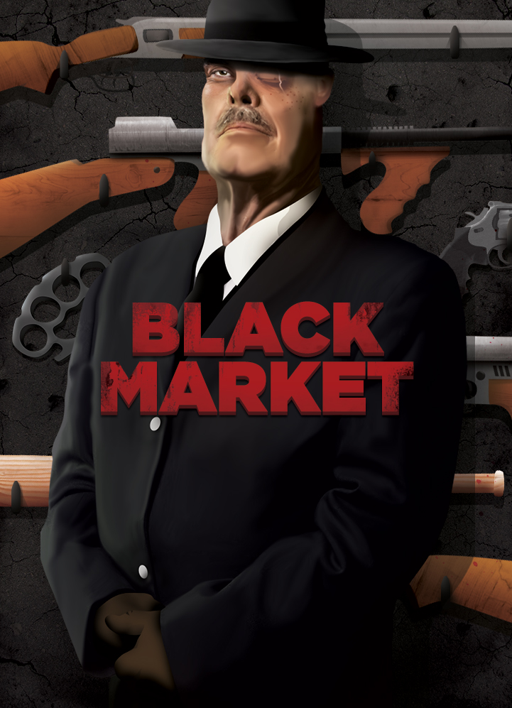
The cards feature some visual flourishes, such as the writing behind the imagery on the Mobster cards. How important were these style choices, and where did they come from?
Karl: Yeah, we have almost a poster-like design on Mobster and Black Market cards. I wanted to make sure that everything important is clear and easy to read, since those cards will make up players’ hands. The designated phase for each card is clearly visible on the top sign. The effect is always described at the bottom part, with a short text that is easy to read, combined with easy to understand icons. The name of the card, however, is actually not that important for gameplay, but still adds to the overall setting. I, therefore, decided to use the names as a backdrop and let the illustrations take over and cover parts of the wording to make them pop – but it is still easy to read each card name. I have created this quite unique style from scratch, which treats design elements almost like a poster.
For the Newspaper cards, which you only read once per turn, I looked at a lot of newspapers from the first half of the 20th century. Once again, I started with the essential effect of the card and then filled out the rest of the space with headlines. This creates a very nice look but also recreates very text heavy feeling of Newspapers, where a lot of (too much) text is often squeezed into a limited space. Last but not least, our Police Cards, also read once per turn, is all about clarity and structure as they contain effects for all players. Again, it is important for the game flow that it is easy to grasp the effects straight away.
As I am the only artist in this project, I have full control over all the art and layout. That provides many benefits. Instead of ordering imagery from external artists, we can start with adding all the text we find essential during the development, both the name in the background and effect text. I then continue to work with the illustrations in order to fill empty spaces and add elements on many levels. Many other producers instead have to make a dedicated box for text, one box where the art should be, etc. and then send that as a template to their artists. Our approach is more flexible but still presents key elements in a very clear way.


What advice would you give to anyone looking to launch a Kickstarter game?
Joel: Making a game is perhaps half of the job. Everything else surrounding the production of a board game and the making and launch of a Kickstarter campaign easily takes up as much time, if not more. Be prepared to learn a lot. Luckily, there’s many great blogs (James Stegmaeir’s being the most frequently quoted) and some extremely helpful Kickstarter creator groups on Facebook. Feel free to reach out to us if you want to be invited to any of those!
Karl: Concerning art and artists specifically. You’ll need a lot of art for a campaign and a huge part of it will be art that won’t be used in your game. There are many elements you’ll need for your campaign page, like signs for sections and gifs that explain the game, etc. etc. Much art will be static during the campaign, but you’ll also need to continuously update art for changing sections like Stretch Goals. Additionally, you should be prepared with art for the updates you’ll frequently send out to your backers. A lot of that will be specific art to showcase some new components you’ve reached in Stretch Goals, or new initiatives to encourage backers to spread the word about your campaign. You can’t plan all that in advance, as you won’t know the pace of your campaign or the number of Stretch Goals you will achieve. As a result, whether you have an artist in your team or hire someone, make sure it is someone that you can work closely with (and afford) during your campaign. It is an extremely intensive period, where new needs will pop up with very short notice, regardless how much you’ve planned.
Finally, if we’d like to see more of you and your work, where can we find you?
Karl: I don't have an online portfolio, because I haven't been looking for a job for a very long time. But feel free to check out some of my work at the agency where I'm working, Perfect Fools. I also have a Vimeo that showcase some of my motion.
Joel: Honestly, just look at Karl’s work. I don’t usually do the kind of work you show off in a portfolio. But I am fairly good with InDesign. So if you want to see something visual that I’ve done in this project, please feel free to check out our rulebook. You’ll find it at the Mobster Metropolis Kickstarter campaign page! Also, feel free to contact us at STORMAKTEN Production on Facebook, @mobstermetropolis on Instagram and @STORMAKTEN_Prod on Twitter!
(All images supplied by Stormakten Production, 2018)